RFID transitions

Touch interface Istanbul's public transport system features an interesting aspect regarding "touch interfaces". Two validation solutions coexist in the form of:

  1. AKBIL (deployed in 1995): an electronic transit pass made of a small stainless steel button ("1-Wire Interface") on a plastic holder. Interestingly, from a UX perspective, two or more people can use the same Akbil. The company which provide the solution mentions that " the communication rate and product breadth of iButtons goes well beyond the simple memory products typically available with RFID. As for durability, the thin plastic of smart cards is no match for the strength of the stainless-steel-clad iButton".
  2. Istanbulkart (deployed in 2009): an RFID chip card that is slowly taking off (I have to admit that I haven't seen anyone using it). In this case, the card is personal and enable to take five trips using a single ticket.

Touch interface

Touch interface

Why do I blog this? Transition moment between different technical solutions are always intriguing as both are still in use. The new interface is deployed and users will be encouraged to use it. In this case, given the fact that it's an infrastructure, there's a lot to be done (adding RFID readers here and there).

This transition leads to interfaces with several points of entries as shown on the picture above. The current vending machine still reflects the prevalence of the AKBIL: it's funny to notice how the old AKBIL charging system is convenient (right below where you insert bank notes, which makes the interaction flows more easily).

Book proposal about joypad evolution

Game controller project The game controller book project moves slowly but we tentatively wrote a draft of the book proposal that we intend to use. The provisional title is "The Joypad Continuum: tracing the evolution of game pad design" (by Nicolas Nova and Laurent Bolli).

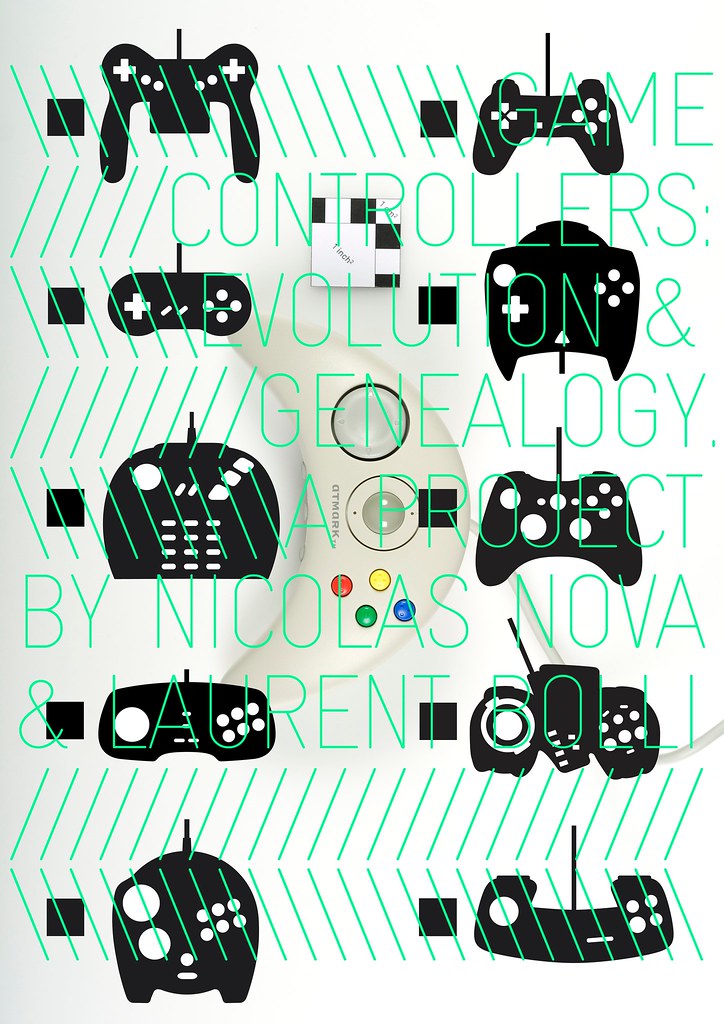
For the record, there's already some interest here and there but we thought it would be good to confront the book ideas with potential readers. The poster above is one of the artifacts that reflect the work we're doing to analyze the game pads. And yes it's a book entirely focused on joypads. Joysticks will be mentioned of course, but we zero in the evolution of pads.

Feel free to comment on this, we already collected lots of feedback, which is very refreshing and insightful (thanks for those who sent comments and emails). The outline is almost there and we have lots of material for the different parts of the book. We'll post stuff later on.
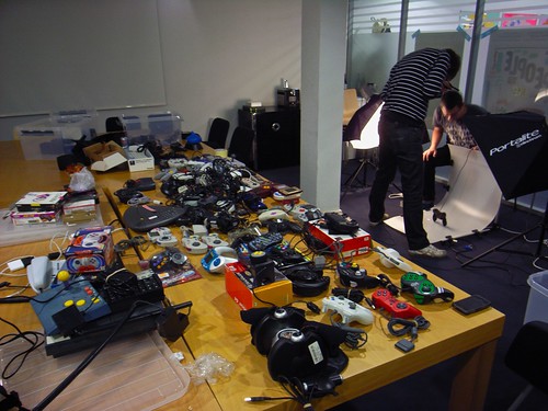
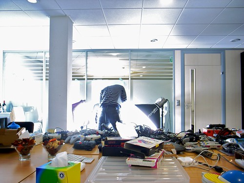
photoshooting photoshooting

Project description

This book describes the evolution of joypad designs over the short history of video games. It systematically tracks the process of change and how it happened in order to reach two goals. On the one hand, the book sets off to discuss the design decisions behind key interface attributes featured by this apparently banal class of artifact. It primarily focuses on joypad shapes, direction and action buttons as well as various other features that have enriched video game controllers. On the other hand, the book discusses the circulation and modification of such design attributes over time and between joypad models. Doing so, this work exemplifies general principles about patterns of change and highlights the specificities of this class of technical objects.

Among contemporary objects, joypads are peculiar given their existence both as physical artifacts and as interfaces to control characters in digital environments. Unlike joysticks, they correspond to a type of game controller held in the hand where fingers interact with buttons, sliders and tiny sticks. Therefore, observing this unique device enables to highlight critical implications about human-computer interaction and innovation in the field of new media: the intricate relationship between joypads and video game design, the evolution of game interfaces (and upcoming changes) as well as the evolution of technical objects in general.

In terms of theoretical framework, the book adopts an evolutionary perspective (Simondon, 1980; Deforge, 1985; Basalla, 1988) to describe the different paths taken by joypad design and to give the reader a critical overview of the underlying trends that shaped the various iterations of this artifact. However, the evolutionary analogy serves here as an organizing principles to track the iterative changes of objects and does not reflect any teleological assumption of progress. From a methodological perspective, this book is based on the ethnographical analysis of technical objects (Star, 1999), interviews with controller designers or the gathering of second-hand material about the design decisions that led to certain joypads (interviews, books, patents). Instead of adopting the common approach focused on studying usage and people, this work is based on the examination of artifacts. The systematic analysis of artifactual iterations enabled to build genealogies and to foster insights about patterns of changes (e.g. evolution of the number of buttons, evolution of the button/surface ratio). Furthermore, the evolutionary angle posits that objects are not explored independently but as being part of various lineages, which shares common design attributes such as controller shapes or navigation interface.

Such book targets mainly academic researchers in the field of Science and Technology Studies, New Media or Human-Computer Interaction as well as practitioners in the field of interaction design. However, the book is also meant to be relevant for video game fans who are interested in a deeper perspective about game controllers. It is intended to be short (140-180 pages) and illustrated by black and white joypad drawings and diagrams (genealogy trees, histograms as carried out by Deforge, 1985).

Fields of discourse: The fields of discourse adopted in this project are a combination of: - Science and technology studies (Simondon, 1980; Basalla, 1988; Akrich, 1992) for the analysis of technical objects and the description about how mundane artifacts are the product of various forces. More specifically, the work of Zimmermann (2010) about the circulation of cultural elements is informative for the analysis of how design choices about game pads spread and evolve. The book also relies on the work of Star (1999) concerning how ethnography can be applied to physical artifacts. - Human-Computer Interaction (Gibson, 1977; Norman, 1990; Gaver, 1991; Gaver, 1996) for the focus on interfaces and the notion of affordance. At first this term corresponded to the action possibilities present in the environment. This notion evolved in the field of HCI to refer to "the perceived and actual properties of the thing, primarily those fundamental properties that determine just how the thing could possibly be used." (Norman, 1990). - New media studies and more specifically Platform Studies (Monfort and Bogost, 2009) because of the renewal of interest in platforms/technical objects.

Reasons for writing this book: The first reason to write this book stemmed from the personal collection of joypad we collected in the previous months. This material enabled to analyze and discuss the evolution of these technical objects and serve as the starting point for interaction and game design research in different contexts (workshops with students, seminar with practitioners).

A second reason is that the large majority of books about game interfaces are non-academic and take a descriptive approach with plenty of pictures but a limited analysis of their evolution (see for example Forster, W. and Freundorfer, S., 2003 or Miller et al., 2009). Our interested lies in providing an analytical perspective about joypads instead of a description of all the existing artifacts.

In addition, there is currently a renewed interest in studying artifacts (beyond their usage) in new media studies, as attested by the Platform Studies collection at the MIT press. We therefore believe the analysis of joypads is relevant both from the video game analysis standpoint and also as an introduction to the analysis of technical objects. Compared to other research foci (such as video game analysis or media usage), the joypad is a less-explored element that is paradoxical compared to its iconic nature as a powerful metaphor for video games. Because of the potential appeal of joypad to readers, the book is also an opportunity to exemplify general lessons about the history of technical objects (which generally draws upon artifacts that are less common for todays' readers such as washing machines or car engines).

Finally, from a video game standpoint, looking back at the evolution of game controllers is important given that the console manufacturers are transferring hardware cycle to the peripherals rather than console platforms. Furthermore, the disappearance of the controller in Microsoft Natal's project and its recombination in the case of the Wii and Sony's Motion Controller makes the joypad an interesting object to investigate.

References: Akrich, M. (1992), "The description of technical objects", in Bijker, W.E., Law, J. (Eds),Shaping Technology/Building Society, MIT Press, Cambridge, MA, pp.205-24.

Basalla, G. (1988). The Evolution of Technology. Cambridge University Press.

Deforge, Y. (1985). Technologie et génétique de l'objet industriel. Paris: Maloine.

Forster, W. and Freundorfer, S. (2003). Joysticks. Gameplan; Auflage.

Gaver, W. (1996). Affordances for interaction: The social is material for design. Ecological Psychology, 8(2).

Gaver, W. (1991). Technology affordances. Proceedings of CHI, 1991 (New Orleans, Lousiana, USA, April 28 - May 2, 1991) ACM, New York.

Miller, F., Vandome, A.F., McBrewster, J. (2009). Game Controller. Alphascript Publishing.

Montfort, N. & Bogost, I. (2009). Racing the Beam The Atari Video Computer System. MIT press.

Norman, D. A. (1990). The design of everyday things. New York: Doubleday.

Simondon, G. (1980), trans. Ninian Mellamphy, On the Mode of Existence of Technical Objects. London: University of Western Ontario, 1980 [1958].

Star, S.L. (1999). “The Ethnography of Infrastructure,” American Behavioral . Scientist, 43: 377-391

Tulathimutte, T. (2005). Controller Mediation in Human-Computer Play. Honors Thesis, Stanford University.

Zimmermann, B. (2010). Redesigning Culture: Chinese Characters in Alphabet-Encoded Networks, Design and Culture, Berg Publishers.

Remote control analysis

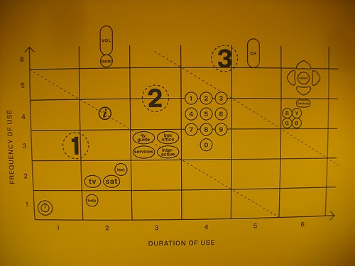
Remote control ergonomics An interesting diagram encountered in London at the 'ergonomics' exhibit (thanks Alexandre Burdin for the two pictures). The horizontal axis corresponds to the duration of use of a certain button, while the vertical axis is meant to represent the frequency of use. Doing this enable to discriminate 3 clusters of remote control features.

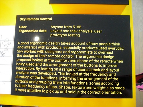
As described below, this graphic emerged from an empirical study of remote control prototypes.

Remote control ergonomics

Why do I blog this? Definitely an interesting way to analyze a physical artifact. More specifically, this is a relevant way to visualize results from a study of how people use a remote control. It's also interesting (with regards to a design process) to understand how they employed this as a way to work out the buttons arrangement using this kind of data reduction method.

A similar graphic can be designed for joypads, considering the use of various buttons.

A visit to the Rolex Learning Center (EPFL)

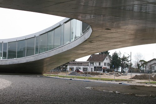
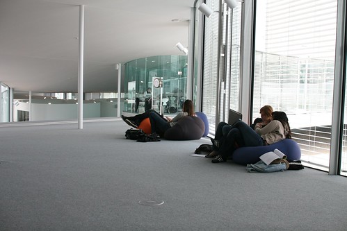
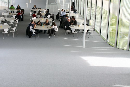
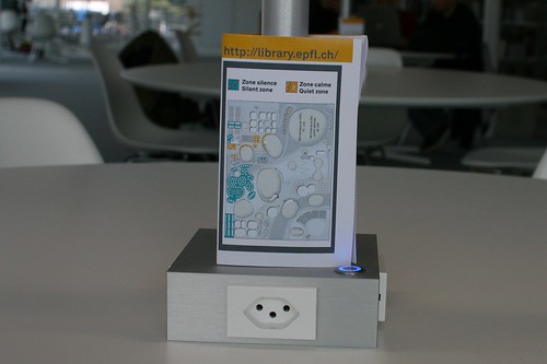
Rolex Learning Center (EPFL)Rolex Learning Center (EPFL) Rolex Learning Center (EPFL)

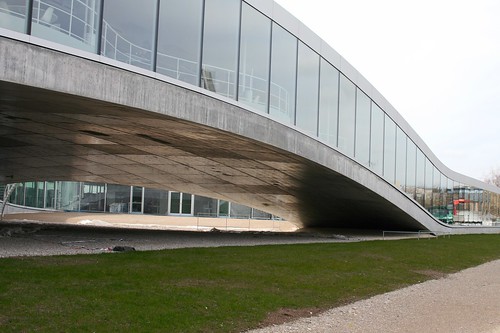
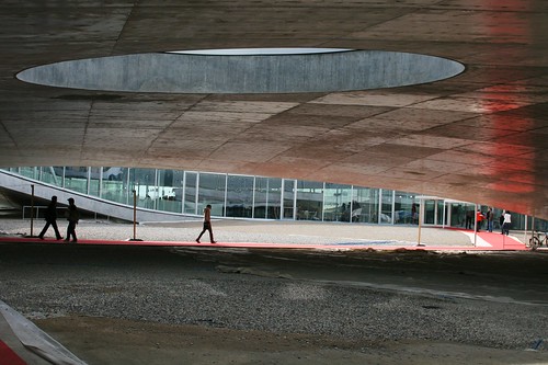
Some quick thoughts about the Rolex Learning Center that I visited yesterday afternoon at the Swiss Institute of Technology in Lausanne (EPFL). Designed by Sanaa, a japanese architecture firm, the building is an intriguing super large open space with a fairly low number of walls and partitions. This facility includes the school's library, the research lab where I've done my PhD research (Craft: Center for Research and Support of Training and its Technologies), the student and alumni association offices, an auditorium, two restaurants and a café. It's perhaps from above that the view is even more stunning. However, the most obvious way to see this is to take a flight to Geneva Cointrin (GVA) and have a proper wind that enables aircrafts landing route over Suisse romande instead of France's Jura Mountains.

The place is filled with natural daylight and only the restaurant and library, are equipped with refrigerating ceilings (which use cooled by water from the lake).

Rolex Learning Center (EPFL)

Given the interest here about user experience and weird insights concerning people, some details attracted my attention. Most people commented on the outside. As for me, it's some of the indoor elements that I want to describe.

Open space and Partitions

As described the architects in this interview with The Guardian:

""The main aim is to make a space for people to stay together," says Sejima, "but where you can also have some privacy." The design reflects their idea of "softening boundaries". She opposes "programmes that say a room is a place to learn and a corridor is a place to relax. I do not think that is a way to learn. Sometimes, activities become continuous. You might have a coffee outside the classroom and change your opinion." The role of architecture is to suggest ways to use the space, rather than to prescribe. Nishizawa pushes the analogy with landscape: "When people find valleys, they tend to settle there and build villages. When they find a hill, they like to build a beautiful cafe on the hill. When they find slopes, they cover them in terraces." In the same way, they think their artificial hills will prompt different kinds of occupation: "We hope students can find nice places for themselves." "

It's indeed interesting to confront the architects' intents to current behavior: Rolex Learning Center (EPFL)

Although the partitions are not so present in the designers intents and in the building itself, there are still "invisible" boundaries, as attested by this map displayed on the library table. There are clear indications of areas where certain behavior are acceptable or not. Rolex Learning Center (EPFL)

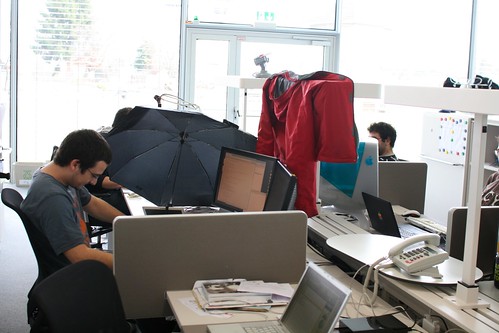
Another intriguing example lies in the usage of personal space. See for example how this Phd student re-created his bubble with "temporary walls". The coat is interesting for that matter but the use of the umbrella is even more striking. Daylight is so important here that sometimes yes, people needs a bit less light to look at the numerous displays present on everyone's desks.

Rolex Learning Center (EPFL)

Steep curves

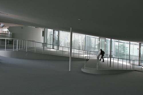
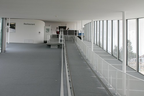
In addition, the surface of the floor and the ceiling is both elegant and curious. Also, the curves are actually quite steep as shown by the examples below. There is therefore a need to have particular devices to bring people up and down. I do not know the designers' intents here but the Alpine context around (think about the Mont Blanc on the opposite side of the lake) turns the indoor walking experience into something closer to natural structures.

Rolex Learning Center (EPFL) Rolex Learning Center (EPFL)

Signage

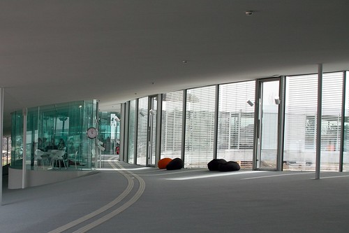
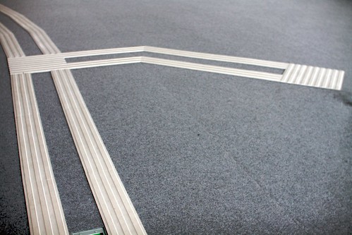
The use of what I would call "smooth podotactiles" is remarkable as well. These plastic lines on the floor aims at guiding people to the main locations of the Learning Center. Because of the curved floor, these elements sometimes give a very particular impression. It is as if perspective has been added to the interior architecture.

Rolex Learning Center (EPFL) Rolex Learning Center (EPFL)

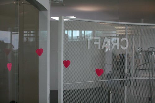
A funny aspect of signage is also the post-its people have started to put on glass walls... because of their translucence, it seemed that some folks bumped their heads into them. The repurposing of post-its was found as a solution to prevent this problem.

Rolex Learning Center (EPFL)

Time

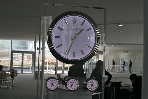
Of course, it's impossible no to mention the importance of time in the context of this building. The main partner of this construction is Rolex (hence the name of the learning center) and it somewhat leads to the inclusion of clocks here and there. They act as physical marker of the presence of time. It's a library where people work so it's indeed relevant for students and researchers. But clocks also have another role here. if you look at the picture below, it shows time in different cities (the future is urban right?): San Francisco, Boston, Tokyo, etc. to remind people that the "outside" is as important as the inside. Perhaps it's also meant to represent a direct connection to other "knowledge places" which are relevant in this era of cognitive capitalism.

Rolex Learning Center (EPFL)

"you are here" updates

Recent encounters in London with other "you are here" signs". The first one is interesting because it also add a "walking time" limit through a circle: You are here

This other one is a bit old and intriguing as it does not use a textual "you are here" but replace it with an elegant pointing finger: You are here

Why do I blog this? i simply continue the systematic list of "you are here" elements that i encounter. Can be handy when working on location-based services interfaces as examples of current practices.

Impact! exhibition at the RCA

Spent two days at the RCA in London. A good opportunity to have some time to discuss with James Auger, Anthony Dunne and their class, give a talk to them and explore the "Impact!" exhibition. This exhibition is another highly interesting example of interdisciplinary collaborations between design and scientific research, as already discussed about this other project. As described on the web platform, 16 researchers have collaborated with designers from the RCA under the coordination of the Engineering and Physical Sciences Research Council (EPSRC). Designers worked with them to produce conceptual designs (videos, photographs, interactives, prototypes, props and system diagrams and illustrations).

What's interesting here is to reflect upon the role of design. As described by Anthony Dunne, who curated the exhibition:

"Design can shift discussions about the impact of science on our daily lives away from abstract generalities to concrete examples grounded in our experience as members of a consumer society. It can facilitate debate about different technological futures before they happen, create dialogues between different publics and the experts who defines the policies and regulations that will shape the future of technology, and help ensure that we pursue the most desirable, and avoid the least desirable.

The design projects in this exhibition offer an alternative view of how science could influence our future. The purpose is not to offer prediction but inspire debate about the human consequences of different technological futures, both positive and negative.

There are no solutions here, or even answers; just questions, ideas and possibilities. They probe our beliefs and values, they challenge our assumptions, and they help us see that the way things are now is just one possibility - and not necessarily the best one."

Some projects were more revealing to me than others, I guess my choice reflects a personal choice rather than a judgement on their quality. Perhaps the most inspiring to me is the one called "Happylife" by James Auger and 3 other scientists. It basically explore the uses thermal imaging to analyse emotional states in a domestic context. This technology embedded in a HAL9000-like eye of Sauron can detect heat signatures (as shown on a video on the left on the picture below). Doing this, the system assesses a person’s physiological state and turn the changes into movements/dials on a family dashboard (with barometer-like displays). This project questions how imperceptible body parameters could reveal emotions such as guilt. What is highly intriguing (and smart according to me) is that the dashboard does not have any label... leaving its interpretation to the people who will live with it. How would this change social interactions in the family home? Would this electronic device enable family members to infer new things about their relatives? Would the device detect patterns invisible to people? All these issues are suggested by beautiful vignettes that I did not capture with my camera.

Happy Life (Impact!) Happy Life (Impact!) Happy Life (Impact!)

This Happylife project evolved from James and Jimmy's ideas about this notion of artifacts that would detect cues about our behavior and pre-empt what we feel and desire. Autonomous and adaptive devices have explored by science-fiction writers and researchers desperately want to implement them (sometimes urged by politics who find it could be a convenient solution against terrorism for instance). In their own words, here is how they frame their design research about this topic:

"The potential for this to go much further with the application of face recognition, thermal imaging and expression monitoring is obvious. The design challenge here is to explore how this might happen. How might products and services react to humans if they were aware of their mood."

Another project I enjoyed as the one called "The 5th dimensional camera" by Anab Jain, Jon Arden and three other researchers. It explores the notion of quantum mechanics and the possibility to access multiple dimensions. The project consists in a fictional camera that can capture "glimpses of 450 parallel universes suggested by quantum physics". By presenting such images, the two designers aimed at highlighting the "the strange processes at work within quantum computation to the wider public, and explore how they might impact our beliefs, our values and indeed our fabric of reality". To understand more the implications of such potential, the exhibit featured different narratives of test subjects who employs the camera in their own different ways.

Impact! (RCA)

Why do I blog this? these are quick and selective notes about the exhibit to keep a trace of what echoed with my interests. The two projects I mentioned as well as Anthony Dunne's framing are relevant IMHO in terms of how design research can operate and what sort of artifacts could be designed in such context. We're close to the idea of design fiction here.

People interested in this can also look at other write-ups by Richard Banks or building_space_with_words.

G.Basalla: The Evolution of Technology

George Basalla's book called "The Evolution of Technology" (Cambridge University Press, 1988) is another important resource for the game controller project. In this volume, the authors describes his theory of technological change based on the history of technology, economic history and anthropology. The whole book is driven by a strong theoretical perspective: the analogy between the evolution of technical objects and the evolutionary metaphor in order to show to that this metaphor can give insights otherwise unavailable to the history of technology Basalla uses the term "evolution" as a metaphor "at the heart of all extended analytical and critical thought" and highlight it as useful to apply this concept from biological evolution to evolution in technology. Initially this analogy was used from technology to biology (to describe living organisms in mechanical terms) and then the other way around, as a way to arrange technical objects into "genera, species and varieties and proceed from this classificatory exercise to the construction of an evolutionary tree illustrating the connections between the various forms of mechanical life". To him the difference is the following:

"the evolutionary metaphor must be approached with caution because there are vast differences between the world of the made and the world of the born. One is the result of purposeful human activity, the other the outcome of a random natural process. One produces a sterile physical object, the other a living being capable of reproducing itself. (...) Technological evolution has nothing comparable to the mass extinctions that are of interest to evolutionary biologists. History does not record any widespread, cataclysmic extinctions of entire classes of artifacts, although something similar might occur on a local level in remote communities or on isolated islands"

(The evolution of aboriginal weapons by Lane-Fox Pitt Rivers)

His theory of technological evolution is rooted in four broad concepts: diversity, continuity, novelty and selection.

Continuity Based on a fair amount of examples, Basalla debunks the notion of "technological revolutions" and the mere existence of "heroic inventors". To him, both are wrong and "key artifacts such as the steam engine, the cotton gin, or the transistor, emerged in an evolutionary fashion from their antecedents". Of course some changes are more important than others but: (1) There's always a continuity between techniques, (2) sometimes artifacts iteration is not based on other artifact but what Basalla calls "naturfacts": artifacts created after the analogy with natural elements (see the example of Barbed Wire based on thorny fence made of short trees).

He explains the origins of the discontinuous argument with the following notions:

  1. The loss or concealment of crucial antecedents: "the first automobiles were little more than 4-wheeled bicycles. Henry Ford called his car a "quadracycle",
  2. The emergence of the inventor as a hero: "Because heroic deeds are most often linked with revolutions, evolutionary explanations of technological change did not have a broad appeal. Nationalism also played a part in the 19th Century (...) The same exhibitions that glorified industrial progress, and the men who made it possible (...) A bizarre situation thus developed in which the heroic inventors of one country were scarcely acknowledged in another land"
  3. The patent system: "All of patent law is based on the assumption that an invention is a discrete, novel entity that can be assigned to the individual who is determined by the courts to be its legitimate creator. (...) Such dissimulations are the result of a system that attempts to impose discontinuity on what is essentially a continuous phenomenon"
  4. The confusion of technological and socio-economical change: the term "Industrial "Revolution" seems to imply the technological artifacts that made it up was revolutionary. Instead, it was evolutionary!

(Evolution of spark catchers for train locomotive smokestacks)
Novelty This chapter aimed at understanding how to account for differences and diversity in technological artifacts. In this part, the author substitutes the notion of "Homo Faber " ("Man the maker") to "Homo Ludens" ("Man the Player") to show the role of play in innovation. He then describes various sources:

  • Fantasy and Play: technological dreams: "the machines, proposals and visions generated by the technological community (...) epitomizes the technologists' propensity to go beyond what is technically feasible", technological extrapolations: "conservative ventures well within the bounds of possibility, perhaps a step or two beyond current practice", patents, bold and fantastic technological visions or popular fantasies: sci-fi, cartoons, fantastic machines...
  • Knowledge transfer by borrowing some aspects of a technology outside: cultural contacts because of imperialism, migration, trade, technology missions, industrial espionage, war.

In another chapter, he highlights how "human intervention can guide the variations toward a new artifact" and described the notion of skeuomorphs: "An element of design or structure that serves little or no purpose in the artifact fashioned from the new material but was essential to the object made from the original material".

Selection As defined by Basalla:

"Because there is an excess of technological novelty and consequently not a close lit between invention and wants or needs, a process of selection must take place in which some innovations are developed and incorporated into a culture while others are rejected (...) evolution by natural selection has no preordained goal, purpose or direction. This is not true for artificial selection as practiced by animal and plant breeders. Here criteria are established by the humans who select characteristics they consider worthy of preservation. (...) Variant artifacts do not arise from the chance recombination of certain crucial constituent parts but are the result of a conscious process in which human taste and judgment are exercised in the pursuit of some biological, technological, psychological, social, economical, or cultural goal."

Some additional quotes about the notion of "needs":

"According to functionalist anthropologists and sociobiologists, every aspects of culture, material and nonmaterial, can be traced directly to the satisfaction of a basic need. (...) Critics of the biological theory, however proposed a number of strong counterarguments. (...) We cultivate technology to meet our perceived needs, not a set of universal ones legislated by nature (...) the artifactual world would exhibit far less diversity if it operated primarily under the constraints imposed by fundamental needs. (...) a skyscraper is not simply a structure to protect people from the vagaries of the weather"

Why do I blog this? I was drawn to this book thanks to several discussion threads. Mostly the recurring chat about circulation of design choices with my neighbor Basile, as well as an exchange of tweets with Antonio Casilli who recommended the book. The material in there was highly useful in general and relevant to our project that aims at mapping the evolution of joypads. Given our interest in studying a "lineage" of technical artifacts, I was wary of using the "evolution" metaphor because of the underlying idea of progress that I did not want to imply.

Overall, three quotes about the use of the evolutionary metaphor are important for our investigation of artifacts evolution:

"I use the evolutionary analogy because of its metaphorical and heuristic power and caution against any literal applications, not the least, the process of speciation (...) On the most general level the evolutionary analogy serves as a useful organizing principle for studying technological change (...) A workable theory of technological evolution requires there be no technological progress in the traditional sense of the term but accepts the possibility of limited progress toward a carefully selected goal within a restricted framework"

Paris metro interactive map

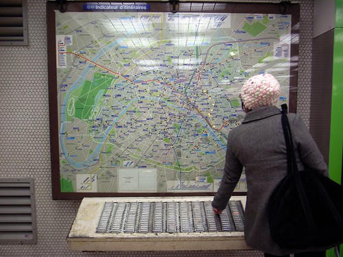
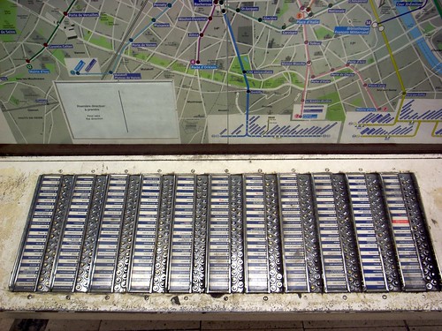
Subway map in Paris On the most interesting "static" map I've ever seen is the "indicateur d'itinéraires" located on some of the metro station in Paris (this one is close to the entrance of Ligne 1 in Paris Gare de Lyon). You press the number of the metro station that you want to reach with the keyboard below and the suggested route appears displayed on the lights on the board.

Subway map in Paris

Subway map in Paris

Although some folks think there's a small person in there, the inner mechanism is closer to "Operation" with lights. Very low-bandwidth and based on electricity.

This device is actually called PILI, which stands for "plans indicateurs lumineux d’itinéraires" (Light-Based Indicator Plan for Itinerary") and has been implemented in 1937. A simple and straight-forward way to get both a general overview as well as information about where you want to go. It's intriguing to see how people from these times designed a map-based system without any complex display technology, and it's very efficient.

Why do I blog this? Going to the French capital quite often, I love to spend some time observing how people interact with these machines. There are lots of things to notice, see for example:

  • User's proximity to the device, which depends on their purpose (getting and overview, looking for a specific route).
  • The flexibility of usage: the device is very big and it allows people to use it in various ways altogether. If a person looks for a route, it doesn't prevent others to observe the map and look for their information (without necessarily using the buttons).

Interestingly, I found it much more efficient than the 21st century version that you can see below. Even though it has different features, this new version is rather small (intended to be used by only one person) and I generally rarely see people using it.

Urban signage

Lift Seminar @ Imaginove about gestural interfaces

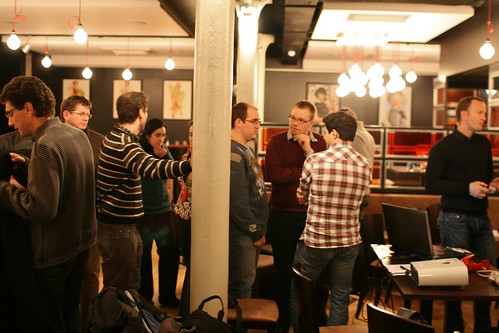
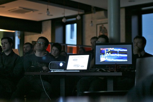
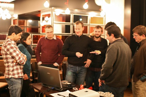
Lift seminar @ Imaginove Yesterday in Lyon, Emmanuel Rondeau and myself organized a Lift@Home about gestural interfaces. We (Lift) indeed partnered with Imaginove, a French cluster of companies, research institutions and universities focused on video games, audio-visual, cinema, animation and multimedia. Several other Lift seminars will be organized around various topics such as the Social Web, 3D virtual environment, networked objects and locative media. We'll focus on the uses and practices of each of these technologies, to reflect upon how they are appropriated by users and how this information can be fed back into the design process.

Yesterday's seminar focused on how gestural interfaces such as the Nintendo Wii, new kinds of accelerometers and (3D) cameras are used in the context of video games. There were around 50 participants, mostly game designers, interaction designers and Human-Computer Interaction academics.

Lift seminar @ Imaginove

After a quick introduction about the evolution of video-game peripherals over time, I described the pros and cons of these kind of interfaces as shown on the following slide

In addition, I mentioned some of the projects we carried out when I worked at Phoenix Interactive, a French video-game studio based in Lyon. These projects showed how we studied the various ways to transmit/explain gestures to players, a project in collaboration with a laboratory in Cognitive Psychology.

The next presenter, Emmanuelle Jacques, a sociologist from the University of Montpellier, described some results from an ethnographical study of Nintendo Wii usage. She described the discrepancy between the gestures that game designers expected to be made and people's practices. As shown in the following picture, the movement amplitude of gestures is indeed quite different with expert players (the smaller girl) and novice players who think they must replicate real-world gestures. Emmanuelle discussed the implications of such notions, showing that playability is a much more complex notion than simply replicating what is done in the physical world.

The following presenters, Timothée Jobert from Litus/CEA and Etienne Guerry from XPteam in Grenoble presented an interesting case study of user-centered design. They described the results of an ethnographic study about how people use two sorts of gestural interfaces (the Nintendo Wii and the Bodypad). They then showed how these results were used in the design of video game prototypes based on a new kind of technology (a combination of an accelerometer and a magnetometer designed by Movéa). They ended their presentation with a demo of their prototypes, leading to a lively discussion about new technologies can overcome the problems game designers encountered with the Wii and the notion of realism.

Lift seminar @ Imaginove

Locative media projects that caught my attention

Interesting locative media project that I've found relevant lately:

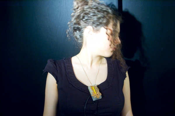
Address necklace by Mouna Andraos and Sonali Sridhar:

"Address is a handmade electronic jewelry piece. When you first acquire the pendant, you select a place that you consider to be your anchor – where you were born, your home, or perhaps the place you long to be. Once the jewelry is initialized, every time you wear the piece it displays how many kilometers you are from that location, using a GPS component built into the pendant. As you take Address around the world with you, it serves as a personal connection to that place, making the world a little smaller or maybe a little bigger."

I like the idea of having a personal connection to a place and not necessarily a human being. This is so different than the raft of buddy-finder applications.

Compass Phone by HaYeon Yoo:

"This project addresses the issue of whether the mobile phone is a surveillance tool or a digital leash and explores designing an alternative means of communication which delivers a more poetic and aesthetic experience.

The Compass Phone does not support any verbal communication side, but has only a GPS function. It measures the distance between two people in real-time and then converts it to the time it takes for them to meet each other by either transport or time unit. A compass is hidden under the digit display. The centre of the compass always indicates the user's position and its needle indicates the other person's direction. "

This one is also interesting at it gives subtle cues about friends' movement in space; I see it as indicating a possibility, and less a factual or objective indication as other buddy-finder try to implement.

Petroski's "The Evolution of Useful Things"

Reading about technical objects evolution for the game controller project led me to The Evolution of Useful Things: How Everyday Artifacts-From Forks and Pins to Paper Clips and Zippers-Came to be as They are by Henry Petroski. Focused on forks, paper clips or spoons, the book asks this basic-but-interesting question: "how did these convenient implements come to be, and why are they now so second-nature to us?". It basically try to seek answers to "provide insight in the nature of technological development", and by approaching it with an evolutionary lense:

"Putting implements such as the common knife and fork and chopsticks into an evolutionary perspective, tentative as it necessarily must be, gives a new slant to the concept of their design, for they do not spring fully-formed from the mind of some maker but, rather, become shaped and reshaped through the (principally negative) experiences of their users within the social, cultural, and technological contexts in which they are embedded. The formal evolution of artifacts in turn has profound influences on how we use them."

Based on a wide array of illustrative examples, he debunks the "Form Follows Function" myth:

"Imagining how the form of things as seemingly simple as eating utensils might have evolved demonstrates the inadequacy of a “form follows function” argument to serve as a guiding principle for understanding how artifacts have come to look the way they do. Reflecting on how the form of the knife and fork has developed, let alone how vastly divergent are the ways in which Eastern and Western cultures have solved the identical design problem of conveying food to mouth, really demolishes any overly deterministic argument, for clearly there is no unique solution to the elementary problem of eating.

What form does follow is the real and perceived failure of things as they are used to do what they are supposed to do. Clever people in the past, whom we today might call inventors, designers, or engineers, observed the failure of existing things to function as well as might be imagined. By focusing on the shortcomings of things, innovators altered those items to remove the imperfections, thus producing new, improved objects. Different innovators in different places, starting with rudimentary solutions to the same basic problem, focused on different faults at different times, and so we have inherited culture-specific artifacts that are daily reminders that implements used to effect it. (...) The form, nature, and use of all artifacts are influenced by politics, manners, and personal preferences as by that nebulous entity, technology, manners and social intercourse. (...) it is really want rather than need that drives the process of technological evolution"

Although I found the argument a bit too mono-causal, it's highly interesting to read this kind of assertion from an engineer. While I agree that form may follow failure (and my interest in design failure is certainly related to this opinion), it is as if Petroski was too quick to dismiss other kinds of influence. There are *other" divers of innovation.

It's also relevant to see him acknowledging, after G. Basalla, that the existence of continuity in technical objects "implies that novel artifacts can only arise from antecedent artifacts - that new kinds of made things are never pure creations of theory, ingenuity and fancy". This is a favorite topic of mine, that I already addressed here. Petroski illustrates it with the example of the paper clip:

"the invention of a new paper clip will not occur in some amorphous dream world devoid of all artifacts save imaginative shapes and styles of bent wire or formed plastic. Rather, any new clip will come out of the crowded past of reality."

Another aspect of the book I was interested in is the vocabulary employed to refer to evolution of technical objects. The evolutionary metaphor is exemplified using the following terms extracted from geography, genealogy or biology:

"a route, detours, layovers, wrong-turns, retracings and accidents, paths... antecedents, ancestors... variations, new models... a vestigial trait/feature, a survival form... precursor... the idea of XXX long survived in such diverse applications"

Why do I blog this? Some interesting insights here about the evolutionary metaphor in the design of technical objects. The book gives plenty of details about interesting examples and is a bit short on theories. That said, given its origin (Petroski is not an STS researcher), there are some good points and pertinent elements we can re-use in the game controller project.

Superimpose various urban realities

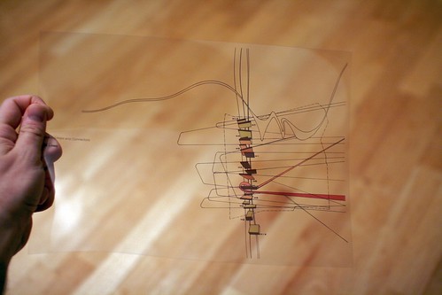
You Are the City (Petra Kempf) Received today my copy of You Are the City: Observation, Organization and Transformation of Urban Settings by Petra Kempf, definitely a gem in my collection of books and artifacts about urbanism. Made of 22 transparent slides in a folder, and a 16 page brochure, as described by the author:

"this publication offers architects, urban planners and general readers interested in city design and growth a novel approach, a mapping tool that creates a framework for understanding the continually changing configuration of the city. With the aid of themed transparencies, the tool allows one to superimpose various realities in layers in order to create new urban connections, thus inviting readers to immerse themselves in the complexity of our cities."

You Are the City (Petra Kempf) You Are the City (Petra Kempf)

Readers interested in Petra Kempf's work may be interested in this interview, from which I took the following excerpts:

"there are many ways to represent cities and each of the mapping technologies available certainly have their value and importance. However the technologies that are currently available, are mostly based on numbers and facts, not personal experiences. But to really experience a city one must be part of it. This is an analog process, by which we engage with a city’s intricate fabric. To re-create that analog process, in this project, I needed to use a tool that helped me simulate that experience. The limitations and computational restrictions of a computer program did not allow me that opportunity. (...) Mapping human flows in cities is a daunting task. I have mixed feelings about mapping these flows, since it could easily shift into ‘the big brother is watching or tracing’ the flows of people. Examples are already at hand with tracing people through their mobile phones, personal GPS security devices, ISP addresses, debit cards or passports. I think one needs to be very diligent with this subject. When I think of mapping human flows I think of Michel de Certeau or Henri Lefebvre, to name just two. They thought of the urban inhabitant as someone who could never be traced, since he/she always slips away from the ‘official’, traceable path. In this way each individual creates their own path, which can not be traced—even though they shape the city and the city shapes them."

You Are the City (Petra Kempf) You Are the City (Petra Kempf)

Also about how cities have always been informed by the traces we leave here and there: You Are the City (Petra Kempf)

Why do I blog this? What I find intriguing with this "instrument" is that the transparent sheets enable readers to perceive the city by isolating and superimposing different urban components. Doing so, one build his or her own representation of what a City can be.

Beyond the author's purpose, these sheets remind me of Dan Hill and Andrew vande Moere's workshop exercices. As you may notice, it's perhaps the use of transparent and overlays that made me think about it. I like this project both for its aesthetics (and how it reshape the notion of maps) and as a methodology to observe and discuss about the urban fabric. The manipulation of transparent sheets (superimposing various versions) enable to trigger interesting conversations and I am pretty sure that the design of similar maps for a specific neighborhood can also be a curious tool in workshops.

Matt Jones on mujicomp and mujicompfrastructures at Technoark

Two week ago at the the "New Digital Spaces conference at Technoark in Sierre, Switzerland, Matt Jones gave a talk called "people are walking architecture". You can see the video here. (Fabien's picture of Matt Jones at Technoark)
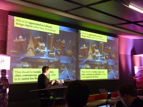
In his presentation, he introduced the notion of "Mujicomp", a portmanteau word made of "Muji" (the japanese retail company which sells a wide variety of household and consumer goods) and "Computing". What does it mean?

According to Jones, the idea of "mujicomp" revolved around the notion that ubiquitous computing needs to "become sexy and desirable... able to be appreciated as cultural design objects rather than technology... they should be tasteful, simple, clear, clean, contemporary, affordable in order to be invited into the home". If designers and engineers want to "make smart cities bottom up with products and not academic ubiquitous computing which are always postponed", he argued that ubicomp will need some "muji". And of course, as shown by Jone's use of the quote from Eliel Saarinen, "always design a thing by considering it in its larger context... a chair in a room, a room in a house, a house in an environment".

Starting from the ground-up can lead to some "almost mujicomp" products he mentioned ranges from energy monitor (Watsson, Wattcher) to more curious devices such as Availabot or Olinda that they develop at BERG. The fon phone is also an example here.

As computing requires not only artifacts but also infrastructures, there's a need for "mujicompfrastructures":

"could you create infrastructures with desirable things? the importance of threshold: how could we look at the spaces where we used our devices in a same way architect look at things? like bottom-up urbanism? different elements/gray shades between the private and the public: street, sidewalk, pavement, porch, home this connects to jane jacobs: intervening is not just about creating big infrastructures but sidewalk-scale system that could leak out into the home"

Also in his presentation, Matt talked about the "patchy homebrew equivalent of the nearly-net that would work", relying on Clay Shirky's Permanet, Nearlynet, and Wireless Data:

"Call the first network "perma-net," a world where connectivity is like air, where anyone can send or receive data anytime anywhere. Call the second network "nearly-net", an archipelago of connectivity in an ocean of disconnection. Everyone wants permanet -- the providers want to provide it, the customers want to use it, and every few years, someone announces that they are going to build some version of it. The lesson of in-flight phones is that nearlynet is better aligned with the technological, economic, and social forces that help networks actually get built."

Why do I blog this? took some time to sort my (messy) notes that highlight interesting aspects of ubicomp evolution and the role of designers in this.

Famous user figures in the history of HCI

Marketing people, engineers and designers often rely on persona, i.e. fictional characters created to represent the different user types within targeted characteristics that might use a service or a product. In the history of human-computer interaction, some user figures have been so prominent that it is important to keep them in mind.

josephine


Two of the most prominent characters are Joe and Josephine, a fictional couple described by Henry Dreyfuss, in "Designing for People" with plenty of simplified anthropometric charts. Dreyfuss introduced what has been called "Human Engineering" in the form of this couple, his common denominators for all dimensions. Simply put, Joe and Josephine representing the numerous consumers for whom they were designing:

""if this book can have a hero and a heroine, they are a couple we call Joe and Josephine.... They occupy places of honor on the wall of our New York and California offices.... They remind us that everything we design is used by people and that people come in many sizes and have varying physical attributes.... Our job is to make Joe and Josephine compatible with their environment... consider josephine as a telephone operator". It wasn't too long ago that she had the mouthpiece of the phone strapped to her chest and the earphones clamped to her head."

sparky

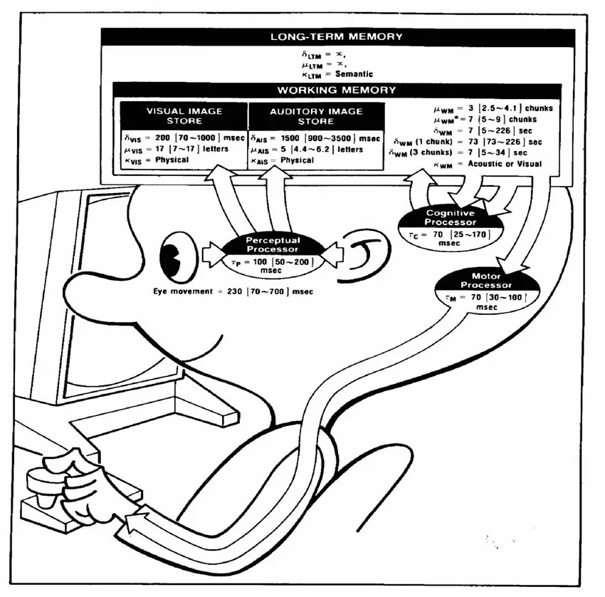
Another good example is Sparky, the "Model Human Processor", introduced by two HCI researchers: Stuart Card and Thomas Moran in 1983. In this case, Sparky was less a persona than a model of user interaction with the computer. For these authors, the goal was to build a model of computer users based on their perceptive, motive and cognitive abilities to interact with digital artifacts.

sally

Perhaps the most caricatural is Sally, the fictional secretary from Xerox PARC. You can find the following description in a conversation with Douglas Englebart:

"But fashion shifted. XEROX PARC was formed. The 'inn' thing to do was to focus on the 'real' user - personified at PARC by 'Sally' the secretary. She need to have a computer she could figure out how to use quickly and have her paper-based work on, after all, XEROX was a 'document company'. The thinking was very far removed from augmenting the executive 'knowledge worker'."

As discussed by Thierry Bardini in his book:

"the real user was born, and her name was 'Sally' (...) Two main characteristics defined this new model of the user: Sally was working on paper, on her Royal, but in the professional business of publishing, and she was a skilled touch typist. (...) Sally, "the lady with the Royal typewriter," once and for all validated Licklider's conclusion that the real users, "people who are buying computers, especially personal computers, just aren't going to take a long time to learn something. They're going to insist on using it awfully quick - easy to use, easy and quick to learn."

You can also traces remnants of Sally in this research paper where she's back with a guy called Bob.

Why do I blog this? This is only a limited list of classical persona in the history of HCI, I am pretty sure there are others. There were helpful in my presentation (in french) about how networked objects are designed with limited models of targeted users. As you surely realize, these fictional characters tend to exhibit important bias and flawed representation of human beings. Thanks Emmanuelle Jacques for pointing me to this line of work! What is of interest here, is simply to trace reasons of design choices made by certain "innovators" over time.

Object evolution

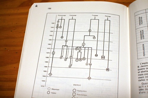
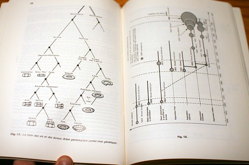
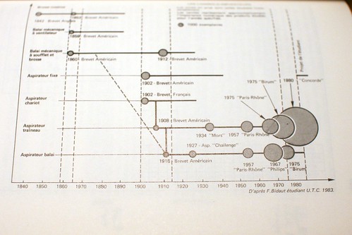
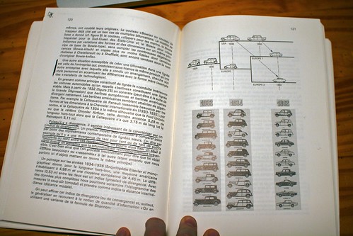
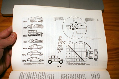
A recurring topic on this weblog is the evolution of technical objects. The game controller project is of course one of the reason for this interest but it goes beyond this category of artifacts. Some examples of genealogy trees we are inspired of in the project below. They come from a book by Yves Deforge, a french researcher, who produced lot of material about this topic. His book "Technologie et génétique de l'objet industriel offers an interesting introduction to theoretical constructs (based on Gilbert Simondon's work) and a good series of examples:Technologie et génétique de l'objet industriel (Yves Deforge)

Technologie et génétique de l'objet industriel (Yves Deforge)

Technologie et génétique de l'objet industriel (Yves Deforge)

Technologie et génétique de l'objet industriel (Yves Deforge)

Technologie et génétique de l'objet industriel (Yves Deforge)

mapenvelop: post it from the exact place

mapenvelop is a project by beste miray dogan that I like a lot: the inner walls of the envelope are blanketed by a Google map that indicates where the sender's address is. As described by the designer "post it from the exact place".

Why do I blog this an interesting low-tech approach to adding locational information to a message. A sort of locational information that adds subtlety in communication given that a map can be perceived as "richer" than a written address. It would be even more intriguing to have such envelopes for places you visit... you would buy a map of barcelona and pinpoint where you wrote the letter... so that your contact can be aware of where you thought about them. Surely something that is possible with digital communication through location-aware devices but that is even more curious on paper.

ixda interaction 2010 in Savannah

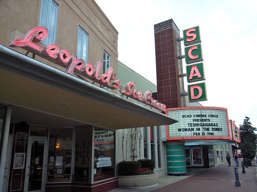
SavannahSCAD

Back from interaction10, the annual conference hosted by the Interaction Design Association (IxDA) in Savannah, Georgia. A good occasion to visit the deep south (aka "dirty south 2) that I did not know at all. More observation on this at the end of this post, let's focus first in lessons learned at the conference.

Before coming, I was not sure about the whole thing, wondering whether the talk/audience would be into web-stuff or other concerns. After three days there I have to admit that I am really happy with the quality of the talks as well as the diversity of the conference formats. As opposed to lots of events, it seems that the venues have certainly contributed to the quality of the interactions (definitely no big hotel-chain lobby with their cheesy carpets). Furthermore, I was also glad to present my talk about failures and get some interesting feedback to go further.

Instead of a selection of semi-automatic writings of the talks as I've done after the Microsoft Social Computing Symposium, I tried to put together a selection of insights I collected at interaction2010. Overall, I was struck by the following three elements:

Incentives and rewards

A recurring topic was sur toutes les lèvres: the notion of providing "incentives and rewards" for the use of certain services. Be it about changing one's behavior to reach a more sustainable development model or as a way to let people use applications they wouldn't otherwise. This was a term I've heard in talks, conversations, participative activities and side activities. The break-out group about Foursquare at the Microsoft Social Computing Symposium the other day also connects to this discussion because I think 4^2 epitomizes by-products of incentives. Simply because one the rewards the interaction designers of this location-based system created turned users into point-addicts. Although the design community has always talk about this, my impression was that design was more about creating "affordances" than incentives. Where the former lies in perceptual and cognitive psychology, industrial design and human–computer interaction, the latter stemmed from economics and sociology. I don't judge anything here, I just see a pattern, perhaps design is well qualified to use both metaphors in its creative repertoire. The very notion for service design is perhaps useful here to understand this shift and I've heard someone arguing that an incentive was an "immaterial affordance" (which made me frown).

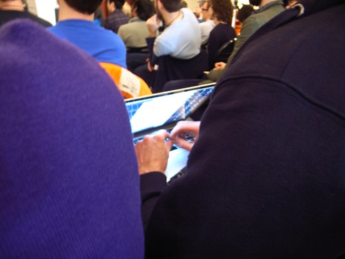
Typing without looking at the screen (someone typing notes without bothering looking at the blue-glow display)

About models

In addition, one of the theme I was interested in was the way designers work, achieve their projects and think. Which is why I paid close attention to tools, methodologies and abstractions. Fortunately, most of the presentation I attended showed some interesting examples of "models". See for instance the two examples below: Nathan Shedroff's model of experience/meaning (see his presentation for more) or Timo Arnall's interesting model of the 3 levels for designing networked objects, and the one presented by Mike Kruzeniski.

Shedroff's model was descriptive: as he explained, it helped him to show how meaning works in experience and the 6 dimensions of what constitutes an experience: significance, breadth, intensity, duration, triggers and interaction. As shown on this checklist, the role of the model is also prescriptive because it helps practitioners making decisions and acting upon other insights (i.e. user research).

Timo's model is different, it originated in the categorization of experiences with networked objects, which can be:

  1. Immediate tangible experiences: glanceable and that do not take too much attention as the Nabaztag, Nike+ or Chris Woebken's animal superpower
  2. Short term connecting and sharing: where the purpose is to share/get immediate feedback from friends such as the on-line component of Nike+
  3. Long term service, data & visualization of the data produced that become social objects

What was interesting in Timo's talk was that he showed afterwards how these three central aspects could be used to evaluate existing objects AND as a basis for designing new artifacts that could be used as an iterative cycle. The model is therefore evaluative and generative.

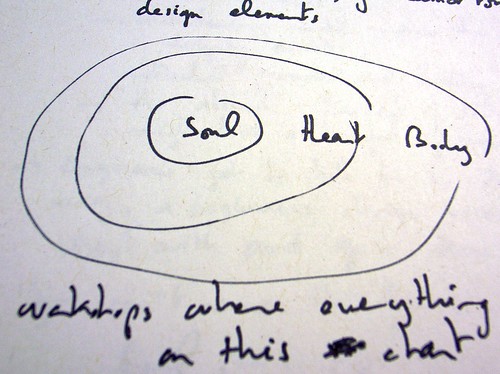
Body Heart Soul

A third sort of model was the one showed by Mike Kruzeniski in his talk. In his work at Microsoft, his purpose is to connect engineers with a more emotional vision of innovating. The problem they encountered was that developers tended to cut features and design elements with a specific rationale which did not take into account emotional factors. The first model/metaphor they chose was the tree (cutting two many features of a product may lead to a weird tree) but it was not efficient. Thus, they adopted the "Body, Heart, & Soul" framework to qualifies, validates, and prioritizes the intangible qualities of design work alongside the more practical concerns of our Engineering partners. To put it shortly, categorizing features as "heart" or "soul" was a more legible way to prioritize (and suppress design elements). The soul is untouchable, the heart elements support the soul and the body is the rest. Each of this component has certain rules ("no more than 5 "soul" features) and it was a more humane way to prioritize than "p0", "p1" and "p2". This kind of model was metaphorical in the sense that it helped engineers talk in a different way, a "beginner's design vocabulary to start with an grow from". Additionally, doing the simple work of categorizing features in these 3 topics was about articulating what matters emotionally to users (and then making choices). In this case, the model is both metaphorical (to convey this emotional sense) and operational (to enable easier prioritization).

These three examples are interesting given they exemplify the use of abstract models by designers from the ixda community. It as if the notion of model had been re-appropriated in a flexible way to serve the designer's purposes, which is a relevant locus of observation. Make not mistake here, these are only examples I've seen and I won't generalize from this sample. I am pretty sure you would also find predictive abstractions in designers' work. However, it's curious to point them out to show how models here are more seen as "tools to give structures to help you think" than explicative elements. The difference between designers and scientists in the way they build and use models, some epistemological comparisons may be intriguing here and I feel I am just scratching the surface.

Wifi login and password in the toilets (Wifi data points on a post-it in the washroom)

Showing products or not?

My third comment on the conference was the surprising lack of examples/products/services in lots of the presentation. I expected a design conference to be much more evocative in terms of design examples and it was not the case. Of course there are exceptions (as if Matt Cottam, Timo Arnall or Dan Hill's presentation were exceptions) but it's as if all the potential examples had been vacuumed and resurfaced in Paola Antonelli's talk.

The interest in objects

The mention of Antonelli's work allows me to make a smooth transition to a trend I find interesting: the increasing interest (or the resurgence of interest) in technical objects and a way to talk about them, to analyze them (Timo's model is inspiring for that matter) and how the history of digital artifacts matter. In her talk, she described how objects have always spoken to her and she summarized an upcoming MOMA exhibit that will cover the evolution of new media/digital technologies. Perhaps it's just me reading The Evolution of Useful Things: How Everyday Artifacts-From Forks and Pins to Paper Clips and Zippers-Came to be as They are (Henry Petroski), Carl di Salvo's new blog about objects, discussions with my neighbor or the game controller project with Laurent Bolli, but I am feeling a renewal of interest in analyzing objects (rather than users).

Not so much time for a write-up about the city itself but some pics are always worth a thousand words.

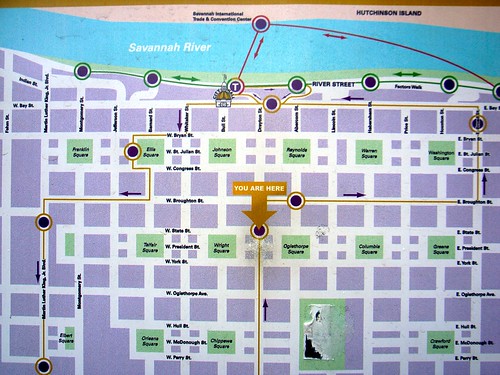
youarehere (The intriguing repartition of green pockets in Savannah)

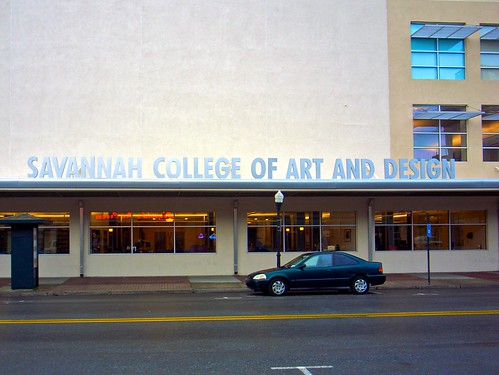
SCAD (The pervasive presence of a local design school)

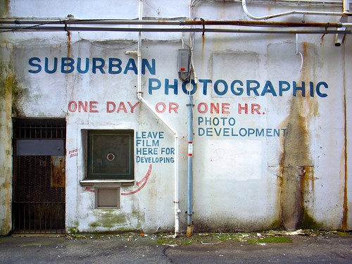
Suburban photographic (Savannah has remnants of old shops)

Colorful Savannah (Luxuriance on the street, lovable pipes and nature around)

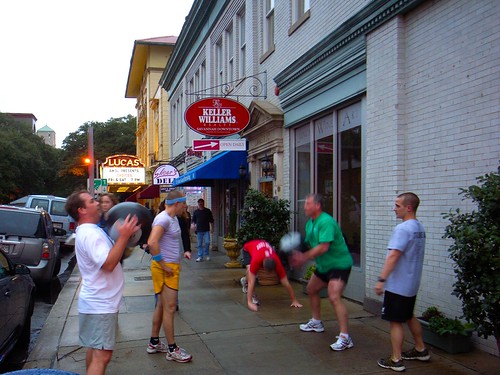
Sport team on the streets (Cultural shock for me maybe)

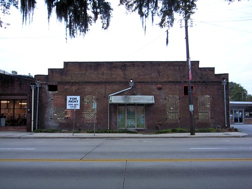
For rent (Gorgeous brick buildings to be rented, a common feature in this town)

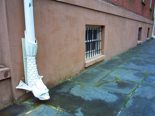
Sidewalk + nice drain pipe (Evocative drain pipe)

Slides from interaction2010 talk

The annotated slides from my talk "Design and Designed Failures: From Observing Failurs To Provoking Them" at ixda interaction10 are now available on Slideshare. The video of the talk is here as well.

Failures are often overlooked in design research. The talk addressed this issue by describing two approaches: observing design flops and identify symptoms of failures OR provoking failures to document user behavior.

This talk was actually a follow-up of my introduction to the Lift 2009 conference a bout the recurring failures of holy grails. It was very much inspired by Mark Vanderbeeken (Experientia) who pushed me to go further than pointing out product failures and exploring why it's important as a design strategy.

There was a good crowd of people and someone interestingly commented on the fact tat I may have made my presentation intentionally a failure to make the crowd react.

Thanks for the ixda interaction 2010 committee for letting my present this work!