Failure

Computing chic hiccups: the Prada store case

Back to failing technologies... this piece on CNN Money from 2004 gives an intriguing snapshot of the problems encountered by "users" of the Prada building designed by Rem Koolhaas. As described in this article, this cutting-edge architecture was supposed to "revolutionize the luxury experience" through "a wireless network to link every item to an Oracle inventory database in real time using radio frequency identification (RFID) tags on the clothes. The staff would roam the floor armed with PDAs to check whether items were in stock, and customers could do the same through touchscreens in the dressing rooms". Some excerpts that I found relevant to my interests in technological accidents and problems:

"But most of the flashy technology today sits idle, abandoned by employees who never quite embraced computing chic and are now too overwhelmed by large crowds to coolly assist shoppers with handhelds. On top of that, many gadgets, such as automated dressing-room doors and touchscreens, are either malfunctioning or ignored (...) In part because of the crowds, the clerks appear to have lost interest in the custom-made PDAs from Ide. During multiple visits this winter, only once was a PDA spied in public--lying unused on a shelf--and on weekends, one employee noted, "we put them away, so the tourists don't play with them."

When another clerk was asked why he was heading to the back of the store to search for a pair of pants instead of consulting the handheld, he replied, "We don't really use them anymore," explaining that a lag between the sales and inventory systems caused the PDAs to report items being in stock when they weren't. "It's just faster to go look," he concluded. "Retailers implementing these systems have to think about how they train their employees and make sure they understand them," (...) Also aging poorly are the user-unfriendly dressing rooms. Packed with experimental tech, the clear-glass chambers were designed to open and close automatically at the tap of a foot pedal, then turn opaque when a second pedal sent an electric current through the glass. Inside, an RFID-aware rack would recognize a customer's selections and display them on a touchscreen linked to the inventory system.

In practice, the process was hardly that smooth. Many shoppers never quite understood the pedals, and fashionistas whispered about customers who disrobed in full view, thinking the door had turned opaque. That's no longer a problem, since the staff usually leaves the glass opaque, but often the doors get stuck. In addition, some of the chambers are open only to VIP customers during peak traffic times. "They shut them down on the weekends or when there's a lot of traffic in the store," says Darnell Vanderpool, a manager at the SoHo store, "because otherwise kids would toy with them."

On several recent occasions, the RFID "closet" failed to recognize the Texas Instruments-made tags, and the touchscreen was either blank or broadcasting random video loops. During another visit, the system recognized the clothes--and promptly crashed. "[The dressing rooms] are too delicate for high traffic," says consultant Dixon. "Out of the four or five ideas for the dressing rooms, only one of them is tough enough." That feature is the "magic mirror," which video-captures a customer's rear view for an onscreen close-up, whether the shopper wants one or not."

Why do I blog this? It's a rather good account of technological failures, possibly useful to show the pain points of Smart Architecture/Cities. The reasons explained here are all intriguing and some of them can be turned into opportunities too ("otherwise kids would toy with them.")

That said, it'd be curious to know how the situation has changed in 7 years.

Neal Stephenson on failure and innovation

A good excerpt from a text by Neal Stephenson:

"Most people who work in corporations or academia have witnessed something like the following: A number of engineers are sitting together in a room, bouncing ideas off each other. Out of the discussion emerges a new concept that seems promising. Then some laptop-wielding person in the corner, having performed a quick Google search, announces that this “new” idea is, in fact, an old one—or at least vaguely similar—and has already been tried. Either it failed, or it succeeded. If it failed, then no manager who wants to keep his or her job will approve spending money trying to revive it. If it succeeded, then it’s patented and entry to the market is presumed to be unattainable, since the first people who thought of it will have “first-mover advantage” and will have created “barriers to entry.” The number of seemingly promising ideas that have been crushed in this way must number in the millions.

What if that person in the corner hadn’t been able to do a Google search? It might have required weeks of library research to uncover evidence that the idea wasn’t entirely new—and after a long and toilsome slog through many books, tracking down many references, some relevant, some not. When the precedent was finally unearthed, it might not have seemed like such a direct precedent after all. There might be reasons why it would be worth taking a second crack at the idea, perhaps hybridizing it with innovations from other fields."

Why do I blog this? This kind of situation echoes with my feeling in certain meetings and projects. Besides, I find interesting to rely on failures in order to move forward, as described in this excerpt.

About the influence of failed products on technological change

Design failures and recurring non-products is of course a favorite topic of mine. Hence, a paper entitled "The Curious Case of the Kitchen Computer: Products and Non-Products in Design History" by Paul Atkinson appears clearly promising for a Friday afternoon train ride between two European countries.

I wasn't disappointed. This article takes the Honeywell Kitchen Computer, a futuristic computer product that never sold, as a starting point to ask questions concerning design history, the significant agency that non-products can have and the role of a period zeitgeist in design.

The Honeywell H316 was a so-called "pedestal computer", a sort of miniature computer compared to the mainframes, released in the 1960s. They were meant to be used for scientific and engineering calculations, processing business information, file handling and access to pre-punched computer cards. The design of the various models is quite radical with this intriguing pedestal form. As pointed out in Atkinson's paper, "the final result was a futuristically styled, red, white and black pedestal unit that looked as if it could have been taken straight from the set of Star Trek or 2001: A Space Odyssey".

(Image of the Kitchen Computer from Life magazine, 12 December 1969. © Yale Joel/Time & Life Pictures/ Getty Images)

What I found interesting in this article is the description of how a non-product such as his Kitchen Computer can influence technological change:

"As a ‘real’ product, the adoption of a science fiction-inspired form provided the means for Honeywell to promote itself as a progressive company, to differentiate itself from its more mainstream traditional competitors such as IBM, and to align itself with younger, more innovative companies such as Data General Corporation. The fact that actual orders were received for the product despite its being purely a marketing ploy is a reflection of its success and the acceptance of such iconography amongst at least some of its customers. As a non-product, the Kitchen Computer had even more agency. It created a huge amount of publicity for Neiman Marcus and, because of its price, reinforced the position of the company as an exclusive retailer to the upper classes. It also reinforced popular cultural representations of the domestic kitchen as the focus of family interactions with technology in the home, in a variety of fora. In addition, it inspired those working at the forefront of computer developments to realize that, despite the limitations of technology at the time, there was real value in seriously considering a domestic market for computer products. Finally, despite the fact that both the product and the non-product were consumed largely as a piece of visual culture, as a part of the cultural milieu or zeitgeist, they provided very pragmatic, positive results for both Honeywell and Neiman Marcus, as well as having a direct influence on the future direction of the computer industry itself."

Why do I blog this? Yet another great reference for my research about technological, product failures and their significance. Which, by the way, recently led to a French book about this very topic.

Series of articles about failures

There's suddenly a surge of interest in failures (technological, entrepreneurial, social) in the press. Curiously, I encounter various of these last week when traveling.

First, it was a piece on the Wired UK 05.11 issue which gives an account of various entrepreneurial stories and approaches. The article shows the importance of failures and the cultural lessons one could draw out of them ("Fail fast"...).

More specific and full of interesting details and analysis is the April issue of the Harvard Business Review. Although this is a journal I don't read very often, the material was kind of inspiring. The articles addressed several aspects such as the reasons to "Crash a Product Launch", the reluctance from entrepreneurs to learn from failures, the failures-that-look-like-successes, effective strategies to learn from failures, ethical issues, etc.

What struck me when comparing both the Wired issue and the HBR articles was that the entrepreneurs/innovators' testimonials were rarely interesting and pertinent... compared to external analysis (meta or not). As if there was some sort of blindness that prevented people from analyzing the problems at stake.

The Economist's Schumpeter gives a quick overview of this HBR issue with the following excerpts:

"simply “embracing” failure would be as silly as ignoring it. Companies need to learn how to manage it. Amy Edmondson of Harvard Business School argues that the first thing they must do is distinguish between productive and unproductive failures. There is nothing to be gained from tolerating defects on the production line or mistakes in the operating theatre. (...) Companies must also recognise the virtues of failing small and failing fast. (...) Placing small bets is one of several ways that companies can limit the downside of failure. Mr Sims emphasises the importance of testing ideas on consumers using rough-and-ready prototypes: they will be more willing to give honest opinions on something that is clearly an early-stage mock-up than on something that looks like the finished product (...) But there is no point in failing fast if you fail to learn from your mistakes. Companies are trying hard to get better at this. India’s Tata group awards an annual prize for the best failed idea. Intuit, in software, and Eli Lilly, in pharmaceuticals, have both taken to holding “failure parties”. P&G encourages employees to talk about their failures as well as their successes during performance reviews."

Why do I blog this? I just completed a book (in French) about recurring technological failures (title and cover are provisional, to be released at the beginning of June)... and it's interesting to see that there's a kind of momentum on these issues.

Workshop about Failures and Design Fictions at the Swiss Design Network symposium

Last Saturday, Julian and I gave a quick and punchy workshop called Using Failures in Design Fictions at the SDN 2010 in Basel, Switzerland.

What's better than a broken iPhone screen in a workshop about accidents and failures?

Here's the workshop abstract we proposed to the conference committee:

"The notion of ‘Design Fiction’ is an original approach to design research that speculates about the near future not only with storytelling but also through active making and prototyping. As such, design fictions are meant to shift the interest from technology-centered products to rich and people-focused design. There are of course various ways to create design fictions. One of them we would like to explore in this workshop consists in relying on failures.

We hypothesize that failures and accidents can be a starting point for creating rich and meaningful speculative projects. Think for instance about creating props or prototypes and exhibiting failures within it to make them more compelling. Or showing something as it will work with the failures — so anticipating them somehow rather than ignoring the possibility. What will not work right? What problems will be caused? What does it mean?

Based on short and participative activities, the workshop will address the following issues:

  • Can we include the exploration of failures in the design process? How to turn failures and people’s reaction to failures into prototyping tools?
  • How can design fiction become part of a process for exploring speculative near futures in the interests of design innovation? What is the role of failures in creating these design fictions?"

The 2-hours workshop started with an introduction about the wide range of failures, accidents, malfunctions and problems that are related to designed objects. We basically relied on the presentation made in Torino for that matter. The point of this intro was also to set the objectives: build a failure literacy (taxonomies, categories...), discuss their role in design using design fictions, fictional storytelling to discover new possibilities/unknown unknowns. We then splitted the participants into 6 groups for 3 short activities.

Activity 1: Listing of observed/existing failures

Given that the participants had a very diverse background (industrial design, fashion design, service design, media/interaction design), the point of this was to cast a wide net and observe what people define as failure. No need to write down the whole list here but here are some examples that reveal the range of possibilities:

  • Wrong hair color, not the one that was expected
  • Help-desk calls in which you end up being re-reroute from one person to another (and getting back to the first person you called)
  • Nice but noisy conference bags
  • Toilet configuration (doors, sensors, buttons, soap dispensers, hand-dryers...) in which you have to constantly re-learn everything.
  • Super loud and difficult to configure fire alarms that people disable
  • Electronic keys
  • Garlic press which are impossible to clean
  • On-line platforms to book flights for which you bought two tickets under the same name while it's "not possible" from the company's perspective (but it was technically feasible).
  • Cheap lighter that burn your nose
  • GPS systems in the woods
  • Error messages that say "Please refer to the manual" but there is not manual
  • Hotel WLAN not distributed anymore because hotel had to pay too many fines for illegal downloads

Activity 2: Description of anticipated failures (design fictions)

In the second activity, we asked people to craft two stories about potential failures/problems caused by designed objects in the future. By projecting people into the near future, we wanted to grasp some insights about how failures can be envisioned under different conditions. Here again, some examples that came out:

  • Identity and facial surgery change, potentially leading to discrepancies in face/fingerprint-recognition,
  • Wireless data leaking everywhere except "cold spots" for certain kind of people (very rich, very poor),
  • Problems with space travelling
  • Need to "subscribe" to a service as a new person because of some database problem
  • People who live prior to the Cloud Computing era who have no electronic footprint (VISA, digital identity) and have troubles moving from one country to another,
  • 3D printers accidents: way too many objects in people's home, the size of the printed objects has be badly tuned and it's way too big, monster printed after a kid connected a 3D printer to his dreams, ...
  • Textiles which suppress bad smells also lead to removal of pheromones and it affects sexual desire (no more laundry but no baby either)...
  • Shared electrical infrastructure in which people can download/upload energy but no one ever agreed on the terms and conditions... which lead to a collapse of this infrastructure
  • Clothes and wearable computing can be hacked so you must now fly naked (and your luggage take a different flight)

It was interesting to notice that the "observed failures" (activity 1) were about a large range of designed objects (without necessarily Information Technologies). In this second case, ICT were always involved in the anticipated failures. It is as if we had trouble projecting other possibilities.

Activity 3: Towards failure taxonomies/categories

The last activity consisted in building a taxonomy of failures based on existing and anticipated ones (what the group came up with in Assignment 1 and 2): kinds of, categories. Some categories and parameters that emerged were the following:

  1. Short sightedness/not seeing the big pictures
  2. Failures and problems that we only realize ex-post/unexpected side-effects
  3. Excluding design
  4. Bad optimization
  5. Unnoticed failures
  6. Miniaturization that doesn't serve its purpose
  7. Cultural failures: what can be a success in one country/culture can be a failure in another
  8. Delayed failures (feedback is to slow)
  9. When machines do not understand user's intentions/technology versus human perception/bad assumptions about people ("Life has more loops than the system is able to understand")
  10. Individual/Group failure (system that does not respond to individuals, only to the group)
  11. System-based failures versus failures caused by humans/context
  12. Natural failures: leaves falling from trees considered as a problem... although it's definitely the standard course of action for trees)
  13. Good failures: Failure need interpretation, perhaps there's no failure... alternative uses, misuses
  14. Inspiring failures
  15. Harmless failures

Why do I blog this? This is of course a super quick write-up but we wanted to have these ideas written so that could build-up on them in other workshops. Also, what the groups worked on is close to the literature about accidents and problems in Human-Computer Interaction (I'm thinking about Norman's work) but it went beyond the existing lists. In addition, what was interesting, especially in the last assignment was that the list of categories reveal some important norms and criteria of success that designer have in mind.

Thanks to all the participants!

Accidents, mistakes, failures and malfunctions, a talk at Share Festival (Torino)

Last Wednesday I went to Torino. I was part of a "Warm-up event" for the Share Festival, which focuses this year on a topic called "Smart Mistakes". The talk was called "Accidents and failures as creative material for the near future" and slides can be found on Slideshare. It was actually an updated version of an earlier talk I've given at Interaction 2010.

[slideshare id=5531113&doc=share-torino2010-101022102413-phpapp02]

The talk starts with a presentation of how accidents are cool and funny (on the Internets)... which lead me to a sort of typology of failures and a discussion about how problems, accidents and malfunctions are actually important for design. I then move to how failures, problems and limits of technologies can be employed as a design tactic.

Thanks Simona for the invitation!

Slides from interaction2010 talk

The annotated slides from my talk "Design and Designed Failures: From Observing Failurs To Provoking Them" at ixda interaction10 are now available on Slideshare. The video of the talk is here as well.

Failures are often overlooked in design research. The talk addressed this issue by describing two approaches: observing design flops and identify symptoms of failures OR provoking failures to document user behavior.

This talk was actually a follow-up of my introduction to the Lift 2009 conference a bout the recurring failures of holy grails. It was very much inspired by Mark Vanderbeeken (Experientia) who pushed me to go further than pointing out product failures and exploring why it's important as a design strategy.

There was a good crowd of people and someone interestingly commented on the fact tat I may have made my presentation intentionally a failure to make the crowd react.

Thanks for the ixda interaction 2010 committee for letting my present this work!

Those Magnificent Men in Their Failing Machines

...or how a "litany of failed aircrafts" is a good metaphor of design iterations.

Read in "Hailing, Failing, and Still Sailing" by Richard Saul Wurman, a chapter of "Design Disasters: Great Designers, Fabulous Failures, and Lessons Learned":

"It made me think about the beginning of that wonderful film, Those Magnificent Men in Their Flying Machines, in which you see a litany of failed aircraft. You laugh, but you also see how seriously involved everybody was in trying to fly. All the failure, all the things that didn't work, make you realize that the Wright brothers were really something. All the paths taken, all the good intentions, the logistics, the absurdities, all the hopes of people trying to fly testifying to the power we have when we refuse to quit.

There should be a museum dedicated to human invention failure. The only problem it would face would be its overnight success. In almost any scientific field, it would add enormously to the understanding of what does work by showing what doesn't work. In developing the polio vaccine, Jonas Salk spent 98 percent of his time documenting the things that didn't work until he found the thing that did."

Why do I blog this? Preparing a speech about failures led me to revisit my bookshelves. This chapter is great and I remember this very excerpts in the movie. As a kid, I used to watch this part again and again as I found it hilarious. More seriously, this excerpt is important in the sense that it reveals the notion of iterations in innovation.

A museum of human invention failure also strikingly connects with Paul Virilio's Museum of the Accident.

About the "long nose of innovation"

Reading the PDFs that accumulate on my computer desktop (see picture above), I ran across two columns by Bill Buxton. Both addresses a constant pattern: the very slow diffusion of technical innovation over time.

The first one, from January 2008 is about what he calls the "long nose of innovation", a sort of mirror-image of the long tail that is "equally important to those wanting to understand the process of innovation". Like its tail counterpart, the "long nose" is an interesting metaphor to describe the diffusion of a certain technology. It complement the list I've already made here by taking a different viewpoint.

To Buxton, the long nose states that:

"the bulk of innovation behind the latest "wow" moment (multi-touch on the iPhone, for example) is also low-amplitude and takes place over a long period—but well before the "new" idea has become generally known, much less reached the tipping point."

In his column, Buxton grounds this notion in research conducted by Butler Lampson which traced the history of a number of key technologies driving the telecommunications and information technology sectors. They found that "any technology that is going to have significant impact over the next 10 years is already at least 10 years old.". Research about technical objects diffusion often refers to this kind of delay (some says 10, other 20 but one should also remember than some technologies never make it) and Laurent gave another example this morning.

The conclusion the author make is the following:

"Innovation is not about alchemy. In fact, innovation is not about invention. An idea may well start with an invention, but the bulk of the work and creativity is in that idea's augmentation and refinement. The newer the idea, the coarser the granularity of most analysis, and the more likely people are to say, "oh, that's just like X" or "that's been done before," without any appreciation for how much work and innovation is involved in taking an idea from concept to wide practice. (...) The heart of the innovation process has to do with prospecting, mining, refining, and goldsmithing. Knowing how and where to look and recognizing gold when you find it is just the start. (...) those who can shorten the nose by 10% to 20% make at least as great a contribution as those who had the initial idea."

In a second column, Buxton applies this to the frenziness towards "touch technology" that appeared after the iPhone. He describes how "touch and multitouch are decidedly not new". It was first discovered by researchers in the very early 1980s and staid below the radar before some peeps "recognize the latent value of touch".

But there's another good lesson from this article. He starts by mocking executives and marketers who rush on saying "It has to have touch" (I guess you could replace "Touch" by 3D back in 1998, or Second Life back in 2005 or Augmented Reality in 2009). He then recommends that "true innovators needs to know as much about when, why, and how not to use an otherwise trendy technology, as they do about when to use it." What this means is simple: one should not dismiss the technical innovation, but simply have a more specific/detailed approach. As shown by his example of touch interfaces on watches, saying that "something should have a touch interface" is pointless because "The granularity of the description is just too coarse. Everything—including touch—is best for something and worst for something else". Therefore, his lesson is that:

"Rather than marveling at what someone else is delivering today, and then trying to copy it, the true innovators are the ones who understand the long nose, and who know how to prospect below the surface for the insights and understanding that will enable them to leap ahead of the competition, rather than follow them. God is in the details, and the details are sitting there, waiting to be picked up by anyone who has the wit to look for them."

Why do I blog this? Good material for my course about innovation and foresight, as well as insights for an upcoming book project about failures.

Individual blame

Attributing one's failure to use (or problematic use) of a certain technical object is often refered to in the literature as the "Individual Blame Bias". In his book "Diffusion of Innovation", Rogers gave the following example:

"Posters were captioned: «LEAD PAINT CAN KILL!» Such posters placed the blame on low- income parents for allowing their children to eat paint peeling off the walls of older housing. The posters blamed the parents, not the pain manufacturers or the landlords. In the mid-1990s, federal legislation was enacted to require homeowners to disclose that a residence is lead-free when a housing unit is rented or sold."

Why do I blog this? Always been intrigued by the tendency to hold individual responsible for his/her problems rather than system. It's definitely a recurring topic when you run field studies, it's as if people wanted to take responsibility for causes that are beyond their scope (bad manual, missing information, etc.).

Of course, this issue has some consequences in terms of the diffusion of innovations and Rogers proposed to overcome this bias when studying the diffusion of innovation by refraining from using individuals as the units of analysis for diffusion (it then remove the possibility of blame on particular individuals).

About non-users of technologies

Most of the research about people in HCI and interaction design focuses on technology usage. This is all good and there are lot of things to get from such studies. However, it's also important to take this issue the other way around: non-usage of technologies is relevant as well. Researchers in STS (Science Technology Society) and HCI tackle this issue as shown in the book by Pinch and Oudshoorn which introductory chapter is entitled "how users and non-users matter". Earlier work in computer sciences and HCI have also considered non-usage to understand limits and acceptance problem, to a point where anxious engineers and tech researchers looked at "non-users" in terms of "potential users" A recent article by Christine Satchell and Paul Dourish also deal with this topic (at the upcoming OZChi conference in November). More specifically, they are interested in "aspects of not using computers, what not using them might mean", and what researchers/designers might learn by examining non-use as seriously as they examine use.

The article sets off to go beyond the narrow and reductionist vision of the "user". It clearly acknowledge the notion of "user" as "a discursive formation rather than a natural fact" and "examine use and non-use as aspects of a single broader continuum". Which approach is somewhat different from earlier work. The main point of the authors consists in highlighting that "interaction reaches beyond 'use'". What this means is simply that the experience of technology per se may be shaped and influenced by elements that are outside or beyond specific circumstances of 'use'". This is an highly interesting point that is very difficult to address, especially with certain peeps who think that the UX is solely shaped by the technology itself (not to mention the good folk who told me once that what "users" are looking for is "simple enough algorithm").

The meat of this paper also lies in the description of six forms of non-use:

  1. Lagging adoption: non-users are often defined "with respect to some expected pattern of technology adoption and diffusion" [the 4 Pasta and Vinegar readers may have recognized here the notion of s-curves]. The problem is that this view tells nothing about "who do not use technology, but rather about people who do not use technology yet.". As if technological usage was inevitable and "non-use" a temporary condition.
  2. Active resistance: "not simply a failure to adopt – i.e., an absence of action – but rather, a positive effort to resist a technology". This can take various forms such as infrastructure resistance (home-schooling, people who live "off the grid").
  3. Disenchantment: "this often manifests itself as a focus on the inherently inauthentic nature of technology and technologically-mediated interaction, with a nostalgic invocation of the way things were", which may be an appeal to a "way we never were",
  4. Disenfranchisement: "may take many different forms. Interest in universal accessibility has largely focused on physical and cognitive impairments as sources of technological disenfranchisement, but it may also have its origins in economic, social, infrastructural, geographical, and other sources."
  5. Displacement: some kind of repurposed usage of the artifact that make it difficult to understand who is really the user.
  6. Disinterest: "when the topics that we want to investigate are those that turn out not to be of significant relevance to a broader population"

And the conclusion gives insightful arguments about how this may influence design:

"From the perspective of system developers, a utilitarian morality governs technology use. The good user is one who adopts the systems we design and uses them as we envisioned (Redmiles et al., 2005). Similarly, the bad or problematic user is the one who does not embrace the system or device. (...) what we have tried to show here is that non-use is not an absence or a gap; it is not negative space. Non-use is, often, active, meaningful, motivated, considered, structured, specific, nuanced, directed, and productive."

Why do I blog this? Non-usage of technologies is a topic that has always attracted me, and it's perhaps related to my interest in product failures. The typology proposed here as well as the discussion of "non-users" is of great important IMO to understand technologies.

Hamel and Prahalad's take on failures

Generally, I do not read so much of business books but I wanted to have a glance at "Competing for the Future" (Gary Hamel, C. K. Prahalad) because it deals with issues I am interested in: futures and the importance of foresight research. Although the vocabulary is idiosyncratic and turned to a certain category of people ("managers", "leader"), there are some interesting parts. More specifically, I was of course curious about how the authors dealt with "failures", a research topic I came to cherish for a while. Some dog-eared pages excepts below.

First about what constitutes a failure, p.267:

"Verdicts of new product failure rarely distinguish between arrows aimed at the wrong target and arrows that simply fell short of the right target. And because failure is personalized - if the new product or service doesn't live up to internal expectations it must be somebody's fault - there is more often a search for culprits than for lessons when initial goals are not reached. Even worse, when some salient new facts comes to light as a result of market experience, the manager in charge is deemed guilty of not knowing it in advance. With risk so often personalized, it is not surprising that when failure does occur, there is often a race to get the body to the morgue before anyone can do an autopsy. The result is a missed opportunity to learn.

Not surprisingly, if the personal price of experimentation is high, managers will retreat to the safety of test-it-to-death, follow-the-leader, do-only-what-the customer-asks-for conservatism. Such conservatism often leads to much grander, though less visible failures. (...) Failures is typically, and we believe wrongly measured exclusively in terms of dollars lost rather than dollars foregone. In which traditional US computer company, for example, has a senior officer lost his or her job, corner office, or promotion for surrendering leadership in the laptop computer business to others? Managers seldom get punished for not trying, but they often get punished for trying and coming up short. This is what promotes the obsession with hit rate, rather than the number of hits actually generated."

And further out, p.268:

"Failure is often the child of unrealistic expectations as it is of managerial incompetence. (...) IBM0s ill-fated first attempt, in the late 1983, to enter the home computer market with PC jr. Widely criticized for having a toylike keyboard and for being priced too high, the PC jr. was regarded by both insiders and outsiders as a failure. Yet at the time, it would have been difficult for anyone to predict exactly what product would appeal to home users whose computer experience to date withe home computing was likely to be playing video-game on an Atari or Commodore. The real failure was not that IBM's first product missed the mark, but that IBM overhyped its entry and was thus unable to find a quiet refuge from whence it could relaunch a calibrated product. (...) The point is not that the ambitions of IBM were too grand, but rather that what constitutes failure depends on management's initial assumptions about how quickly and easily success should come."

Interestingly, given that the book has been written in the 90s, there are some striking examples that are brought under scrutiny... and which eventually makes a lot of sense today. See for instance the iphone/newton resurgence:

"If the opportunity is oversold and risks under-managed, failure and premature abandonment of the opportunity are preordained. Overhyping damaged Apple's early experiment with handwriting recognition in the form of the Newton Message Page. While the Newton was a failure in terms of Apple's optimistic predictions, it may not be a failure in the longer-run battle to create a market for personal digital assistants (...) this is partly the price of being a pioneer. (...) Thus one can't judge success or failure on the basis of a single product launch"

And, of course, there's a short part about how to spot one's failure on p.270:

"it is, though, a mandate to learn when inevitable setbacks occur. When a product aimed at a new market goes astray, management must ask several important questions. First, did we manage the risks appropriately or barge in like a bull in a china shop? Second, did we possess reasonable expectations about the rate at which the market will develop? Third, did we learn anything that will improve our chances on the next attempt? Fourth, how quickly can we recalibrate and try again? Fifth, do we believe that the opportunity is still for real and does its size warrant another attempt? And sixth, if we don't try again, have we just taught our competitors a valuable lesson that they will use to get to the future ahead of us? Failures should be declared only if the answer to all these questions is no."

Why do I blog this? working on the outline of the next book leads me to collect material about failures and their importance in foresight/design. These excerpts come from a very business/management sciences angle but they bring interesting aspects to the table that I will quote and re-use.

Failure(s)

failure is cool According to the thesaurus I use:

"Failure:

Definition: lack of success

Synonyms: abortion, bankruptcy, bomb, botch, breakdown, bungle, bust, checkmate, collapse, decay, decline, defeat, deficiency, deficit, deterioration, downfall, failing, false step, faux pas, fiasco, flash in the pan, flop, frustration, implosion, inadequacy, lead balloon, lemon, loser, loss, mess, misadventure, miscarriage, misstep, nonperformance, nonsuccess, overthrow, rout, rupture, sinking ship, stalemate, stoppage, total loss, turkey, washout, wreck

Antonyms: accomplishment, achievement, attainment, earnings, gain, merit, success, win"

Why do I blog this? writing a paper about design research and failures, looking for inspiring material and vocabulary.

Causes and symptoms of failures

Perusal My interest in failures (as attested by my Lift09 speech) led my peruse "Anatomy of a Failure: How We Knew When Our Design Went Wrong, and What We Learned From It" (by William Gaver, John Bowers, Tobie Kerridge, Andy Boucher, Nadine Jarvis) with attention.

The article is a case study that examines the appropriation (or the wrong appropriation I should say) of an home health monitor device. The authors identify what they call ‘symptoms of failure’ that touches 4 themes: engagement, reference, accommodation, and surprise and insight. They discuss theses reasons of failures by looking at three different angles: (1) problems particular to the specific design hypothesis they had, (2) problems relevant for mapping input to output more generally, and (3) problems in the design process they employed in developing the system.

An interesting aspect in the paper is the must-have definition of what constitutes a failure:

"Approaches to evaluating interpretive systems such as the sort we describe here tend to focus on how to go about gathering suitable material for assessment, but avoid discussing how success or failure might be determined. For instance, Höök et al. based their evaluation of a system on analysing the conversations that groups of people had on encountering it. Others seek alternatives to verbalised judgements to capture more intuitive and sensual aesthetic and emotional responses. Finally, others advocate gathering multiple forms of evaluation from a variety of perspectives, including those of ‘cultural commentators’ such as journalists or filmmakers. Opening out evaluation to multiple voices and new forms of expression in these ways reflects the multiple interpretations afforded by the class of systems in which we are interested. On the other hand, these approaches can invite a kind of relativism from which it is difficult to draw firm conclusions. (...) we propose features of user engagement as being reliably symptomatic of success or failure, (...) we describe the symptoms of success and failure that emerge from a comparison of the unsatisfactory experiences observed in this field study with more rewarding deployments of other systems in the past."

The authors then go on with a description of their system (the "Home Health Monitor") with an account of early field trials that serve as a sort of baseline against which they compare the results from a field study. What is important to my research here is the description of how the system failed in conjunction with certain behavioral indicators they did not find:

  • Engagement: Beyond any explicit declaration of liking, we take as evidence such things as an enthusiasm about discussing the design and their experience with it; persistence in use and interpretation over time; suggestions for new enhancements that reflect our original design intentions, showing the prototype to friends.
  • Reference: the tendency for volunteers to discuss successful prototypes through reference to other technologies or experiences that they like.
  • Accommodation: the degree to which people accommodate successful designs to their existing domestic activities and rhythms
  • Surprise and Insight: successful systems are those which continue to occasion new surprises and new insights over the course of encounters with them. For instance, new content might appear, or unfamiliar, potentially rare, behaviours might be observed, and this might give rise to new perceptions of the system or the things it indicates. Equally, people may find new meanings for relatively rich but unchanging experiences. Of course, surprise and insight are neither properties of the system per se nor of the people who use it, but instead characterise the relationship between the two.

These were the symptoms of failures, which should no be confused with potential reasons of failure. The authors also contrast early trials results to the field study to get a grip on the causes that are quite specific to their design.

Why do I blog this? pursuing my work about failures here, gathering material about design issues with regards to failures for publication ideas. This piece is highly interesting as it shows how field research may help to uncover symptoms and causes of failures. Surely some good content to add to my lists.

About why people hate Clippy

Taking some time reading about technological failures, I found this interesting reference by Luke Swartz called Why People Hate the Paperclip: Labels, Appearance, Behavior, and Social Responses to User Interface Agents. This dissertation deals with Office assistants on computers that seem to be a big pain for lots of people. The documents provides an interesting contextual history of such user interface agents and it tackles the user experience angle based on theoretical, qualitative, and quantitative studies, the author.
Some of the results:

"Among the findings were that labels—whether internal cognitive labels or explicit system-provided labels—of user interface agents can influence users’ perceptions of those agents. Similarly, specific agent appearance (for example, whether the agent is depicted as a character or not) and behavior (for example, if it obeys standards of social etiquette, or if it tells jokes) can affect users’ responses, especially in interaction with labels."

But my favorite part is certainly the one about mental models of Clippy:

"Two interesting points present themselves here: First, beginners—the people who are supposed to be helped the most by the Office Assistant—are at least somewhat confused about what it is supposed to do. Especially given that beginners won’t naturally turn to the computer for help (as they seek out people instead, it may be especially important to introduce such users to what the Assistant does and how to use it effectively.

Second, that even relatively experienced users attribute a number of actions (such as automatic formatting) to the Office Assistant suggests that users are so used to the direct-manipulation application-as-tool metaphor, that any amount of independent action will be ascribed to the agent. For these users, the agent has taken on agency for the program itself!"

Why do I blog this? collecting material about technological failures and their user experience, this research piece is interesting both in terms of content and methodologies. Besides, I was intrigued by the discussion about mental models and how people understand how things work (or don't work). There are some interesting parallels between this and the catchbob results. Especially in how we differentiated several clusters of users depending on how they understood flaws and problems.

What happens when you criticize a holy grail


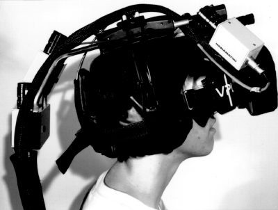
(Picture taken from Azuma's "Tracking Requirements for Augmented Reality", 1993)

The other day, Julian wrote an insightful critique of Augmented Reality, as a one of those glorious holy grails I referred to in my Lift09 presentation. Julian argued about how he wasn't convinced by the current iterations of this endpoint that has been presented in the past already, and why the meme is coming back nowadays.

While I share similar concerns about this very technology, I was more specifically intrigued by some of the comments, which dismiss Julian's claims and re-iterate that AR is *teh next big thing*. Let's have a look at the range of opinions:

  1. AR (or whatever technology) is inevitable and this is generally demonstrated by bringing a usual suspect to the table: Moore's law. Such a reference is what sociologist Bruno Latour calls an allie: a piece of theory/knowledge used to back up position. What other french sociologist (like Lucien Sfez) have shown is that the allies in the discourse about progress and technology are often recurring. In this sense, Moore's law can be described as a "usual suspect" in the discourse about the inevitability of technology. To put it shortly, it's generally very useful to bring this law out from the blue as you can prove almost everything wrt to increase and improvement. The law states that the number of transistors that can be placed inexpensively on an integrated circuit has increased exponentially (doubling approximately every two years). However, if you read it correctly, the law is about a "number of transistors" (then extended to cost per transistor, power consumption, cost per transistor, network capacity, disk storage and even "pixel per dollars"). What I mean here is that there is some sort of technological determinism implied by this law (not to mention its role in acting as a self-fulfilling prophecy!). See more in Ceruzzi's "Moore's Law and Technological Determinism: Reflections on the History of Technology".
  2. The next argument is generally that "technology" has changed. This is a fair one and it's indeed true that the technological underpinning are different now than 15 years ago ("1995 tech and 2009 tech are a wee bit different). However, it does not necessarily mean that the use of AR proposed 15 years ago will work in today's context. It's not because we have a "mobile internet" that we will end up with a "3D Twitter where people walk around with “what I’m doing” status updates hovering above their heads, or mood labels" as one of the comment express (hmm). Perhaps I would have reacted differently if the statement was "society has changed / we're more used to used mobile technology for XXX".
  3. Some people think that willing to avoid "tour-guide" AR scenarios on the basis that it's a loss of poetry in our way to live in our environment corresponds to being an old fart ("This reaction is about as annoying and as useless as people who, when confronted with ebook readers, say “but I like the smell of books and/or turning page"). This techno-geek reaction is quite funny and inadequate as it dismiss the wide range of desires and wants express by people. It's as if techno-enthusiasts could not understand the inter-individual variability and gave an opinion based on their sole interest. Doing lots of workshop about the future of mobile and locative technologies, I am often stunned by how much some people only rely on their own experiences and needs to think about the possibilities.
  4. Others say that you can be critical because it's "the idea has been around for ages" but under different forms signage like trail blazing). Nevertheless a sign on a rock is different than what is currently proposed on AR devices.

This is highly intriguing as it echoes a lot with the reactions I sometimes received in my talks about failures. There are also other opinions, not expressed in the comments posed after Julian's blogpost.For instance see the the "it's already here argument" that I encounter very often when I talk about the failure of social location-based applications (such as buddy-finder and place-based annotation systems). Lots of folks seem to by confused by the adoption of a service and it's mere existence. It's not because you have Latitude on your phone that social location-based services are "already here". Furthermore, I do admit that the we're moving slightly on the adoption curve thanks to mobile internet and better devices/applications (especially on the iphone) but it's still a super-small portion of human beings on Earth.

Perhaps the best conclusion for this post is to look at Adam's comment on Julian's post about AR:

"They get defensive, they hide behind rhetoric or jargon, they appeal to authority or the aura of inevitability, they call you names - you see it right here in these comments. This is what happens when technological literacy is allowed to reside solely in the class of people who benefit from the widespread adoption of technology, and why I believe we should work to extend such literacy as far outward into the far larger pool of “(l)users” as is practicable."

That said, a bit of reflexivity here wouldn't hurt. The arguments used here:

  • also emerges from allies, although they're different: sociology and science-technology-society research.
  • see technological success with a different lens, ore metric: the adoption of the device by a large number of people out of the techno-enthusiats sphere, who will then appropriate it in different ways (hence creating new usage). I can fairly admit that some people can have other measure of success.

Success evaluation for radical innovation

Gathering some notes about "successes" and "failures" of innovations to improve my talk about foresight failures, I ran across interesting material in Communicating Technology Visions by Tamara Carleton (Funktioneering Magazine. Vol 1, pp. 13). The paper actually shows how measuring only financial and commercial results for a radical innovation is inadequate and that other aspects should be taken into account. She basically shows how "meeting management’s expected sales, profits, market share, andreturn on investment" only offer a partial view. Some excerpts I found relevant to my research:

"For radical innovations, this default definition presents a thorny issue. There is an assumption that all innovations are predicated on financial results. Many experts today consider the Apple iPod to be a successful example of a highly radical technological innovation, and most would argue that the product was radically innovative from the start. However, if the iPod was measured solely in terms of financial profit based on its first few years on the market, then its proof as a successful innovation is not as strong or convincing. (...) Radical innovations may be truly radical and innovative without necessarily producing monetary gains. There are at least three ways to be considered radically innovative. An innovation could create an entirely new market or product catego- ry, such as the Honda Insight, the first American hybrid vehicle that laid the foundation for other cars like the Toyota Prius to follow. Or an innovation might generate a significantly new customer base but still not produce revenue, such as Napster, the original file-sharing service for music. Or an innovation may introduce a new technological application that is recast as novel or revolutionary in a different market without generating lasting financial returns. This would be the adoption of text messaging in the U.S., years aftewidespread phenomenon in Europe. (...) There is another problem in using the common test of success. Financial information about a radical innovation must be available and unambiguous. (...) Historical analysis will identify radical innovations clearly in terms of success and failure, but investigation of contemporary or budding innovations for the future require different metrics."

Why do I blog this? some good elements here about the definition of "success". Given my interest in "failures", it's important as it helps to symmetrically rethink what is a failure: a commercial failure is not necessarily an innovation failure as described in the example above.