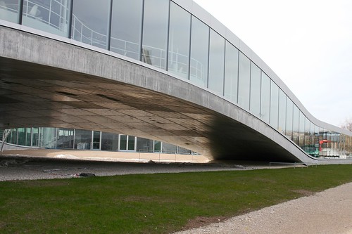
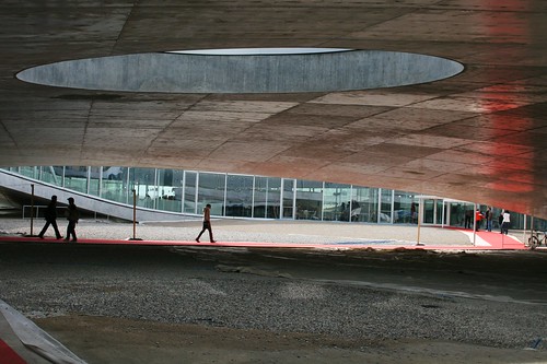
Some quick thoughts about the Rolex Learning Center that I visited yesterday afternoon at the Swiss Institute of Technology in Lausanne (EPFL). Designed by Sanaa, a japanese architecture firm, the building is an intriguing super large open space with a fairly low number of walls and partitions. This facility includes the school's library, the research lab where I've done my PhD research (Craft: Center for Research and Support of Training and its Technologies), the student and alumni association offices, an auditorium, two restaurants and a café. It's perhaps from above that the view is even more stunning. However, the most obvious way to see this is to take a flight to Geneva Cointrin (GVA) and have a proper wind that enables aircrafts landing route over Suisse romande instead of France's Jura Mountains.

The place is filled with natural daylight and only the restaurant and library, are equipped with refrigerating ceilings (which use cooled by water from the lake).
Given the interest here about user experience and weird insights concerning people, some details attracted my attention. Most people commented on the outside. As for me, it's some of the indoor elements that I want to describe.
Open space and Partitions
As described the architects in this interview with The Guardian:
""The main aim is to make a space for people to stay together," says Sejima, "but where you can also have some privacy." The design reflects their idea of "softening boundaries". She opposes "programmes that say a room is a place to learn and a corridor is a place to relax. I do not think that is a way to learn. Sometimes, activities become continuous. You might have a coffee outside the classroom and change your opinion." The role of architecture is to suggest ways to use the space, rather than to prescribe. Nishizawa pushes the analogy with landscape: "When people find valleys, they tend to settle there and build villages. When they find a hill, they like to build a beautiful cafe on the hill. When they find slopes, they cover them in terraces." In the same way, they think their artificial hills will prompt different kinds of occupation: "We hope students can find nice places for themselves." "
It's indeed interesting to confront the architects' intents to current behavior:
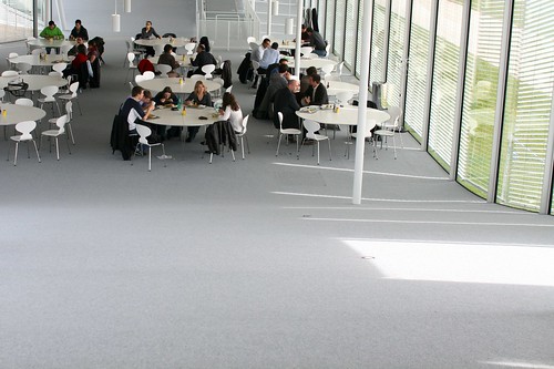
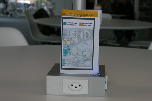
Although the partitions are not so present in the designers intents and in the building itself, there are still "invisible" boundaries, as attested by this map displayed on the library table. There are clear indications of areas where certain behavior are acceptable or not.
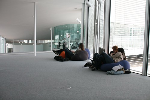
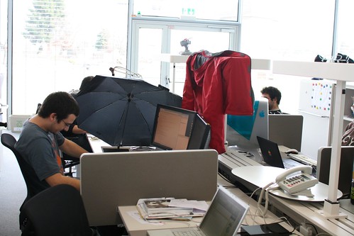
Another intriguing example lies in the usage of personal space. See for example how this Phd student re-created his bubble with "temporary walls". The coat is interesting for that matter but the use of the umbrella is even more striking. Daylight is so important here that sometimes yes, people needs a bit less light to look at the numerous displays present on everyone's desks.
Steep curves
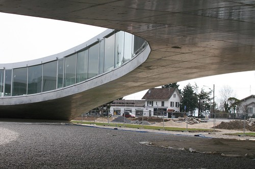
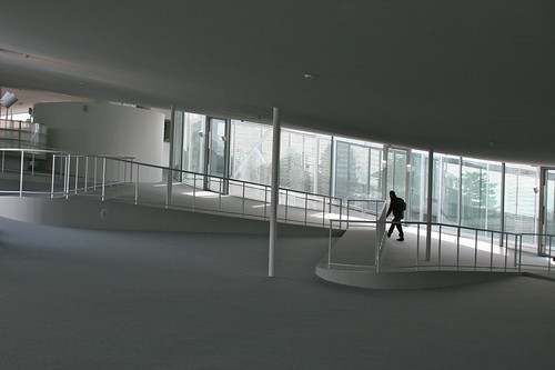
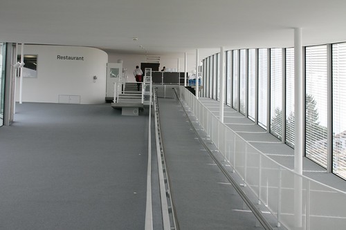
In addition, the surface of the floor and the ceiling is both elegant and curious. Also, the curves are actually quite steep as shown by the examples below. There is therefore a need to have particular devices to bring people up and down. I do not know the designers' intents here but the Alpine context around (think about the Mont Blanc on the opposite side of the lake) turns the indoor walking experience into something closer to natural structures.
Signage
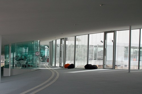
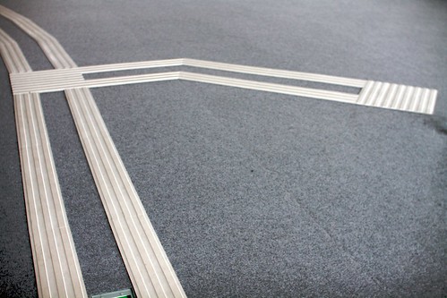
The use of what I would call "smooth podotactiles" is remarkable as well. These plastic lines on the floor aims at guiding people to the main locations of the Learning Center. Because of the curved floor, these elements sometimes give a very particular impression. It is as if perspective has been added to the interior architecture.
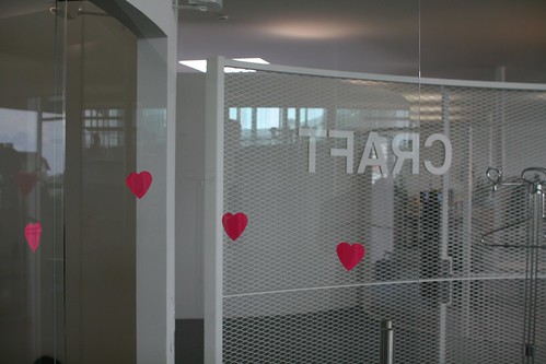
A funny aspect of signage is also the post-its people have started to put on glass walls... because of their translucence, it seemed that some folks bumped their heads into them. The repurposing of post-its was found as a solution to prevent this problem.
Time
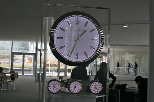
Of course, it's impossible no to mention the importance of time in the context of this building. The main partner of this construction is Rolex (hence the name of the learning center) and it somewhat leads to the inclusion of clocks here and there. They act as physical marker of the presence of time. It's a library where people work so it's indeed relevant for students and researchers. But clocks also have another role here. if you look at the picture below, it shows time in different cities (the future is urban right?): San Francisco, Boston, Tokyo, etc. to remind people that the "outside" is as important as the inside. Perhaps it's also meant to represent a direct connection to other "knowledge places" which are relevant in this era of cognitive capitalism.
