Back from interaction10, the annual conference hosted by the Interaction Design Association (IxDA) in Savannah, Georgia. A good occasion to visit the deep south (aka "dirty south 2) that I did not know at all. More observation on this at the end of this post, let's focus first in lessons learned at the conference.
Before coming, I was not sure about the whole thing, wondering whether the talk/audience would be into web-stuff or other concerns. After three days there I have to admit that I am really happy with the quality of the talks as well as the diversity of the conference formats. As opposed to lots of events, it seems that the venues have certainly contributed to the quality of the interactions (definitely no big hotel-chain lobby with their cheesy carpets). Furthermore, I was also glad to present my talk about failures and get some interesting feedback to go further.
Instead of a selection of semi-automatic writings of the talks as I've done after the Microsoft Social Computing Symposium, I tried to put together a selection of insights I collected at interaction2010. Overall, I was struck by the following three elements:
Incentives and rewards
A recurring topic was sur toutes les lèvres: the notion of providing "incentives and rewards" for the use of certain services. Be it about changing one's behavior to reach a more sustainable development model or as a way to let people use applications they wouldn't otherwise. This was a term I've heard in talks, conversations, participative activities and side activities. The break-out group about Foursquare at the Microsoft Social Computing Symposium the other day also connects to this discussion because I think 4^2 epitomizes by-products of incentives. Simply because one the rewards the interaction designers of this location-based system created turned users into point-addicts. Although the design community has always talk about this, my impression was that design was more about creating "affordances" than incentives. Where the former lies in perceptual and cognitive psychology, industrial design and human–computer interaction, the latter stemmed from economics and sociology. I don't judge anything here, I just see a pattern, perhaps design is well qualified to use both metaphors in its creative repertoire. The very notion for service design is perhaps useful here to understand this shift and I've heard someone arguing that an incentive was an "immaterial affordance" (which made me frown).
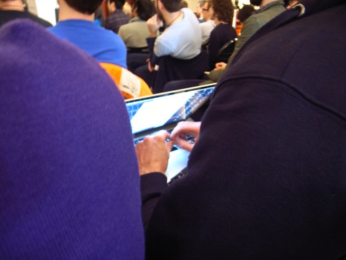 (someone typing notes without bothering looking at the blue-glow display)
About models
In addition, one of the theme I was interested in was the way designers work, achieve their projects and think. Which is why I paid close attention to tools, methodologies and abstractions. Fortunately, most of the presentation I attended showed some interesting examples of "models". See for instance the two examples below: Nathan Shedroff's model of experience/meaning (see his presentation for more) or Timo Arnall's interesting model of the 3 levels for designing networked objects, and the one presented by Mike Kruzeniski.

Shedroff's model was descriptive: as he explained, it helped him to show how meaning works in experience and the 6 dimensions of what constitutes an experience: significance, breadth, intensity, duration, triggers and interaction. As shown on this checklist, the role of the model is also prescriptive because it helps practitioners making decisions and acting upon other insights (i.e. user research).

Timo's model is different, it originated in the categorization of experiences with networked objects, which can be:
- Immediate tangible experiences: glanceable and that do not take too much attention as the Nabaztag, Nike+ or Chris Woebken's animal superpower
- Short term connecting and sharing: where the purpose is to share/get immediate feedback from friends such as the on-line component of Nike+
- Long term service, data & visualization of the data produced that become social objects
What was interesting in Timo's talk was that he showed afterwards how these three central aspects could be used to evaluate existing objects AND as a basis for designing new artifacts that could be used as an iterative cycle. The model is therefore evaluative and generative.
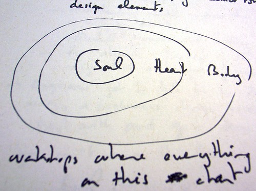
A third sort of model was the one showed by Mike Kruzeniski in his talk. In his work at Microsoft, his purpose is to connect engineers with a more emotional vision of innovating. The problem they encountered was that developers tended to cut features and design elements with a specific rationale which did not take into account emotional factors. The first model/metaphor they chose was the tree (cutting two many features of a product may lead to a weird tree) but it was not efficient. Thus, they adopted the "Body, Heart, & Soul" framework to qualifies, validates, and prioritizes the intangible qualities of design work alongside the more practical concerns of our Engineering partners. To put it shortly, categorizing features as "heart" or "soul" was a more legible way to prioritize (and suppress design elements). The soul is untouchable, the heart elements support the soul and the body is the rest. Each of this component has certain rules ("no more than 5 "soul" features) and it was a more humane way to prioritize than "p0", "p1" and "p2". This kind of model was metaphorical in the sense that it helped engineers talk in a different way, a "beginner's design vocabulary to start with an grow from". Additionally, doing the simple work of categorizing features in these 3 topics was about articulating what matters emotionally to users (and then making choices). In this case, the model is both metaphorical (to convey this emotional sense) and operational (to enable easier prioritization).
These three examples are interesting given they exemplify the use of abstract models by designers from the ixda community. It as if the notion of model had been re-appropriated in a flexible way to serve the designer's purposes, which is a relevant locus of observation. Make not mistake here, these are only examples I've seen and I won't generalize from this sample. I am pretty sure you would also find predictive abstractions in designers' work. However, it's curious to point them out to show how models here are more seen as "tools to give structures to help you think" than explicative elements. The difference between designers and scientists in the way they build and use models, some epistemological comparisons may be intriguing here and I feel I am just scratching the surface.
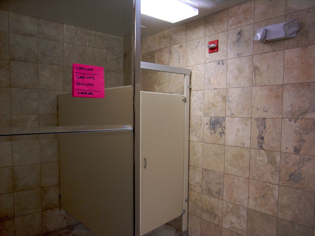 (Wifi data points on a post-it in the washroom)
Showing products or not?
My third comment on the conference was the surprising lack of examples/products/services in lots of the presentation. I expected a design conference to be much more evocative in terms of design examples and it was not the case. Of course there are exceptions (as if Matt Cottam, Timo Arnall or Dan Hill's presentation were exceptions) but it's as if all the potential examples had been vacuumed and resurfaced in Paola Antonelli's talk.
The interest in objects
The mention of Antonelli's work allows me to make a smooth transition to a trend I find interesting: the increasing interest (or the resurgence of interest) in technical objects and a way to talk about them, to analyze them (Timo's model is inspiring for that matter) and how the history of digital artifacts matter. In her talk, she described how objects have always spoken to her and she summarized an upcoming MOMA exhibit that will cover the evolution of new media/digital technologies. Perhaps it's just me reading The Evolution of Useful Things: How Everyday Artifacts-From Forks and Pins to Paper Clips and Zippers-Came to be as They are (Henry Petroski), Carl di Salvo's new blog about objects, discussions with my neighbor or the game controller project with Laurent Bolli, but I am feeling a renewal of interest in analyzing objects (rather than users).
Not so much time for a write-up about the city itself but some pics are always worth a thousand words.
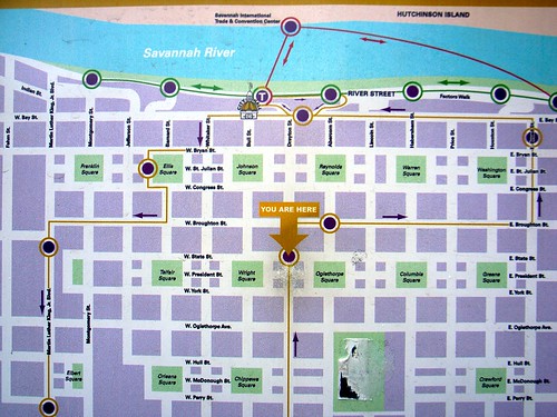 (The intriguing repartition of green pockets in Savannah)
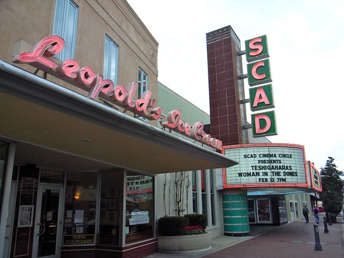
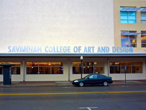 (The pervasive presence of a local design school)
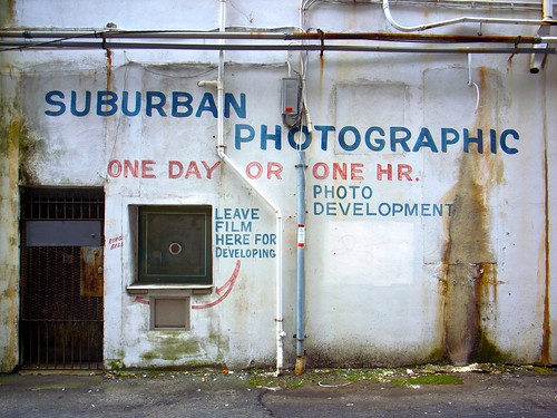 (Savannah has remnants of old shops)
 (Luxuriance on the street, lovable pipes and nature around)
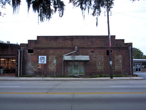 (Gorgeous brick buildings to be rented, a common feature in this town)

