Tangible/Intangible

Evolution in rapid prototyping/3D printing

A common remark I've heard at Lift France 11 about the session focused on fab labs and rapid prototyping dealt with the lack of business opportunities in these fields. Interestingly, the NYT had an overview of the current possibilities in this article. Various companies ranging from HP to Boeing are mentioned, showing the importance of this topic. But it's not what caught my attention. (A Fab bot encountered in Paris few months ago)

Instead, I found relevant to see what has changed in the field:

"The technology has been radically transformed from its origins as a tool used by manufacturers and designers to build prototypes.

These days it is giving rise to a string of never-before-possible businesses that are selling iPhone cases, lamps, doorknobs, jewelry, handbags, perfume bottles, clothing and architectural models. And while some wonder how successfully the technology will make the transition from manufacturing applications to producing consumer goods, its use is exploding. (...) Advocates of the technology say that by doing away with manual labor, 3-D printing could revamp the economics of manufacturing and revive American industry as creativity and ingenuity replace labor costs as the main concern around a variety of goods. (...) Manufacturers and designers have used 3-D printing technology for years, experimenting on the spot rather than sending off designs to be built elsewhere, usually in Asia, and then waiting for a model to return. Boeing, for example, might use the technique to make and test air-duct shapes before committing to a final design. (...) Moving the technology beyond manufacturing does pose challenges. Customized products, for example, may be more expensive than mass-produced ones, and take longer to make. And the concept may seem out of place in a world trained to appreciate the merits of mass consumption.

But as 3-D printing machines have improved and fallen in cost along with the materials used to make products, new businesses have cropped up."

Why do I blog this? Following up on previous talks at past Lift conferences, putting things in perspectives.

Augmented Reality B&W footsteps

How Augmented Reality was portrayed back in the days. The evolution with B&W graphic landmarks:

Circa 1992 (Source: T. P. Caudell, and D. W. Mizell, “Augmented Reality: An Application of Heads-Up Display Technology to Manual Manufacturing Processes”, Proceedings of 1992 IEEE Hawaii International Conference on Systems Sciences, 1992, pp 659-669)

Milgram's continuum (Source: P. Milgram and F. Kishino, "Taxonomy of Mixed Reality Visual Displays", IEICE Transactions on Information and Systems, 1994, pp. 1321-1329.)

2D matrix code (Source: Rekimoto, J. (1996). Augmented Reality Using the 2D Matrix Code. In Proceedings of the Workshop on Interactive Systems and Software (WISS'96).)

More material (in color too!) at this insightful URL

Why do I blog this? Collecting material for an upcoming presentation. It's interesting to get back to these early representations that I studies during my MSc in HCI... and compare them to current instantiations.

Sony move and gestural interactions

Some interesting insights about gestural interfaces, the Wii and Sony Move on Gamasutra in an interview of Rob Dyer (Sony Computer Entertainment America's senior vice president of publisher relations):

"There are certain games and certain genres that are great for motion gaming. I think the biggest problem that third parties have had with the Wii is that everybody had to implement everything with the Wii-mote, and a lot of games were never meant to have that kind of physical [interface]. It was supposed to be a D-pad only type of experience.

There are going to be some categories that are going to be absolutely spectacular with the Move. There are going to be some categories that are going to be very good with Natal. Now, the big difference with the Move and the Natal, if you're going to do it with Natal, you're going to do it exclusive with Microsoft. That's not going to be the case for the Move. You have a code base that works across all three platforms. How do you build that up and how you implement it into your game? Do I think you're going to see [inappropriate Move implementations]? Absolutely. Our challenge here is to make sure you're doing it with the right games and the right genres, and that's where we're spending a lot of our time, going back to people and going, "Good idea. Bad idea. Good idea. Yeah, not so good idea." Those are the types of things that we're trying to at least steer people away so they don't spend millions of dollars, come back to me and go, "Eh... It didn't sell." "Well, okay. You never should have made it. It was never going to work anyway. It didn't work on the Wii for a reason. That category didn't. Why did you think it was going to work on this one as well?" (...) The Wii doesn't have a camera. We've got a camera. Use that camera, implement that in there. A lot of these guys don't want to. They just want to use the accelerometer and say, well... No. Not gonna happen. It doesn't work that way. Put the camera in there, make it work with that, get your trophies, up-res is, put some more content in, come on down.

Why do I blog this? curiosity towards this new interface... and I cannot help framing it in the evolution of game interfaces. Surely some stuff for the game controller project

Les Editions Volumiques, Paper computing and curious reading interactions

Les Editions Volumiques finally launched their website showing plenty of curious and original products based on mixing paper and digital technologies:

"Here are the first pieces of les évolutions dynamiques following research on both volume and interactivity, playfully mixing paper and computation. By allowing interactivity and gameplay in the page (for example with the Duckette project) or between the pages (in The book that turns its own pages, or Labyrinthe), we try to bring new life to paper. We then pushed physical behavior to paper and ink (the book that disapears). There, the paper is no longer only the frame for representation, but at the same time the field of a real physical experience. We also played with the volume and perspective of book and content (paradoxales, Meeting-Zombies). And then, we tried to combine paper with this little computer-object almost of us all carry everywhere: our cell phone (the night of the living dead pixels, (i) pirates)."

Why do I blog this? I find these projects fascinating and love the idea of mixing digital tech with paper to create compelling user experiences. The examples showed on the picture (see more on their website) are stunning and show the future of books go far beyond boring reading machines. The use of playful metaphors and game mechanics in the work of Bertrand and Etienne are also highly intriguing for those interested in inspiring ways to renew the reading experience.

Besides, if you're interested in this type of "paper computing", be sure to check the Papercomp 2010 workshop at Ubicomp. Organized by friends from EPFL, it's based on similar ideas:

"Paper is not dead. Books, magazines and other printed materials can now be connected to the digital world, enriched with additional content and even transformed into interactive interfaces. Conversely, some of the screen-based interfaces we currently use to interact with digital data could benefit from being paper-based or make use of specially designed material as light and flexible as paper. In a near future, printed documents could become new ubiquitous interfaces for our everyday interactions with digital information. This is the dawn of paper computing. "

Tangible interaction frameworks

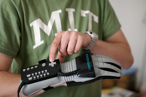
Gestural interfaces from the 80s Two interesting frameworks I often use in design research about tangible/gestural interfaces:

The first by Benford et al. (2003) is focused on three components: "Movements of interfaces can be analysed in terms of whether they are sensible, sensable and desirable. Sensible movements are those that users naturally perform; sensable are those that can be measured by a computer; and desirable movements are those that are required by a given application.". Their framework is based on these 3 components and they show how " how a systematic comparison of sensible, sensable and desirable movements, especially with regard to how they do not precisely overlap, can reveal potential problems with an interface and also inspire new features":

Source: Benford, S., H. Schnadelbach, B. Koleva, B., Gaver, A. Schmidt, A., Boucher, A., Steed, R. Anastasi, C. Greenhalgh, T. Rodden and H. Gellersen (2003). "Sensible, sensable and desirable: a framework for designing physical interface, Technical Report Equator-03-003, Equator.

The second is by Bellotti et al. (2002) and it proposed 5 "questions posing human-computer communication challenges for interaction design". Each of these issues can provide "the beginnings for a systematic approach to the design of interactive systems":

Source: Bellotti, V., Back, M., Edwards, W.K., Grinter, R.E., Henderson, A., and Lopes, C. Making sense of sensing systems: five questions for designers and researchers. In CHI, 2002, 415--422.

Why do I blog this? Preparing my interaction design course led me to these paper. Might prove handy to discuss framework (roles, interests, limits) in the context of gestural interfaces such as the one depicted at the beginning of this blogpost. As usual with theoretical insights like this, there are pluses and minuses, but I often find them relevant to systematically approach new kinds of interactions.

Lift Seminar @ Imaginove about gestural interfaces

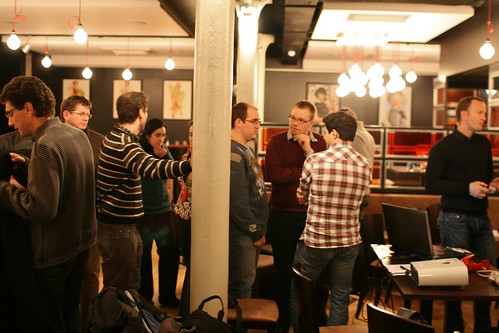
Lift seminar @ Imaginove Yesterday in Lyon, Emmanuel Rondeau and myself organized a Lift@Home about gestural interfaces. We (Lift) indeed partnered with Imaginove, a French cluster of companies, research institutions and universities focused on video games, audio-visual, cinema, animation and multimedia. Several other Lift seminars will be organized around various topics such as the Social Web, 3D virtual environment, networked objects and locative media. We'll focus on the uses and practices of each of these technologies, to reflect upon how they are appropriated by users and how this information can be fed back into the design process.

Yesterday's seminar focused on how gestural interfaces such as the Nintendo Wii, new kinds of accelerometers and (3D) cameras are used in the context of video games. There were around 50 participants, mostly game designers, interaction designers and Human-Computer Interaction academics.

Lift seminar @ Imaginove

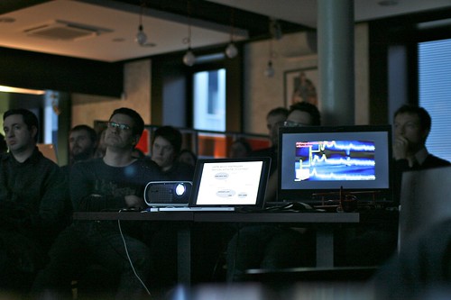
After a quick introduction about the evolution of video-game peripherals over time, I described the pros and cons of these kind of interfaces as shown on the following slide

In addition, I mentioned some of the projects we carried out when I worked at Phoenix Interactive, a French video-game studio based in Lyon. These projects showed how we studied the various ways to transmit/explain gestures to players, a project in collaboration with a laboratory in Cognitive Psychology.

The next presenter, Emmanuelle Jacques, a sociologist from the University of Montpellier, described some results from an ethnographical study of Nintendo Wii usage. She described the discrepancy between the gestures that game designers expected to be made and people's practices. As shown in the following picture, the movement amplitude of gestures is indeed quite different with expert players (the smaller girl) and novice players who think they must replicate real-world gestures. Emmanuelle discussed the implications of such notions, showing that playability is a much more complex notion than simply replicating what is done in the physical world.

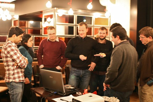
The following presenters, Timothée Jobert from Litus/CEA and Etienne Guerry from XPteam in Grenoble presented an interesting case study of user-centered design. They described the results of an ethnographic study about how people use two sorts of gestural interfaces (the Nintendo Wii and the Bodypad). They then showed how these results were used in the design of video game prototypes based on a new kind of technology (a combination of an accelerometer and a magnetometer designed by Movéa). They ended their presentation with a demo of their prototypes, leading to a lively discussion about new technologies can overcome the problems game designers encountered with the Wii and the notion of realism.

Lift seminar @ Imaginove

Matt Jones on mujicomp and mujicompfrastructures at Technoark

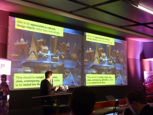
Two week ago at the the "New Digital Spaces conference at Technoark in Sierre, Switzerland, Matt Jones gave a talk called "people are walking architecture". You can see the video here. (Fabien's picture of Matt Jones at Technoark)

In his presentation, he introduced the notion of "Mujicomp", a portmanteau word made of "Muji" (the japanese retail company which sells a wide variety of household and consumer goods) and "Computing". What does it mean?

According to Jones, the idea of "mujicomp" revolved around the notion that ubiquitous computing needs to "become sexy and desirable... able to be appreciated as cultural design objects rather than technology... they should be tasteful, simple, clear, clean, contemporary, affordable in order to be invited into the home". If designers and engineers want to "make smart cities bottom up with products and not academic ubiquitous computing which are always postponed", he argued that ubicomp will need some "muji". And of course, as shown by Jone's use of the quote from Eliel Saarinen, "always design a thing by considering it in its larger context... a chair in a room, a room in a house, a house in an environment".

Starting from the ground-up can lead to some "almost mujicomp" products he mentioned ranges from energy monitor (Watsson, Wattcher) to more curious devices such as Availabot or Olinda that they develop at BERG. The fon phone is also an example here.

As computing requires not only artifacts but also infrastructures, there's a need for "mujicompfrastructures":

"could you create infrastructures with desirable things? the importance of threshold: how could we look at the spaces where we used our devices in a same way architect look at things? like bottom-up urbanism? different elements/gray shades between the private and the public: street, sidewalk, pavement, porch, home this connects to jane jacobs: intervening is not just about creating big infrastructures but sidewalk-scale system that could leak out into the home"

Also in his presentation, Matt talked about the "patchy homebrew equivalent of the nearly-net that would work", relying on Clay Shirky's Permanet, Nearlynet, and Wireless Data:

"Call the first network "perma-net," a world where connectivity is like air, where anyone can send or receive data anytime anywhere. Call the second network "nearly-net", an archipelago of connectivity in an ocean of disconnection. Everyone wants permanet -- the providers want to provide it, the customers want to use it, and every few years, someone announces that they are going to build some version of it. The lesson of in-flight phones is that nearlynet is better aligned with the technological, economic, and social forces that help networks actually get built."

Why do I blog this? took some time to sort my (messy) notes that highlight interesting aspects of ubicomp evolution and the role of designers in this.

Another apple "pad" grabbed my attention

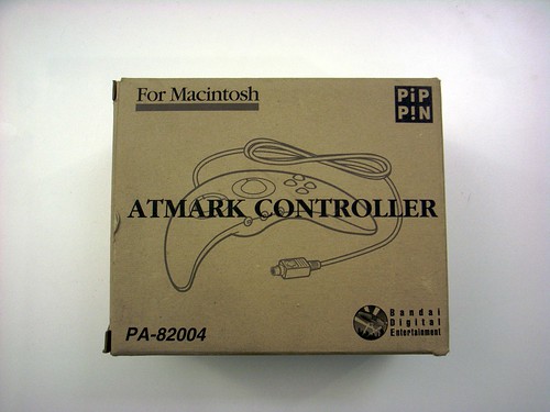
Yes, there's the iPad but it's a different Apple "pad" product that grabbed my attention. This morning, I received this morning a package from Honk-Kong with this curious gamepad that was designed for the Pippin, a console/multimedia platform designed by Apple and produced by Bandai back in 1995. Pippin was actually derived from the second generation of Power Macintosh computers. It was unfortunately a failure. Apple Bandai Pippin game controller Apple Bandai Pippin game controller

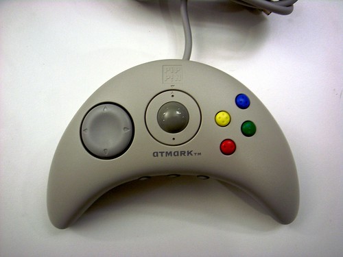
The game controller was called "AppleJack" (a name that eventually has been re-used because it's now a command line user interface for Mac OS X). White models like this one were called "Atmark" (for the "@" mark) and were only marketed and sold in Japan. What's curious here is that it features two interesting elements:

  • A centre built-in trackball, which is highly uncommon on game controllers (instead of a joystick)
  • Two front mounted orange select buttons designed to replicate the features of a computer mouse.

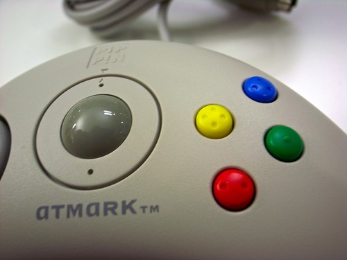
Apart from that it's quite common: boomerang-shaped, direction-pad on the left and four action buttons "laid out in the classic Super Nintendo diamond design + the button colors are a match for the PAL SNES controller" as pointed out here. What's maybe relevant in terms of design is the button shape with tiny braille-like dots to indicate the user which one he/she is using without looking at it.

Apple Bandai Pippin game controller

Another curious aspect is the fact that the Applejack controller was sold with a floppy disk that contains the "Applejack Software Developer's Kit" for editing the `pippin mapping resource, and an Applejack 2.2.0 system extension file. Which means that you could customize the `pipp' mapping resource of the Applejack input device drivers.

Why do I blog this? this pad goes straight into the collection/project about gamepad evolution. Although it was a failure, it's definitely an interesting artifact that tried to innovate (trackball!) and its "boomerang" shaped was also the one Sony showed as an early version of the PS3 controller. A sort of evolutionary dead-end to some extent because of the trackball.

Are you ready for the Internet of Things?

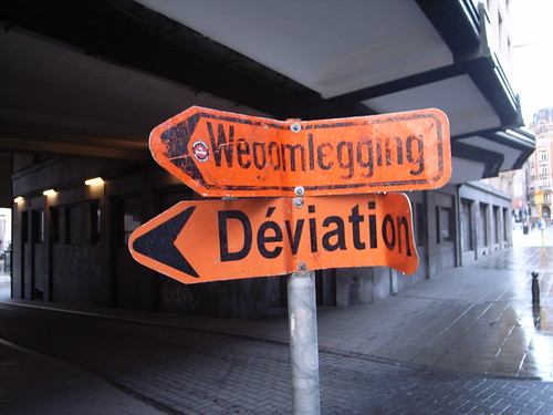
Deviation Lots of things going on in the Internet of Things world lately. See for example, as pointed out by Marc the other day, Casagras, which stands for Coordination And Support Action for Global RFID-related Activities and Standardisation, has just issued its final report on RFID and the inclusive model for the Internet of Things.

On a different front, we teamed up with Council, tinker.it to set a one-day event about this important topic. It's called "Are you ready for the Internet of Things? and will happen at iMal in Brussels on December 4. This conference will celebrate the launch of Council orchestrated by Rob van Kranenburg.

The program is impressive with a great bunch of pioneers, entrepreneurs, designers, analysts, researchers and developers. The event will feature different activities ranging from keynote speech to workshops and role-playing games:

"0930 : Opening by Rob van Kranenburg and Alexandra Deschamps-Sonsino

0945 0955 : Talk by Nicolas Nova

0955 - 1005 The future of storytelling through scenarios, with Gill Wildman

1005 - 1015 The future of IOT, with GS1

1015 - 1115 : Inspiration

RFID Guardian with Melanie Rieback Pachube and Connected Environments, with Usman Haque Nearness, with Timo Arnall Mime, with Lorna Goulden Noisetube, with Matthias Stevens Privacy Coach with Jaap Henk Hoepman Legal Issues in the Internet of Things, with Nicola Fabiano What I learned from the Violet experience with Rafi Haladjian: The problem with the Internet of Things, are the Things. “Or, how do you get to have open and intelligent artifacts and devices all around the place, without having to manufacture them, transporting them, distributing them (hardly very innovative). How do you creat proliferation, the Internet way, with atoms.”

1115 - 1230 Workshops (with input, questions and views by Gérald Santucci (Head of Unit, Networked Enterprise and Radio Frequency Identification, INFSO D4)

WS 1: Accelerating the roadmap to an Internet of Things @ Home, Philips Design WS 2: IoT in education: creating an MBA WS 3: Interactive Role Playing workshop, Summ()n WS 4: Homesense, Tinker.it WS 5: HC Systems and Self-care, IDC Limerick WS 6: Tools for mediation in IOT 1230 - 1400 Lunch

1400 - 1430 Inspiration

Gaming, with Karim Amrani Urban Eyes, with Marcus Kirsch Awareness Technology, with Alan Munro TownToolKit, with Christian Nold A distributed physical network of humans through the city unveilling invisible and always mobile connections, with Natacha Roussel Social Implications of IoT, with Jim Kosem 1430 - 1630 Workshops continuation

1630 - 1730 Workshop leaders present the results. Short Q & A. 1730 - 1930 Dinner

2000-2200 Public evening program. Opening by Yves Bernard. With lectures, keynotes, interviews, short presentations of workshop results by workshopleaders. Speakers include Liam Bannon, Karim Amrani, Karmen Franinovic, Slava Kozlov on "New mindsets and personal/psychological skills we need to develop for the IoT", Jo Caudron..."

Feel free to register here.

Networked objects session at Lift Asia 2009

The "networked objects" session at Lift Asia 09 was a good moment with three insightful speakers: Rafi Haladjian (in transition from Violet to his new company called sen.se), Adrian David Cheok (from the Mixed Reality Lab in Singapore and Keio University) and Hojun Song. My notes from the session hereafter.

In his presentation entitled "Demystifying the Internet of Things", Rafi Haladjian shared his perspectives on the Internet of Things. Starting from his own experience with the Nabaztag and other Violet products, he made of point of adopting a down to earth approach to the Internet of Things. Based on a analysis of the Darwinian evolution of devices and connectivity, he gave examples such as the Teddy Bear (which went from the basic version to the talking bear (because the maker needs to recreate value and then new products) and finally new toys with rfid now that we have cheap technologies. He also took the example of the scale (mechanical bathroom scales - digital scale - wifi bathroom scale).

He then highlighted "a raw and cynical definition of the IoT":

  • The expansion of the internet to any type of physical device, artifact or space. Which is not a decision but something that is happening "organically" because of the availability of cheap communication technologies
  • The product of decentralized loosely joint decisions
  • Something that will be technology and application-agnostic

This three characteristics led him to pave the way for possible evolution of the IoT. To do this, he stated how it is important to look at past experiences. The mechanical typewriter (one purpose) evolved into the word processor (a computer that could only be used to type in text) AND into another branch: the personal computer (multi-purpose, not just a word processor) that then took the form of laptops or netbooks (with an infinite number of applications). If we look back to things such as bathroom scales, now that we have ICT in there, the wifi scale does the same job as a scale only better but it can be done other things differently (send recommendation, update doctor, personalize the gym equipment, make the information completely social, games with prizes and promotions, organize strikes!). As he explained, this sounds weird, but is it so different than the iphone? The iphone showed that you can have a device and let third-parties make applications and you do not need to bother what should be done for this device.

According to him, the IoT change the way devices should act in the following ways:

  • From one purpose to a bundle of sensors and output capabilities designed for a context
  • Leads to application agnostic open to third party
  • Most probably you will not be able to create new types of devices: it's easier to piggyback on existing devices and use habits (that people are familiar with)
  • You must be economically realistic, you cannot turn a device into an iphone, you must solve the cost/price/performance issue

In addition, such a system helps solving what he called the "Data Fishbowl" effect: today all our data are like fished in a fishbowl and there is just one spot in our environment where the information are: the computer. The IoT has the ambition to have vaporize information... like butterflies, or, more simply, like post-it notes. It's about putting the information in context.

He concluded by saying that the purpose is to go from a world where with have a handful of single-purpose devices to give sense to everything: which is what Rafi is going to be doing in my next company: sen.se

(Poultry Internet)

The second presentation by Adrian-David Cheok was called "Embodied Media and Mixed Reality for Social and Physical Interactive". It outlined new facilities within human media spaces supporting embodied interaction between humans, animals, and computation both socially and physically, with the aim of novel interactive communication and entertainment. Adrian and his team indeed aim to develop new types of human communications and entertainment environments which can increase support for multi-person multi-modal interaction and remote presence.

Adrian's presentation consisted in a series of ubiquitous computing environment based on an integrated design of real and virtual worlds that aims to be an "alternative" to existing systems. His examples aimed at revealing the paradigm shift in interaction design: it's not "just" sharing information but also experiences.

He started from the well-known examples he worked out at his lab with Human Pacman (Pacmen and Ghosts are now real human players in the real-world experiencing mixed computer graphics fantasy-reality) or the hugging pajamas (remote-controlled pajama that could be hugged through the internet). He then moved to "human-pet interaction systems":

  • Poultry Internet: remote petting through the internet (red door / blue door to test pet preference to interactions & objects)
  • Metazoa Ludens, that allows to play a computer-game with a pet: the human user controls an avatar which corresponds to a moving bait that an hamster tries to catch. The movement of the animal in the real world are translated in the digital environment and the pet avatar chases the avatar controlled by the human)

He finally spent the last part of his presentation dealing with "Empathetic living media", a new form of media that follows two purposes: (1) To inform: Ambient living media promotes human empathy, social and organic happenings around a person’s life, (2) To represent: Living organisms representing significant portions of one’s life adds semantics to the manifestation. Examples corresponded to glowing bacteria (Escherichia coli) or the curious Babbage Cabbage System:

"Babbage Cabbage is a new form of empathetic living media used to communicate social or ecological information in the form of a living slow media feedback display. In the fast paced modern world people are generally too busy to monitor various significant social or human aspects of their lives, such as time spent with their family, their overall health, state of the ecology, etc. By quantifying such information digitally, information is coupled into living plants, providing a media that connects with the user in a way that traditional electronic digital media can not. An impedance match is made to couple important information in the world with the output media, relating these issues to the color changing properties of the living red cabbage."

(Babbage Cabbage)

In his conclusion, Adrian tried to foresee potential vectors along these lines:

  • Radically new and emotionally powerful biological media yielding symbiotic relationships in the new ubiquitous media frontier
  • Plants which move: Animated display system, plants as sensors
  • Ant-based display system
  • Cuttlefish Phone

The third presenter in the session, korean artist Hojun Song, showed a quick description of his current project: the design and crafting of an DIY/open source satellite. He went through the different steps of his project (design rationale, funding, technical implementation) to show an interesting and concrete implementation of a networked object. Concluding with a set of potential issues and risks, he asked participants for help and contributions.

Digital keypads in Paris

Paris keypad Among the various objects that we touch on an everyday basis, the outdoor keypads always catch my eyes each time. Called "digicode" in France (standing for "digital code"), the examples in this blogpost are a small sample that I ran across in Paris last week-end. The first one (above) is definitely the classic and clean version of the standard model in Paris. The keypad layout, a topic we already addressed here about the iphone is the classical "dial layout" that comes from the telephone set (as opposed to the calculator layout) with 1 2 3 on the first line.

The other examples below reveal some interesting features about touch interactions:

Paris keypad This one nicely shows what happens over time when people input codes. Buttons with dirt and patina on 1 2 3 6 9 A reveal their frequent usage (and possibly inspire stalkers and people who want to sneak in). Nonetheless, it's inevitable and it's how things age. But wait a minute, this one has the "calculator layout" with the 7 8 9 above, another intriguing component, which may be caused by the fact that this "coditel" brand could prefer this setting.

Paris keypad At night, Paris doorways features these red (or blue)-lighted versions that aims at helping people to locate the correct keypad structure.

Paris keypad And finally, this one, a bit messed-up for some reasons beyond my understanding depicts a nice and nonchalant design.

Why do I blog this? documenting everyday objects, as usual here. In a time of "touch interactions" craziness (towards iphone and interactive table), I find interesting to revisit existing touch interfaces and understand the whole gamut of design issues.

Swiss post box: from the material to the physical

La Poste Another one about post-related issues: the swiss Post just launched a new service called Swiss Post Box: the "electronic equivalent to your regular physical mail box".

It allows subscribers to receive scans of their unopened envelopes by e-mail message and then decide which ones they want opened and scanned in their entirety, to be read or achieved online (or "shredded"). You pay a monthly fee and you get a a set number of scans, at least one address for free and long-term archiving. There's even a connection with a Miles program for flights.

An interface detail that struck me as curious too is the fact that the interface is only in english, which gives an interesting hint about the target groups of these services.

Why do I blog this an interesting service at the crossroads of the digital and the physical. I am pretty sure there could be lots of possibilities in terms of applications based on this kind of platform, both in terms of personal information management and less utilitarian purposes.

Besides, It's intriguing to think about the implications in terms of need to have letters/mail in material format and the importance of physical space. Concerning the importance of paper, I'm curious to see how people would be react and what sort of routine can be put in place to choose between what should be sent online and what should be kept (and when because there are obviously lots of exceptions). Now about space, as the NYT piece puts it "There’s a huge amount of infrastructure", the letters will no longer sit in a shoebox under your desk but they will be stockpiled in huge data-warehouse here and there, a sort of add-on to the post buildings. Eventually, it may also change the Post's general process which are based on flow and less on accumulating data. I don't mean here that Postal services never had to deal with keeping things but the scale may change with this sort of innovation.

Bandai poking box

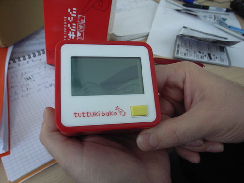
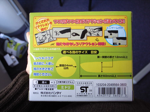
tuttuki bako One of the weirdest electronic toy I've played with so far is certainly this "tuttuki bako" (tuttuki box) poking box by BANDAI. It consists in a basic box with a LCD screen, a cute yellow button and a hole on one side of the box. To play the games, you simply have to insert your finger in this hole, and see it appear on the LCD screen.

Apart from being a basic clock, you have different games as represented on the photo below: poking a panda, removing boogers from someone's face, touching slime or ticking a stick figure character. I actually played with it for sometimes yesterday afternoon at the game studio and it sparked a good discussion about this type of gesture-based interactions.

tuttuki bako

Why do I blog this? this object is the typical geek magnet as you can see from its presence on tons of blogs about gadgets. Oftentimes, they miss the point and only see the odd character as well as the proximity to old-school tamagotchis. Being interested in electronic toys and their user experience (in a video game project), I try to nail down the interesting aspects of this device.

What's intriguing here is the mode of interaction proposed. Clearly, sticking one's finger in a hole to interact with an object is highly uncommon and almost taboo. Furthermore, it's really about being "engaged" in the interaction physically since you feel that a body part is can be both an input and a somewhat output through the LCD screen.

Second, the vocabulary of interaction of highly interesting. On the physical side: insert, touch, twiddle around inside, stick in, etc. And on the digital side: pushing around a stick figure, ticking someone’s nose, petting a tiny panda bear, etc.

Instances of touch-based interaction

Touch arphid key

Touch interactions

touch

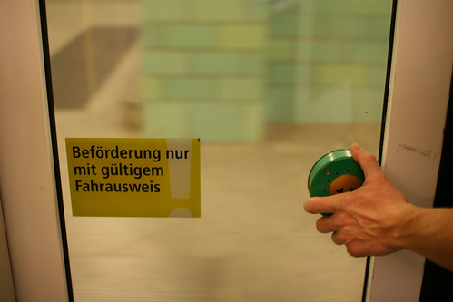
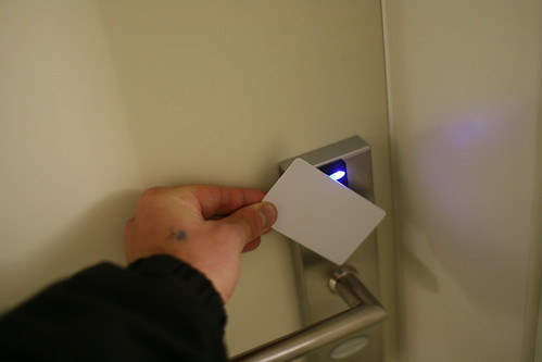
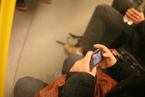
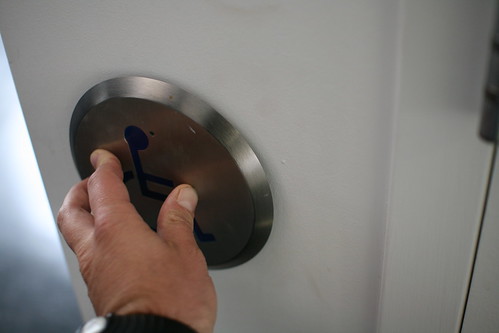
Some design issues that emerge from few instances of touch-based interactions: different sorts (touch, press, wave ...), different attitude (hold when waiting before your can touch on pic 1), use of different hands (left/right, influence of one's lateralization), the role of signs on the surface to be touched, the surface texture, presence/absence of cues indicating where to touch, multitasking with your hands (holding and touching on picture 3), etc...

Vocabulary of touch

Quick wordle after a discussion I had about touch with Timo last week. Each of these words can lead to ask interesting questions regarding interface affordance, vocabulary of interactions as well as how create human-legible touch interactions. Exercise: take each of these terms and a technological device (eg. an SLR), ask youself how to use each of them to support the existing features. And then wonder about the relevance of gestures and touch-interactions for such uses. What does waving a device would support? What would caressing mean in photography?

Why do I blog this? mapping some words about the vocabulary of touch for future brainstorm (and then research). Echoes a lot with a current research project about gestures.

Pervasive games and mobile distributed group work

In their paper entitled "New uses for mobile pervasive games - Lessons learned for CSCW systems to support collaboration in vast work sites", Matthew Chalmers and Oskar Juhli discusses how such games could be of benefit to conduct research about mobile and distributed work (e.g. infrastructure management at airports and road inspection, as well as public bus transportation). From what I can tell, it's a sort of longer development on their previous workshop paper "New uses for mobile pervasive games"from the Computer Games & CSCW Workshop at ECSCW'05. They take on the analogy of space and place issues in both domains (pervasive gaming and mobile distributed group work), more especially concerning the focus on the geography both as a topic and a resource in the work. They then show how different pervasive game they worked on (Treasure, Road Rager, Backseat gaming, Castles) as well as the results from user studies can give fruitful information:

"we suggest that there are valuable lessons to be gained from research into games in which players create their forms of play subject to the rules of the game, the technology they use and the wider social and environmental situation. We see strong and useful parallels with the situation of workers who create their work within organisational rules but also within their wider technical, social and environmental setting. "

Why do I blog this? This was the approach we also adopted in CatchBob during my PhD thesis work. What I find important today is that beyond the current serious game trend, there are more and more initiatives that try to employ games as platform to do other things than playing. The paper above is an example but thing such as Superstruct, i.e. the use of ARG as a foresight tool, is another interesting sign.

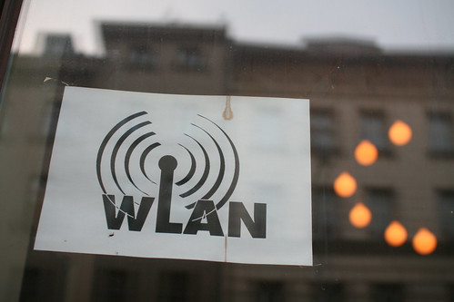
WiFi vocabulary

WiFi WLAN

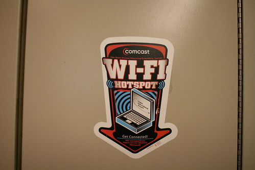
Continuing my exploration of internet vocabulary, the terms employed in different cultures to refer to WiFi are diverse and interesting to document (and discus with Timo). The first one is from Boston airport (but I could have shown some from other countries) and the second from Berlin. I find intriguing the use of a technical term such as "WLAN", as opposed to the more universal (and more basic) "WiFi".

W-Lan for free