art

"Berenice" by Motohiko Odani

In the 2004 edition of the Venice Biennale, there was this intriguing piece of work by Motohiko Odani and called Berenice:

Some comments by Thomas Kramar:

Ein Stockwerk höher, unter anderen räumlichen Krümmungen dieses so seltsam in sich gekrümmten Kunsthauses, liegt eine Art Ufo: eine Kugel, wirr verkabelt, schon leicht angerostet, aber immer noch vibrierend, wie kürzlich gestrandet auf einem gleichgültigen Planeten: "Berenice" heißt das Objekt von Motohiko Odani - nach der antiken ägyptischen Stadt?

Why do I blog this? I like this big white sphere plugged with cables; it looks like a left nuclear weapon that is curious, intriguing and maybe about to explode (a la Akira); or pulsing "information". In the end it interrogates people about its role: would it be the "consciousness" (the place where information flows converge) of a place? To me, it can be the server of a city district that would enable to host what is needed to have a mixed reality. And of course, it might be left in an old cave that nobody can access.

Wifi Camera Obscura

One of the recent project of Adam Somlai-Fisher, Usman Haque and Bengt Sjölén is " Wifi Camera Obscura":

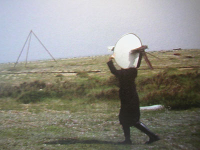
Wifi Camera Obscura reveals the electromagnetic space of our devices and the shadows that we create within such spaces, in particular our wifi networks which are increasingly found in coffee shops, offices and homes throughout cities of the developed world. We will take realtime "photos" of wifi space.

(picture taken from the original project, courtesy of Adam Somlai-Fisher, Usman Haque and Bengt Sjölén)
Why do I blog this? not because it's made up of wasabi cans but rather because I find the idea of revealing the "the electromagnetic space of our devices": visualizing the info cloud is compelling to me; both in terms of tech awareness in the environment as well as for aesthetical issues.

Cardboard mouse pad

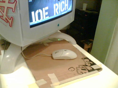
Just ran across this nice mouse pad in a shop in Lausanne: Nice mouse set

Why do I blog this? I quite like cardboards and "cardboard hacking culture", this one is an example of how people reshuffled an old piece of cardboard to another purpose.

Content-less places in virtual and physical realms

Via aeiou, Internet Soul Portraits is a project by Mark Callahan:

Internet Soul Portraits (I.S.P.), net art project

I.S.P. is a tongue-in-cheek treatment of web design as pure representation. In this project, familiar images are altered by the application of essentialist, reductive approaches from a painterly tradition. The images are derived from the home pages of some of the most popular sites on the Web: Yahoo, Google, MSN, Amazon, CNN, eBay, The Weather Channel, MapQuest, Best Buy, and MySpace.

Removing the content of this virtual place, it reminds me some art projects such as "Floating Logos" by Matt Siber (on the left) or Christoph Steinbrener et Rainer Dempf's "Delete!" project or Cedric Bernadotte's "A town without writings" (below):

Why do I blog this? I like the parallel between virtual and real place.

Mario Soup by Ben Fry

Mario Soup is an information visualization project by Ben Fry that aims at "revealing a beautiful soup of the thousands of individual elements that make up the game screen. It used the "the unpacking of a Nintendo game cartridge, decoding the program as a four-color image, revealing a beautiful soup of the thousands of individual elements that make up the game screen".

Any piece of executable code is also commingled with data, ranging from simple sentences of text for error messages to entire sets of graphics for the application. In older cartridge-based console games, the images for each of the small on-screen images (the "sprites") were often stored as raw data embedded after the actual program's instructions. (...) The images are a long series of 8x8 pixel "tiles". Looking at the cartridge memory directly (with a black pixel for an "on" bit, and a white pixel for an "off") reveals the sequence of black and white (one bit) 8x8 images. Each pair of images is mixed together to produce a two bit (four-color) image. The blue represents the first sequence of image data, the red layer is the second set of data that is read, and seeing them together produces the proper mixed-color image depicting the actual image data

Why do I blog this? I like this idea of "soup" and intertwined individual elements that eventually constitute a game screen: destructuring the game display.

A mini-skyscraper controllable with a clickr

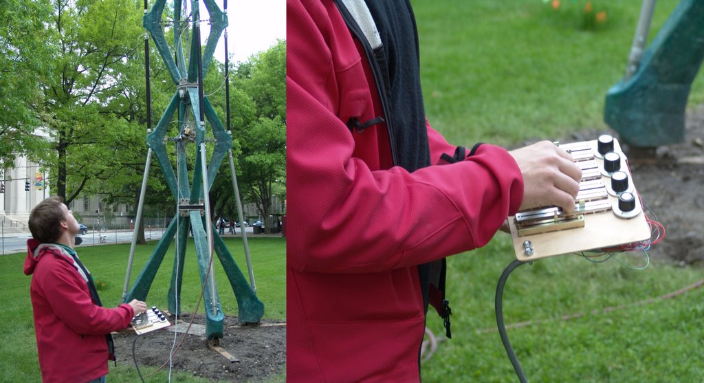
WhoWhatWhenAIR is a blog that follows the development and fabrication of a 40ft interactive/kinetic tower (by Philippe Block, Axel Kilian, Peter Schmitt, John Snavely).

The project was submitted for the mini-Skyscraper competition in the Department of Architecture at MIT. As winning entry we received $7,000 to build it in a month. (...) We wanted to connect the culture of the hack at MIT with a personified miniskyscraper. To bridge interactivity and personality, we created a language. You can speak to the mini skyscraper by operating a bicylce pump and it responds with movement. Coordinated efforts produce unexpected structural choreography.

Pneumatic muscles allow the structure to move in all directions. They pull the structure out of an equilibrium position, creating three-dimensional curvature in the central core. By stacking several units, the mini skyscraper can curve in several directions at once. This core acts as a spine to keep the structure upright when none of the muscles are actuated. The pneumatic movement is graceful and precise.

Also check the movie (.mov, 3.62 Mb).

City landscape hacks

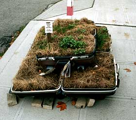
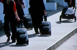
Two curious projects related to bringing nature into cityscape. The first one is by Buster Simpson and it's called "Portable Landscape": it consists in plastic suitcases and sod with salvaged plants on pallets. The second one (on the right) is from a project by Iain Mott called "Sound Mapping":

The second one is by n55, it's called "City Farming Plant Module" (2000):

Why do I blog this? week-end browsing...

Nils Norman's Weather Station Prototype

Nils Norman explains here what he wanted to achieve with his "Gerard Winstanley Radical Gardening Space Reclamation Mobile Field Center and Weather Station Prototype (NYC Chapter)" in 1999.

a prototype of a bicycle with a small solar powered Xerox machine on it and a library of books. The books are a very special library on urbanism, architecture, city design, experimental gardening, alternative energy and also alternative city design. You could travel around, stop at any place and people can Xerox parts of the books if they wanted to. On the bike is also a weather station so that you can measure the humidity, the windrate etc. when you stop at gardens.

Flip Frogs

Flip Frogs is a curious project from 2004 by Meridith Pingree:

rainbow ribbon-wire, green LEDs, MDF, conductive nickel paint, backflipping plastic frogs, aluminum foi.

An image of water in conductive paint covers the surface of the shelf. Every painted line feeds into one of the strands of rainbow ribbon-wire, either positive or negative, which intersect on the wall with an LED. When people play with the foil-footed frogs, they are crossing wires and activating various locations on the wall with limited control.

Why do I blog this? an intriguing example of location activation of toy-like artifact. A model for a weird wires-apparent board game?

Urban post-it in Geneva

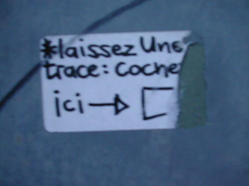
I saw this in Geneva today, a sticker on a wall that invite people to "Drop a note: tick here": drop a trace here

Why do I blog this? a curious action in the urban practice. What happened here? I am looking forward to get back their and see if someone ticked and put more annotations. This sort of message is more than just a sticker or a graph, I like this invitation to participate.

Ingrid Hora's work and extreme users

While doing random searches on google image, I ran across the work of Ingrid Hora. I like her research agenda:

There is a whole category of people living on the order of madness and normality. I want to narrate the life of a disordered (or hyper ordered) society, a life of people left on their own. People builds walls around themselves to create oder and borders. I am interested in showing what happens behind these walls, where obsessions, desires and fantasies hide. I want to show the anarchic constructions initiated by the individuals to accommodate their strange desires and needs.

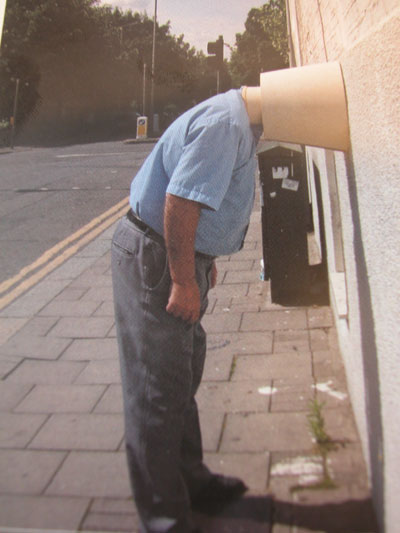
For instance, see those two pictures:

I basically found them on Regine's blog and I have nothing to contextualize (more than just the outline of her work described above) and I definitely makes me thing about how people modify ("détourne" in french) for other purposes that makes sense to them and not always for others.

Why do I blog this? this is a topic very interesting to me because of (1) cultural feeling, I tend to be interested in such borderlines experiences and how they are translated into behaviors/craft (2) how this affect technology usage research: what Ingrid Hora is nothing more than extreme users (or tinkerers) of technology.

Besides, see this rhetorical vision in her description: how "space" features (walls, borders...) are deployed? No space is not dead.

perimeters, boundaries and borders

An interesting call for submission from artists, designers, architects, tinkerers and makers at www.fastuk.org.uk and www.folly.co.uk. They are looking for 9 existing works and in addition will be commissioning 6 new works

perimeters, boundaries and borders’ is an exhibition of contemporary art and design practice. It is especially concerned with object and spatially oriented disciplines, the use of digital technologies and the convergence of sculpture, product design and architecture. This exhibition will bring emerging and existing contemporary practitioners and technologies into the public arena and help to make cutting-edge developments in art and technology more accessible. ‘perimeters, boundaries and borders’ will be held from 29 September - 21 October 2006 at venues across Lancaster city centre in the North West of England. The main exhibition space will be the new CityLab development in Dalton Square. The aim of this exhibition is to present the very latest examples of work that blur the conventional boundaries of arts and design practice through the use of technology. The exhibition will include works which explore these creative perimeters, boundaries and borders including: computer-designed or manufactured objects and environments, visual and audio installations, pervasive and locative interactive artworks, computer games and 3D net based works. More at www.fastuk.org.uk and www.folly.co.uk

Dates: Exhibition: September 29th-October 21st, Monday to Saturday only, 12-6pm Symposium: September 28th, 10am to 4pm Private View: September 28th, 6-9pm

Why do I blog this? Now that we're into space/place discussion, boundaries, perimeters and borders are certainly relevant because it allows to ask new questions regarding the relations between art and technology.

Visualize the invisible (dataflowviz)

Just found this on information aesthetics: Free Network Visible Network, a project by the Mixed Reality Lab.

Free Network Visible Network is a project that combines different tools and processes to visualize, floating in the space, the interchanged information between users of a network. The people are able to experience in a new exciting way about how colorful virtual objects, representing the digital data, are flying around. These virtual objects will change their shape, size and color in relation with the different characteristics of the information that is circulating in the network.

Why do I blog this? this is something very important to me: the possibility to visualize the dataflows, showing the overlay of information in various environments. This would nicely depicts what we were discussing yesterday at the conference: how a certain place now has different meaning: given that in one place you can be there physically and virtually meeting people on IM, MMORPG or something else, the inherent simultaneity of this situation can be visualized through this sort of project.

So let's start a review about this kind of projects:

Related projects:

Any others dataflowviz?

Spreadsheet art

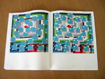
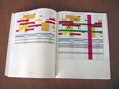
(via), Danielle Aubert's 58 Days Worth of Drawing Exercises in Microsoft Excel is very appealing to me.

Microsoft Excel is a program designed to track and compute information, but here I am using Excel as a drawing tool. These drawings are a part of a series of sixty drawings that I executed (more or less) every day for fifty-eight days. Each drawing is in a new 'worksheet,' which is automatically set up as a grid. These drawings were made by changing cell preferences for background color, fill pattern, and border styles and from time to time inserting 'comment' boxes and letters or words. Other manifestations of these drawings are 58 Days Worth of Drawing Exercises in Microsoft Excel as Rendered for Web and Animated Daily Excel Drawings (2005, ongoing). A year's worth of drawings will be featured as part of a group show at Gallery Project, in Ann Arbor, Michigan (May 10 - June 18, 2006). They will be published as a book over the summer of 2006

Why do I blog this? it definitely reminds me how game designers were doing level design 4-5 years ago. They were basically using excel spreadsheets to create spatial topographies and I found it nice and interesting at that time. This art project then nicely reflects the aesthetical practices of excel. The two I put there are gorgeous.What thismakes you think? Would it be the representation of something? For me it's an instanciation of an imaginary world.

Strata by Jody Elff

Doing a presentation in Lyon (France) today, I encountered this interesting sound installation in a parking garage (the policy here is to put art installation in every underground parking garage, which is nice): Strata by Jody Elff

Commissioned by Lyon Parc Auto, Strata is a reactive sonic sculpture distributed throughout 6 levels of the new subterranean parking garage at the Cité Internationale complex in Lyon. The work is the result of 2 years of combined effort between Jody Elff, Lyon Parc Auto, and Art/Enterprise. Strata explores the relationships of levels, or strata of the structure itself

The work consists of 6 unique sonic “personalities,” one for each level of the facility. A computer controls the occurrence and distribution of the sounds throughout the facility. When an observer is on a particular level of the garage, they hear only the sound of that level. However, there is a global control process in place that guarantees that all six levels are harmonically and rhythmically coherent. In addition to the control of the sounds by the computer, the sounds of vehicles themselves will be transformed and integrated into the final presentation. The result is one of a spontaneously generated composition, comprised of the individual sonic events from each floor. This combined result can be heard in the main pedestrian entrance hall of the facility.

In addition to the sonic sculpture, a visual component of the work was installed in the elevator cars. A series of patters drawn directly from the software used to create the sound sculpture was realized in a light filtering material. As your visual relationship to the elevator cars shifts, the materials change color, from amber to blue to translucent.

Why do I blog this? what I like in the parking company approach here is the idea that space is not a neutral domain. Their interest is to pay attention to the aesthetic considerations of their spaces.

The mobile phone as an emerging social, cultural and technological phenomenon

The Fourth Screen Global Mobile Media Festival Call:

The Fourth Screen Global Mobile Media Festival will focus on the mobile phone as an emerging social, cultural and technological phenomenon. We invite artists, technologists, and other creative thinkers to submit creations, inventions and concepts in two categories:

1/ moving images: videos made with mobile phone, movies, animation and games intended for mobile delivery

2/ wise technologies: software art, software and hardware that proposes new uses for mobile multimedia communication, applications that have positive cultural, social and economic impact in diverse cultures

The use of phone cameras is already pervasive, millions shoot, share, watch video clips with this all-in-one personal production - distribution - player device.

Why do I blog this? cell-phones based art, that's an intriguing concept. What's cultural content creation with such devices? how they help circulating culture, there are interesting issues related to this festival.

Telephoning has lost its physicality

Via news.3yen: Telephoneboxing is an art installation which very clear aims:

Telephoning has lost its physicality; it has literary become weightless. The smaller the telephone gets, the easier it is to communicate, anytime, anywhere, with anyone. (...) What would communication mean if a phone call would become an extremely physical action? When dialing a number requires a lot of concentration and words need to be exclaimed?

"Telephoneboxing" is an installation which explores the borders of communication. In a 20ft container, 10 buttons are attached to the walls. The buttons look like boxing balls and that is exactly what they are. In order to make an international phone call, one puts on boxing gloves and hits the buttons to dial a number. When a connection is made, one has to stand in one specific spot and speak loudly in order to be heard. The answer can be heard on a spot a few meters further into the container. The calling person will automatically adjust the level of communication to his or her eagerness to talk and/or to his or her physical condition.

Why do I blog this? I like this idea of re-introducing physicality in phone communication using tangibility.

The Flock: a musical interactive sound sculpture

the Flock is an impressing project by Ken Rinaldo:

The Flock is a group of musical interactive sound sculptures which exhibit behaviors analogous to the flocking found in natural groups such as birds, schooling fish or flying bats. (...) Our Flock consists of three 9 1/2 foot long jointed robotic arms, constructed from grapevines, which hang from the ceiling and interact with viewers, participants and each other. Each dangling arm has an array of three infrared sensors, projecting out from the top of the arm, which function as active eyes and permit the sculptures to avoid participants walking around the installation. Another infrared eye at the tip of each arm functions to allow the sculptures to approach and simultaneously react to participants presence. Each arm also has an array of four microphones which function as ears allowing the sculpture to move toward participants. The microphones are placed so relative volume levels of viewer/participants voices can be monitored.

Why do I blog this? I like the integration between electronic and organic elements; also the relation between the viewers and the art piece is interesting too.