art

Strange hand “choreographies” + mobile phones

Screen Portraits by Anna Pinkas:

"Each video in this series was shot on the New York City subway and captures a passenger’s interaction with his/her phone. The video has been edited frame-by-frame to call attention to the strange hand “choreographies” that our constant use of handheld screens has engendered."

Why do I blog this? An intriguing project that's related to my "Curious Rituals" project. I like the focus on the hands themselves and the way the movement is represented. It allows to highlight specific gestural aptitudes related with digital artifacts such as phones.

It's also intriguing to stumble across this roughly at the same time as Facebook's "Photos of hands holding various phones, to be used in any presentation of your designs." (which are far less inspiring).

Serge Delaunay's technological (GTX) futures

This morning I've been to the Collection de l'Art Brut (Outsider Art) in Lausanne, for the "vehicles" exhibition. It's a new series, addressing means of transport with over 200 pieces by forty-two authors:

"Vehicles of the most rudimentary kind or of a more technical nature, and whether intended for travel by air, land or water, have always fascinated mankind. Incorporating a link with the childhood world with which Art Brut creators tend to remain attached, vehicles also embody an idea of power, both physically and sexually, as if to prolong human aptitudes."

It's brilliant and the pieces that caught my attention were the one by Serge Delaunay:

"Delaunay uses black felt pen on large sheets of paper. Colour is rare. Cars and spaceships are his favourite subjects. He is fascinated by science, especially astronomy and mechanics, and buys science magazines every week. He adds texts and captions to his drawings. The initials GTX, often under his signature, refer to the automotive industry too. "

Serge Delaunay 1
Serge Delaunay 1
Serge Delaunay 2
Serge Delaunay 2

Two examples: (Copyright Collection de L'Art Brut)

Serge Delaunay 3
Serge Delaunay 3

See also some this one that reflects his interested towards technological futures:

Why do I blog this? I'm very curious by Outside Art and the way these pieces exemplify some alternative and curious vision of our reality. Delaunay's vision of technological artifacts such as car, TVs and robots are utterly stunning.

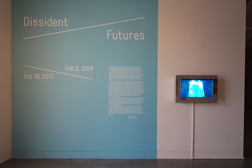
"Dissident Futures" exhibit at YBCA in SF

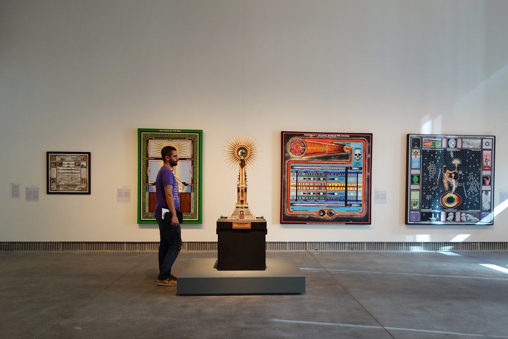
One of the best art/design exhibit I've seen lately is called "Dissident Futures" and it's currently at the Yerba Buena Center for the Arts. Curated by Betti-Sue Hertz, YBCA’s Director of Visual Art, it's described on their website as "an investigation into possible alternative futures, particularly those that question or overturn conventional notions of innovation in biological, social, environmental, and technological structures." The exhibit is made of a wide range of pieces based on photography, painting, installation, performance, sculpture, video and film. Operating as an echo of the innovation-focus of the Bay Area, each of these corresponds to three main topics:

  • the utopian: "scenarios in which the best possible outcomes are achieved for the greatest number of people"
  • the speculative: "consistently pushing beyond the known, even beyond existing systems of logic to locate potentialities that may seem impossible, unreal, or fantastical at the moment."
  • the pragmatic: "groundwork for what the future will look like in the real world"

Some of the projects described there caught my attention for different reasons.

Paul Laffoley's diagrams (dataviz?) feature planes of higher consciousness or act as a mediation aids; they can be seen as utopian worldviews with a strikingly curious spin:

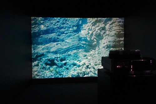
Some of the best piece IMHO are the ones from Basim Magdy, an Egyptian artist living in Switzerland. His fabulous series of pictures (called "Investigating the Color Spectrum of a Post-Apocalyptic Future Landscape") correspond to a stunning representation of how what Science-Fiction should be in my opinion: entanglements between the real and the fictional, between the actual and the virtual... with a peculiar and magical aesthetic. Trevor Paglen's work was also impressive and among similar lines.

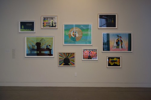
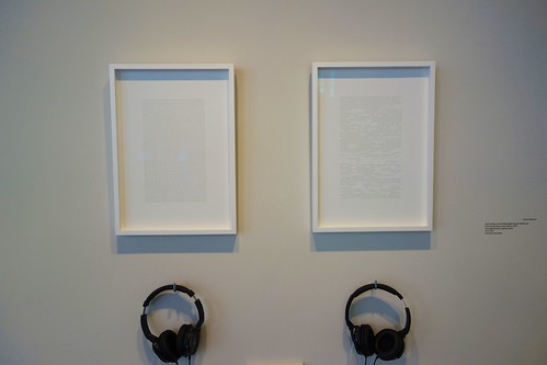
Also, Magdy's series of paintings offer a compelling representation of the future with a representations that may look tongue-in-cheek at first glance... and far more serious when observed longer. I found Katie Peterson's Moonlight Sonata very subtle: "For this work Beethoven's Moonlight Sonata was translated into morse code and sent to the moon via E.M.E. Returning to earth fragmented by the moon's surface, it has been re-translated into a new score, the gaps and absences becoming intervals and rests. In the exhibition space the new 'moon–altered' score plays on a self-playing grand piano."... which leads to these beautiful framed morse scores:

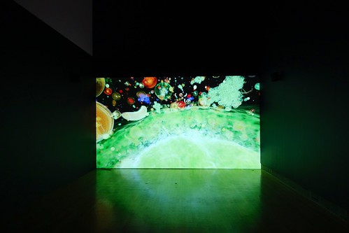
Peter Coffin's video of flying fruits was also fantastic. This short film made of fruits flying through a black void has a mesmerizing effect... an impressive representation of how the ordinary can become intriguing and original when observed with a different viewpoint.

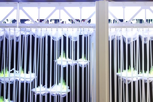
The series of pieces by Future Cities Lab were quite convincing, especially the colonisation of the now defunct part of Bay Bridge with suspended habitations/gardens/aquaponic farms:

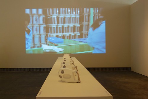
Finally, Revital Cohen and Tuur van Balen's 75 Watts project was also revealing in the sense that it ironically frames mass-manufacturing products: "Engineering logic has reduced the factory labourer to a man-machine, through scientific management of every single movement. By shifting the purpose of the labourer's actions from the efficient production of objects to the performance of choreographed acts, mechanical movement is reinterpreted into the most human form of motion: dance. What is the value of this artefact that only exists to support the performance of its own creation? And as the product dictates the movement, does it become the subject, rendering the worker the object?"

Why do I blog this? I see this show as part of a much larger series of exhibit focused on "the future"... with an interesting and aesthetically-convincing series of weak signals about the possible, the potential and the virtual. The pieces presented here look far more intriguing than what Scifi produces and better frame the discussion about tomorrow's paths. I'm definitely looking forward to reading the book which is planned to be published by the end of the year.

Art/tech scene

Art piece by Sylvie FleuryAn interesting quote seen in this NYT article I saw today:

"“I’ve been a bit disappointed by the disconnect between New York City’s art world and technology space,” he wrote in an e-mail later. “It’s extremely rare to see start-up people at gallery openings, for instance.”

There are all sorts of plausible explanations: the tech industry is relatively new (especially in New York); its members are young, busy and most did not plod through four years’ worth of liberal arts syllabuses.

But as many in the art world point out, there is no reason new-media moguls cannot get a remedial art education now."

Why do I blog this? This remark about NYC would totally stand here in the Geneva/Lausanne area. Apart from certain exceptions, I generally feel the same disconnection. Although it's hard to see what groups we are talking about here (tech moguls, developers, designers, new media artists), I don't see many connections betweens these different people. When we started Lift a while back, we had intuition that it would be valuable to foster such a mix, and we were right. However, it's kind of hard, for various reasons. Three of them bother me a lot:

  • The importance of silos here in French-speaking Switzerland (and the francophone countries of Europe I would say): with so many "sub-communities" trying to exist, there is a tendency from people to differentiate themselves from others and not try to be part of a community. For instance, the debate about the difference between interaction designers and new media artists can be problematic for that matter. So... if it's already hard to bring these two together, how can we expect start-up people to go to art exhibit! That being said, I'm sure there are exceptions.
  • The idea that technology is for technicians and that it's some sort of dirty thing that art should not really bother about.
  • The fact that art related with digital technologies (video games, new media art pieces...) is part of popular culture, and hence less important than more noble realms of art such as theatre pieces, opera, contemporary dance or literature. Spending time in California for the laboratory activities (and having fun), this looks utterly weird and passé.

These new aestheticians were a bit too literal, weren't they?

Why do I blog this? Probably because this encounter with a weird table, whose shape has been generated by a computer program, seem to exemplify the excess or the mere simplicity of adopting this approach in design/art. We'll probably see more and more things like that.

Perhaps this signal can also be connected with some of the insights Regine brought up in her interview with Jeremy Hutchison. This artist contacted a bunch of manufacturers around the world asking them to produce an item which had to be imperfect, come with an intentional error. In this blogpost, i was fascinated by this part:

I got a frantic call in the middle of the night: Waleed was at the customs port. The authorities had seized the ball. When he explained than an Englishman had ordered a ball with errors, all hell broke loose. They said it was illegal to fabricate incorrect products, and they would revoke his company's trading licence. I explained that this product wasn't incorrect since it was exactly what I'd ordered. Days passed: nothing. Lost in the bureaucracy of Pakistani customs, I eventually got through to the high commissioner in Islamabad.

She was very apologetic, and explained that 20kg of heroin had recently passed under the radar at Sialkot customs. So everyone was feeling a bit paranoid. She issued a document stating that "the sculpture/artwork looks like a football but in fact is not a football and primarily this object is not for using as a football but is an artwork." But it was too late: someone had destroyed the ball, and it disappeared without a trace. I never quite found out who.

The intentional creation of failed object and the influence they can have on people or organization's behavior is always a fascinating research avenue.

Tom Sachs' DIY Lunar Module

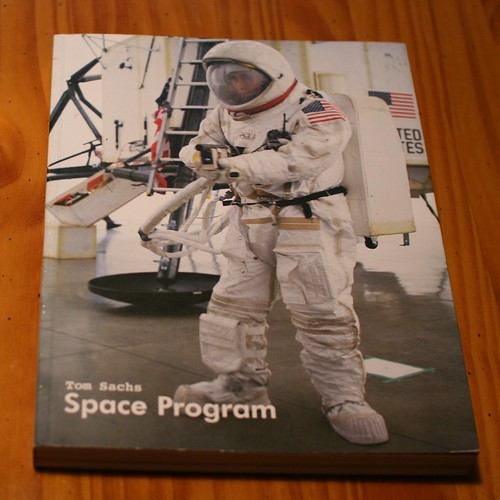
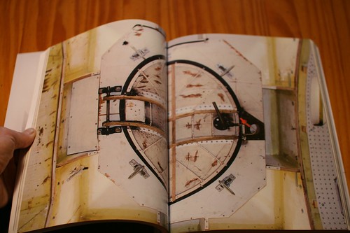
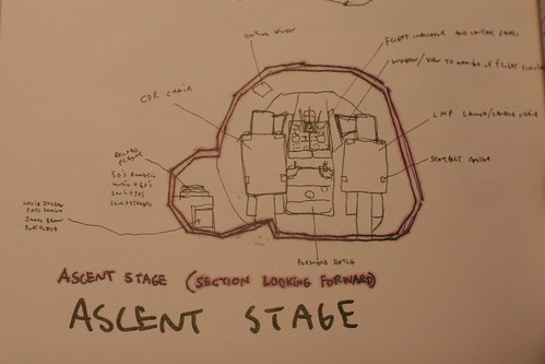
The book called "Space Program" by Tom Sachs stayed on my shelves for quite a while and I never went beyond flipping through it. A vague fever and the continuous fall of the snow gave me a good occasion to read the whole thing cover to cover... and it was a fascinating read.

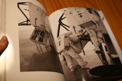
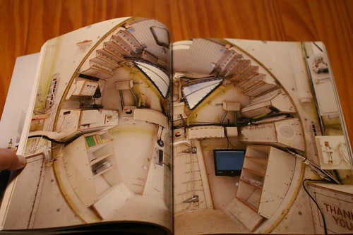
"Space Program" is first and foremost an art exhibit. It's based on the re-enactment of the Appolo program, in a peculiar way by Sachs and his team. The cornerstone of this oeuvre lies in the reconstruction of various devices, of which the most intriguing one is certainly a 1:1 model of the Lunar Module made of simple stuff-foamcore, hot glue and standard materials such as plywood. Given the importance of the performance, it's important to read the book in conjunction with the video of the Moon exploration designed by Sachs and the team.

What struck me as fascinating in this work is described by Sachs in an insightful discussion with Buzz Aldrin in the book. He basically highlights why, IMHO, his work is of interest and far more important than the being accumulation of weird pictures. The quote below shows the uniqueness of the process and how it leads to relevant design implications:

"Our space program is expensive, slow, and crappy... but that's why it's magic. In my studio, by building functional elements, by making systems really work, we create new problems that require even more work to solve. This compounded work process, with things built according to our strict code of love and haste, defines the look of what we do. So for us, going to the Moon is a physical armature for continuing to practice what we do.

I could argue that our is just as real, although it's maybe more theatrical and more representational (...) my sculptures are not just studies of "real things"; they are real things. Building a spaceship out of plywood creates some special problems that force unique solutions. It's in those solutions that the work has value to me."

Why do I blog this? As shown by Arthur Dento, in his introduction to Sach's book "the work is full of surprises, visual jokes and winks of complexity that are there to assure Sachs' viewers that he and they are on the same page, and that for all that he is a cultural critic". So, to me, this work exemplifies three important things:

  • The strong capability of designed artifacts to support a critical viewpoint about human culture: the commodification of space, NASA policies, the role of technologies, etc.,
  • The magic of DIY/bricolage and how actually doing something lead to constraints which force to invent original solutions,
  • The very notion of design fiction. Personally, I read less and less Space Opera but this kind of book makes more curious and passionate about issues which used to be address in SciFi literature... which are now addressed by designers and artists with their own means of expressions.

Grafikdemo: Transition between reality and 3D representation

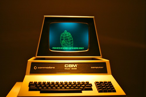
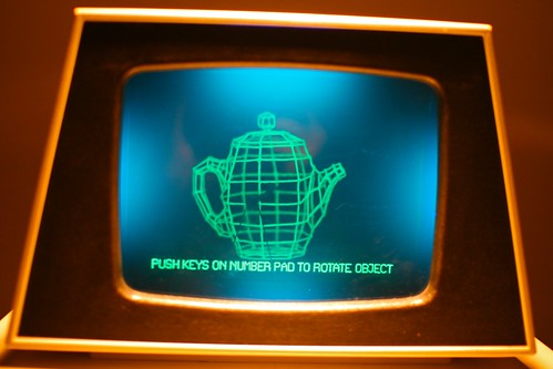
Grafikdemo by Niklas Roy is another interesting project I stumbled across in Basel two weeks ago. The set-up is pretty basic: it consists in a physical wireframe model of a teapot included inside a Commodore CBM 3032 cabinet. The user/viewer can rotate the model by pressing some keys on the keyboard. As formulated by the artist, "Sophisticated lighting of the model makes it hard for the viewer to distinguish whether he sees a real digital model or a fake computer screen".

This project hence "explores the transition between reality and representation in a playful way" and the choice of a teapot is definitely not fortuitous: ""The decision of using a teapot as wireframe model is a result of this object’s outstanding importance in computer animation history".

In an interview, Roy explained:

"My intent was simply to create a physical copy of a digital object and look what happens. It was an experiment. And I did what I've done all the years before as a 3D animator: I've built a 3D wireframe model. When I started to build it, it was funny to recognize that I did everything in the same way and order, like if I would have done it with a 3D modeling software. The lighting was also an experiment: I wanted to let the wireframe model glow, but I don't really like the look of UV light, because It always has this cheap disco touch. So, I've put a green gel (maybe the better word is filter?) behind the monitor glass, which blocks the UV light. The result was that you only see the green wires but no blacklight. At the end, the piece worked much better than I had expected. Many people who play with it don't understand at the beginning what they see and how it is done. They first think is that it is a very sophisticated 3D display in an old computer. But when they start to wonder about the strange motor noises, which happen when they push the buttons, they start to recognize that this is a simple mechanical device."

Why do I blog this? I simply loved the beautiful design of the artifact, as well as the teapot rendering with this green color. IMHO it acts as a sort of tribute to the internet/cyber-culture. The idea of manipulating a real wireframe model is brilliant.

Do Robots Dream of Spring? Ken Rinaldo exhibit at the Swiss Museum of Science Fiction

Last saturday, I made a quick trip to the Swiss Museum of Science Fiction for the opening of an highly intriguing exhibition called "Do Robots Dream of Spring?". It features the work of Ken Rinaldo, an american new media artist who specializes in exploring the confluence and coevolution of organic and technological cultures.

This 6-month retrospective exhibition opening in Switzerland features a diverse set of artifacts and documents. Most of the work showed at the Maison d'Ailleurs is made of curious installations that promotes "communication between species". See below some examples that attracted my attention:
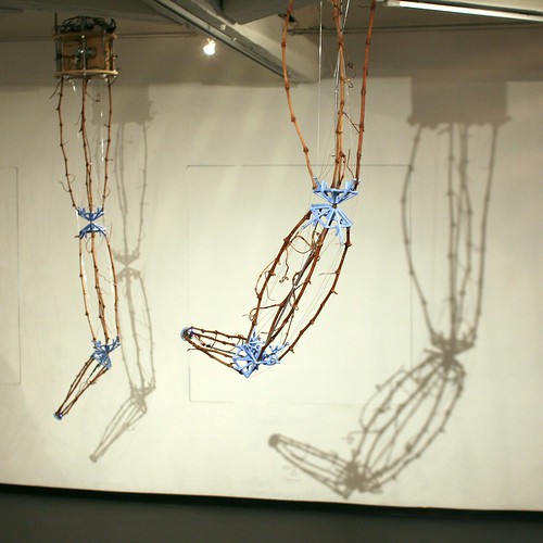
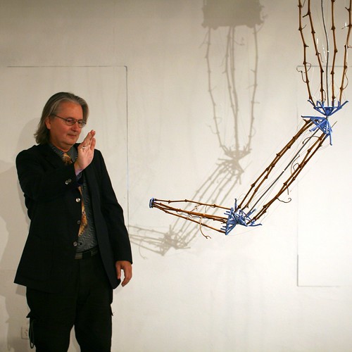
"Autopoiesis"

This one was my favorite in the exhibition. This installation consists of six robotic sound sculptures that interact with the public (using IR sensors) and modify their behaviors over time. These big robotic arms (made out of Cabernet-Sauvignon grapewine and steel wire) talk with each other through a computer network and audible telephone tones, which act as a musical language for the group. The group consciousness of the sculptural robots corresponds to "a cybernetic ballet of experience" with the bots and and viewer/participant involved in a grand dance of one sensing and responding to the other (the photo above depicts a science-fiction writer interacting with one of these arms).

The piece explores the idea of group consciousness and the notion of Autopoeisis coined by Francisco Varella and Humberto Maturana. As described by Rinaldo:

"Autopoiesis utilizes a number of unique approaches to create this complex and evolving environment. It uses smart sensor organization that senses the presence of the viewer/participant and allows the robotic sculpture to respond intelligently. (...) Each sculpture also generates bit strings of information as algorithms using an internal numerical randomizer. These randomizers effect overall sculptural form and the evolution of the sound environment. Additionally, the tones are a musical language that allows individual robotic sculptures to communicate and give the viewer a sense of the emotional state of the sculptural elements as they interact."

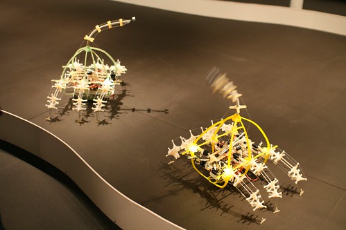
"Autotelematic Spider Bots"

This installation is a sort of playground in which spider-like bots sense and interact with the public in real-time. This artificial life piece is based on the idea that the bots can modify their behaviors based on interactions with each other (communicating like twittering birds), the public, the environment and "food source". Some can activate viewers' cell phone.
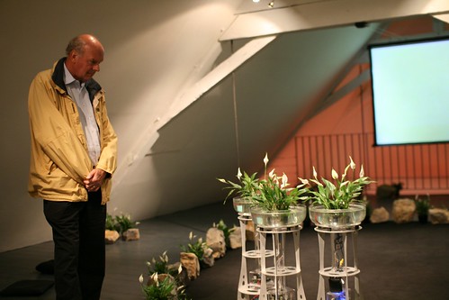
"The Augmented Fish Reality"

This interactive installation is made of 3 rolling robotic fish-bowl sculptures that is meant to explore interspecies and transpecies communication. Interestingly, this fish-driven robots are controlled by Siamese fighting fish chosen here for two reasons: (1) they have good eyes (which allow them to see for great distance), (2) they associate humans with food. The picture above shows the curious human-robot interactions at stake here. As Rinaldo described:

"This design uses 4 active infrared sensors around each bowl which allow the fish to move forward & back and turn the bowls. By swimming to the edge of the bowl the fish activate motorized wheels that move the robots in that direction. Humans will interact with the work simply by entering the environment. (...) these are robots under fish control and the fish may choose to approach and/or move away from the human participants and each other. These bowls consist of a living environment of peace lillys, which help to absorb the waist stream from the fish. The bowls and robots are designed to allow the fish to get to within 1/4 inch of each other for visual communication between the fish, both male and female."

Overall, I found that these superb artifact looks like giant and sleek exoskeleton (from the fish's viewpoint!) that are very distinct from the common armour-like devices that robotic research produces. Can we think about peculiar type of exoskeletons for human? without any reference to the shape of our bodies? Not necessarily a fish bowl for humans, but eh, you get the point.

Beyond this, what's interesting in this project is simply that observing the fish leads the viewer to wonder about its very intentionality: Does the fish really move to get closer to humans? What makes it move? How does the environment/other fishes/human beings influence the movement?
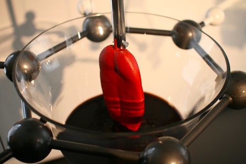
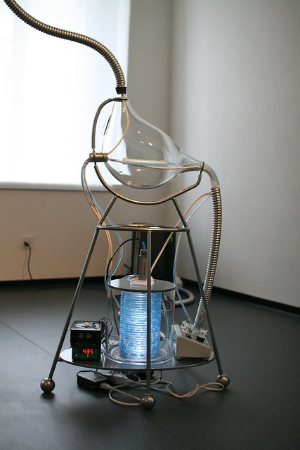
"The Enteric Consciousness"

This one is an artificial tongue activated by living bacteria that gives viewer a massage on a robotic chair (shaped into a massive tongue). This work is concerned with our "microbiome" and the symbiotic relationships humans share with bacteria. It also proposes a new form of interactive robotic installation that involves direct touch and smell.

Why do I blog this? Documenting these fascinating examples of how new media arts, science-fiction and robotics intersect led me to think about some issues raised by artificial life, robots and technology:

  • The very definition of robots and their shape. As you can see on the picture above, the devices do not really like your common R2D2/Bender/C3PO. However, they sense things in the environment, they compute this information and they react with movements and interactions... which corresponds to being a robot.
  • The self-organization of robots behavior based on what is sensed.
  • The feedback loop between robots, other robots, the environment and the viewers (which are turned into "participants" in Rinaldo's work).
  • The notion of intentionality: Are the movements of the fish/arms intentional? What influenced their movements?

Another aspect that I found relevant in Rinaldo's work corresponds to how close it is to science fiction. In his introduction to the booklet about the exhibition, Patrick J. Gyger shed some light about this aspect:

"Naturally, as a creator of systems which imitate the behaviour of living organisms, Rinaldo knows full well that the determinism of their programming prevents any evolutionary independence. But his uncanny ecologies allow a reversal of perspective. They succeed in suspending the onlooker's disbelief and incite their wonder, as perhaps only science fiction at the height of its inventiveness can. Thus Ken Rinaldo goes beyond the clichés which link robots and science fiction and sets our imagination in motion. He proves that science fiction art is not limited to the cinema, novels or illustration. He has appropriated an essential contemporary science fiction technique. He has taken ownership of the technologies that surround us, and his poetic interrogations of these technologies cause us to wonder if robots really can wait for the arrival of better days."

To which, i would point to a quote from Bruce Sterling in his speech during the opening: "Robots have been invented as performing artists [by Kapek's brothers], and they're still are performing artists".

Sensory anomalies

Laptop music This morning, while preparing my upcoming course, I stumbled across this great chapter about Sensory Anomalies by Michael Naimark. Some excerpt I found relevant below:

"The single biggest difference between first-hand and mediated experiences is whether sensory anomalies exist. There are none in first-hand experience. Such anomalies always have explanations (...) The physical world obeys the laws of science. When we experience anomalies in the physical world, it's due to human hardware or software issues, such as blindness or psychosis, not because of the environment. (...) "Virtual Reality", in its theoretical construct, is the merging of the feeling of first-hand experience with the freedom from physical-world constraints. (...) the goal is indistinguishability from first-hand experience in the physical world: "just like being there." Such VR doesn't exist and may never (at least not without electrodes). So for now, we live with even the best sensory media having some degree of anomalies. These anomalies are not intentional, and entire industries exist to make higher resolution cameras, better synthesized lighting models, and auto-stereoscopic displays."

In the chapter, Naimark describes several projects that both transcend and exploit sensory anomalies as well as give a series of observations about what happens. It leads him to the following conclusion:

"Sensory anomalies are funny things (...) Metaphor to some is violation to others. "Faithful representation" is a noble engineering goal, but things aren’t quite as clear in art and design. To confuse, or clarify, things further, good metaphor can often be a form of shorthand. If we share similar cultures, backgrounds, or personal experiences, metaphor is a form of abstraction, of compression. So in the end, the degree of faithfulness and the degree of violation depend on what we want to say. "

Why do I blog this? I really love these lines. They very much echo with recent discussions I had with people from the game industry who aim at jumping over the Uncanny Valley. The notion of preferable anomaly seems more appealing to me in terms of opportunities and design constraints.

The image above was taken yesterday at Share GVA, an audiovisual jam session for media artists and technicians that I attended. The whole event ( my picture too, actually) are based on toying with sensory anomalies.

Laptop music

Art and R&D

In his presentation entitled Is "digital art" Western ? Digital art or the utopia of "world art"? Orange researcher Emmanuel Mahé deals with the relationship between R&D and Art. Some excerpts I found relevant to me:

"The relationship between R&D and Art happens at two levels: LEVEL 1 : Artistic practice and related fields (such as design) as an object of research to find solutions either in terms of uses or technical solutions:

  1. Subject of analysis (measure the effects between IT and uses, understand the social mechanisms, etc)
  2. Innovation method (collaborations between artists and engineers , multidisciplinary cooperation, etc)

LEVEL 2 : Artistic practice and related fields (such as design) as a subject of research to create new problematics, to ask new questions:

  1. hypothesize objects, in the sense of “research hypothesis”
  2. construct new communications hypotheses
  3. use these new hypotheses to create new models which may be used for creating services, fundamental research etc."

He then gives the example of current artistic work about invisibility and shows how artists are "creating new ways (techniques and uses) to make visible what is at the moment invisible and to make audible what is no longer audible. In this way, they are not resisting progress, just modifying it; they are redefining forms. These are the people who are the driving force behind these current developments". Why do I blog this? the issue of art and R&D is a topic I do not work on in my UX research but I tend to follow it carefully, especially for its potential in foresight work. This articles delineates some of the reasons why it's important to understand how artistic projects pave the way for near futures.

Mobilisable at Arts Déco in Paris

Mobilisable Finally managed to get some time to write down my notes from the conference I attended last week in Paris. Called "Mobilisable" and organized at the Ecole Nationale Supérieure des Arts Décoratifs, the conference was both a scientific and art event about focused on mobility and the hybridization of technologies, environments, objects and people. The whole point of the event was to highlight and illustrate the current mutations at stake in interaction design, new media art and new mapping forms.

The first session was about relational cartographies, maps and mobilities.

Boris Beaude started off by describing the problems to visualize mobility on maps. Some of them are due to the inherent characteristics of maps:

  1. Mobility implies time, a diachronic dimension; so it's difficult to represent this on a map.
  2. Maps generally represents aggregates of people, not individuals
  3. Maps impose an euclidian metric, everything is laid down on a plan so it's difficult to represent different layers.

This is why most of the map depict means of transport, instead of mobilities. In addition, geographers like Boris are experimenting a shift in map design: they try to represent the "space of individuals". He showed results from a project called Scalab in which they asked people to describe their own mobility and map the results on graphics. This type of visualizations allows to show different set of practices. He also talked about projects such as Real Time Rome or Facebook Palantir to show how this sort of visualizations of maps is a evolution of mobilities, that spatial practices are different and that art is inteing as it manages to uncover new forms of representations beyond what geographers are building.

Then Philippe Vasset talked about an interesting book he just wrote about holes in maps: the white spaces you can find on maps where nothing is represented. He explored different white spaces in Paris area, documenting what sort of stuff you can find there.

(Map produced by Bureau d'Etude about the crisis in Argentina)

And finally, Bureau d'Etudes showed their different projects and the underlying rationale or process to design them. Their objective is to represent the world and its components with a subjective approach using visualizations tools and abstract maps. They discussed how this kind of representations have an important critical component. They basically focus on creating informational maps whose purpose is to visually represent different facets of contemporary capitalism: corporations, industrial and financial or influential groups.

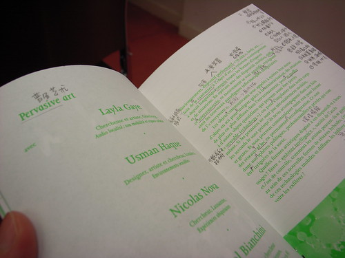
Mobilisable (The conference leaflet annotated by my chinese neighbor)

The next session was about "pervasive art", i.e. how artists and designers envision the internet of things as well as ubiquitous computing. Lalya Gaye, Usman Haque and myself discussed the role of these practitioners in the field.

As a first speaker, I showed why and how designers and new media artists are paving the way for the near future. After a quick introduction of ubiquitous computing and a description of the current challenges, the other part of the talk was a rerun of my why art/design is meaningful to HCI research.

The second speaker, Lalya Gaye gave a great presentation about audio projects in urban environment. What was highly inspiring was that she grounded the discussion about these projects (hers as well as some made by others) in a very relevant design rationale:

  • The iPhone is a presented as the optimal mobility object but she thinks it's not the case. Not simply because the text input sucks to send messages in less than 10 seconds but rather because there are other possibilities which interest her better. Using the city as an interface is such approach
  • The second reason is more aesthetical: urban space, beyond its surface, provides lots of potential affordances that can be creative. For instance, an handlebar can be use by skateboarders, a surface can be filled with stickers, staircases can be employed for parkour, etc. Mundane objects can indeed be seen as having other characteristics: handrails in stairs can be perceived as a way to generate music according to a certain pattern.
  • Daily actions, such as mobility, can be turned (or doubled) into new signfications.

She presented various audio projects built on these principles and concluded with this intriguing question: "what if the augmentation of objects and activities through this process may change the initial meaning of these? Do we get rid of the original object's signification?".

Finally, Usman Haque gave a great a talk (in french!) about his projects to show four key ideas:

  • Traditionally, people think architecture is about hard material (walls, ceilings) but for Usman, it's what remains: between walls, smell, temperature, social relationships, things that help the perception of space, etc.
  • Technology versus instruments: people generally thinks technology is an object but it's a system of relations to "do sth". He said that "nobody takes a frog and say 'this biology is great'". He prefers the notion of instruments.
  • User versus Participant: users imply that there are designers and passive users... which is why he prefers the notion of participants.
  • Publis space versus commons: now that space is filled with surveillance technologies, where are the boundaries between private and public space?

Why do I blog this my notes from this insightful sessions. Good material from interesting speakers. Some good things to sleep on and re-inject in current projects.

Thanks Samuel Bianchini for the invitation.

Newscocoon (Convergeo + Media and Design Lab)

A quick post about the latest project by my former Media and Design Lab boss: Jef Huang and his wife Muriel Waldvogel: the newscocoon project:

"Newscocoons is a set of pulsating furniture objects that display news - user-generated videoclips, pictures, stories, blogs - fed from geographically dispersed sources. The cocoons glow and breath slowly. Each cocoon tracks specific keywords (such as “body,” “emotive,” “recombinant,” “alienation,” “reality,” etc.), and aggregates content tagged accordingly, created locally and over the Internet, by amateurs and professionals. The global shape of Newscocoons is constantly in flux, emerging from the particular constellation and intensity of information flows from the various sources. (...) The ambition for Newscocoon is to create a new kind of furniture for news consumption, one that breathes news, has a memory and fosters social interaction in the form of co-zapping."

Why do I blog this? what I find curious in this project is the notion of pulsation with fed information and the importance of a threshold where physically it gives the impression of "when the eminent danger of an explosion becomes unbearable".(and yes of course it's easy because I love inflatable stuff). The co-zapping feature is also innovative.

SHARE (Turin) about manufacturing

Next week's must see event in Turin, Italy: SHARE, a conference curated by Bruce Sterling:

"The theme for the 2008 edition, which will dominate the contents of the conferences, round tables, workshops and performances, is the new materiality of digital arts. In the 90s the net art phenomenon addressed a need to reach beyond its own limits, drawing immateriality into the equation and threatening the real. Nowadays, society relates to technologies in a natural way by allowing the immaterial to become real. By exploring new, intelligent interaction between man and machine, this relationship has been completely integrated into everyday life. In the new millennium man and machine interact on the same level, shaping and changing the surrounding environment as they see fit."

Won't be able to make it there but the line-up is very good:

"Speakers and guests are many, including Montse Arbelo, Andrea Balzola, Massimo Banzi, Luis Bec, Gino Bistagnino, Julian Bleecker, Chiara Boeri, Stefano Boeri, PierLuigi Capucci, Stefano Carabelli, Antonio Caronia, Paolo Cirio, Gianni Corino, Lutz Dammbeck, Luca De Biase, Kees de Groot, Hugo Derijke, Giovanni Ferrero, Fabio Franchino, Joseba Franco, Piero Gilardi, Owen Holland, Janez Jansa, Nicole C. Karafyllis, Maurizo Lorenzati, Mauro Lupone, Giampiero Masera, Motor, Ivana Mulatero, Daniele Nale, Anne Nigten, Donald Norman, Marcos Novak, Gordana Novakovic, Giorgio Olivero, Claudio Paletto, Luigi Pagliarini, Katina Sostmann, Stelarc, Bruce Sterling, Pietro Terna, Franco Torriani, and Viola van Alphen."

Steampunk tangible interface for music

Being a great fan of all the electro-dub production of french label Jarring Effect, my interest has been drawn by a device designed for Ez3kiel's last show, created in partnership with Medias-Cités. That blogpost by Clement Thierry has a good write-up (in french though) about it.

Called "cycloharpe" (bike-harp), this installation is meant to allow the user to change the music titles of the band's new album. Pedaling and using old-school buttons on this Jules Vernes-like device allow to control samples through different melodies and rhythms.

Why do I blog this? just found curious this steampunk tangible interface to control sound.

Mini street art

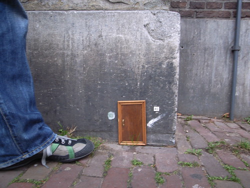
Mini street art seen last week in Amsterdam, a little door+street number plate that we encountered while wandering around. A little door

Yet another thing to add in the list of objects stuck on street material. Beyond classical stickers and graffiti, the mini-doors is a quite intriguing move.

Defining glitches

Reading Glitch aesthetics by Iman Moradi (mulimedia design dissertation - 2004), I was intrigued by the definiton of glitch in that work. The author starts by describing how the dictionary definition of the word “glitch” would be too narrow, especially because it does not consider "the different works and practices prevalent in the production and presentation of glitch artwork".

(Picture is glitch in Second Life found here).
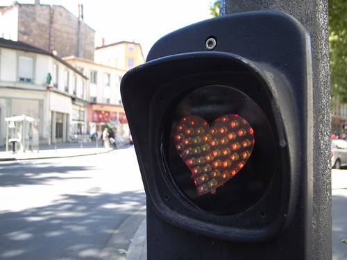
So, the definition can be defined by these excerpts, showing two dimensions:

"The pure glitch is the result of a Malfunction or Error. (...)So in a sense the glitch has always been associated with the definition of a problem. It’s a word used to describe the result of a situation when something has gone wrong. (...) The Pure Glitch is therefore an unpremeditated digital artefact, which may or may not have its own aesthetic merits. (...) Glitch-alikes are a collection of digital artefacts that resemble visual aspects of real glitches found in their original habitat. (...) Pure Glitch ----------- Glitch-alike Accidental ----------- Deliberate Coincidental ----------- Planned Appropriated ----------- Created Found ----------- Designed Real ----------- Artificial"

Why do I blog this? pure curiosity towards failures, malfunction and their possible aesthetic. The part about the techniques to create glitch is insightful as well (replication-repetition, linearity, fragmentation, complexity). The glitchbrowser is a good example for that matter.

Cops aren’t really looking for guys attaching grids of foam board to giant TV

The august issue of ICON featured an article about the physical customization of cities by Scott Burnham. It describes how the frustration towards municipal policies against street art has led to a "fresh wave of guerrilla urban design"/interventionists to focus on "physical objects, media channels and aesthetics of the city as source material."

"The current physical city is seen merely as a starting point – its streetscapes malleable and interactive. (...) Scott Wayne Indiana: “Parking meters, sidewalks, fences, gates, awnings, alleys, manhole covers… there is a list of things that could be designed in such a way as to engage with cities [and shift] the focus on the urban environment as a vibrant place that inspires the imagination, intellect and wonders of the human experience.” (...) Yet in the face of such work, the authorities remain largely unforgiving – intervention equals vandalism, and many of the cities coming down hardest are those that lust most for “creative city” status."

For example, it's interesting to hear about Jason Eppink's motivation and methods:

“I started looking at the city in a completely new way. The urban landscape was suddenly full of potential. Objects weren’t just objects anymore; they were opportunities. I occasionally stumble upon an area so devoid of either life or humour that I have an incredible urge to contribute something. This is when I take pictures of the area, study them and develop a piece around what exactly is missing from the space. I look at it like a tailor measuring a client to make the best fitting suit, or a doctor examining a patient to prescribe the right medication.” (...) “One advantage of working outside of the traditional graffiti media is that cops aren’t really looking for guys attaching grids of foam board to giant TVs.”"

Why do I blog this? It's interesting to see how street arts evolved form graffiti/sticker to much more elaborated practices because of various factors ranging from form novelty (beyond graffiti), security issues (cops, municipal policies) and possibly the need to craft/DIY more concrete stuff.

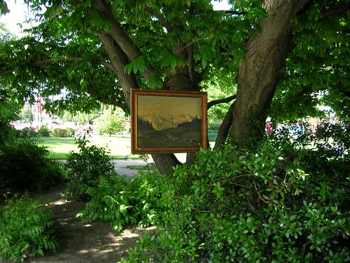
Dscn0066

Picture taken by myself in 2005 in Geneva, some folks here hang up paintings in the city.