VideoGames

Rotary dials as game controllers

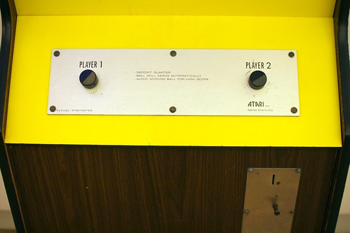
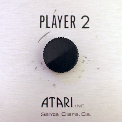
Working on the book about game controllers, I did some research about the first game peripherals. This is actually chapter 1... and one of the most intriguing example is certainly the existence of rotary dials. Potentiometers and knobs were of course the first lineages in terms of game controllers; think about Tennis for Two or Pong. Rotary dials are one step beyond as it introduces a sort of discrete interactions in the use of knobs... and of course they were employed to use video games. One of the earliest game (Noughts And Crosses) used a phone rotary dial but it was certainly more advanced later on in Japan with the rotary joysticks described on this website:

"as fun as rotary joysticks might have been at the time, in the end they failed to become more than a novelty control gimmick. So when the '90s kicked in with SNK dropping their trademark control scheme to go with their new multi-game NEO-GEO MVS system, and as better and more advanced shooting games were being released, rotary joysticks pretty much vanished into thin air from the arcade scene without anyone really noticing or caring. (...) The only real advantage of the rotary joysticks is that although they can only be pushed in the same 8 directions than the standard 8-WAY joysticks, they come with a special 12-WAY switch box that allows them to be rotated in 12 different positions, thus giving the player the ability to face and shoot in 4 additional directions not possible with the standard joysticks. Unfortunately, as great as this might sound on paper, in reality only very few games had actual 12-WAY support, and those that did, like it's the case of「BATTLE FIELD」and「CAL. 50」, only showcased how unnecessary the additional directions were gameplay-wise."

Why do I blog this? Working on the book leads to curious discoveries. I'd be happy to play Super Mario with a phone dial, if possible, perhaps that can be an intriguing research avenue for the laboratory. Of course it's more interesting to think about old school physical phone dials as opposed to the visual versions one can find on smartphones lately. On a different note, I am also fascinated by rotary dials and the way they subtly conveyed feedback to the users.

"Game Story" exhibit in Paris

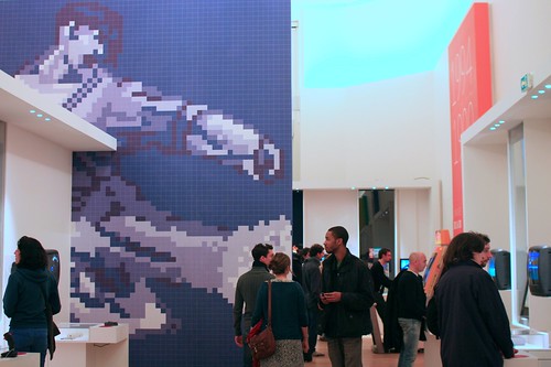
Yesterday I went to le Grand Palais in Paris to attend "Game Story". This exhibit organized by the RMN (a French museum institution) and MO5 (an associated devoted to video-game and computer platforms) addressed the history of video games, from "big white squares" to 3D displays, from arcade box to mobile consoles.

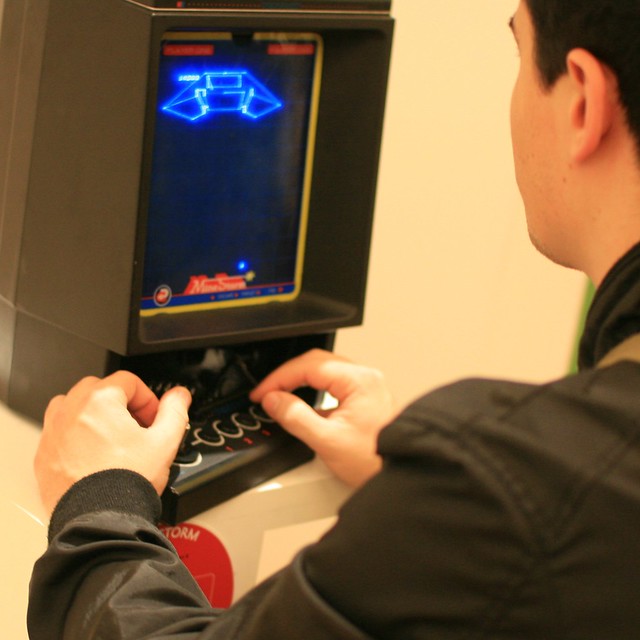
The exhibit is not just about looking at old cubic machines scattered in the magnificent palais since people can also play with most of the devices. This is actually quite interesting as there are two things that attracted my attention there: the game platform and the way people used it. As most of the pieces are not brand new (and given that people could use them) you could see traces of dust and dirt here and there... which is always a good indicator of an artifact relevance. Those traces of human activity reminds us that these pieces make sense to people and they really enjoy using them.

Observing how people "use" with pieces in museum is generally limited to Contemporary art exhibit with interactive artifacts... and perhaps it's far less interactive than a whole aisle made of video-games. Even security members chatted with visitors to discuss the pluses and minuses of game controllers and specific titles.

Interestingly, the exhibit is not just about platforms; you also have plenty of artefacts from what shaped the video game culture : RPGs, toys, magazines among other pop-culture objects. This is quite good as it allows the attendants to draw some comparisons between contextual elements (that could be related to kawai or heroic-fantasy content) and what's exposed on the game console per se.

Such an exhibit also reminds us of the difficulty to maintain this sort of non-tangible material. Most of the pieces presented are based on cartridges and electronic devices (with some CD/DVD-based games) but it becomes harder with cassette and even more impossible if you want to consider early network-based platforms (Minitel games, the beginning of the Web).

Why do I blog this? On a more personal note, I definitely enjoyed spending time there because of the game controller book project. No big surprise for sure but it was an occasion to see the artifacts I am writing about and to observe how people interact with them.

More game controllers evolution charts

Working on the game controller project book, we're building various charts of joypad evolution. What's interesting is that we're definitely not the sole persons doing this. Over the recent months, there's been several other relevant visualizations, that I compiled in this blogpost. Obviously, the first that caught my eyes several years ago is the following one by Sock Master:

Then, more recently by incontrol and Steve Cable:

Or these two, focused on game controllers, beyond joypads by Pop chart lab:

I also found this others one, slightly less visual:

Why do I blog this? We try to differentiate our representations, so it's good to see how others are proposing relevant visualizations. In our case, we're creating a family tree for each of the joypad characteristics (d-pad, shape, action buttons). Which, hopefully, will highlight the complexity of the gamepad evolution.

Feeling interactivity in a video-game

An excerpt from Pilgrim in a microworld found in Rules of play by Katie Salen and Eric Zimmerman:

"I'd catch myself turning my chair into a more en face position vis-à-vis the TV. An obvious delusion. Maybe I could rest one elbow on the set to help feel the angle of my look and deepen a sense of the scale of things. See it from this side and that; see the invisible backside of things through an imaginary bodily tour of the object. Nonsense!  If only I could feel the impact of the ball on the paddle, that would certainly help, would give me a tactile marker, stamping the gesture's places into a palpable little signature, so I'd feel each destination being achieved and not just witness the consequences of a connect shot. Nonsense!

Nonsense, just your eyes way up top, to be somehow fixed on things in ways that can't feel them fixing, then this silent smooth little plastic knob down there, neither near nor far away, but in an untouchable world without dimension. And in between all three nodes of the interface, there is nothing but a theory of electricity. So fluid, to have to write your signature with precise consistency in size within the strict bounds of a two and three sevenths of an inch of space, say, while the pen somehow never makes contact with the paper. There's nothing much to hold on to, not enough heft in this  knob so your hands can feel the extent of very minor movements, no depth to things you can use to anchor a sense of your own solidity."

Why do I blog this? This is an enlightening account of playing a video-game from the user's point of view.

Recent columns debunking videogame "trends"

Two interesting columns on Gamasutra caught my attention recently. Both of them have been written by people I follow for a long time and they both debunk myths about video games. On the one hand, Ian Bogost writes about how hard it is to make games and the inherent problem of "serious games" or "gamification" approaches. His point is that making game is super hard and that making good games to serve external purposes is even harder. Some excerpts I found important:

"key game mechanics are the operational parts of games that produce an experience of interest, enlightenment, terror, fascination, hope, or any number of other sensations. Points and levels and the like are mere gestures that provide structure and measure progress within such a system. (...) The sanctity of games' unique means of expression is just not of much concern to the gamifiers. Instead they value facility -- the easiest way possible to capture some of the fairy dust of games and spread it upon products and services. Games or points isn't the point -- for gamifiers, there's no difference. It's the -ification that's most important (...) In the modern marketing business, the best solutions are generic ones, ideas that can be repeated without much thought from brand to brand, billed by consultants and agencies at a clear markup. Gamification offers this exactly. No thinking is required, just simple, absentminded iteration and the promise of empty metrics to prove its value."

On the other hand, Greg Costikyan gives his perspective on the "social" of social games. He basically wonder about the asocial or even antisocial characters of these games:

" Developers of social games have clearly given great thought to using the social graph to foster player acquisition, retention, and monetization; but as far as I can see, no thought whatsoever has given to the use of player connections to foster interesting gameplay. It's all about the money, and not at all about the socialization.

The peculiarity of this is that social networks are actually far better suited than most online environments to fostering social gameplay. Messaging and chat are built into the system, and need not be separately implemented by developers; but more importantly, the social graph allows players to interact with people who are their actual friends."

Interestingly, Costikyan then describes what could be a "social gameplay": the value of having teams, diplomacy, negotiated trade, resource competition, hierarchy or performative play (not as "winning point to get the best performance", rather "speaking and acting in character").

Why do I blog this? These two columns are important and interesting read as they reduce the inflated reputation of two current "trend" candidates. They also offer relevant counter-versions about what is relevant in game design.

Video games that recently caught my attention

Recently, a journalist asked me what are the console games that I found interesting lately. I froze for a while, told him about 3 games: Superbrothers: Sword & Sworcery EP, Minecraft and Dwarf Fortress... and realize none of them were available on consoles... Few notes about these 3 video-games that caught my attention in the last few months. Each of them made me wonder about the possibility to go beyond standard console games through various aesthetics and forms of interactions.

Superbrothers: Sword & Sworcery EP (S:S&S)

S:S&S EP is the video game that reconciled me with storytelling, a feature that I largely ignored in the last few years. Described as a "21st century interpretation of the archetypical old school videogame adventure, designed exclusively for Apple's touchtronic machinery", it's an intriguing mix of "laid-back exploration, careful investigation & mysterious musical problem-solving occasionally punctuated by hard-hitting combat encounters". Exactly what I needed after a tough series of weeks organizing conferences.

As discussed by game’s creator/artist/animator Craig D. Adams in this interview, the game was inspired by Shigeru Miyamoto’s design sense with the original Super Mario Bros, Jordan Mechner’s original Prince of Persia and Eric Chahi’s Another World because all off these "have a cinema-influenced style, expressive human movement and a more grounded narrative concept". This combination of players' interactions with "sound, music & audiovisual style" underpinned by a basic narrative and very low-key dialogues made me tick. More specifically, I am impressed by the rhythm of the game, which is sometimes super slow/contemplative and sometimes very quick/nervous in combat.

Also, one of the curious feature of the game is the integration of social software in the game. You input your twitter login/password and you can broadcast dialog, hints, descriptions from the game to your twitter channel. It's pretty basic right now (lots of people tweet the same things) but I guess this is the beginning of something and there could be an interesting potential in also using content coming from tweets tagged with the #sworcery hashtag.

Minecraft (Markus Persson)

Minecraft has a very clear value proposition (I find this term funny), it's a (sandbox) game that engage users in placing blocks to build anything they can imagine. As described in the Wikipedia:

"The core gameplay revolves around construction. The game world is essentially made up of cubical blocks arranged in a fixed grid pattern, that represent different materials, such as, dirt, stone, various ores, water, tree trunks, etc. While the players can move freely across the world, objects and items can only be placed at fixed locations relative to the grid. The player can gather these material "blocks" and place them elsewhere, thus potentially creating various constructions."

The game was kind of a puzzle for the video game industry because of various characteristics. It doesn't follow the AAA marketing logic, graphics and are super basic, it's a simple download (no app store), you buy it with PayPal, no marketing/publicity, no publisher. But this is not what I found interesting.

Chris DeLeon has a good perspective on what makes Minecraft an important platform. He describes that it's a game about discovery:

"Discovering what’s beyond the horizon, discovering new cave systems, discovering incredible projects others have done, discovering new features snuck into updates, discovering new like-minded people, discovering architecture / electronics / sculpture / texturing / landscaping / action / photography / decorating / music / trading / storytelling / adventure / modding, and discovering that we all love to make things, provided that we have an accessible and cost-effective way to do so."

Dwarf fortress (Bay 12 Games)

Even geekier than Minecraft, Dwarf Fortress is a combination of a roguelike and city-building games in which the user interface has been limited to text. A sandboy-style simulation platform, it's a game that allows the player to build and organize a city of dwarves.

What I love in Dwarf Fortress is simply the spatial environment, its representation, how you interact with it as a player and how it's generated by the computer. As written in the Wikipedia:

"Prior to play, a world must be generated using the software or downloaded from the Internet. Each constructed world is unique; events that take place during play will affect subsequent games in the same world. World creation in Dwarf Fortress is elaborate: terrain is generated using fractals, erosion is simulated, then wildlife, towns, and other sites are placed. A specific history is attached to each site; references to these events can be found during gameplay (in artwork and conversations with non player characters (NPCs)), and development's current focus (as of April 2008) is to make world generation wars determine in-game territory distribution and NPC background stories."

Readers interested in this game can have a look at this masters thesis by Joshua Diaz about how the "space, code, and player choice (...) not only encouraged players to view the game as a world full of stories, but also gave players tools to craft their own kinds of tellable moments through the game".

Why do I blog this? Writing some quick notes about these games as a pointer in further discussion about the evolution of video games, the importance of looking at the fringes and the spatial component in virtual environments.

Some material about Pacman

As described by Toru Iwatani, Pac-Man creator:

"Well, there’s not much entertainment in a game of eating, so we decided to create enemies to inject a little excitement and tension. The player had to fight the enemies to get the food. And each of the enemies has its own character. The enemies are four little ghost-shaped monsters, each of them a different colour - blue, yellow, pink and red. I used four different colours mostly to please the women who play - I thought they would like the pretty colours.

The brief encounter with this real-world Pacman in Geneva (made by Bufalino Benedetto & Benoît Deseille for the "Arbres et Lumières festival) was particularly curious in conjunction with this insightful short paper called "Why do Pinky and Inky have different behaviors when Pac-Man is facing up?" by Don Hodges:

"In the videogame Pac-Man (and in many of its sequels and clones), it has been previously established that the ghosts, Pinky and Inky, track Pac-Man by examining the direction he is facing and use that information as part of their determination of their respective targets. For example, Pinky usually targets the location four tiles in front of Pac-Man's location. However, if Pac-Man is facing up, this location becomes four up and four to the left of Pac-Man's location. Inky has a similar change in his targeting when Pac-Man is facing up. Why do Pinky and Inky have different behaviors when Pac-Man is facing up?

The short answer is, in my opinion, because of a programming bug. Here is the evidence."

Why do I blog this? I find it interesting to think about the Pacman ghosts algorithms, especially in the context of real-world Pacman instantiations... and how it would apply to other kinds of actors (humans/non-humans) in the physical environment.

Session about game design at Lift11

At Lift 2011 in Geneva (yes we do have a new website) we will feature various speeches about game design, gameification and transmedia approaches. Video games have long escaped the realm of nerdy teenagers to become one of the most important cultural product of our time - ahead of cinema and music. Now we hear our life will be "gamified", with many of the mechanisms invented in games showing up to our "real life". Is this really happening? What are the real possibilities and pitfalls of such a proposition? We will also talk about how games can be used to engage people into an activity like reading, and discuss the implications of transmedia approaches. We’re going to have 3 speakers about these topics:

  • Steffen Walz (GEElab), The lowdown on "gameification": With the advent of gameification, we've seen a recent proliferation of points, badges and other game mechanics in lots of on-line services. Based on various projects, Steffen will offer an insightful and critical perspective on how game design is not just about forcing users to earn points and that there is much more to it.
  • Etienne Mineur (les éditions volumiques), The paper book as a new computer platform: If you're interested in how designing old fashion paper book can be transformed by video game mechanics and computing technologies, you'll be intrigued by Etienne's talk. The work he is going to show is about creating “Paper Video Games”, mixing paper in either books or board games with the digital world.
  • David Calvo (Ankama Play), Beyond transmedia: David is a game designer, writer and cartoonist interested in how to go beyond current transmedia postmodernist approaches. In his talk, he will describe his quirky, whimsical way to spin contexts on various platforms (games, books, social media) and how it can be fueled by careful observations of users’ activities in and out of the games.

Beyond treasure hunt: locative games 2010 and the near future

Being interviewed by a French media about the state of location-based gaming, I took this opportunity as a way to frame my recent thoughts about this:

Adoption :(

An important adoption factor for social-locative games is simply... the players: lots of problems described by Dan Hon in his talk "Everything you know about ARG is wrong" can also apply to location-based games: games never have enough players, people who play are not “mainstream”, etc. Above all, the main issue with player is simply the the lack of critical mass... it's never very funny and engaging to play alone. LBGs really suffer from not reaching networks effect, a situation that Kati London in her talk at Where2.0 referred to as "The empty room effect".

Gamification, again

At the same time, it's intriguing to see that game mechanics (in general, but also the one present in early instances of location-based games) have been instrumental in the adoption of a broader category of applications: mobile social software such as Foursquare or Gowalla... which are not games per se. Having lots of discussion with people in the mobile guide/signage/urban discovery/tourism business, it's funny to see how these persons dismiss a service such as Foursquare as being only "a game". Different cultures, different perspectives :) It's also a good occasion for them to dismiss such application as not relevant for their field (to which of course I object that they're entirely wrong).

On the shoulder of "giants"

Interestingly, platforms such as Foursquare (today/tomorrow) or Facebook Places (tomorrow) could be an opportunity to develop third-party games. See for example how City Warfare has been built on top of Foursquare:

"You check into your local pub/coffee-shop/train station using FourSquare (as normal). 2) You open City Warfare in your phone’s browser. 3) You place waterballoons, shoot passers-by with your waterpistol etc. 4) While you are away, those balloons remain where you placed them and will burst when the timer runs out or you detonate them remotely. 5) The aim is to try to get as many people wet as possible. You earn credits which can be used to buy better waterbombs etc."

Location-based game genres

Concerning the challenges and purposes of these games, the types ranges from very focused goals (treasure hunts, people hunting, object collection) to less-defined goals (SCVNGR is interesting in the sense that it lets people defining the challenges). Compared to the past, location-based games have also been influenced by rampant gamification: the emphasis has been made on social comparisons (points, badges, leading boards, etc.)... and of course such games have been included in the toolbox of Media planners and digital communication agencies.

The location-based narrative/storytelling trope has never been huge BUT it less suffered from waves of interest/disillusion. Observers have noted that even standard mobile social software such as Whrrl have implemented collective location-based storytelling. And of course, platforms such as 7 Scenes also offer good possibilities for "mobile storytelling".

Besides games, there has been a surge in the development of "game engines" to enable people to create their own games. See for example what Playground (that we saw at this Lift seminar in Lyon) or Gbanga are doing.

Phones, rather than game consoles

Speaking about platforms, the de facto device for location-based games is definitely the mobile phone. Although the video game consoles such as the Nintendo DS (with games such as Treasure World) or the Sony PSP (with this Golf game), playful location-based activities are fairly limited.

In terms of technologies, the increasing number of smartphones and App stores (such as the Apple Store) have definitely eased the possibility to try and play. It's far less complicated than the past, in which we had to download weird software on Tablet PCs, PDAs and cell-phones with tiny displays + low computing power

In addition, on the sensor side, we will see an increasing use of various data beyond players' location: the usual suspects are of course the number of footsteps (and other accelerometer-based data),... plus self-declared information. Foursquare/Gowalla/Facebook Places check-in are pretty standard here but the use of pictures (taken with a camera) is also common. See for example Foodspotting (which uses "location to augment their own reality-based game").

So, what did we learn?

  • Geolocation is only one kind of data that can be employed and LBG should be framed in a broader context: ARG or pervasive games. Coupled to pertinent and original forms of storytelling and game mechanics, the articulation of data such as location, pictures, SMS, tweets, or the ones generated by touch sensors (NFC on iPhone?), accelerometers, have the potential to lead to curious interactions.
  • In terms of innovation, the video game industry is definitely not the right actor here. Rather digital communication agency, small interaction design boutiques and digital studio who work on interactive fictions seems more willing to push the envelope. Curiously, the new media art community has slowed down on the "locative media" meme. I have to admit that I haven't seen a lot of projects in the field in the 1-2 years (which correlated with the release of "Spook Country by William Gibson).
  • I haven't mentioned Augmented Reality, I don't know what to think about AR and location-based games.

And what are the possibilities ahead?

  • To avoid the empty room problem there is a need to design for single-usage, then for collective usage. We can expect platforms like these in the near future.
  • Focus not only on geolocation but also other types of data. There will be games that combine the different sorts of data that can be captured or collected. Of course the most simple forms of data (self-declared such as check-ins, pictures taken with the camera) are the most likely candidate.
  • Location-based games with scenarios that are too disruptive and complex for daily usage will continue to remain niches. Will people change their route to go to work in the morning? it's a bit unlikely.
  • There is still some room in different urban activities: think about urban sport (skateboard, rollerblade, fixie/bike ride, parkour, etc.). The articulation of location-based games with these types of sport is an original idea that can produce good possibilities.

Game maps evolution and level design

A map of Zelda found at Atari2600.com

Last week in the Guardian gamesblog, I ran across this insightful piece called "The lost art of video game cartography". It's basically about " the homemade map remained an important navigational device" and the importance of map (hand) drawing on a notepad while playing back in the early days of the video game era.

A map of Loco Roco found at Quickjump

The article describes the different approaches ("naturalistic approximations of the game environments, creating miniaturised ordinance survey maps" versus "more diagrammatic approach, inspired by the topographic purity of Harry Beck's tube map"). It also reflects upon the evolution of game design.

Any game/interaction designer might find interesting the discussion about the influence of level design on drawing maps manually:

"while early Japanese RPG titles like Final Fantasy and Legend of Zelda initially required some mapping skills thanks to their burgeoning use of open world 'overmap' environments, later iterations brought in a variety of navigational aids (...) world maps that opened up new sections as the player gained fresh abilities, (...) teleportation zones, and the ability to set waypoints across a map screen – somewhere along the line, travel became an inconvenience rather than the point of the game. (...) CD-Rom technology allowed the birth of the cinematic adventure (...) The whole concept of exploration has changed; we no longer need to explore to progress, we explore to find power-ups and hidden extras, and in this overtly stage-managed form of freedom, cartography isn't really necessary. The pictorial map has been replaced by the didactic walkthrough. (...) Even so-called 'open world' titles are map-free experiences. There will usually be a mini-map or radar display in the corner as well as an HUD that paints your required destination with big arrows and a distance read-out."

Why do I blog this? This is related to my interest in video game spaces (see some earliers posts about it here or on the Terra Nova platform). I have always been fascinated by vernacular maps like these and find interesting to see how the game design features influence the production of such artifacts. From a design standpoint, I think it'd be curious to envision games that would force people to create maps (or games that would force people to use external material such as notepad, pens, figurines or whatever seems interesting).

My (quick) notes from Playful10, London

Gameification. Points. Badges. Gamepocalypse. External rewards. Every day the headlines about games remind us that there must be more to games than these keywords. The game industry has sometimes a bad navel gazing habit... which is why it's good to attend event such as the playful10 conference in London last Friday. The point of this conference is to "look at what PLAY means both creatively and culturally, and put speakers on the stage who offer different perspectives on where we are currently, where we’ve been, and where we’re going. We want people walking away talking about the nature of games… what they mean to different people inside, on the periphery, outside or miles away from the industry".
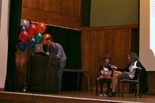
The playful10 conference was certainly as good as last year's: passionate speakers (ranging from comic book writers to hair dressers), intriguing topics (old jew jokes, item collections from badge to game controllers, Mad Men quotes, dead chicken, critics about gameification), good audience and cosy venue.

Some quick notes below about what inspired me:

In his introduction, Toby Barnes first claimed that "not all play is created equal" and that we need to go back again. To clarify this, he then pointed to H.G. Wells' classic victorian wargame books from 1913: "Little Wars" and "Floor games" with great quotes such as "the home that has no floor upon which games may be played falls so far short of happiness". or "How utterly we despise the silly little bricks of the toyshops! They are too small to make a decent home for even the poorest lead soldiers, even if there were hundreds of them, and there are never enough, never nearly enough; even if you take one at a time and lay it down and say, "This is a house," even then there are not enough". The importance of the floor (and other structures to play games) has also been re-asserted later on by another speaker who presented a project for racing games on sidewalks. Barnes' second point to start off the day was also that creating games is hard. Based on this tweet ("Deciding that games design is 20% fun, 80% frustration."), he showed that reversing the percentages is a matter of iterating (as suggested by Matt Locke), so "let's keep iterating".

Naomi Alderman discussed the problem of storytelling in video-games: "it's almost impossible to tell the player something about the character at the same moment you give him/her total freedom about what to do".

Paul Bennun, in his presentation about audio games, showed intriguing videos from loneconspirator. Based on this material, he described how audio games indeed make you look like a dork but the user is definitely "in flow". Audio games are just like any other games: some are good, some are bad. Eventually, when you get rid of the screen, you find yourself more free, have less constraints and it's because of how sounds work. As a matter of fact, the difficulty here is that sound can only be "in the moment" and this is why it's so immersive, especially for first person games.

Tom Muller unveiled inspiring examples of his work about graphic design and comic books. He basically showed the importance of typography in these fields and I quite enjoyed examples such as World's best robot, World war robot, Pop Bot and 24SEVEN, which seems to be tremendously interesting.

Development director at TT Games, Jonathan Smith worked for the production of LEGO Star Wars. In his talk, he claimed that game design revolved around a conflict finely described by Dr. Miller in the second episode of Mad Men (4th season):

"Faye Miller: Look, we're both in the same business. I'm not embarrassed to say. It's about helping people somehow to sort out their deepest conflict.

Don Draper: And what is that?

Faye Miller: In a nutshell, It all comes down to "what I want" versus "what's expected of me."

Freedom versus constraints. He showed that people who play video-games are not there to be indulged and that they want to be "directed by the system". They want to find the boundaries and the rules through communicated affordances. The game designer creates an awareness of the permitted possibilities... to create play.

Then Sebastian Deterding gave an insightful analysis of "gameification and its discontents". He started by asserting that there's a disease currently on the web: the "badge measle", i.e. the pervasive presence of rewards such as badges. These are being given for tons of reasons ranging from posting a blogpost to watching a TV channel. It is as if points and other rewards were given to achieve life goals. Deterding simply wondered about "what the hell is going here?". His critique focused on the idea that game mechanism are now perceived as a crunchy thing you can add to anything, a trend weirdly called "gameification" and propelled by game designers, "talking heads" and - worse - service vendors.

He followed on this by addressing what is wrong with gameification:

  • Confusion 1: games are not fun because they are games, they are fun because they are well designed! Sturgeon's Law "Ninety percent of everything is crap"
  • Confusion 2: rewards are not achievements, this is just bad psychology. Vendors who sell this have a Pavlovian model in mind. "it's so 1940" as Deterding said. He exemplified this by showing a game on which there's big button called "earn 1,000,000,000,000 $" on which you can click and win. Based on the reward model, this would be the best game. As described by Raph Koster, "fun in games arises from mastery".
  • Confusion 3: competition is not for everyone!

The problem is also that gameification also has side-effects: it creates unintended behavior, people game the system and it messes with implicit social norms.

When people take gameification too directly, they generally miss that games are about: fictions, make believe, talk, and freedom to play ("whoever plays plays freely, whoever must play cannot play!"). Playing = "as if" and playing is fun because of the autonomy. As shown on Deterding's slide below, this is the difference between work (a spreadsheet) and play (Eve On-line):

After this, Bertrand Duplat from Editions Volumiques showed some of the awesome prototypes they recently produced. And then I had to catch my flight missing the last speakers.

Lessons learned from studying Nintendo DS appropriation

A Nintendo DS attached to a luggage encountered in Marseille the other day.

Some excerpts I found interesting from a user study about the Nintendo DS appropriation by kids written by J. Alison Bryant, Anna Akerman, Jordana Drell:

"handheld gaming systems, and particularly the Nintendo DS, are coveted entertainment devices. As older children in the household “graduate” to newer versions, the younger members of the household inherit their old systems. This opens up the opportunity to create games for the younger audiences, particularly preschoolers. (...) Preschoolers cannot read, which means that all instructions need to be in voiceover and include visual representations. (...) Text instructions take up minimal memory, so they are preferable from a technological perspective. Figuring out ways to maximize the sound and graphics files we have while retaining the clear visual and verbal cues that we know are critical for our youngest players is a constant give and take. (...) Preschoolers may use the DS stylus or may use their fingers, or both! (Although they are not very accurate with either. (...) Although preschoolers do not have trouble holding the small stylus, they do have difficulty making small movements that require fine motor skills. This means that the “hotspots” for interaction within the game must be forgiving for them (i.e., larger). (...) While rhythm games seem ideal for the DS, and are very successful with older demographics, preschoolers find it difficult and frustrating to tap in a rhythm or on a beat. (...) The microphone is a big hit with preschoolers! They love to yell or blow into it and see the game respond. (...) Combining directional pad mechanics with stylus movements is a problem for young children. (...) Two-step processes (i.e., drag the item over here and then tap on it) are not as successful with preschoolers. (...) Preschoolers love immediate (and positive) responses to their actions (...) Replayablity is key with both parents and preschoolers. (...) Being able to re-use graphics or sound for new variations on a game is a good way to make the game feel “new” to the child."

Why do I blog this? Certainly useful material to be shown in my course about user research in interaction design. The findings echoes a lot with similar ethnographical exploration I conducted for a video game studio in the past. This sort of insights also have implications beyond gaming, there's a lot to draw from the paper about the research paper: methodology, implications for design as well as ideas for mobile computing services.

Into the night with Jason Rohrer + Chris Crawford

Yesterday, I watched the latest episode of the documentary series called "into the night" on Arte (the French/German television). The point of this series is to have two intriguing people and get them to talk to each other. In this episode, the conversation happens between the Indie game designer Jason Rohrer and legendary game designer Chris Crawford over the course of a day during the GDC 2009 in San Francisco.

The 52-minutes documentary shows Crawford and Rohrer playing and discussing different indie titles, show their approaches to one another, and wonder about the evolution of game design. There are some funny moments where the "old fart game designer" (as Crawford defines himself) complains that he has seen "everything under the sun" and that all the games today are "derivative or some old variation of hand-eye coordination"... but he admits that Rohrer's stuff is new and original. However, the overall impression is that both of them seems to be trapped... as shown by the uncertainty expressed by Crawford's difficulties with interaction storytelling or Rohrer's cluelessness about what to do in the future. Quite sincere indeed but a bit sad for the game industry.

Two aspects in the discussion struck me as important, with regards to my interest in game design. They're very short and maybe not that conclusive, but at least they surface interesting issues.

First, the brief conversation about space and game design is insightful. Crawford is interested in how Rohrer sees spatial metaphors. Rohrer shows an excerpt of Passage in which the player can choose to join a companion who appears in the game. Once you do that, you realize you can't get into certain spaces of the maze where two people won’t fit. Rohrer defines it as a spatial trade-off. Crawford then wonders: "What is most important about your approach... you're taking out the spatial navigation, which is always done too literally and you turn it into a metaphor and explore what kind of metaphor can be created. How far do you think it can be pushed?". Rohrer then describes why he is so much interested in 2D games (as opposed to 3D) showing how the level of Pacman enables to see the whole environment (in contrast to FPS in which you only see what is around you).

Second, I find important that these two game designers are interested in interaction rather than glossy graphics ("graphical sugar"). As claimed by Crawford: "the entertainment lies in the interaction, not the presentation... you have to make the interaction entertaining, it should influence your experience (...) I am very dismissive of the techie approach to game design (...) Do not be prescriptive, be descriptive".

Why do I blog this? quick summary of what I felt when watching this documentary about game design... from a standpoint that can be seen as an alternative to mainstream video games. The uncertainty expressed by the two designers here is stunning and left us wondering about the possibilities for the future.

Joypad memory game

The game controller project moves slowly but we're definitely onto something. We'll release soon an iPad/iPhone application that would correspond to a visual corpus to all the joypads. Each pair of pages will describe one of the 42 official joypads along with various data: date, brand, corresponding console, total surface, action button surface, d-pad surface, connector pin type, wire length, weight, etc. But there's more.

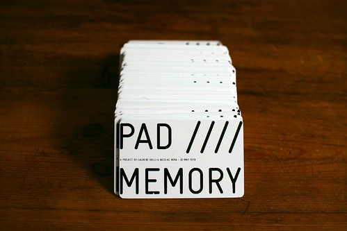
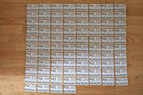
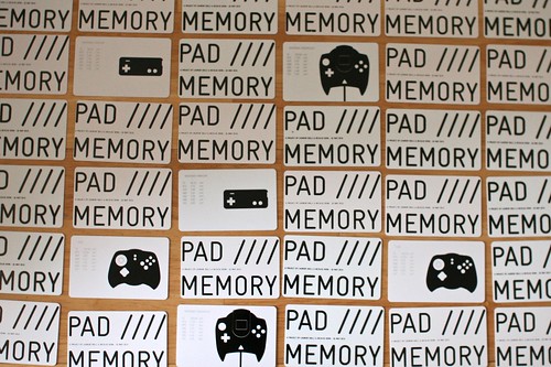
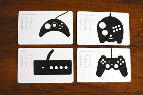
Given that Laurent Bolli had a curious machine that enabled us to print badges for participants at the Lift10 conference in Geneva, we repurposed it and create a Memory/concentration game with all the gamepad visuals we had. Each card features a graphical representation of the game controller as well as information about the joypad surface (total surface, action buttons, menu buttons, d-pad surface, etc.). A first prototype of the card game here:

More and more complex pedometer games

Pedometers connected to video-games are more and more complex, as attested by this Pokéwalker, a Poké Ball-shaped pedometer which can connect to Pokémon HeartGold and SoulSilver game cards via infrared signals. See the possibilities:

"It uses a currency known as "watts", which are obtained as the player walks with the device. Every 20 steps will earn the player one watt. It can communicate with other Pokéwalkers. Exchanges are not limited merely to watts, but also items and Pokémon

When players transfer a Pokémon from their game into their Pokéwalker, they can select which route they would like to take their Pokémon along. Depending on which route the player takes (such as in a grassland or by the sea), they will encounter different wild Pokémon and items. When players first begin their journeys with the Pokéwalker, the list of routes they can select from is short. But, the more players take a stroll with their Pokémon, the more routes will appear and the more Pokémon and items they will be able to get.

And you can get a more in-depth perspective in Katie Salen's article Pokéwalkers, Mafia Dons, and Football Fans: Play Mobile with Me. Why do I blog this? documenting material about tracking technologies and how game mechanics could lead to peculiar usage of such platforms.

Another apple "pad" grabbed my attention

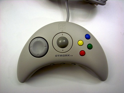
Yes, there's the iPad but it's a different Apple "pad" product that grabbed my attention. This morning, I received this morning a package from Honk-Kong with this curious gamepad that was designed for the Pippin, a console/multimedia platform designed by Apple and produced by Bandai back in 1995. Pippin was actually derived from the second generation of Power Macintosh computers. It was unfortunately a failure. Apple Bandai Pippin game controller Apple Bandai Pippin game controller

The game controller was called "AppleJack" (a name that eventually has been re-used because it's now a command line user interface for Mac OS X). White models like this one were called "Atmark" (for the "@" mark) and were only marketed and sold in Japan. What's curious here is that it features two interesting elements:

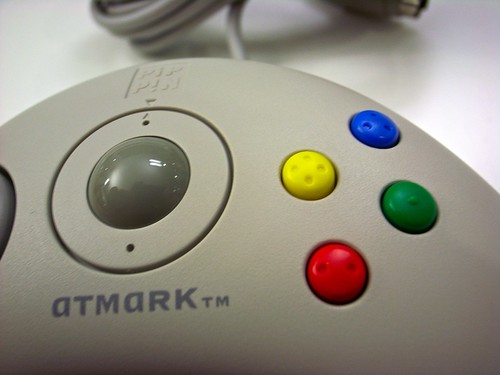
  • A centre built-in trackball, which is highly uncommon on game controllers (instead of a joystick)
  • Two front mounted orange select buttons designed to replicate the features of a computer mouse.

Apart from that it's quite common: boomerang-shaped, direction-pad on the left and four action buttons "laid out in the classic Super Nintendo diamond design + the button colors are a match for the PAL SNES controller" as pointed out here. What's maybe relevant in terms of design is the button shape with tiny braille-like dots to indicate the user which one he/she is using without looking at it.

Apple Bandai Pippin game controller

Another curious aspect is the fact that the Applejack controller was sold with a floppy disk that contains the "Applejack Software Developer's Kit" for editing the `pippin mapping resource, and an Applejack 2.2.0 system extension file. Which means that you could customize the `pipp' mapping resource of the Applejack input device drivers.

Why do I blog this? this pad goes straight into the collection/project about gamepad evolution. Although it was a failure, it's definitely an interesting artifact that tried to innovate (trackball!) and its "boomerang" shaped was also the one Sony showed as an early version of the PS3 controller. A sort of evolutionary dead-end to some extent because of the trackball.

Nintendo processes

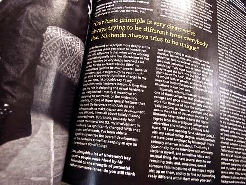
Interview of Myamoto Reading the video-game press is a rare occasion for me but this interview of Shigeru Miyamoto a funny piece during breakfast. Why? simply because it's interesting to hear about the design process (and HR) at Nintendo. Of course there are some elements that can be perceived as a bit cliché but I find intriguing to observe how they categorize their products, try to recruit people or how Myamoto defines his participation in projects.

Testing Sony Eyepet Augmented Reality

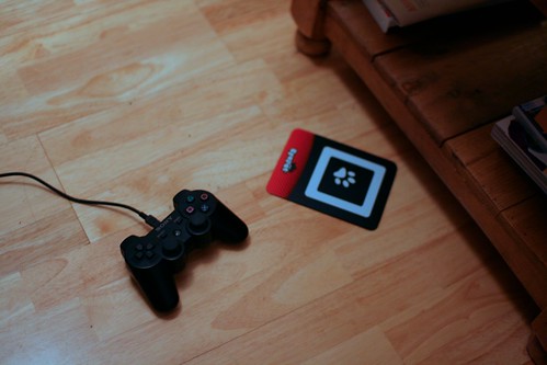
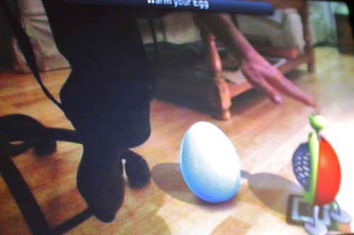
Eyepet gear Into testing Eyepet, a game for the PlayStation 3 that is based on Augmented Reality. It basically uses the PlayStation Eye camera to allow you to interact with a virtual pet and objects in the real world. The process is very straight-forward. You have this black plastic placard shown on the picture above with a white square and a paw-print on it that you carefully place on your floor next to your TV set. The PS3 Eye recognizes it (as well as the environment): your surroundings then appear on your TV. You can start fooling around with an egg that soon becomes a gremlin-like pet. The game mechanic is progressive and based on interacting with the virtual animal either by touching (I mean, moving around in front of your TV that see on the screen what you're touching) OR by using virtual objects by holding the card (which has a symbol that is recognized by the system and make the digital item appear on the screen). See for example the following case:

Eyepet Here I am, trying to activate a heater to warm-up an egg. The point is to push the lever below the pink arrow.

Eyepet Pushed, now I can warm the egg.

The gesture-based interaction works pretty well, especially when using virtual items. However, what is definitely tough here is that you have to act in front of your TV in a mirror-way: moving an object on the right (on the screen) requires that you move your hand on the left. This reversed-then-flipped mirror image of your room is a bit disorientating for me; i guess it may be difficult for kids as well. In the preliminary gameplays you need to make your pet jump several on a trampoline, so you really need to be accurate when you move it around so that the pet doesn't fell down on your floor. That being said, I found intriguing to have this sort of setting where you make gestures in the physical world and you access some sort of mirror-world on the TV. I do think however that game designers could play more on that trick.

There is also an impressive feature that enables you to draw things on a sketchbook... which are then translated into virtual items in the game. You draw a picture, hold it up in front of the camera and the system will try to copy it (it only works with good lighting conditions).

Why do I blog this? My interest in this sort of things is connected to by my research about interaction design and my interrogations about the role of uselessness in robots/networked objects.

Of course it's a bit frustrating (game mechanics are quite basic, loading times are long) but there are really some interesting interaction ideas in there. I am personally not sure about the virtual pet thing (why does those thing ALWAYS have to look like boring gremlins?) but this is an interesting step in the evolution of virtual/digital interlinkages.