Adaptive street infrastructures

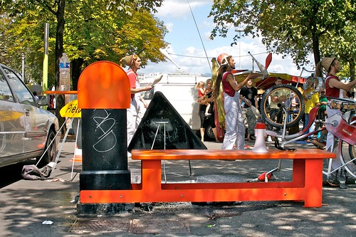
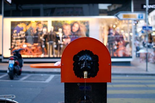
Adaptive water interface Several occurrences of adaptive street interface encountered in Geneva this summer. The street fountains has been accommodated with either a little table (above) or both a little table and a bench (below) with a bright orange color. I assume it's meant to encourage the street life/gathering around fountains.

Add-on

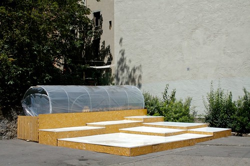
Another example below: a street garden device made out of wood

Guerilly gardening

Why do I blog this? interest towards how the existing (hard) infrastructure can be complemented by other add-on devices that can enable new behavior (gardening) or facilitate existing ones (gathering). It's interesting to think about how to start from existing elements and not go directly for a new artifact.

Besides, I also like the temporarily aspect of it: the orange steel devices seem to be limited for summer use. Different seasons, different objects.

Robot exhibit at the Design Museum in Zurich

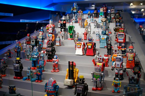
Robots Went to Zurich last wednesday, for the robot exhibit at the Design Museum. Called "Robots - From Motion to Emotion?", it is meant to give an overview of robotic research, with a presentation of robot highlights (ASIMO, nanorobots or the robotic jockey) as well as addressing issues such as: why robots are accepted or rejected and what characteristics determine the relationship of people to machines.

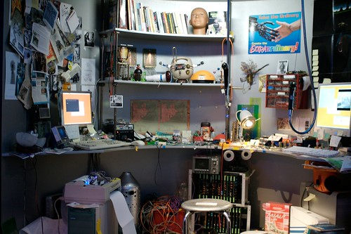
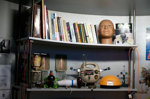
However, the part that I attracted my interest was the weird desk of a robotic designer: Robot designer desk

It's actually a "staged mess" that may be supposed to show how robot design is grounded into specific references (books, picture, newspaper clipping), artifacts (computers, electronic and electric tools) and prototypes. Unfortunately, this part was documented. I was thus left out with my own musing when examining it. If you look at the books in the picture below, you can see that the references that has been chosen ranges from "The Buddha in the robot" to "Y2K or "Action perception" and Charles Stross's "Singularity". Don't know what lead to this choice but there were also different pieces by Asimov that I haven't captured. Obviously the bible for robot designers/fans (that said, I am often mesmerized by the preponderance of Asimov in this field, there might be a lot to do in terms of Non-Asimovian robot design, as Frederic highlighted already) Robot designer desk

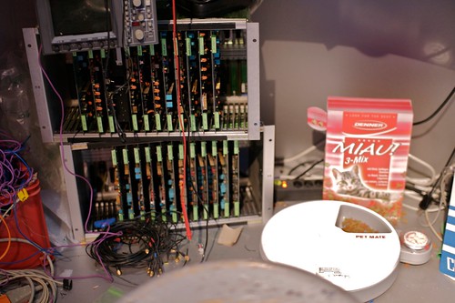
The office floor interestingly features cat food and a cat food dispenser, which may account for the importance of animal proximity in the robot design process. Perhaps some sort of hint to tell us to what extent creating a bot needs a metaphor from living beings: Robot designer desk

Why do I blog this? the whole exhibit gives and interesting overview of the robot scene but I was a bit disappointed by the design/art part since there's a lot going on this field. For that matter, it was a bit conservative. And as usual with robots, there is always a strong emphasis on locomotion as opposed to other characteristics of robots that I would find more intriguing to explore (agency, learning from the history of interactions, networked capabilities, etc.).

Pacman maps

Been stuck into Pacman maps and cartographic representations lately, as the one above (that represents the "strawberry and first Orange" levels. I found the one above at this Unified Resource Locator when practicing random combinations of keywords on the Google (an activity I often carry out with a keen interest).

I do not really know why but they seems highly peculiar and remarkable, perhaps as a seminal depiction of video game levels; in other words, one of the most important (and early) representation of a digital environment based on a metaphorical grid (Not to mention the 256th "split screen" special).

Beyond this map metaphor, what is also intriguing is the solution possibilities, which are based on the fact that Pacman works on a deterministic but not random. What I mean here is that the opponents you have to escape from have very specific kinds of behavior. Each ghost has a specific role (chaser, ambusher, fickle and stupid). As explained on the Wikipedia:

"enabling experienced players to devise precise sequences of movements for each level (termed "patterns") that allow them to complete the levels without ever being caught. A later revision of the game code altered the ghosts' behavior, but new patterns were soon developed for that behavior as well. Players have also learned how to exploit other flaws in the ghosts' behavior, including finding places where they can hide indefinitely without moving, and a code bug occasionally allows Pac-Man to pass through a non-blue ghost unharmed. Several patterns have been developed to exploit this bug. The bug arises from the fact that the game logic performs collision detection based on ghost / Pac-Man occupancy of grid squares, where the grid squares are large relative to the size of the characters. A character occupies (for collision detection purposes) only one grid square ("tile") at at time, despite its graphic depiction overflowing to another tile. If a ghost and Pac-Man switch tiles with each other simultaneously (which is not a rare phenomenon, because the tiles granularity is large), a collision isn't detected"

The solution is about finding patterns about the grid and artifacts' behavior, which is something some players understand and some others never get. At least, some who did, took some time to get it or were told to spot a pattern.

Why do I blog this? Pure curiosity towards this historical piece of culture. There must be something to nail down here about Pacman's grid (and players' behavior) as a metaphor/vehicle for discussions nowadays about the advent of augmented maps. We all know the cartographic representations updated in real-time (or in a more asynchronous way) and based on the aggregation of digital traces. Mapping the use of cell-phones for instance to highlight urban activities with a platform such as Citysense.

To what extent the "instant maps" based on the collecting of digital traces will require users to perform the same pattern analysis than Pacman maps? Should it be like them? different? How can we formulate the difference and help users to spot patterns?

But wait. What is pattern anyway and why do we need to reveal them to people in the first place?

Hamel and Prahalad's take on failures

Generally, I do not read so much of business books but I wanted to have a glance at "Competing for the Future" (Gary Hamel, C. K. Prahalad) because it deals with issues I am interested in: futures and the importance of foresight research. Although the vocabulary is idiosyncratic and turned to a certain category of people ("managers", "leader"), there are some interesting parts. More specifically, I was of course curious about how the authors dealt with "failures", a research topic I came to cherish for a while. Some dog-eared pages excepts below.

First about what constitutes a failure, p.267:

"Verdicts of new product failure rarely distinguish between arrows aimed at the wrong target and arrows that simply fell short of the right target. And because failure is personalized - if the new product or service doesn't live up to internal expectations it must be somebody's fault - there is more often a search for culprits than for lessons when initial goals are not reached. Even worse, when some salient new facts comes to light as a result of market experience, the manager in charge is deemed guilty of not knowing it in advance. With risk so often personalized, it is not surprising that when failure does occur, there is often a race to get the body to the morgue before anyone can do an autopsy. The result is a missed opportunity to learn.

Not surprisingly, if the personal price of experimentation is high, managers will retreat to the safety of test-it-to-death, follow-the-leader, do-only-what-the customer-asks-for conservatism. Such conservatism often leads to much grander, though less visible failures. (...) Failures is typically, and we believe wrongly measured exclusively in terms of dollars lost rather than dollars foregone. In which traditional US computer company, for example, has a senior officer lost his or her job, corner office, or promotion for surrendering leadership in the laptop computer business to others? Managers seldom get punished for not trying, but they often get punished for trying and coming up short. This is what promotes the obsession with hit rate, rather than the number of hits actually generated."

And further out, p.268:

"Failure is often the child of unrealistic expectations as it is of managerial incompetence. (...) IBM0s ill-fated first attempt, in the late 1983, to enter the home computer market with PC jr. Widely criticized for having a toylike keyboard and for being priced too high, the PC jr. was regarded by both insiders and outsiders as a failure. Yet at the time, it would have been difficult for anyone to predict exactly what product would appeal to home users whose computer experience to date withe home computing was likely to be playing video-game on an Atari or Commodore. The real failure was not that IBM's first product missed the mark, but that IBM overhyped its entry and was thus unable to find a quiet refuge from whence it could relaunch a calibrated product. (...) The point is not that the ambitions of IBM were too grand, but rather that what constitutes failure depends on management's initial assumptions about how quickly and easily success should come."

Interestingly, given that the book has been written in the 90s, there are some striking examples that are brought under scrutiny... and which eventually makes a lot of sense today. See for instance the iphone/newton resurgence:

"If the opportunity is oversold and risks under-managed, failure and premature abandonment of the opportunity are preordained. Overhyping damaged Apple's early experiment with handwriting recognition in the form of the Newton Message Page. While the Newton was a failure in terms of Apple's optimistic predictions, it may not be a failure in the longer-run battle to create a market for personal digital assistants (...) this is partly the price of being a pioneer. (...) Thus one can't judge success or failure on the basis of a single product launch"

And, of course, there's a short part about how to spot one's failure on p.270:

"it is, though, a mandate to learn when inevitable setbacks occur. When a product aimed at a new market goes astray, management must ask several important questions. First, did we manage the risks appropriately or barge in like a bull in a china shop? Second, did we possess reasonable expectations about the rate at which the market will develop? Third, did we learn anything that will improve our chances on the next attempt? Fourth, how quickly can we recalibrate and try again? Fifth, do we believe that the opportunity is still for real and does its size warrant another attempt? And sixth, if we don't try again, have we just taught our competitors a valuable lesson that they will use to get to the future ahead of us? Failures should be declared only if the answer to all these questions is no."

Why do I blog this? working on the outline of the next book leads me to collect material about failures and their importance in foresight/design. These excerpts come from a very business/management sciences angle but they bring interesting aspects to the table that I will quote and re-use.
Outdoor television

Protection for outdoor TV Watching television outdoor often requires some sort of bricolage... such as this TV encountered in Omalos, Crete. The cardboard piece is an easy-but-convenient way to manage to see the images when the sun if glowing a bit too much.

7 qualities of "responsive environments"

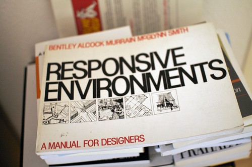
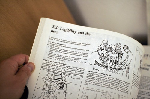
Responsive environments Awesome encounter the other day at the flea market in Geneva: Responsive environments: a manual for designers by Sue McGlynn, Ian Bentley, Graham Smith (1985). I bought it right away and started perusing this interesting compendium of urban design principles. Very practical and straight to the point, exemplified with illustrations and drawings, it shows how to crate environments that do not alienate but offer comprehensible, friendly and controllable places.

The whole book is about this:

"The design of a place affects the choices people can make, at many levels:

  • Permeability: where people can go and where they cannot.
  • Variety: the range of uses available to people
  • Legibility: how easily people can understand what opportunities it offers
  • Robustness: the degree to which people can use a given place for different purposes.
  • Visual appropriateness: the detailed appearance of the place make people aware of the choices available.
  • Richness: people's choice of sensory experiences
  • Personalization: the extent to which people can put their own stamp on a place."

For each of these, there are interesting assignments such as doorstep interviews or probing people at street corner with peculiar photographs: Responsive environments

Why do I blog this? surely some insightful material to chew on, will try to spend more time on it and connect these thoughts with Dan Hill's discussion of hackability and design. So far, I like how the book offer interesting models that can go beyond architecture or urban planning.

Personal informatics instances

Walk with me Playing with personal informatics' devices lately. Such as Walk with me or On Life.

On Life

Walk with me enables you to track and monitor your daily walking routine, set certain goals, rate your day, etc. Onlife is meant to observe interactions with digital services (such as your web browser mailer, IM client, etc.). The two of these services belong to a category of applications called "personal informatics" that track people's daily activities to eventually allow them to modify their behavior based on trends. Of course, there are plenty of others. Some are more well-known than others.

Why do I blog this? The two aforementioned examples are interesting as they reveal some patterns that people may not have noticed but two things struck me as important:

  • Both examples depict a sort of limited visualization of the traces that has been collected. In these two examples the information architecture is very similar (though it represents various things on the y axis) and the Gantt-like aspect could be replaced by other metaphors.
  • The overemphasis on quantification: in Walk with Me, most of the stuff here is about counting the number of steps, it allows to see accumulations (per day, etc.), cycles and holes during your days. However, life's more than quantification, there are single and non-repeated events that can make sense to (weak signals coming from nowhere) and I wonder how they could be taken into account with a certain weight. To some extent... how the quality of traces could be more elaborate and not just represented with a scale. Let's explore this more thoroughly

Retro-computing

People interested in retro-computing (i.e. the use of early computer hardware and software today), may want to have a look at 101 Project: an independent creative platform to collect memories and archives in order to develop a documentary film. Selected at SIGGRAPH, it is a kind of collective memory incubator that will be first of all part of the film and it will live also apart and after the film as a web platform.

It's possible to start dropping your memories here.

Lift Asia is coming

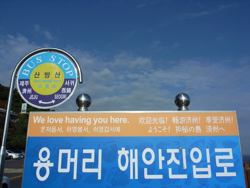
Right after the Lift Marseille edition, we had to get back to our pen and pencils to build up the upcoming edition in Che-Ju (Korea). The event is taking shape with "Serious Fun" as a theme. Make not mistake, the point of the conference is definitely not to address serious games but rather to adopt the following perspective:
"The Internet started as platform for academics, then it became a huge business platform. Now it is an entertainment playground for users. People spend time having fun on the Social Web, access virtual worlds on their cell phones or interact with robots and networked objects.

Now we believe these services and platforms go far beyond mere leisure: their usage may reveal new social practices that will spread in other contexts (business, education), and the services first targeted at entertainment can lead to original innovations. This year's Lift Asia will focus on the lessons we can draw for fields such as innovation, sociology, management, business, design and education"

We already have a speaker roster with people such as Adrian David Cheok (Mixed Reality Lab, Singapore), Benjamin Joffe (Plus Eight Star, China), Julian Bleecker (Nokia Design, LA), Kohei Nishiyama (CUUSOO, Japan), Minsuk Cho (Mass Studies, Korea) or Rafi Haladjian (Violet, France) and others.

We love

A side note for swiss entrepreneurs who may be willing to join, we organize again the "asia venture trip" that help start-ups develop and promote themselves on the Korean Market, meet potential clients, suppliers, partners, or investors. Last year we had the likes of Poken, Arimaz, KeyLemon, Secu4, Lighthouse, Pixelux. It resulted in more than half the start-ups developing strong ties with the country of the morning calm, some finding new clients, others new suppliers (especially if you work in electronics or robotics). Look at the call for project and send us your application!

Upcoming piece about the asynchronous city

Julian Bleecker and myself are putting a final touch to a pamphlet entitled "A synchronicity: design fictions for asynchronous urban computing" in the Situated Technologies series. Here's the blurb:

"Over the last five years the urban computing field has increasingly emphasized a so-called “real-time, database-enabled city.” Geospatial tracking, location-based services, and visualizations of urban activity tend to focus on the present and the ephemeral. There seems to be a conspicuous “arms” race towards more instantaneity and more temporal proximity between events, people, and places. In Situated Technologies Pamphlets 5, Julian Bleecker and Nicolas Nova invert this common perspective on data-enabled experiences and speculate on the existence of an “asynchronous” city, a place where the database, the wireless signal, the rfid tag, and the geospatial datum are not necessarily the guiding principles of the urban computing dream."

Due for September 2009. A sort of updated version of near future laboratory thinking that builds upon various projects, discussions (and partly going beyond material from my french book). Stay tuned.

Correlation != cause and effect

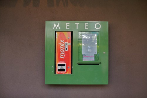
Cluster of services Definitely an awkward combination of services encountered in Chamonix last week: the weather board has been combined with a condom vending machine and a letter-box. As written on the green thing, the "Meteo" box (which means "weather" in french) is a curious cluster.

I take it as an example to express that correlation (i.e. a connection between two or more things) DOES NOT mean causation.

Granularity degrees of "nearby"

Easyjet recommandation Travelling very often in different european cities, I am always curious about Easyjet place recommendation to observe what sort of advices they bring to the table and how they renew their propositions over time.

Easyjet recommandation

One of the feature that interest me is the "Escape" part, the quick description of how to go out of the city you just landed and what sort of magical things you can discover in the surroundings. I generally look at various cities (Paris, Lyon, Geneva, Lisbon, Milan, etc.) and am sometimes struck by the granularity of the "escape" range. Sometimes, most of the time I should say, the recommendation is to visit something nearby. The term "nearby" or "vicinity" is not stated, yet it's the basic assumption of the "escape paragraph". Like you're in Paris and one recommend you a quick hop to Eurodisney, not my thing but it's fair enough, it's quite close in termes of mileage (kilometers for the metric readers).

However, there are sometimes exceptions. In the example shown form a recent Easyjet trip, the description of the city of Lyon is filled with "escape" notes about the possibility to visit Camargue. Surely a nice place that I explore from time to time, but definitely not perceived as "nearby" from the continental europe standpoint... given that you must at least drive 3 hours from Lyon to get there.

Why do I blog this? This is definitely no big deal but it strikes me as revealing to what extent representations of "nearby escape" can be perceived. There is clearly here a gap between the writer's mental model and reader's representations. Of course, there is not just one type of reader and it may matter to escape from Lyon and go to Camargue. What is at stake here, and it's a must-have question for location-based services designers, is the notion of spatial granularity which needs to be taken care of. Let me reformulate it here: if you want to provide people ("consumers") with location-based information about what is relevant in the vicinity, how can you make sure what is hidden behind the term "in the vicinity" or "nearby"?

Failure(s)

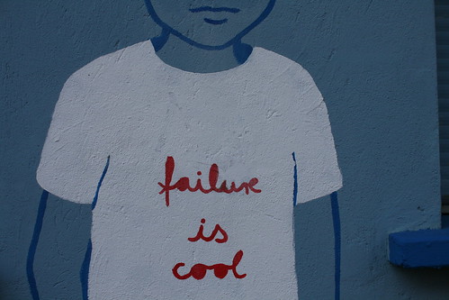
failure is cool According to the thesaurus I use:

"Failure:

Definition: lack of success

Synonyms: abortion, bankruptcy, bomb, botch, breakdown, bungle, bust, checkmate, collapse, decay, decline, defeat, deficiency, deficit, deterioration, downfall, failing, false step, faux pas, fiasco, flash in the pan, flop, frustration, implosion, inadequacy, lead balloon, lemon, loser, loss, mess, misadventure, miscarriage, misstep, nonperformance, nonsuccess, overthrow, rout, rupture, sinking ship, stalemate, stoppage, total loss, turkey, washout, wreck

Antonyms: accomplishment, achievement, attainment, earnings, gain, merit, success, win"

Why do I blog this? writing a paper about design research and failures, looking for inspiring material and vocabulary.

Swiss post box: from the material to the physical

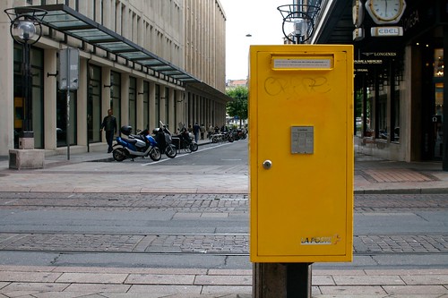
La Poste Another one about post-related issues: the swiss Post just launched a new service called Swiss Post Box: the "electronic equivalent to your regular physical mail box".

It allows subscribers to receive scans of their unopened envelopes by e-mail message and then decide which ones they want opened and scanned in their entirety, to be read or achieved online (or "shredded"). You pay a monthly fee and you get a a set number of scans, at least one address for free and long-term archiving. There's even a connection with a Miles program for flights.

An interface detail that struck me as curious too is the fact that the interface is only in english, which gives an interesting hint about the target groups of these services.

Why do I blog this an interesting service at the crossroads of the digital and the physical. I am pretty sure there could be lots of possibilities in terms of applications based on this kind of platform, both in terms of personal information management and less utilitarian purposes.

Besides, It's intriguing to think about the implications in terms of need to have letters/mail in material format and the importance of physical space. Concerning the importance of paper, I'm curious to see how people would be react and what sort of routine can be put in place to choose between what should be sent online and what should be kept (and when because there are obviously lots of exceptions). Now about space, as the NYT piece puts it "There’s a huge amount of infrastructure", the letters will no longer sit in a shoebox under your desk but they will be stockpiled in huge data-warehouse here and there, a sort of add-on to the post buildings. Eventually, it may also change the Post's general process which are based on flow and less on accumulating data. I don't mean here that Postal services never had to deal with keeping things but the scale may change with this sort of innovation.

User participation

Out of order A basic occurrence of user participation, taking the form of a rough message that indicates this stamps machine is broken. User-generated content if I may use this term.

This sort of activity has been taken as potentially transferable to digital interfaces. Think, for instance, about GPS devices that allow people to send over some updates concerning traffic jams and constructions (and sometimes send fake information about non-existing constructions only to prevent other persons to use certain routes). A topic I address yesterday on the french radio "France Culture" (podcast here, french only, sorry about that).

Causes and symptoms of failures

Perusal My interest in failures (as attested by my Lift09 speech) led my peruse "Anatomy of a Failure: How We Knew When Our Design Went Wrong, and What We Learned From It" (by William Gaver, John Bowers, Tobie Kerridge, Andy Boucher, Nadine Jarvis) with attention.

The article is a case study that examines the appropriation (or the wrong appropriation I should say) of an home health monitor device. The authors identify what they call ‘symptoms of failure’ that touches 4 themes: engagement, reference, accommodation, and surprise and insight. They discuss theses reasons of failures by looking at three different angles: (1) problems particular to the specific design hypothesis they had, (2) problems relevant for mapping input to output more generally, and (3) problems in the design process they employed in developing the system.

An interesting aspect in the paper is the must-have definition of what constitutes a failure:

"Approaches to evaluating interpretive systems such as the sort we describe here tend to focus on how to go about gathering suitable material for assessment, but avoid discussing how success or failure might be determined. For instance, Höök et al. based their evaluation of a system on analysing the conversations that groups of people had on encountering it. Others seek alternatives to verbalised judgements to capture more intuitive and sensual aesthetic and emotional responses. Finally, others advocate gathering multiple forms of evaluation from a variety of perspectives, including those of ‘cultural commentators’ such as journalists or filmmakers. Opening out evaluation to multiple voices and new forms of expression in these ways reflects the multiple interpretations afforded by the class of systems in which we are interested. On the other hand, these approaches can invite a kind of relativism from which it is difficult to draw firm conclusions. (...) we propose features of user engagement as being reliably symptomatic of success or failure, (...) we describe the symptoms of success and failure that emerge from a comparison of the unsatisfactory experiences observed in this field study with more rewarding deployments of other systems in the past."

The authors then go on with a description of their system (the "Home Health Monitor") with an account of early field trials that serve as a sort of baseline against which they compare the results from a field study. What is important to my research here is the description of how the system failed in conjunction with certain behavioral indicators they did not find:

  • Engagement: Beyond any explicit declaration of liking, we take as evidence such things as an enthusiasm about discussing the design and their experience with it; persistence in use and interpretation over time; suggestions for new enhancements that reflect our original design intentions, showing the prototype to friends.
  • Reference: the tendency for volunteers to discuss successful prototypes through reference to other technologies or experiences that they like.
  • Accommodation: the degree to which people accommodate successful designs to their existing domestic activities and rhythms
  • Surprise and Insight: successful systems are those which continue to occasion new surprises and new insights over the course of encounters with them. For instance, new content might appear, or unfamiliar, potentially rare, behaviours might be observed, and this might give rise to new perceptions of the system or the things it indicates. Equally, people may find new meanings for relatively rich but unchanging experiences. Of course, surprise and insight are neither properties of the system per se nor of the people who use it, but instead characterise the relationship between the two.

These were the symptoms of failures, which should no be confused with potential reasons of failure. The authors also contrast early trials results to the field study to get a grip on the causes that are quite specific to their design.

Why do I blog this? pursuing my work about failures here, gathering material about design issues with regards to failures for publication ideas. This piece is highly interesting as it shows how field research may help to uncover symptoms and causes of failures. Surely some good content to add to my lists.

Telescope to see leaves

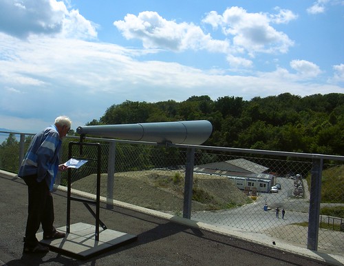
Installation in Lausanne This huge tube that looks like a medieval bull horn is one of the installation from the Lausanne Jardins project (Lausanne garden), which is a series of devices located here and there in the city that aims at renewing the relationship to nature.

The piece above is called "Dentelles" ('lace' in english) and it has been designed by Aline Juon, Florine Wescher. It's made of 3 telescopes that target a nearby forest (yes, in Lausanne) which used to be much closer to the city in the past. These devices have been created as a invitation for passers-by to observe the detailed elements of trees, and eventually notice this fragile urbanization boundary as a "lace".

Why do I blog this? the gigantic size of the devices struck me as fascinating when I came past. Observing the trees through the lense is intriguing as it leads to a very detailed representation of leaves, as if you were close to nature (like it used to be in the past in this neighborhood). Unlike lots of devices which are meant to make visible phenomena that are invisible, this piece aims at bringing things closer, which is also an interesting goal.

It looks like a sort of macroscope (big size of the device) but it's closer to a microscope.

Nametagged

Alex This name-tagged hooded that I ran across yesterday morning reminded me of Aram Bartholl's WoW project. The fact that this kid walked around with his first name written on his clothe seems to be a curious phenomenon; although, it's perhaps not his name (is there a brand called "Alex"? or is it some sort of movie star I am not aware?).

Assuming that's this is the teenager's name, displaying one's name publicly like this denotes a shift in identity and privacy perception that is very well addressed in Bartholl's WoW project:

"[in World of Warcraft] Each player is represented by an individual avatar, which is given an unalterable name that by no means corresponds to the real name of the player but serves as a clear means of identification in the online world. This so-called nickname floats above the avatar’s head and is constantly visible by all other players. There is no anonymity for the avatars themselves

The WoW project takes this mode of publicizing players’ names that’s typical of online 3D worlds and transfers it into the physical domain of everyday life. Participants of the WoW-workshop will be able to construct their own name out of cardboard and then parade around in public with it hovering above their head. What happens when a person’s customary anonymity in the public sphere is obliterated by the principles operative in virtual worlds online?"

Why do I blog this? A street encounter like this led me to get back to Bartholl's project and wonder about the display and projection of identity in physical space. I did not want to mean that there is a direction relationship between the kid's hooded and online habits. However, I found intriguing to see how this sort of MMO interface can echo with existing physical artifacts' design: there are already some instances of people wearing and displaying their identity in the material space. Of course, the "conference badge" and name tags is a common one but the hooded example here is even more curious as it's a more opened (and less formal) context.

Another instance of such observed in Montreux this afternoon: Name tag