User Experience

Things disclose a world, also when they break

In "What Things Do: Philosophical Reflections on Technology, Agency, And Design", Peter-Paul Verbeek writes that:

"Things, in short, disclose a world. (...) But that this is so, according to Heidegger, generally appears only when a handy or ready to hand tool or piece of equipment breaks down. When this happens, the tool suddenly demands attention for itself. The reliable dealings we are used to having with the tool are ruptured, and instead of withdrawing from our attention the tool suddenly forces itself upon us. Someone sits at a word processor focused on the text at hand and all of a sudden the computer freezes. The trustworthy world that developed around the computer – the open book, the keyboard, the screen, the cup of coffee; in short, the entire mutually referring network that Heidegger calls a world – is abruptly destroyed. The computer changes from being one of the handy or ready-to-hand that shape this world to what Heidegger calls something vorhanden: ‘objectively present’ in the newer translation, or ‘present-at-hand’ in the older. Its transparency is transformed into opacity. (...) Only when it starts up again and everything works without a hitch is the world that was destroyed again restored."

Why do I blog this? accumulating notes and insights about issues regarding people's experience of infrastructure for a project about electricity and the internet of things. The topic of breakings and failures is of course a long-time favorite, somehow linked to my fascination towards breakdowns. Beyond this, what I find important here is how to take that sort of unexpected issue into account in the design process, as well as investigating the range of people's reaction. Having a sort of typology (failures reactions) can be a good start.

What, How, Why automation

In What Should be Automated?, Matti Tedre discusses the fundamental flaw in the debate around automation. The question should not be "what should be automated?" but instead "How can one automate things efficiently and reliably?", which then shifted to "why things should be automated?":

"since the 1980s the focus in computing research has been gradually broadening from the machine and automation toward how and where computers are used, the actual activities of end users, and how end users collaborate and interact (...) Neither the theoretician's question "What can be efficiently automated?" nor the practitioner's question "How can processes be automated reliably and efficiently?" include, explicitly or implicitly, any questions about why processes should be automated at all, if it is desirable to automate things or to introduce new technologies, or who decides what will be automated."

Why do I blog this? preparing a presentation about failed futures, including some elements about the problems caused by "automation". The author of the paper argues that the shift from what to how/why lead computing researcher to a situation where they really have to pay attention to " the needs, wants, hopes, expectations, wishes, fears, concerns, and anxieties that people have regarding technology".

Spectrum range and human activities

This colorful diagram depicts the allocations of frequencies of the electromagnetic spectrum in the US. It's stunning to see how revealing the comparison between different media/communication system and the spectrum range they "inhabit". For instance, blue is “tv broadcasting". Navigation is very present too.

Why do I blog this? Lots of stuff to analyze with these inscription, it's intriguing to see what you can draw in terms of social organization (as well as assumptions about society) from technical diagrams like this. A nice exercise for the bored reader, try to find 3 hidden patterns about human activities in this representation.

On a more user-centric angle, see also “the bubbles of radio”.

Spontaneous kid play activities with cell-phones

Yet another interesting reference for a project about children and mobile gaming devices (ranging from the Nintendo DS to cell phones): In the hands of children: exploring the use of mobile phone functionality in casual play settings by a swedish team of researchers: Petra Jarkievich, My Frankhammar, and Ylva Fernaeus (taken from the Mobile HCI conference 2008). The paper reports the results of a field study concerning swedish kids (10-12 y.o) and their use of mobile phones in indoor and outdoor settings. The authors mention that they were interested by unsupervised social play and "spontaneous play activities" taking kids as a particular use case of mobile devices target. The locus of their study was therefore peculiar: situations where children were able to play fairly undisrupted for a longer period of time, and in explicit social settings. This is why they chose play centres located in parks. In terms of methodology, it's a mix of observation and kids interview (focus groups) about cell phone usage over the course of 6 weeks.

A quick overview of the results (although reading the whole finding section is very important to get the sense of what happens):

"The first general observation concerns the dual nature of the phones; simultaneously being serious and important communication tools for parents, as among the children being treated and valued primarily as resources to act locally in the group (...) Sharing media content was one of the key activities that we observed and seemed to play a central role in these respects, where individual ownership of the media content was assessed and valued largely based on its social context. (...) Our second general observation has to do with the skills that the children displayed at using the different features of the technology, and how these were constantly appropriated in a variety of ways. Existing physical play activities were sometimes altered and expanded to suit the technical resources, and the discovery of new functionality also inspired entirely new play scenarios. The children thereby also made use of functions in the phones to do things that these functions were clearly not intended for. We also observed several ways to overcome, and even make use of, the technical limitations of the devices. This suggests that children at this age put much value into the freedom of creating their own play scenarios, as a way to make meaningful use of the technologies at hand. (...) Our last more general observation is related to the long-established worry that computing technology may make children less physically stimulated, often favouring passive forms of learning, and how it has tended to force children’s play environments to move indoors."

And the following "implication for design" is also intriguing:

"some of the most meaningful and interesting technical functions were those that allowed users to invent and develop their own activities. We see no reason to suspect that this would not be a much appreciated feature also among adult users, at least in certain settings"

Why do I blog this? accumulating material about kids and mobile devices for a client project about mobile gaming. I am preparing a field study about that topic and try to get both methodological/results from other researchers. Reading the findings also worth it as it shows mobile phone usage is articulated with kids games such as 'cops and robbers'.

Jan Chipchase @ LIFT Asia 2008

In this session, focused on mobile technologies, the first speaker was Jan Chipchase. His "Future Social" presentation relied on examples of technology use behaviors to show trends that both disrupt these behaviours and generate new social practices. He basically used cases from his field study and personal experience. Example 1: In a study about how people react to head mounted displays in Tokyo and New York, they hired actors to simulate various use cases to test their social feasibility

Example 2 (Co-presence): people sit in a café, opened clam-shell cell-phone next to the tea mug, to check updates (messages, IM) and also for women sitting alone as a way of sending a social signal to others that they are currently occupied.

Example 3: mobile phone headset held in the hand for 2 purposes: cutting the microphone from ambient noise and tells other people that the person want to be quiet.

Example 4: in a UK café, the manager did not want people to use a laptop, if it's the case, the manager have different strategies to encourage people stop using it (cleaning next to the customer...). When people dot lots of things that are not appropriate, there's a lot of signage that is appearing. Signage is interesting because it shows where society wants to go and who defines authority

Example 5: secret use: it's common in Korea to see school kids watching mobile TV for example secretly with the phone in a case on their desk.

New trends based on Jan (and his team)'s work: - more and more of what we use if "pocketable" (fit in the pocket) carried into context where people do not necessarily anticipate their use. So it provokes behavior leakage from one context to another. So it leads designers from Nokia to ask within what time frame does what stuff become pocketable and what services can be accessible from that device. - serial-solitarity: it's always easier to design something for sole use rather than shared use (although there is a big buzz about youtube, etc.). What this means that we see more and more people in the same place, doing the same things but apart. - real-time associations: technologies enable to ease the answering of questions one have, to make what Jan referred to as "real time associations" of people, things, what people does, etc. - tech literacy/age: technology is use more and more at a younger age - boundaries between work/other things are blurring. It takes a lot of discipline to maintain these boundaries. - speed of change/hours: adoption of services/devices in lots of countries, volume of devices created, etc. - invisible technologies: pocketable is a step towards more important miniaturization: we're going to not see a lot of technologies; because they disappear in the infrastructure. And when technologies disappear, the emphasis on social cues to make then explicit is even more and important.

And the conclusion of his talk was, simply,: "I have way more questions than answers, that's what we do"

Classy graphic equalizer

Seen on the street this morning This classy HiFi equipment that I encountered yesterday on the street made me think about the importance, at a certain point in time, of revealing certain technical characteristic. The presence of the graphic equalizer displayed on the device definitely gives some cachet and might have created some interesting conversations by users.

Revealing this sort of information is also intriguing as most users (in general perhaps not the target group of that device in its time) are not always versed in the art of tuning equalization. Perhaps the aesthetical effect is more fascinating; I remember a friend who use to like the representation of equalizer on his device as it looked "futuristic": are mathematical visualization still classy now?

Ethnographic outputs for design

Working lately on how a course and a seminar concerning how ethnography can produce relevant and adequate material for design, I read "The ‘adequate’ design of ethnographic outputs for practice: some explorations of the characteristics of design resources" (by Tim Diggins & Peter Tolmie) with great interest. Published in Personal and Ubiquitous Computing in 2003, it used to sit on my laptop for ages and I finally got time to peruse it properly. The paper deals with the difficulties of making good use of ethnographic output in multidisciplinary user-centred design team and discusses some pertinent observations about the kind of characteristics the result may take for a successful collaboration between designers and UX researchers. Although they acknowledge there is no overall consensus concerning this question, the authors acknowledge the importance of employing diagrams as representational devices. Which reminds me of this other paper by Hughes et al. entitled "Moving Out from the Control Room: Ethnography in System Design" which claimed that "The output of ethnographic analyses are typically discursive and lengthy, looking nothing like the blueprint diagrams which are de rigeur in systems engineering".

After an analysis of few ethnographically-inspired diagrams, the authors nail out the characteristics and problems that can be encountered. They propose their own representational vehicle along with an organizational solution:

"so that a particular formulation of ethnographic material is locally (indexically) relevant, it must have provide for mutual appopriateness among the interested parties (i.e. the design team). And mutual appropriateness is something that is worked up in situ between the ethnographer and designer, rather than something open to generic pre- formulation. The grounded innovation map was, for us, a mutually appropriate means of representing the ethnographic work for design, and it was designed and redesigned by us according to current need. (...) It’s worth noting that the actual work of arriving at a mutually appropriate (and mutually acceptable) form, is arguably the most important output of the formulation itself – it is in this collaborative design and negotiation that some of the most important transfer of understandings can take place. (...) The interest is not in exporting detail, but rather in supporting the provision of information that is relevant and meaningful for the purposes in hand. At the same time it is important not to consider these devices to be offering generalisations to cover all ends (...) it is a mistake to presume that generic claims will be relevant and meaningful to just any particular design enterprise (...) This also forcefully underscores the importance of colocating designers and ethnographers on the same design teams."

They then describe the different characteristics of such representation (that they the "grounded innovation map" as represented above):

  • Form: economy (appropriate for its presentational use, whether screen-based or on paper), appropriate format (to a given subset designers)
  • Use: ordering & logic of practice (how the representation is delivered), indexicality (should have internal features that can be pointed out and explicated in a variety of ways, both in terms of occasioning particular ethnographic accounts and/or recollections for debriefing), mnemonicity (a resource for a member of the design team, for calling to mind instances from the fieldwork)
  • Embededness: iconicity (physical resource and support for talking about the ethnography in multiple settings), sequentiality and organisational accountability (serve to show that certain kinds of work and collaboration have been done), integration (provide common resources for those right across a multidisciplinary/multi-organisational project)
  • Warnings: reductivity (it may be seen to replace the diversity and irreducibility of the fieldwork observations.), constraint (the local groupings and categorisations within the representation may come to have too great a significance and become constraints on further interrogation of the fieldwork and thinking about the design space.)
  • Strategies for coping with warnings: change (engendering a lack of attachment to a particular phase of the representation by continual editing and change), instantiation (the deliberate bringing-up of ‘difficult’ instances that cut across the local categorisation), open-endedness/incompleteness (the deliberate avoidance of once-and-for-all formulations that are presumed to ‘explain’ the domain for all purposes), self-insufficiency (Making sure that the representation is not self-sufficient, but instead requires either a locally gathered competence with it or an accompanying explanation).

Why do I blog this? always struck by how this topic is rarely discussed on depth in various UX/IxD/HCI documentation, I am starting to collect material about it to go beyond the current practices. I do admit that some of the ethnographically-inspired research I've dealt with lately were not that imaginative in terms of output and I want to change this. Perhaps it can be caused by the client (who want above all a report with text, text and text) but I am sure one can iron out more adequate material. I generally use lots of pictures in my report too and some higher-level diagrams but it's always good to have some pointers and guidelines about how to craft them more nicely.

On a side note, I am wondering about the importance of providing both primary (pictures, narratives, video excerpts) and secondary data (higher-level representations such as diagrams). Combining both in a topic-map way could be a solution, as described in the paper.

Finally, I found interesting here the notion of organizational solution, with the UX researcher(s) and designer(s) working together to produce this output. Too often both are working in different units and not producing something together.

Diggins, Tim, and Peter Tolmie (2003) "The 'adequate' design of ethnographic outputs for practice: some explorations of the characteristics of design resources" in Personal and Ubiquitous Computing, Volume 7 (3-4) July.

Llamadas: mobile+human pay phone

llamadas One of the most interesting service you find on the street in Peru (and I am sure you can also get it in other countries) is the "llamadas". It's generally women or teenagers with a bundle of mobile phones and a stop-watch who act as pay phones. They wear colorful clothes with mobile carriers brands and the "llamadas" logo (that they also shout when you pass by).

In the example below taken in the village Ayaviri, you can see a local coming with the phone numbers written on her notepad to ask the llamadas to call it. They are ubiquitous in city centers, often found near the Plaza de Armas.

llamadas

A sort of mobile human phone booth in a sense, a proxy for your call.

Unrealistic use cases and personas

Browsing the previous content of Vodafone's receiver, I ran across this old article by Adam Greenfield about persona that struck me as relevant for current discussions about the role of persona/use cases in design (in the context of video game design). The main point of the article is that use cases, designed to capture the important aspects of various users' interaction with an innovation are often "cooked and artificial with no realistic appreciation of people's complex desires and contexts. This is often true and spectacular. if you ever participated in a discussion of personas, you've certainly noticed how sterile and utilitarian use case are described.

Some excerpts I found relevant:

"When considering the social practices around any new technology, the uses foreseen by designers, manufacturers and retailers - and, inevitably, featured in the advertising and marketing campaigns around these technologies - are so much less interesting than what people actually wind up doing with them. (...) I call the gaps between the assumptions and the reality "fault lines": places where emergent patterns of use expose incorrect assumptions on the part of the designers, imperfect models of the target audience on the part of marketers, and social realities that might otherwise have remained latent. (...) there is good business sense in attending carefully to these fault lines, for along such lines is where the truly useful products and services wait to be born. (...) A basic problem with use cases, and the entire product development mindset in which they are embedded, is that they generally fail to anticipate the larger social context inside which all technology exists. "

Why do I blog this? What is interesting here is that Adam is not suggesting to scenarios and use cases but simply to make them more realistic and human. Very often, the use case are so neutral and instrumental that they fail to capture the complexity of people's ambivalent needs and desires. And of course, design needs to take this into account so that the innovation "become part of the everyday pattern of use for the majority of users".

It would be relevant to understand why the situation if often like this, why use cases are sometimes futile and utilitarian, why people avoid to consider weird situations like the one described by Adam: "in the US, Cingular Wireless offers a service called "Escape-a-Date," which provides its subscribers an emergency exit from bad dates". Is it because it's politically incorrect or worse is this because of wrong assumptions about what uses could be?

The problem with tools such as personas and use cases is less about the process itself, and rather about the type of behavior promoted (or forgotten) in them. Also read what Steve Portigal wrote about personas and how they patronize users.

Holding the wiimote

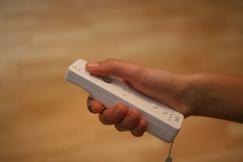
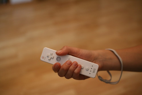
hold the wiimote #1 Interesting discussion yesterday at the game studio around the holding of the wiimote. Surely one the topic that emerged from the usability tests of wii games we conducted, especially with people who've NEVER touch a video game console. The first picture represents the regular wiimote holding scheme whereas the two other shows how a novice user held it when playing different mini-games.

hold the wiimote #2

hold the wiimote #3

Some of the issues the tests raised: How do we design applications for the B button in the previous cases? What about the 1 and 2? Can we use them in the interaction? Should the A-button be important so that the thumb or the second finger? Is the "plus" button the right one to break scenes? What about the cross? What's the role of the direction cross with these two ways of holding the wiimote?

Subtle reminder of speed camera

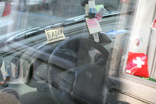
Subtle reminder of gatso Seen this morning in Geneva. A subtle reminder crafted by the driver to keep in mind the presence of speed/traffic enforcement camera/gatso. The location of the note right above the dashboard is especially interesting.

What's also intriguing is the fact that the note is a reminder of a possibility, unlike post-its notes to remind you to do something

The importance of exceptions for design

Recently working on a project about gestural interfaces and the user experience of the Nintendo Wii, I had my share of discussions about sampling in user experience research and the role of exceptions. Quantitative researchers often drawn nice curves with cute statistical distributions with "means" and quantiles. The type of things I've done in my PhD research, measuring X and Z (satisfaction to a certain project, number of messages typed on a phone, number of time someone pressed a certain button, etc.). In the end, you get this sort of graph represented below with anonymized dots which eventually represents how normal humans did certain things.

In general, quant research (the sort I've done in the past yes) compares different "conditions": you have two sorts of interfaces, each group of users test one of the interface and you compare the number of time a certain group did certain things on the interface they had. Say, the number of time they pressed on the button called "OK". Applying different statistical techniques (like variance analysis is the distribution is normal in the statistical sense, checking variances and if you're in trouble then you always employ "non-parametric tests"). This is robust no kidding, I don't criticize that kind of method. However, what I am wondering about is when this sort of methodology is solely applied to design research.

And it leads me to the discussion I had the other day with a colleague about the importance of exceptions, dots which are not close to the means, the weird outliers, peeps who do not fall in the distribution like that weird circle on the upper right-hand corner on the boxplot below:

Depending on your mood, the research methodology and your colleagues' attitude, there is a wide spectrum of reaction ranging from "WTF, that person screwing my distribution?" to "OK this is an extreme user, he/she is special, let's have a look more closely". And then, of course, because you're a smarty pant and you ALSO have qualitative data you see what the person SAID or DID (or whatever other types of data sources you have). Then the real thing starts: who are the extreme users? how extreme are they? what makes them extreme? are there other data source which attest that they are "exceptions". And obviously this leads you to the question the norm (the mean).

To some extent, that's the story of why I slowly moved from quant research to a mix of descriptive quantitative and qualitative research in user experience projects. I started getting interested in the role of exceptions, especially with regards to their importance in design. Why exceptions are important in design? Perhaps because they might show peculiar behavior and routine which can announce futures norms or trends (and then inspire new products, features and services) but also to show that the notion of a "normal user" or "mean user" is difficult to grasp as diversity exist and is important. Surely a very relevant near future laboratory spin.

An interesting example of an extreme user was this deaf guy I saw the other day at the train station, walking and gesticulating in front of his video cell-phone. If you map the use of video-communication on cell-phone you get a very low usage of the feature in general but that guy would be an exception.

Why "future perfect" is what it is

Quite enjoyed reading future perfect's rationale in this interview:

"Your blog Future Perfect ("about the collision of people, society and technology") includes a lot of your musings about what you see on your travels, but poses more questions that it answers.

I'm pretty bad at shoehorning life into what amounts to lifeless journal and conference submissions. I mean, how do you take the essence of what's out there, the richness of life, and put it on paper? I don't think you can. The motivation behind the blog is that I do something that totally fascinates me, and I'm lucky to be well resourced and to work with very talented people. I want to be able to communicate some of that. It's not about saying what the answers are; it's about asking the questions and maybe some of those will stick in people's minds and they'll ask those questions in their own contexts."

Why do I blog this? it's always interesting to get people's motivation behind what they're doing... Also, I like the idea of "asking questions" to inform design.

Tailored solutions for various affordances

A weird keyhole which needs more information about what sense to turn the key ("ouvrir" in french means "open"):complex affordance requires simple solution

And an elegant solution to the "elevator button issue": how to know which of the "up" and "down" button to choose: what's the underlying rationale? what's the referential? the elevator that you want to come down? or yourself who wants to go up? A basic caption with "to go up" near the button is a good fix. Elevator issues

Softness for the ears

headphone hack #1 Ears are an important part of our body and consumer electronics is often adapted to them through various process. But sometimes, the aging of technologies make them fall apart and people need to fix the device they have. When it comes to intimate products such as headphones, people look for easy-and-soft solution so that it's still adapted to the ears.

headphone hack #2

Cotton and the mandatory duct-tape can be of good help here as shown by this headset found during a home visit for a field study few days ago. A fix that will not age, gentle anyway. Again an interesting example of people's creativity in repairing their own gear.