Tangible/Intangible

Hertzian space and architecture

Obviously related to my talk about the invisiblity of ubicomp, Kazys Varnelis wrote an intersting A+U paper that you can find on his blog about how we live in "Hertzian space" the cloud of electromagnetic radiation that surrounds us and wonder how architecture that actively engage Hertzian space would look like:

"Two examples tentatively suggest ways in which urbanism might take into account our radically changed environment. The first of these forces us to confront the invisible forces in our environment. The second proposes to warp the very fabric of the city. (...) In Osman and Omar Khan’s project “SEEN-Fruits of Our Labor” the designers crafted (...) acrylic screen, (...) The designers set out to foreground questions of labor in the United States by asking members of three groups crucial to the Silicon Valley economy—technology workers, undocumented service workers and outsourced call center workers—the question “What is the fruit of your labor?” The Khans displayed the responses on the screen via a grid of infrared LEDs. (...) viewers saw a message that otherwise existed only in Hertzian space, invisible to the eye, on their camera screens (...) Robert Sumrell and I produced the second piece, “Windows on the World” (...) Windows on the World proposes to site multiple portals in multiple cities to create a true world planetary network, based not on capital and planning but on chance encounters. Remixing Hole in Space and Guy Debord’s map of the “Naked City,” we propose a telematic dérive, with each portal becoming what the Situationists called a plaque tournante, a center, a place of exchange, a site where ambiance dominates and the power of planners to control our lives can be disrupted. "

Why do I blog this? documenting interesting examples of the interlinkage between the digital and the physical, as usual.

Salient design factors for kinetic user interfaces

In a recent issue of Communications of the ACM, Designing kinetic interactions for organic user interfaces, Parkes, Poupyrev and Ishii reflects on the notion of "kinetic user interface":

"Kinetic interaction design forms part of the larger framework of Organic User Interfaces (OUI) discussed in the articles in this special section: interfaces that can have any shape or form. We define Kinetic Organic Interfaces (KOIs) as organic user interfaces that employ physical kinetic motion to embody and communicate information to people. Shape-changing inherently involves some form of motion since any body transformation can be represented as motion of its parts. Thus kinetic interaction and kinetic design are key components of the OUI concept. With KOIs, the entire real world, rather then a small computer screen, becomes the design environment for future interaction designers."

They also discuss "salient design parameters and research" issues to consider when utilizing kinetic motion in interaction design:

"Form and Materiality. In order to recognize and comprehend motion, it must be embodied in a material form. Hence, a crucial and little-understood design parameter is how properties of materials and forms affect motion perception and control. (...) Understanding the material affordances, their interaction with the user and other objects, environmental light and sound is crucial in designing kinetic interactions.

Kinetic Memory and Temporality. While computational control allows actuated systems to provide real-time physical feedback, it also offers the capability to record, replay, and manipulate kinetic data as if it were any other kind of computational data. We refer to such data as kinetic memory (...) for example, objects can fast-forward or slow down motion sequences, move backward or forward in time; or the objects can "memorize" their shape history and share them with other objects.

Repeatability and Exactness. We can easily distinguish artificial motion because of its exact repeatability. In designing kinetic interactions, repeatable exactness is the simplest form of control state, and in many behaviors it is easily identifiable.

Granularity and Emergence. If this principle of dissecting form and mechanics into single elements—kinetic phrases—is combined with contemporary digital control structures, new materials, and actuators, it becomes possible to imagine a system where a kinetic behavior could be designed both concretely and formally."

Why do I blog this? working recently on tangible UI project in which sensors can be put on everyday objects, the ideas expressed in that paper are relevant to what sort of design parameters should be taken into account (and serves as design constraints).

Holding the wiimote

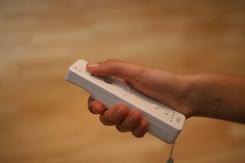
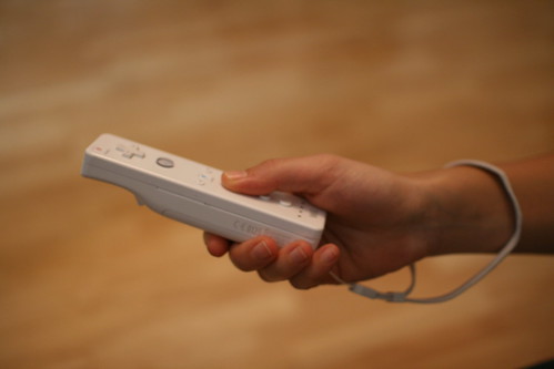
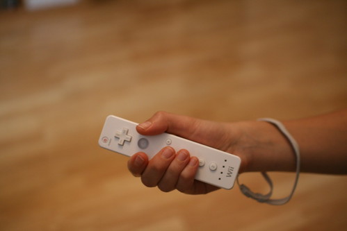
hold the wiimote #1 Interesting discussion yesterday at the game studio around the holding of the wiimote. Surely one the topic that emerged from the usability tests of wii games we conducted, especially with people who've NEVER touch a video game console. The first picture represents the regular wiimote holding scheme whereas the two other shows how a novice user held it when playing different mini-games.

hold the wiimote #2

hold the wiimote #3

Some of the issues the tests raised: How do we design applications for the B button in the previous cases? What about the 1 and 2? Can we use them in the interaction? Should the A-button be important so that the thumb or the second finger? Is the "plus" button the right one to break scenes? What about the cross? What's the role of the direction cross with these two ways of holding the wiimote?

Internet FOR things

In his graduation thesis entitled "Social RFID, at the Utrecht School of the Arts, Patrick Plaggenborg interestingly explores what an "Internet FOR Things" mean, differentiated from the so-called "Internet of Things". The document can be downloaded here.

The goal of the project is to explore supply chain RFID infrastructure to form a public platform and "reveal the invisible emotions in things" so that "people are stimulated to look at objects differently", especially those seemingly worthless objects.

More than the project itself, I was intrigued by the "internet for things" notion and its implication that Patrick defines as follows:

"A world with all objects being tagged and uniquely identified is still not very close, but we can think of scenarios and applications for it. The infrastructure will be rolled out slowly, starting with the bigger and more expensive items. In the mean time designers can speed up this process with Thinglinks and their own RFID tags to create test beds for their own interest. Using this infrastructure, small applications will take off as forerunners to a world where digital interaction with every day objects will be common. This is not the ‘Internet Of Things’, where objects connect to create smart environments and where they collect and exchanging data with sensors. This is about the ‘Internet For Things’""

Why do I blog this? What I find intriguing here is the parallel wave of design research concerning the Internet of Things which seems to me far beyond the current vector pursued by lots of research labs in the domain. Combined with blogjects, thinglinks and relevant interfaces there is a strong potential for these ideas.

To some extent, I am curious about how the new Nokia research lab in Lausanne is interested in this sort of explorations.

Tweaked alternative game controller

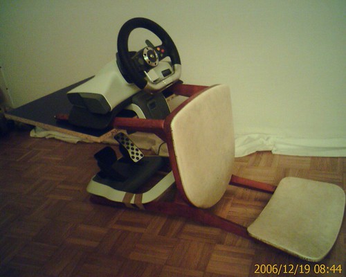
Tweaked Xbox controller Doing ethnographical research about game controllers and carrying out home visit makes me encounter very curious assemblage like the one above. How to turn a chair into a speedy car-simulation seat where the player seats on the back, spread the leg and pump pedals to the maximum.

A very intriguing made-up controller for car simulation that reveals how people tend to modify devices to their convenience. The creative use of duct-tape to enhance the digital experience is interesting to document as a way to find out opportunities to design both physical peripherals and digital counterparts.

The iPhone as a gaming platform with gestural interaction

People interested in tangible/gestural interfaces and mobile devices may be intrigued by this patent filed by Apple. Called "Techniques for interactive input to portable electronic devices", the patent is about:

"A game input area (surface or plane) receives input for multiple applications including an interactive application executed in connection with a scene. The input received is directed to the appropriate application based on one or more locations (e.g., points, positions, regions, portions) of the input area effectively identified when input is received (or entered). In addition, the manner in which input is received (or entered) can be used to determine which application should receive the input. The input area can additionally resemble or approximate the shape of a scene (e.g., game scene) to allow a person to provide input in a more intuitive way. Accordingly, input can be provided in a simple and more intuitive manner by effectively allowing the user to interact with the input area in a way that mimics or approximates a desired action (e.g., moving a ball or bat around by inputting a rotational movement). Examples of such interaction include positional, directional (e.g., rotational), press or pressure input (or movement) which can easily be provided by a thumb or a finger, for example, on a touch screen. (end of abstract)"

That website gives more concrete details with some pics that are more explicit about "Examples of such interactions include that can be characterized as positional, directional, rotational, pressing and/or pushing type inputs (or movement)":

Why do I blog this? the idea of the patent is to have "multitasking" input techniques that would enable iPod/iPhone users to play games on the touch-screen while at the same time maintaining control of a secondary application from the screen. I take it as an interesting signal of upcoming applications on the iPhone; of course it's not the "iphone" word that is important here but instead that there is some good potential to see entertainment innovations with such interface due to a combination of factor: flat-fee internet subscription, touchscreen, easiness to develop web-apps, etc.

Miyamoto on alternative controllers

A recent interview of Nintendo's Shigeru Miyamoto by Chris Kohler (Wired) deals with alternative game controllers employed with casual/sport applications:

"I'd always wanted to try to find a way to make a game out of that, and I felt that with the Wii, that's something that I would normally do in the bathroom is weigh myself. But, with the Wii, if there was a way that we could take that into the living room and turn it into an experience that everybody takes part in, then that might be fun.

What about the timing of this device seems auspicious right now? Does it have to do with the acceptance of alternative controllers now?

I think there are a couple of reasons. One is that at this point the Wii is wireless, and so I think the fact that it's wireless certainly makes it easy to use. For me, personally, also, in this NES era, I myself didn't really think that weighing myself and tracking my progress every day is something that I could turn into a game. (...) initially we created the Balance Board in order to create Wii Fit, and it was essentially designed to enable that experience. And, then after we finalized the design, we looked at it and realized -- or as we were finalizing the design, we realized it could potentially be something that could be used for other games, as well. And, so in finalizing those designs and finalizing the final Balance Board, we ultimately tried to do it in a way that would enable other developers to also take advantage of it. The other thing that we found is that actually in the sports world there are devices that are somewhat similar to this that are used for training athletes. (...) there's actually a game out already called We Ski. It's a skiing game that uses the Balance Board that's developed by Bandai Namco. (...) Using a Wii remote, you could track the timing of the swing and the shifting of the balance on the Balance Board to calculate kind of how good the swing is. Of course, there's still the question of whether or not the mass market would want a game that perfectly replicates that type of an activity. But, in terms of golf training, you could certainly do something like that.

Is there a danger of maybe burning people out on extra controllers?

we are creating a number of different controllers and peripherals for the Wii, as well, so in that sense, I can see your point of how having so many different controllers can be a little bit inconvenient. But, at the same time, we feel that the videogame audience has gotten to the point now where it's so broad that there are different tastes and different needs within people, within the audience of people who are playing the videogames. (...) when we're designing games and designing peripherals, we're not designing them for the purpose of simply creating more devices to use with the Wii. We're trying to create devices that are creating a more streamlined and intuitive approach to gaming so that a broader audience can feel that they're able to interact with and better use the device."

Why do I blog this? great lessons here, with good connections to some current research about tangible interactions. There are good things to wonder about concerning the relationships between the user experience and different use of tangibles interactions. For instance, the "direct mapping" rule is often perceived as the best solution for intuitive apprehension of games. Using the same movement in the physical space as the one rendered in the digital world is indeed a relevant approach but is it that simple? is it that fun? is the movement so physical that it becomes less fun? And what about the overemphasis on gestures, playing soccer by doing gestures which are not a direct translation from the physical to the digital (yes I am thinking about PES on the Wii with its click-and-drag system)?

On a different note, the scale-turned-into-game-platform reminds me of 2 projects which focused on transforming everyday objects into game controllers: Everyday games by Are Hovland Nielsen and Control Freak by Haiyan Zhang.

Alternate controlers and musical interfaces

In The convergence of alternate controllers and musical interfaces in interactive entertainment, Tina Blaine examines the emergence and acceptance ofof alternate/breakthrough game controllers.

She starts off by describing how the game industry is seeking new ways to extend the “gamer” demographic or attract new players and that "many consumers are intimidated by traditional video game controller devices" (which was the rationale behind the Nintendo Wii but the paper is form 2005). She then focuses here review controllers for music applications. She shows how alternate controllers have achieved status as a critical component of gameplay, resulting in more fun user experience. Limiting her reasoning to music game controllers, she concludes that:

"In all of these systems encumbered or not, the players’ physical interactions appear to enhance the feeling of immersion in the games and distract from varying degrees of latency inherent in the responsiveness of the sesystems. Generally, the latency is less noticeable at easier levels of gameplay and doesn’t become problematic until faster execution at more advanced levels is required. Until studies inthis area are conducted, it remains a mystery as to whether or not players are content with controllers that lack complexity but are simply fun to play. (...) opportunities have arisen for third party developers to provide “unofficial” spin-off versions of controllers as accessories for games. These are often offered more inexpensively at the same or higher quality as the large developers, and bypass the need for consumers to purchase software in order to get an extra hardware device."

People interested in knowing more should read the paper and focus in particular on Table 1 that interestingly compares videogame toy devices (Beatmania, DDR...), the purposes of the controllers, the actions that can be performed, the effectiveness as well as the "musical expression intention".

Why do i blog this? collecting new material about gestural interactions for a research project. To some extent, the paper advocates for the benefits from having a "Convergence of Alternate Controllers and Musical Interfaces". It would be good to do the same analysis with sport/arcade game controllers (from power glove to the bodypad) and analyze the idiosyncrasies of each activities (physical or musical).

Blaine, T (2005). The Convergence of Alternate Controllers and Musical Interfaces in Interactive Entertainment. Proceedings of NIME 2005: 27-33

Evolution of game controllers

Recently, I've been involved in a research project about game controllers, comparing different peripheral (gestural or not). This led me to investigate the evolution of game controller over time, a topic already addressed by others. For instance, Damien Lopez made this insightful mapping (.pdf) for both consoles and portable systems:

Game controller 1

Game controller 2

Lopez describes this map as a "a collection of small multiples of game controllers of the main gaming systems from the past 25 years (..,) normalized, and the hands are all approximately the same size as each other, and thus the controllers all to scale". His point was "to show the progression of controller design throughout the last quarter-century. With the introduction of the Nintendo Entertainment System, no more number pads were used on game controllers from that point on".

On Sock Master, there is also a tree-based representation that tries to connect all the current console controllers with their predecessors. What is interesting here is the notion of diachronic evolution as well as the connection between different "families". Game controller 3

Why do I blog this? working on the user experience of game controller for different research projects, this kind of representation are important as they map the existing peripherals as well as show how the possibilities evolved over time. It's overall interesting to note the relative stability in both portable and console shapes but the increasing complexity of controllers. Although sticks remains stable, the number of buttons increases. It would interesting to see how the user experience evolved over time too and see how it's related with the interface. I need to dig more these graphics and draw some implications about what that means.

Technology paternalism, ubicomp and the role of exceptions

In "Technology paternalism – wider implications of ubiquitous computing", S. Spiekermann and F. Pallas deal with how people can maintain control in environments that are supposed to be totally automated. They coined the term "technology paternalism" to describe the situation where "people may be subdued to machines’ autonomous actions". They take the example of car that beeps when you don't fasten your seatblet and show how such situations meet the same criteria as the one that define paternalism:

" the definition of Technology Paternalism extends the general notion of paternalism with respect to two aspects: one is that actions are being taken autonomously by machines. The other one is that by their coded rules, machines can become ‘absolute’ forces and therefore may not be overrulable any more."

And discuss that in conjunction with Weiser's notion of calm computing:

"If machines are controlled, then they are not calm any more. There is a clear disaccord between the concept of disappearing technologies and the attempt to remain in control. Control premises attention and visibility whilst Ubicomp environments are designed to be invisible and seamlessly adaptive. Can this dissonance really ever be resolved? "

And of course there is a part about who's responsible of technology paternalism:

"Of course, this power does not lie in the hands of technology itself. Technology only follows rules implemented into it. Therefore, the question arises: who WILL be the real patrons behind Technology Paternalism if it were to become a reality? Who will decide about the rules, the ‘rights’ and ‘wrongs’ of every-day actions? (...) three groups as the potential patrons behind Technology Paternalism: engineers and marketers of Ubicomp technologies as well as regulators influencing application design. "

Why do I blog this? Some relevant issues regarding the notion of control in ubicomp. The authors finally come up with a series of recommendations. The one that strikes me as fundamental is the following: "there should be a general possibility to overrule ‘decisions’ made by technology and any exceptions from this should be considered very carefully". The notion of exception is a crux issue that is often diminished by lots of engineers I talked to wrt to autonomous technologies such as "intelligent fridges" or location-based services. Exceptions breaks patterns and habits tracked by sensors, disrupt machine learning algorithm and are eventually impediments to prediction-based system that would send emergency messages to 911 because granny did not open her fridge for 2 weeks (because she unexpectedly decided to visit her grandson).

Laundry list for ubicomp

In the last issue of ACM interactions, there is an interesting paper called "When users "do" the Ubicomp" by Antti Oulasvirta. The paper starts off by discussing the 2 perspectives of ubiquitous computing: on the one hand, the sort of research/outcomes you see in conferences and on the other hand, what the author calls:

"present-day IT infrastructure, the real ubicomp, is a massive noncentralized agglomeration of the devices, connectivity and electricity means, applications, services, and interfaces, as well as material objects such as cables and meeting rooms and support surfaces that have emerged almost anarchistically, without a recognized set of guiding principles"

... which is very close to what Bell and Dourish described in their paper Yesterday’s tomorrows: notes on ubiquitous computing’s dominant vision. Oulasvirta wonders if the inherent complexity of ubicomp is one one key explanation to why these applications have not conquered the consumer market. Relying on different results from ubicomp studies, he presents " a laundry list of approaches to improving ubicomp infrastructures":

"1) minimizing overheads that create temporal seams between activities; 2) making remote but important resources, such as connectivity or cables, better transparent locally and digitally; 3) propagating metadata on migration of data from device to device; 4) supporting ad hoc uses of proximate devices' resources like projectors, keyboards, and displays; 5) triggering digital events like synchronization of predetermined documents with physical gestures; 6) supporting appropriation of material properties for support surfaces"

Why do I blog this? some interesting issues to consider here, although I am not sure (or perhaps interested) in everyone of them, some are close to current interests (for example (2)).

Old-schoold handheld electronic games

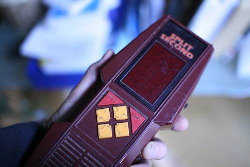
What does handheld electronic game such as Parker Brother's Split Second can teach us? The curious box/enclosure? the super straight select-start-4-arrows buttons? the rockin' analogic screen? the okay-for left-handed and okay for right-handed design? the symmetry of the system with sound on one part and display on the other?

Split second

Maybe it's the whole experience or even the expectations back in the days, when playing with very near 3x15 red matrix was like being immersed in Tron. What impresses me now is the "one-device = one game/purpose" equation. The interface was so rough and basic that you could only play one sort of game. It was even crazier with Nintendo handheld a la Donkey Kong since part of the level design was DRAWN and PRINTED on the screen. Would there still be devices like this? Or only converged phones?

Very curiously, this sort of electronic games have always received a very low interest from both thinkers and academics. In the book "Electronic Plastic (see also here), the authors of that nice compendium state how "the recourse to supposedly primitive games leads us back to the creative source of the contemporary entertainment revolution" and that these game provide as much fun as recent Sony or Nintendo platforms.

Workhop at LIFT about ubiquitous computing

The near future laboratory (Fabien Girardin and Julian Bleecker and myself) organize a workshop during LIFT08 about the failures of ubiquitous computing. The workshop is called "Ubiquitous computing: visions, failures and new interaction rituals":

"We propose to look backward and discusses why we have not reached what has been described in the last 5 years of ubiquitous computing. How might we criticize assumptions and build upon existing models and approaches to design in this context? Can we learn from the discrepancy between the utopia of ubicomp and its deployed reality?

The purpose is to generate debate about the design and integration of ubiquitous systems based on case studies proposed from workshop participants. Moreover, we want to open up a debate around the future of those systems as well as the adoption by a large user base.

The session will start by a short presentation by participants who will each have to describe in 2-3 minutes a ubiquitous computing system that failed and give reasons or causes for that. ..."

Why do I blog this? LIFT is always an enjoyable moments for workshops, let's see what emerge out of that one.

Tangible and gaming in Aix

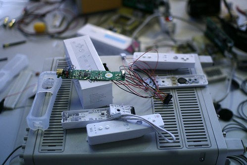
Currently in Aix-en-Provence, at the School of Art where I've given a talk yesterday about tangible interfaces (a rerun from my GDC2007 presentation). The talk was part of a workshop called "Workshop Wiimote Hacking. The whole thing was about how to hack the Nintendo Wiimote and turn it into a tool that artists can employ. Students are involved in the process of adding new sensors as well as defining new sorts of usage. Thanks France Cadet for the invitation and Douglas for having taken time to discuss. Wiimote hacking

The discussion after the presentation revolved around: - How the wiimote might have the potential to become a sort of standard in the living room as the controller. I personally don't predict anything about this. However from current observations of practices, I do think that the Wii is much more than video game device and play an interesting role of multimedia platform in the living room (with photos, usage of personalized mii). In addition, the presence of very focused applications such as wii questions turns it into a platform where facebook-like small application can be played by the family. - Why the game design ideas we have so far on the Wii are so conservative... which turned into why the video game industry is so conservative or how the whole economic system is so controlled by the marketing crowd that it's difficult to go beyond usage of the wiimote as sword/steering-wheel/magic wand. This is a sort of over-statement but it's actually close to the reality. - How this work about tangible interfaces relate to my other work about mobile and pervasive gaming? we discussed the notion of granularity and how complex the game system is when the dimensions reach the city level. Much more than just gesturing in one's own living room, using the city as a game field is complex for lots of reasons (technical, infrastructural, difficulty to have a continuous experience), etc.

Fortunately, there was also an exhibit about games as medium for artists to create and tweak digital worlds. Called gamerz02, there was a bunch of very curious projects.

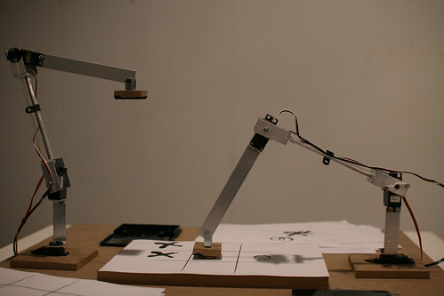
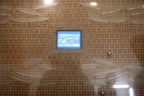
The one that attracted my attention was Patch&KO (Antonin Fourneau and Manuel Braun): instead of using a joystick people can play Street Fighter 2 using a pachinko interface. In a sense, the player's ability to control the character is disrupted by the semi-random movement of the metal balls. As the designers state, the player has to accept a loss of control. Slightly related was this Tictactoe played by robotic arms I blogged about the other day. In this case, what was explored was that the Tic Tac Toe is a curious game in which the only way to win is to rely on the opponent's fatigue and loose of sight in the game. In the context of two mechanical arms played by a computer, the surest way to win is to avoid playing. Finally, I was also interested by Tchouri by Pascal Silondi, a sort of knife-based interface much more intriguing than always-seen magic wands. Some of the pieces there were maybe slightly easy-going and naive but the whole things made sense and I found find fruitful to make game designers more aware of such work, perhaps some ideas about a workshop/seminar.

Tic Tac Toe with mechanical arms

Patch&KO

Workshop on Pervasive Visual, Auditory and Alternative Modality Information Display

Pervasive Expression: Workshop on Pervasive Visual, Auditory and Alternative Modality Information Display is a workshop Oorganized at the 6th International Conference on Pervasive Computing (Sunday 18 May 2008, Sydney, Australia).

It's organized by Andrew Vande Moere, Kirsty Beilharz, Bert Bongers and Stephen Barrass and it will address the following topics:

"This workshop wants to bring together researchers, practitioners, technologists and artists from different domains, interested in the visual or auditory representation of information for users in the pervasive realm. We also hope to explore how novel visual, auditory and alternative modalities (e.g. tactile, olfactory, visceral) materials can function as a physical communicative layer that is truly pervasive. A few potential questions to be discussed in the workshop include: - How to embed pervasive expressive displays in physical reality and materials, such as artifacts, garments and spaces? - What are valid data mapping metaphors for expressive displays that are pervasive, and still can be intuitively understood? - How can the design of pervasive expressive displays influence the experience (e.g. engagement, reflection, persuasion, interpretation), conviction, attitude or behavior of onlookers, users, wearers or any person in its vicinity?"

Blitz game designers on the wii controller

An interesting talk I attended yesterday at the Lyon Game Developers' Conference was the on entitled "Creating Great Games for the Nintendo Wii and Its Unique Controller" by Philip and Andrew Oliver from Blitz Games:

"Even though the ideas are fairly simple to prototype, getting the feel of each control system just right was a challenge in itself. Detecting the correct motion of the controller had to be very specific and tested thoroughly as different people held the controllers in sometimes very different ways. The problem of how to convey the instructions for the controller types within the game had to be addressed. As we all know, nobody reads the manual, especially at the target age range. A series of images, text prompts and even animated movies were experimented with, all with different results. Testing and interpreting these methods were key to getting a successful title."

Some of the results they described about designing wii movements:

"- swiping is tiring and it's difficult to sync movements on the screen - driving using the wiimote as a steering wheel that you can push/pull to accelerate/brake did not work because it was too tiring and small movements were unnoticed... and they noticed how an abstract notion like accelerating is better conveyed by pressing buttons - people hold the wiimote VERY differently. Kids tend to hold it very loosely and do movements with large amplitudes whereas adults hold it more firmly and do not swing it away too much (as if it was a sacred grail or a TV remote control) - certain controls that require player to hold the wiimote vertically did not work... because people do not hold it vertically: people do not look at the wiimote especially when standing. Asking someone to hold the wiimote vertically is difficult because it depends on situations: sit at a desk, lie on a bed, standing, standing with friends. - distance between the wiimote and the screen was easily detected and that variable was very accurate to be employed in a game mechanic."

Why do I blog this? these few elements are interesting and echoes with the (private) work I have done about this. More specially it resonates quite well with the importance of context in playing with the Wii. I am currently thinking about a study concerning how people have expectations about the wiimote, how they understand its usage. It would also be interesting to observe how people naturally hold the wiimote

Talk at the Game Developers Conference about gestural interactions

Gave a talk at the European GDC today in Lyon. It was called "5 lessons about tangible user interfaces" and addressed an overview of classic misconceptions concerning tangible user interfaces. It's actually a modified version of an earlier talk I gave last year at Nokia Design in Los Angeles; I added few things I've done since then. It's always interesting to give such a talk to different audiences; the way it it is received by industrial designers is totally different by game developers, fully different insights and discussions. The slides are here (.pdf, 9.8Mb):

Tangible interfaces hold lots of promises ranging from being more intuitive or realistic, being more appealing to users to enabling people to get some physical exercises in the process. User experience research about it shows that things are not so simple. This presentation discusses 5 misconceptions and why they are wrong. Each can be exemplified by arguments drawn from user studies, which are of importance for game designers: 1. Inert objects do not lead to tangible interactions or how non-gestural interfaces such as TV remote control can be gestural 2. Direct mapping between the physical movement and the interaction in the digital world is simple and intuitive or how direct mapping is not always efficient for players or accurately detected. 3. physical interfaces offer a larger variety of control than standard controllers, and are more realistic and intuitive": depending on the task, tangible interfaces actually do not necessarily lead to intuitiveness and ease of control. 4. The starting point of designing TUI is to look at real-life counterparts... so let's design guns for shooting games, a flute for musical games...: there are actually other alternative that are almost never investigated, taking the opposite direction of direct mapping. 5. Tangible interfaces are ubiquitous and allows mobile/seamless interactions or how tangible interactions do not appear in a vacuum and lots of problems due to the context can happen.

The description of why these ideas are misconceptions lead to important implications and design lessons about how to go beyond current implementations in video games.

The conference was interesting, sometimes a bit too techno-centric for me, I will try to write something about my notes from the sessions I found relevant.

Nomenclature of Wii gestures

Preparing my talk for the Game Design Conference about tangible/gestural interfaces, I ran across this very interesting Wario Ware Walkthrough guide by G. Louie (not only curious because of its ASCII layout). What struck me as very pertinent here is the nomenclature (the naming) and the description of moves. See for example this intriguing list:

"The Form Baton - The Balance Stone - The Remote Control - The Umbrella - The Handlebar - The Sketch Artist - The Chauffeur - The Samurai- The Tug-of-War -The Waiter - The Elephant - The Thumb Wrestler - The Discard -The Big Cheese - The Janitor - The Dumbbell - The Mohawk - The Finger Food - The Boxer -The Mortar and Pestle - The Diner"

With descriptions such as:

" The Handlebar "Turn the Form Baton sideways and grasp the ends firmly in both hands. Like riding a bicyle, perfecting this stance requires grace, steadiness, and tightshorts."

To do The Handlebar, turn the Wii Remote so that the 2 button is on the right. Place hands over the top so that palms are on the buttons. Uses for this form would be pumping and balancing. *Does not use remote sensor bar*"

Why do I blog this? what I find relevant here is the way people try to refer to gestures meant to control specific game interactions. Things get more complicated when the interface is gestural: how to name them? how to describe them not only to the users but in game guide? A solution as we se here is to rely on existing metaphors: type of activities (boxer), postures or animal that makes think of posture (elephant), moments (diner) or jobs (chauffeur).

Tangible UI and Minority Report

In his blogpost about "unconscious gestures", at a certain point, Matt Jones has a good rant about the cultural ownership on the touch interface of the iphone. As if all the other products which use touch/gestures had been copied ("with pride"):

"That last remark made me spit with anger - and I almost posted something very intemperate as a result. The work that all the teams within Nokia had put into developing touch UI got discounted, just like that, with a half-thought-through response in a press conference. I wish that huge software engineering outfits like S60 could move fast enough to ‘copy with pride’.

Sheesh.

Fact-of-the-matter is if you have roughly the same component pipeline, and you’re designing an interface used on-the-go by (human) fingers, you’re going to end up with a lot of the same UI principles.

But Apple executed first, and beautifully, and they win. They own it, culturally."

Why do I blog this? speaking of cultural ownership, what is even more puzzling is all the press about the prominence of "minority report" in terms of interface paradigm.

As if every single gestural/touch UI that we have today have something to do with Minority Report, as if that movie taught people that it was where innovation in that field started. So you have newspaper article about the phone/table/display that-mimics-minority-report-gestural-interface. It's really weird since the interface employed by Tom Cruise et al. are very different. There is really something here about the normative future created by a cultural artifact such as movies and tv series.

Apart from that, Matt's also complains about the fact that what is pursued is more "deliberate touch interfaces - touch-as-manipulate-objects-on-screen rather than touch-as-manipulate-objects-in-the-world for now", which is a relevant remark.

A list of intriguing digital cameras

A follow-up to this blogpost, I started making a short list of "curious digital cameras" Microsoft's Sensecam, a wearable digital camera that is designed to take photographs passively, without user intervention, while it is being worn.

The Wingscapes BirdCam which uses an infrared sensor to detect birds and then automatically captures photos or videos (of your birds while you are away).

Tospom: a ball-shaped camera that takes pictures while playing catch.

Satugo: a bouncing ball camera.

Blinkcam takes a Polaroid picture everytime you blink.

Sascha Pohflepp's blinks and buttons, a networked camera that capture a moment by continuously searching on the net for other photos that have been taken in the very same moment.

Spycamera stuff can also be found.

An HP camera that could be equipped with circuits that could be remotely triggered to blur the face of those who don’t want to have their photo taken.

Why do I blog this? it's both the interest in automatic cameras as tools for User Experience research and as curious devices from the near future. Automatic camera can indeed be used to ask people to reflect on their activities (with some ethical limits) and weird cameras are very interesting devices to imagine new uses.

Please feel free to add any other references in the comment part of that blogpost, it's good to keep track of stuff. There must be thousands of models and prototypes.