Tangible/Intangible

Competition to design NFC services

Today started an countdown to an event called "Touching the future" which aimed at being the 1st European NFC competition. It is organized in conjunction with the European Near Field Communication Developers Summit which will be held on 18 April 2007 during WIMA 2007 at Grimaldi Forum in Monaco. This competition is about designing services themed on the "simplicity of a touch". What seems to be important is the innovation in terms of interaction between people using a mobile device, objects and services. People interested in this might have a look at the call for contribution:

Track A - Present - The most ambitious and successful service in Europe * Actual implementations and/or real life demonstrations with a minimum of 15 users * Evaluation criteria: process improvements, cost savings, and/or improvement of service * (existing/realized pilots, demonstrations and/or services in use with min 15 users)

Track B: Future: Future - The most innovative NFC proposal in Europe * Most innovative new service developed by student or industry teams * Evaluation criteria: creativity, innovativeness, business potential * (New ideas and innovations - no user experience required)

Competition categories in both tracks include, but are not limited to, the following areas: # City Life (public services, transport, payment, tourism, etc.) # Personal Wellness and Healthcare (bio-mechanical sensors, other medical applications) # Information/Entertainment (art, music, advertising, gaming, etc.) # Enterprise solutions (retail, inventory control, logistics, security, etc.)

Submission Deadline: 12 March 2007 at 1pm CET

Why do I blog this? Since my interest in NFC as a peculiar way to interact with new types of objects (such as blogjects), this is Well related to the workshop we had at NordiCHI with Timo Arnall, Julian Bleecker and others. Also, from an innovation standpoint, I am curious to see what can come up from this sort of competition and whether this is model to consider for designing new things.

Immortal computing

According to the Seattlepi, Microsoft aims at patenting a "project that would let information be stored indefinitely and accessed by future generations, or perhaps civilizations". As MS named it, it's a sort-of long-term "immortal computing".

One scenario the researchers envision: People could store messages to descendants, information about their lives or interactive holograms of themselves for access by visitors at their tombstones or urns.

And here's where the notion of immortality really kicks in: The researchers say the artifacts could be symbolic representations of people, reflecting elements of their personalities. The systems might be set up to take action -- e-mailing birthday greetings to people identified as grandchildren, for example. (...) "Maybe we should start thinking as a civilization about creating our Rosetta stones now, along with lots of information, even going beyond personal memories into civilization memories," (...) the instructions would be "self-revealing," the researchers say. The concept is similar to the symbolic instructions with the Golden Record on board the Voyager spacecraft launched in the 1970s -- they gave details on how to build a player for the record, which contained greetings in various languages.

Why do I blog this? two things: one one hand, the duration of information is an interesting issue to address. On the other hand, it seems that when people want to tackle durability, they use concrete artifacts such the Voyager board or Edgar Morin's proposal to engrave information. The tangibility of information seems to be an important characteristic for durability.

Lessons learned from connected classrooms

This morning, Jeffrey Huang gave a very interesting talk at the classroom of the future workshop. It was about lessons and challenges regarding new types of environments that would benefit from technologies to connect people from different places. My raw notes are below: lessons learned from connected classrooms 2 examples - swisshouse project (2000-2010): to address brain drain, a network of 20 buildings in strategic lcoations, to transfer knowledge back in switzerland - digial agora: 4 buildings (washington, naplio, alexandria, callisto: a boat): a structure to facilitate seminars of the harvard center for hellenic studies

in both projects, architecture is an interface using walls, ceilings... to connect this idea is not new, already in the 17th century: athanasius kirchner (1650): walls and ceilings as "interfaces", you can stand next to a statue and eavesdrop conversation or spread secret by whispering secrets to the wall another example: 1964 Eames' IBM pavilion (to show the progress of IBM at the time, the building was a communication vector)

today: it's much easier to do it, these interfaces have become smaller and more powerful how to embed this tech in architecture

design principles used to create those spaces - hardware component: modular system with basic shells to accomodate different configurations + plug and play module. In the swisshouse, the floor is the infrastructure in which they plug walls - software: building OS (operates the i/o devices: light, audiovisual...) and application layers (ambient, artifact, people). Ambient layer = what is part of the wall, there are lots of dispays. Artifact layer = where you display artifact, flat for example on tables. People layer = the way to bring remote people into the space, LCD screens on rollers.

4 key challenges:

  1. Different ways of knowledge transfer: how to go beyond the traditional lectures and passive behavior: this is achieved through a different spaces: knowledge cafés, digital wall (for more traditional lectures and peesentations), arenas (step down spaces for intimate debate) + curtains to reduce noise.
  2. Different levels of presence: problem that you have when people are remote... schedule remote presentations... lack of copresence sense, translucent presence... awareness of others, design a presence that is more gradual. Always-on video that connect spaces (and not people).... virtual cocktail after the lecture in both Boston and Zurich. RFID reader to register physical visitor in order to know who is where (Swatch watch with rfid tag). Viz of who is where
  3. Adaptive usage and future: trading flexibility and coherence... accomodate different knowledge transfer scenarios, can evolve over time versus obsolescence, adapat architecture in real time through software driven cutomization. For example: the glasswall has not technology in it, you can replace it. Part of the design of the 2 projects are 50% about software: different interactive wallpapers. Microphones in certain locaiton that capture conversations and represent them on walls ("sediments of thoughts"), chat on a wall, tangible and playful wall.
  4. Beyond the desktop: choreographing connectivity: coordination of multiple displays and multiple inputs, pervasiveness of mapping (superimpose versus invent new elements), layered approach: context defines content (ambient, artifact, people layers), "tangible" interfaces. Pinwheels that generate wind depending where people are present (if people are in asia...).

no scientific studies of the results yet lessons learned form first nodes so far: (+) community creation capacity - events, rituals informality, spontaneous interactions adaptivity of walls (-) acoustic transparency versus visual transparency (in the end people just want visual transp and not acoustic transp.) connectivity (most of the actions are only local but this is due that are just 1 node with a digital agora... it's like if only one person had a fax machine)

Q&A: Stefano Baraldi: how people learn to use that space? Jef: there is a tech person that set and maintain this stuff so visitors do not have to learn, people intuitively interact there. Because things should work similarly.

Why do I blog this? I liked the approach and the discussion about key challenges to have augmented environments. Besides, the infrastructure is a very well thought with less technology in the environment (it's easy to remove elements such as walls) and rather use software components.

More about this: Huang, J. and Waldvogel, M. (2004). The swisshouse: an inhabitable interface for connecting nations, Symposium on Designing Interactive Systems archive Proceedings of the 2004 conference on Designing interactive systems: processes, practices, methods, and techniques, pp. 195 - 204.

Duct tape, embodiment and pervasive gaming

Artificial has a fantastic interview of Susigames about their Edgebomber project. If you're not familar with their work, this interative art/game platform is a system that allows player to use tape, stickers and scissors to create a playground on a wall. It's one of the very relevant project I have spotted lately (given that I appreciate innovative pervasive gaming AND duct tape).

The interview is very revealing, here are some excerpts I found important:

The most important aspect is the inclusion of the haptic effects of the real world. The creation of the virtual environment by the use of duct tape produces the content of the game - the real and the virtual environment become connected. (...) In some of our exhibitions there are people who only want to use the duct tape to create funny and complex game fields. In order to do so, they use a broad variety of objects and even their own bodies. (...) Twenty years of joypad domination is enough! We have to challenge the nature of interfaces. It is obvious to us that we have to start using the human body as an interface

Why do I blog this? the use of the duct tape proves to be a powerful to connect first life and second life experience, that is an implication! Besides, as explained in the interview, the body is important in the experience, which is a characteristic that is pretty rare.

Mash-up machine

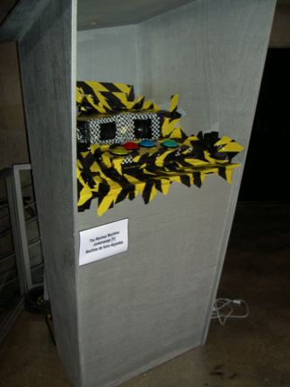
I ran across the Mash Up Machine by Jankenpopp. This apparel seems to be a perfect looking artifact (I like duct tape and buttons). It's actually made of a box with 4 buttons and musical samples. Pressing a button make the box glowing and play one of the musical sample.

Check the video here.

Why do I blog this? I really like how this device looks life and the sponeneity of the interactions that are possible to be engaged with it.

Gaming on digital cameras

Looking for some ideas about gaming on unusual platforms (like projects about ATM), I ran across a post by Ian Bogost about casual game son digital cameras:

The Fujifilm Finepix V10 Digital Camera, which is apparently the only digital camera to come with games you can play on its rather large LCD screen. (...) The Finepix is only one in the noisy digital camera marketplace, but the idea of a game playing point-and-shoot is rather compelling.

The blogpost goes through advantages (big market, connection to personal computer to transfer fiels, memory cards, big value of having a digicam, more reasons to include greater processins) and the drawbacks (different controls, different screen sizes, low opennes...) Why do I blog this? looking at other platforms for gaming is interesting for various reasons: (1) to change the control paradigm and think about innovative usage, (2) after casual game, a second step could be to use the pictures that has been taken as a material for playful activities. Besides, it's interesting to think about convergence starting from a digicam and less from a cell phone.

"come as you are" VR

Today in a meeting in Grenoble, I was reminded this concept of "come-as-you-are Virtual Reality" described here:

In the late 1960s, Myron Krueger, often called "the father of virtual reality," began creating interactive environments in which the user moves without encumbering gear. Krueger's is come-as-you-are VR. Krueger's work uses cameras and monitors to project a user's body so it can interact with graphic images, allowing hands to manipulate graphic objects on a screen, whether text or pictures. The interaction of computer and human takes place without covering the body. The burden of input rests with the computer, and the body's free movements become text for the computer to read. Cameras follow the user's body, and computers synthesize the user's movements with the artificial environment.

Why do I blog this? I totally forgot this album of Nirvana/expression for this specific HCI type.

ATM as a gaming interface

Yesterday evening, some quick search on the web about using ATM interfaces as game platform led me to run across the following news: Ogaki Kyoritsu Bank is introducing fruitmachine-style games of chance which run while the ATM processes its more mundane transactions:

Since Japan's economy turned sour a decade ago, its once-complacent banks have had to work harder to attract custom. And cash machines have been relatively slow to catch on, not least because most banks still insist on charging for withdrawals. In order to persuade clients to use their machines, Japanese banks have introduced a range of inventive selling-points.

Why do I blog this? It's hard to thing more interesting than that, I was expecting some crazy hackers to have tinkered this sort of interface to create hardcore gaming experience. But the only good connection between ATM and games is that some folks designed ATM card to give access to virtual earnings.

"Superimposed, intertwined and hybridised" layers

A good quote that I found in a paper by Karen Martin:

Now they [architects] must contemplate electronically augmented, reconfigurable, virtual bodies that can sense and act at a distance but that also remain partially anchored in their immediate surroundings...Increasingly the architectures of physical space and cyberspace – of the specifically situated body and of its fluid electronic extensions – are superimposed, intertwined and hybridised in complex ways. [Mitchell, 1995]

Mitchell, W. J. 1995. City of Bits: Space, Place, and the Infobahn. Cambridge, MA, MIT Press.

Why do I blog this? I like this idea of superimposed/intertwined/hybridised layers of diverse XXX (call it as you want: information flows, data streams, virtual worlds, augmented space, information super-highway being my favorite). So what about: (1) visualizing them (materializing them?), (2) bridging them, (3) observing gradients (from ultraconnected hip places to electronic ghettos or is ultraconnected the ghettos and hip unconnected places?)...

Affective computing for laptops?

I am not a huge follower of the affective computing trend, but once in a while I read stuff about it, just to keep me updated about progress in that area. There is a piece in the Christian Science monitor entitled What if your laptop knew how you felt?, which deals with this issue. Some parts I found relevant. First about the main principles:

Computers can now analyze a face from video or a still image and infer almost as accurately as humans (or better) the emotion it displays. It generally works like this:

1. The computer isolates the face and extracts rigid features (movements of the head) and nonrigid features (expressions and changes in the face, including texture); 2. The information is classified using codes that catalog changes in features; 3. Then, using a database of images exemplifying particular patterns of motions, the computer can say a person looks as if they are feeling one of a series of basic emotions - happiness, surprise, fear - or simply describe the movements and infer meaning.

Now, in terms of applications:

"Mind Reader" [MIT] uses input from a video camera to perform real-time analysis of facial expressions. Using color-coded graphics, it reports whether you seem "interested" or "agreeing" or if you're "confused" about what you've just heard. (...) Researchers interviewed for this story concur that emotion recognition appeals to the security industry, which could use it in lie detection, identification, and expression reading. [Quite scary, isn't it] (...) there is peril in working with "fake data" if this technology is used in security. Yes, machines may be able to read fear, but fear is not necessarily an indicator of bad intentions [Phew...]

Why do I blog this? well, as I said, I am not very well versed into this domain so it's good to discover the main principles of such applications for pure cultural background. It's also curious to think about the underlying cultural assumptions of such an approach to interacting with machines. And finally, I am looking forward to see how this could be tinkered/hacked by artists in curious ways.

ITP projects worth to have a look at

Two interesting projects from the ITP (thanks regine!): On one hand, MoPres: Sense and contribute to the ghosty presences around you by Jane Oh, Alex Bisceglie (see also their website):

MoPres brings out the risidual presence of the people who occupied your current location. It is a geotagging project with the humanized 'context' of the locations. The raw data is from bio-metric sensers rather than the conscious, forceful, and mostly inaccurate logging which will provide a more creative and sophisticated flexibility of interpretation on the experiences of people

User Scenario: People wear the vest with embedded sensor package [heart rate and body temperature sensors], and the data is logged through the cell phone with geo tagging [gps and/or cell-tower id]. Once the mobile application reads the pattern of the data in relation to locations, it triggers the output devices embedded in the vest [heater and the pulse motor] with relevant residual patterns so that people can experience others' past experiences at the given spot.

On the other hand: the personal range finder: A device used to navigate physical space without the aid of your eyes by Justin Downs:

The personal range finder is an assistive device that translates physical space into a tactile input on your arm. The goal of this project was to make an affordable mobile machine that is rugged, runs off a common power supply (9volt battery) and easy to use. The range finder utilizes sonar to create a map of the surrounding physical space. This map is then translated to a scaled pressure gradient which is applied to your forearm. In this way you are able to “see” the surrounding 8 feet of space allowing for informed movement without the use of your eyes.

Why do I blog this? the first project is very interesting in the sense that it follows the trend "making explicit invisible/implicit phenomenon" in a nice way. Plus, I also like the lowtech look of the hooded :) The second one is different for another reason: the translation from physical space to a tactile input is a pertinent way to create a sort of intangible interaction through gestures: seeing by gesturing.

Ryota Kuwakubo's talk at LDM, EPFL

This afternoon, Ryota Kuwakubo gave a talk at the Laboratory of Design and Media (EPFL).

He presented his now classical pieces such as Bitman, Bithike, the video bulb. These projects are based on 8x8 animations that Ryota used to show how simplicity can make complex things (the reconfiguration of the bitman on the portable device or on the TV screen on which the videobubl is plugged).

Then he showed the PLX game: a two player game in which users are separated by a display that show the same moving icons but they both play a different game. To him it's a way to depict simple model of misunderstanding in communication. As he told us, it looks at gaming from "conflicted perspective": it looks at how miscommunication and immerse users in an intriguing simulation of such situation. This is very intriguing from my CSCW perspective and clearly resonates with some experiments in social psychology (cognitive conflicts). Using this idea for a game is very neat and it'd be curious to see the range of players' reactions.

My favorite was certainly the loopScape: a 2-players device that engage uses in a shooting game on a cylindrical LED screen. The rotating screen made people wandering around it. Judging from the video, the immersion is quite interesting. He presented lots of his projects and I won't enter into much details.

Then he switched to the Perfektron's projects, for instance the "one-button game" (which actually reminded me of this Gamasutra article), a very simple installation that you can play by pressing only one button. It is described here in japanese. The button controls a trampoline game.

What was interesting in this talk were, more than the projects presentation (that I knew already) the ideas that Ryota had behind them. For instance, he explains that he was interested by how systems like the one he designs (or others) are apprehended by people ("I don't like to make some machine very purpose-oriented", "I want to let people see it for a long time, but I noticed that people don't stay for a long time at exhibition... it's the same as watching picture"). From that standpoint, the fact that the videobulb is a sold device is interesting and I am wondering about how people use it: is it something like you leave on your tv all day long or that you only show to friends when they visit you (I am sure shops would like to display it in the facilities).

Also, one of the attendant here remarked that these projects are about "taking control or loosing control through interactivity", a curious topic that such interactive media addresses, which led to some discussion during the coffee break.

Pervasive gaming challenges

The iperg newsletter features a good overview of the field of pervasive gaming called "Highlight: Challenges of Pervasive Game Studies" by Markus Montola. It basically describes the challenges encountered why working on this multidisciplinary project. For those who are not aware of it iPerg is an EU-funded research consortium, which investigated pervasive gaming from diverse perspectives. The article is a condense overview of what they done, the problems they faced and the issue that emerged. Some relevant parts (to me):

When you look at how people are speaking, this field really is a tangled mess. (...) SOLUTION: We have chosen a fairly broad framework for discussing pervasive games. The claim is that they differ from regular games in that they are not fixed in predefined space, time or participation.

Where does the pervasive game end and where does it start again? (...) SOLUTION: In the first Prosopopeia we encouraged seamless merging, and in the second prototype we go for even more emergence and even further seamlessness (...) When it comes to studying the games, it's far more difficult: Acquiring the consent for recording outsider activities is impossible, so you have to rely on the player accounts.

It's hard and costly to try these games out in real situations. But paper prototyping often fails to grasp the essential phenomena such as the aesthetics of urban space, feeling of time when traveling around or the influence of interference from outsiders during the game. (...) SOLUTION: We prototype with paper mockups, prototype again with paper mockups, and when we believe that it might theoretically fly; we do a big technical prototype. Evaluation methodology changes from game to game

More importantly and more related to my concerns:

The few trailblazers of the genre were single shot games that ended years ago, or at least you have to travel somewhere to hook up at the location-based game. You can't try them out for real, and when writing comparative analyses, you can't really expect your readers to be acquaintanced with your portfolio of examples. (...) SOLUTION: Expert interviews, witness reports, game documents and the like should be our daily loaf. An hour of chat with Tom Söderlund on Botfighters gets you deeper into mobile gaming than any book I've seen so far, but unfortunately the availability of both specialists and documents is an issue. Pervasive gaming community also needs to document much more than it has done in order to learn from it's ups and downs. Unfortunately the conference paper format is far too brief for the larger games, and thus a better standard is needed. I'm keeping my fingers crossed hoping that the book on the IPerG planning table might solve this for the people tracking our trails.

Why do I blog this? these challenges are important and still problematic. It also shows how the pervasive gaming initiatives are very different from the "classic" video game industry. However, the work they done is very pertinent (I am referring to the whole project and the various deliverables can attest it). I hope this documents could serve as seminal pieces for the development of the field, and I am very curious to see emerging more pervasive game projects here and there (and then a structured industry? or should it stay out of the industry).

I know mobile gaming is a slightly different concept but when I read this sort of trend report, I really have the impression that there is more to offer than "Consumers are demanding great graphics, great content and great game play" as the nokia game explains it (to their credit nokia is at least taking care of the social gaming side).

Designing a pervasive game controller

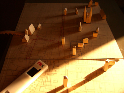
In a course module called DESIGNING A PERVASIVE GAME CONTROLLER", Steffen P. Walz and Philipp Schaerer engaged attendants to plan, design, and prototype the game controller for their game REXplorer.

In the game, the target group - teenage and student tourists - roleplays scientific assistants who investigate odd phenomena occuring across the city core. The players are equipped with a geo-positioning, intelligent measuring apparatus, allowing them to interact with historical and mythical Regensburg characters residing inside landmark buildings with the proper apparatus gesture. Thus, the apparatus serves as the game's controller. It is made out of a hard shell encasing a Nokia N70 smartphone and a GPS bluetooth device.

Why do I blog this? because the design brief is interesting and reflect preoccupations that are of interest with regards to pervasive environment controller, such as magic wands. I'd be curious to see the results.

On a different note (similar though), check the wiimote prototypes here. (this is reminder for me to dig this at some point)

PAC-LAN mixed reality game

In the last issue of the ACM Computers In Entertainment, there is a paper entitled PAC-LAN: mixed-reality gaming with RFID-enabled mobile phones (by Omer Rashid, Will Bamford, Paul Coulton, Reuben Edwards, Jurgen Scheible) that I found very interesting. The paper describes how the incorporation of RFID readers in cell phones can turn it into a game platform to allow interaction with physical objects. The authors present an enhanced mixed-reality version of Pacman. Some excerpts that I found interesting: first the game itself is curious:

PAC-LAN is a novel version of the video game Pacman, in which human players use the Alexandra Park accommodation complex at Lancaster University as the game maze. The player who takes the role of the main PAC-LAN character collects game pills (using a Nokia 5140 mobile phone equipped with a Nokia Xpress-onTM RFID reader shell), in the form of yellow plastic discs fitted with stick-on RFID tags. Four other players take the role of the “ghosts” who attempt to hunt down the PAC-LAN player

It's funny to see how the pacman game is revisited over time (see for instance this version, PACManhattan or Human Pacman)

It's not well discussed in the game but I found pertinent to have the representation of the GPRS network/maze, and to design subsequently around it. That can offer a way to think about Matthew Chalmers' seamful design: how can the seams be exploited to design compelling applications.

I also found very pertinent this idea of "game monitor" developed for monitoring and server administration while in the field. Maybe it's because as a researcher I am interested by all the applications/dashboard that would help me to make sense of how the application is used.

The user experience analysis is very informative (for instance "identify tactics that became apparent during gameplay) and what has attracted my attention overall is the "space-time" analysis. The authors used a space-time plot (still have to check this Bamford 2006 reference) for data obtained during a trial and shows PAC-LAN being hunted down by a ghost:

Here is what they found using this technique:

From this space-time analysis, this particular ghost, despite a delayed start, was often very close to PAC-LAN, and therefore very active in the game. This can be measured dynamically within the game by performing a real-time cumulative correlation calculation between the path of the PAC-LAN player and each ghost. At some point in the game, the server can trigger a power move for the most active ghost. The points or power move benefits will not only encourage ghosts to be more active in the game, but could also result in more collaborative play, e.g., two ghosts lure PAC-LAN into an area where a third ghost is hiding with a power move.

Why do I blog this? because this is an interesting attempt to use mobile phones and RFID to create an pervasive game. The authors are trying to go beyond this concept by adapting the Sega Megadrive classic, Toejam and Earl, with NFC-enabled phones to allow near-field interactions (with touch). They indeed assume that "direct interaction as part of the game may produce a greater collaborative gaming experience", which is a good question to investigate with those technologies.

LEGO joystick

An intriguing joystick made out of LEGO:

Der Joystick besteht im wesentlichen aus einer Achse, die als Hebel benutzt wird. Sie kann vor, zurück, nach links und nach rechts bewegt werden. Der Hebel wird dabei von Gummibändern wieder in seine Ausgangsposition zurückgezogen. Zwei Rotationssensoren erfassen über eine 1:3-Übersetzung die Bewegungen in X- und Y-Richtung. Die Genauigkeit reicht dabei aus, die Koordinaten etwa in den Bereich von -5 bis 5 abzubilden.

Why the hell do I blog this? going through some papers about innovative game controllers, I was struck by the interesting potential of DIY/reconfigurable joysticks (see for instance that project). Maybe I should use LEGO bricks with kids to see how they would prototype the joystick they dream of.

DNA tatoo = Datoo

Design company Frogdesign imagined the concept of Datoo (DNA tatoo):

The concept of the Dattoo arose in response to current trends towards increasing connectivity and technology as self-expression. (... The idea of DNA tattoos (Dattoos) is to use the body itself as hardware and interaction platform, through the use of minimally-invasive, recyclable materials. (...) All hardware would be created on demand and assembled via a special online design portal. Users view, test-drive, and select their product from a variety of options, both functional and aesthetic. They also set the lifecycle of the product, to be utilized for a few hours or a much longer amount of time. Once users are satisfied with their specific configurations, they have this fully-functioning circuitry - including all UI-interactive and display functions - “printed” onto recommended areas of their skin.

Utilizing future technology, Dattoos have yet to reach fruition. The final concept aims to achieve a convergence of the following capabilities: DNA-reader and identification technology; nanosensors and interactive “touch reading” for finger tips (Braille); pattern and image recognition; self-learning and educational applications; living materials that change shape and feel; flexible OLED displays; full voice interaction, directional laser speakers; bionic nano chips; and cyborg components.

Why do I blog this? though speculative, this concept is curious because he it shows how some current practice (tatoo, personalization) are expanded and applied to the "body as the interface" issue.

ThingM

Mike Kuniavsky now announced the lauching of his company (along with Tod Kurt) called "ThingM" (to be pronounced "thingum"). As described by Mike:

ThingM is a design and development studio focused exclusively on ubiquitous computing. We have many hopes for the company, but my dream is to rethink objects in the age of ubiquitous information processing. I believe that information processing can be considered a new kind of material in design (this is the basis of my Smart Furniture Manifesto, and furniture is one of the "object genres" that we have been studying), and that tangible networked objects can be considered a kind of projection of services, rather than mere standalone entities. At ThingM we aim to create a new class of smart everyday objects that abandon the idea of computers as general-purpose devices with a screen, a keyboards and a mouse. Our goal is to change the fundamental nature of all designed objects using pervasive networking and computing. In this, ThingM can be considered a combination of an interaction design studio, an industrial design studio, an engineering consultancy and a software development house, but really, we're a ubiquitous computing studio. Expect to hear more from us in the upcoming months.

Why do I blog this? since I am working on user experience of such ubicomp things, this seems to be a great effort to keep an eye on.