SpacePlace

Chronotopic visualizations: representing traces of people in spatial environments

Reading the newsletter of the french consulting group Chronos, I ran across a term used by Bruno Marzloff that I found intriguing: the concept of "chronotope" defined in Wikipedia as:

"The Russian philologist and literary philosopher M.M. Bakhtin used the term chronotope to designate the spatio-temporal matrix which governs the base condition of all narratives and other linguistic acts. The term itself can be literally translated as "time-space" (...) the chronotope is 'a unit of analysis for studying language according to the ratio and characteristics of the temporal and spatial categories represented in that language'. Specific chronotopes are said to correspond to particular genres, or relatively stable ways of speaking, which themselves represent particular worldviews or ideologies. To this extent, a chronotope is both a cognitive concept and a narrative feature of language."

It seems that this concept if more about narrative and literature analysis but I found it quite relevant when thinking about the evolution of location-based services. Five years ago, location-based services was all about "annotating places" or having "location-based buddy-finder", a more distinctive line of research is now gaining more and more weight: the collection and representation of traces left by people in space through technologies. Will be word "chronotope" be pertinent to refer to these visualizations?

Two examples of "would-be" chronotopic visualization that I find intriguing and relevant (among others):

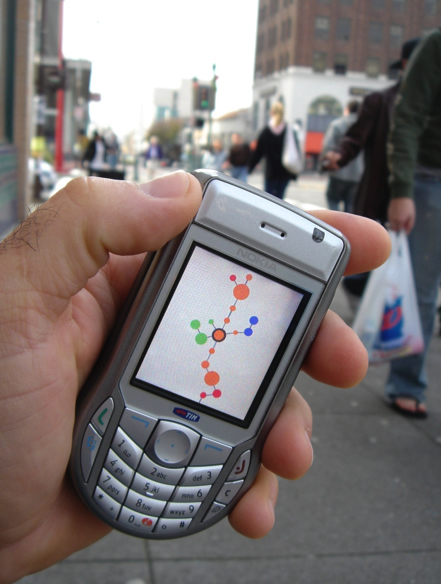
Sashay (by Eric Paulos et al.):

"Sashay is a mobile phone application that leverages the fact that every fixed mobile phone cell tower transmits a unique ID that can be read within the phone’s software. As a user moves throughout an urban landscape this “cell ID” changes. Sashay keeps track of the temporal patterns, history, and adjacencies of these cell encounters to help it build a visualization of connected “places”. (...) The value of Sashay is not in helping you navigate or realize that you are in downtown Austin or at a park in Boston. It is meant to explicitly remove such labeling and leave only an intentionally skeletal sketch of a person’s personal patterns across a city, leaving the individual to wonder and construct their own narrative and meaning. The temptation to build a labeled map is so compelling to many researchers that we are reiterating and advocating the extraordinary value of keeping such visualizations free from literal place labelings."
Real Time Rome by Senseable City

"Real Time Rome is the MIT SENSEable City Lab’s contribution to the 2006 Venice Biennale, directed by professor Richard Burdett. The project aggregated data from cell phones (obtained using Telecom Italia's innovative Lochness platform), buses and taxis in Rome to better understand urban dynamics in real time. By revealing the pulse of the city, the project aims to show how technology can help individuals make more informed decisions about their environment. In the long run, will it be possible to reduce the inefficiencies of present day urban systems and open the way to a more sustainable urban future?"

Why do I blog this? what I find interesting here, more my researcher's POV is the new affordance created by these type of information. It's less about a direct use of space but rather the availability of traces that can be employed to represent city usage or life pattern at a meta level. What would be these new affordances? Of course, lots of emphasis has been put on social navigation ("navigation towards a cluster of people or navigation because other people have looked at something") but how to go beyond that? - make explicit phenomenon that are invisible (lots of projects are about pollution measures) - use these data for urban planning and architecture, to understand "usage of city". I am wondering about how this would benefit to that crowd (that's why I am now working in an architecture lab). See for example Fabien's project for that matter: he investigates spatio-temporal patterns of pictures uploaded on Flickr. - give users some feedback about their activities, closing the control loop as in the Wikicity project (possibly to "empower users, make them in control of their environment"). - create new services based on this information - ...

Spotting high buildings through GPS viz

Reading Stamen's work about cab spots with Eddie Elliott. They actually used the Cabspotting API to produce high-res long-term point maps of San Francisco with cab GPS lcoations. Part of the result description attracted my attention:

"downtown buildings are so high and close together that GPS signals can't make it down to the ground with very much accuracy, bounce around off the glass and steel, and give "bad" results. Fair enough; downtown's not so accurate. But what it means in terms of urban area chartings, where cabs tend to stay in very narrow street slots, is that you can use a visualization like this to tell immediately where the high buildings are by the degree of fuzziness in the map, and if you mapped the height of the buildings over this image, they'd probably overlap prety much one-to-one. (...) you and I live in a world where normal people can look at complex data visualizations of urban environments, notice anomalies in the display, go to the web to find information about where that place is, and then make pretty good guesses as to why the data is showing up the way it is. It needs smart people with some non-trivial technical knowhow to make these particular views on it possible, sure. But once that's done, there's a very quick path available to free information that can be used to reinforce, disprove, or generally poke at the way that the world is, and why it is that way, and it's fluid and easy and you can start asking real questions very quickly.

I think this is a new thing."

Why do I blog this? documenting new processes about the implications of urban visualizations when discussing in a bar with Fabien.

Virtual space evolution according to Korean developer Jake Song

(cross-posted at Terra Nova) Last month, I had the pleasure to co-organize a small event in Seoul about digital and physical space, and how technologies reshape them. One of the speaker, Jake Song gave an interesting talk about the evolution of "virtual space" in multi-player games. A South Korean programmer, regarded as one of the greatest game developers in Korea, Jake is one the of the creator of Lineage and is now CEO of XL Games.

He started by describing text MUDs (1978), in which 100 to 200 concurrent players wandered around virtual places in the form of interconnected rooms. He described to what extent today’s MMORPG inherits most of its design (chat, emote, social structure, etc) but more interestingly pointed out how MUD space was "not correct in 2D sense" using the following schema:

The next step corresponded to 2D MMORPG such as Lineage or Ultima Online, which involved 3000~5000 concurrent players per world. Due to the technical impossibility to have everyone in the same place, there are "parallel universes. As opposed to MUDs, space in geographically correct and as he showed with exampled, players approximately needed about 2 hours from end to end by walking. Through various examples, he showed how buildings are smaller than real world and the necessity to have fast transportation methods (horses, teleportation, etc.)

Then, with 3D MMORPG like EverQuest, Lineage II or WoW, game space is designed for 2000~3000 concurrent players. Compared to 2D MMORPG, the number of concurrent players are reduced somewhat because server has to handle more complex 3D data. The game space generally corresponds to 20 × 20 km in size and transportation methods are needed more than ever (mounts, flying mounts, teleportation). Level design included place utility buildings for players to access conveniently. Shops, banks, etc can be placed far from each other to make players feel the city big, but it will make players inconvenient (" Down time means idle time such like staying in town, moving to other place, etc."). The virtual environment is large enough to feel like the real world and is similar enough to use common sense to navigate.

He concluded with the challenges: the difficulty to have larger game world, the possibility to have user-generated content (to populate worlds), the difficulty to have "one big world" and the ever-growing inclusion of environmental change (weather changing accordingly with weather feeds), evolution over time (deformable terrain destructible building, changing forest, buildings turned into ruins, etc.

So, down the road, the main issues are:

  • geographical correctness: should the system looks and behave like a real-life equivalent (which somehwat connects to the work of Harry Drew).
  • given that geographical correctness is now common, time and transportation is an issue: it takes time to go from A to B and transportation systems must be designed (teleportation, flying in Second Life).
  • presence of concurrent players.
  • presence of "places" with functional capabilities (communication, trading).

Although this may look obvious to many reader, this description if interesting from the research point of view (as well as to have the developers' opinion). In my case, this is important for my research about how location-awareness interfaces can convey information about people's whereabouts in digital spaces. Given the differences to represent space, there are some implications in the way location-awareness tools can be designed. More about this topic later.

Pervasive gaming, laser-games and the "skatepark" model

Last week at PicNic, during the very interesting panel that I participated in, a question from the audience sparked some discussion among us. The attendee slightly complained about the fact that Fabien or myself were a bit too pessimistic about pervasive gaming. Our two presentations, although very different posited that ubiquitous/pervasive computing was difficult to achieve for infrastructure/technical reasons... which leads to user experience issues. The discussion then shifted to "what's the target of pervasive gaming?", I answered that before thinking about a target, one should find the "settings" or context in which pervasive gaming can work. I don't know remember how I phrased the following, so let's see what Tom Hume transcribed it: "It's a bit like laser games, requiring a place with a specific infrastructure. My fear is that it could be turned into theme parks. It might be designed for specific targets or niches".

I tried to elaborate more what I have in mind and think that there are indeed different models of location-based games.

The first one is a bit too utopian: it's thinking that technologies are seamless, hardware and software robust and that no problem occur. In that case, one can envision über-cool location-based networked games running on cell phones everywhere everytime. Although this seems unlikely, one can at least think about this possibility.

At the end of the spectrum, I mention the worse-case scenario: the "laser-game" model in which the game can only be played in a specific time and place. This is what happened in planned games or exhibits (see for example what Blast Theory did with Can You See Me Now?): in this case the game was played in various cities, controlled by the game designers. One can also think about fixed places, as with laser-games, in which horde of players would come and play.

A mid-point on this spectrum would be to have an approach to combine the two. And I quite like the skateboard metaphor for that matter. You can do skateboard freely in lots of places (streets, parking, etc.) and also go to skateparks. In the former, the infrastructure of the everyday environment constrain the skateboarding tricks whereas in the latter the skatepark design is meant to allow certain tricks. What is interesting as well is that in street skating, there is a pleasure associated in finding nice and relevant spots, whereas in skateparks, things are more under controlled.

So, to get back to the topic at hands here, what would be the equivalent if the skateboard practice with regards to pervasive gaming? I think it may corresponds to designing for both targets in minds: both the daily and everyday environment (with its constraints, problems, issues) and for the "laser-park" equivalent in which the control of certain parameters would allow to go beyond the daily environment. And what would be a good candidate (as a device) for that? What corresponds to the skateboard?

Sk8bowls in lyon

Picture taken in Lyon, last month.

Why do I blog this? quick thoughts to be re-used in the future.

The embodiment of space

"We cannot express its relation to ourselves in any other way than by imagining that we are in motion, measuring the length, width and depth, or by attributing to the static lines, surfaces, and volumes the movement that our eyes and our kinesthetic sensations suggest to us, even though we survey the dimensions while standing still. The spatial construct is a human creation and cannot confront the creative or appreciative subject as if it were a cold, crystallized form."

- Schmarsow, August (1994)

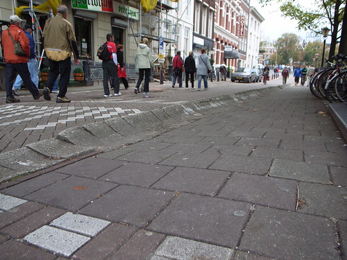
Why do I blog this? I quite like how that quote reflects the importance of the body in space: it's because we are embodied that we can create a spatial construct which corresponds to our reading of the spatial environment. An example? See this street spotted in Amsterdam below, if you're a skateboarder, this quote will make sense: you felt the curved sidewalk only by seeing it, feeling how this would be experienced afterwards with your board. And indeed, the affordance is to make an ollie and use it to jump.

Curved sidewalk

Now, what does that mean for the design of ubiquitous computing systems? I don't have a unique answer but it certainly gives some inspiration about how to create affordances that can be bodily experienced through shapes, forms or representations.

Alien architecture (pre-20th Century)

Alien Architecture: The Building/s of Extra-terrestrial Species - Pre-twentieth Century is a Georgia Leigh McGregor's Honours Thesis from UTS. It deals with what kind of architecture is portrayed by pre-20th century "extra-terrestrial literature". It's basically a study of architectural imagination based on textual research (". It includes both fiction and non-fiction and draws on a range of narrative and scientific works, including utopian, satirical, comedic, philosophical and adventure texts.") that takes architecture as a "tool for understanding" the relationship between ourselves and an alien species, "proposing that architecture is one of the means by which the character of an alien species is read." Few curious insights from the conclusion:

"Consistently the architecture of alien beings has been the architecture of humanity with the wholesale transfer of architectural assumptions. The application of anthropometrics to alien forms, assuming a relationship between dimensions of an extra-terrestrial and their buildings, was made evident (...) In one way the architecture of extra-terrestrial civilisation has remained the same but different, to refer to Ben Jonson’s concept. The conventions of earthly architecture are repeated in space though changing and transforming over time. The twentieth century would see an explosion in the quantity of other worldly literature and new media, with the advent of film and television, through which extra-terrestrial cultures would be portrayed. In the process many of these conventions would be reused and reinvented. Yet some of the most significant conventions arose prior to the twentieth century. (...) Extra-terrestrial architecture moved from representation at an individual level to a portrayal of society, as a whole, integrated with its urban fabric in this period. Architecture was used to create difference and to link to the familiar. Architecture and technology were confirmed as definitive evidence of an intelligent civilisation"

("A View of the Inhabitants of the Moon" - Illustration from an 1836 English pamphlet, publisher unknown - "Note the biped beavers on the right") Why do I blog this? my interest about space, technological implications in space and sci-fi led me to this paper. Lots of interesting stuff here (although it's more food for thoughts than material for my research). I quite like the analysis of the implications as well as the description of the connections between the pieces of text and their context of production (in terms of scientific discovery, etc).
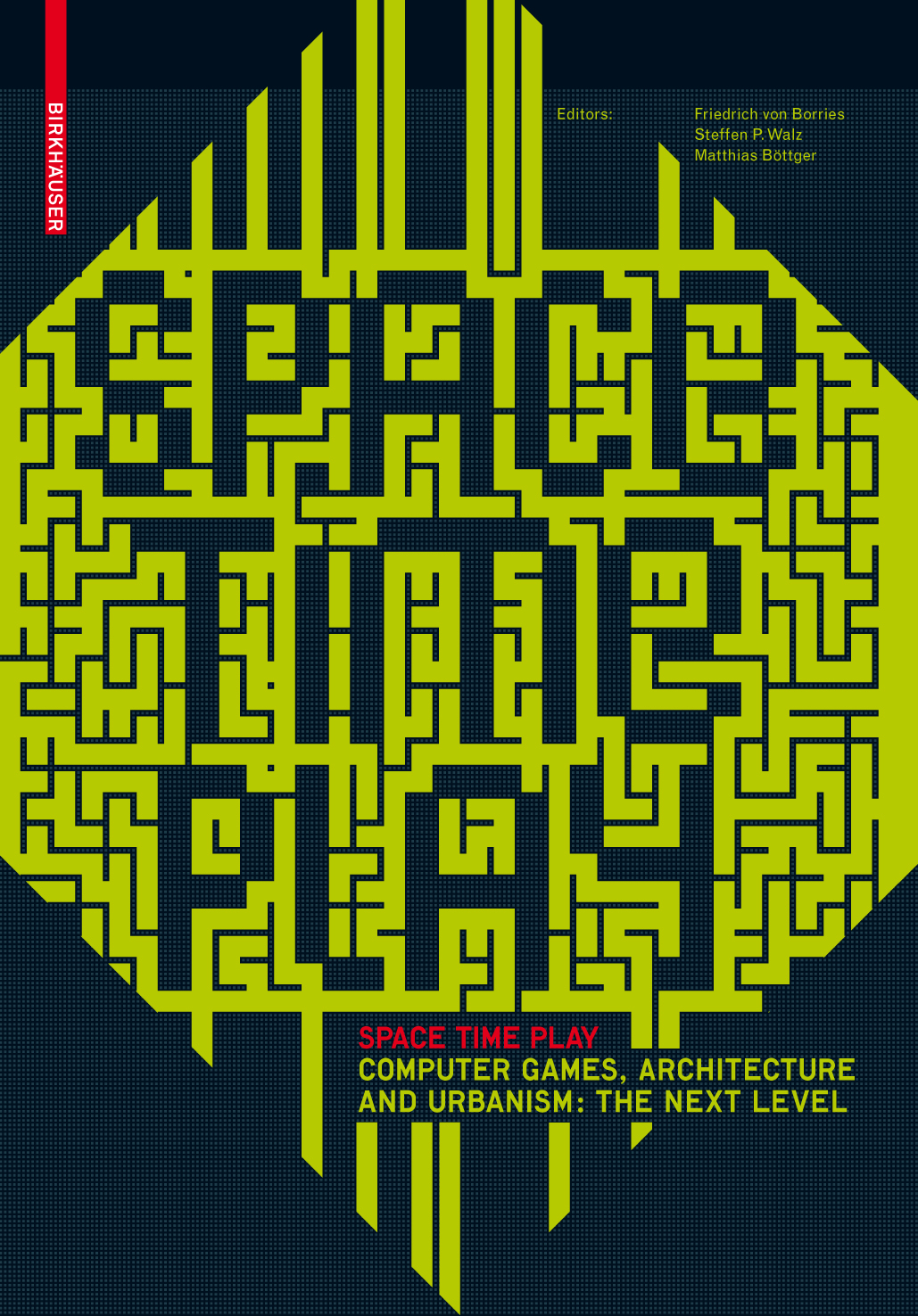
Space Time Play book

Space Time Play Computer Games, Architecture and Urbanism: The Next Level, edited by Friedrich von Borries, Steffen P. Walz, Matthias Böttger (Birkhäuser/Springer Online bookstore). A big compendium of 140 writers, the book "explores the architectural history of computer games and the future of ludic space". The table of content is impressive and I am looking forward to read as it seems to be a blueprint about this topic.

You can fin on-line the introduction about "Why should an architect care about computer games and What can a game designer take from architecture?", which has some interesting perspectives and summarizes very well the issues as stake.

"The spaces of computer games range from two-dimensional representations of three-dimensional spaces to complex constructions of social communities to new conceptions of, applications for and interactions between existent physical spaces. (...) The spaces of the digital games that constitute themselves through the convergence of “space,” “time” and “play” are only the beginning. What are the parameters of these new spaces? To what practices and functional specifications do they give rise? What design strategies will come into operation because of them? "

Of particular resonance with my research will be:

"THE ARCHITECTURE OF COMPUTER AND VIDEO GAMES, traces a short, spatiotemporal history of the architecture of digital games. Here, architects are interested in the question of what spatial qualities and characteristics arise from computer games and what implications these could have for contemporary architecture. For game designers and researchers, on the other hand, it’s about determining what game elements constitute space and which spatial attributes give rise to specific types of interaction. Moreover, it’s not just about the gamespaces in the computer, but about the places where the games are actually played; playing on a living-room TV is different from playing in front of a PC, which, in turn, is different from playing in a bar.

The third level, UBIQUITOUS GAMES, on the other hand, demonstrates how real space – be it a building, city or landscape – changes and expands when it is metamorphosed into a “game board” or “place to play” by means of new technologies and creative game concepts. (...) What happens when the spaces and social interactions of computer games are superimposed over physical space? What new forms and control systems of city, architecture and landscape become possible? (...) The migration of computer games onto the street – that is, the integration of physical spaces into game systems – creates new localities (...) 4th level (...) how the ludic conquest of real and imagined gamespace becomes an instrument for the design of space-time. "

Why do I blog this? tons of material for my current research, I am expecting this to be good for thoughts for future projects. I also wrote a chapter with Fabien about how pervasive gaming can be seen as a re-interpretation of >la dérive situationiste (Guy Debord): a new way to experience the city environment.

"A city is not a tree"

Read in A city is not a tree:

"Each of these structures, then, is a tree. Each unit in each tree that I have described, moreover, is the fixed, unchanging residue of some system in the living city (just as a house is the residue of the interactions between the members of a family, their emotions and their belongings; and a freeway is the residue of movement and commercial exchange).

However, in every city there are thousands, even millions, of times as many more systems at work whose physical residue does not appear as a unit in these tree structures. In the worst cases, the units which do appear fail to correspond to any living reality; and the real systems, whose existence actually makes the city live, have been provided with no physical receptacle."

Why do I blog this? seminal paper about space/place, had a look at it as it popped up the a meeting with Nokia yesterday.

One Wilshire building: when digital is material

Reading this summer "Blue Monday: Stories of Absurd Realities and Natural Philosophies by Robert Sumrell and Kazys Varnelis was a good experience, as the whole book itself is insightful and written exactly in the sort of style I like. It's basically a compendium of stories that may seem odd but which have important implications. The most interesting, with regards to my interests is Ether. Some excerpts I found relevant:

"If Ether were to have a palace, it would have to be the 39-story One Wilshire tower in downtown Los Angeles. (...) One Wilshire unequivocally declares that form follows function. (...) Damaged by the decentralizing policies of Cold War urbanism and increasingly threatened by the sprawling suburbs, the congested vertical urban core began to empty in the 1970s. (...) Eventually, however, a new opportunity presented itself and One Wilshire’s height returned to its advantage. With the deregulation of the telecommunications industry, long distance carrier MCI, which had its own nationwide microwave network, required a tall structure on which to install microwave antennas in close proximity to the AT&T (...) One Wilshire is not only a staging ground for carriers connecting to the local system, it is a key peer-to-peer connection point. (...) Because space in One Wilshire is at such a premium, companies run conduit to adjacent structures. Over a dozen nearby buildings have been converted to such telecom hotels, providing bases to telephone and Internet companies seeking locations near the fountain of data at One Wilshire. This centralization of information defies predictions that the Internet and new technologies will undo cities. But neither does it lead to a revival of downtown in classical terms. (...) The virtual is generally perceived as a drive against the spatial or physical world. Nevertheless, as One Wilshire demonstrates, the virtual world requires an infrastructure that exists in the physical and spatial world. (...) Massive telecommunicational hubs like One Wilshire and their radial networks make the virtual world possible, and firmly ground it into the concrete cityscape."

Why do I blog this? as one of the example I extracted from "Blue Monday", the story about One Wilshire is important because it's an example of how digitality is made possible through materiality. It's also very interesting to see that "space matters", leading companies to locate their servers farms and telecom hotels near this hub. Furthermore, I find curious the presence of such artifacts in cityscape. Here in Switzerland, it's common that server farms (from banks for example) are scattered around the country leading real farms to be also server farms.

Weather forecasts maps and otherness

Today's column by Tyler Brulé in IHT tackles an intriguing issue: the one of map used in weather forecasts:

" In the early '90s, it struck me as odd that British broadcasters never bothered to inform viewers about the weather across the Channel. (...) The pinballing around Europe later revealed that this weather wall stretched to infinity and included most European countries. (...) No matter how many new discount airlines connect Europeans to new destinations at ever lower prices, most TV channels still treat their viewers as if they are house-bound and at most might pop to the store for a carton of milk. There's still no sense, if we're to look at something as simple as the weather bulletin, that there is this bigger entity called Europe and millions of people, everyday, conduct business and personal relationships across multiple borders. (...) the fact is that the media is one of the last sectors to embrace an increasingly global, connected market. Viewers, readers and listeners want to feel they're part of something bigger, not fenced in by borders that might limit choice, opportunity and freedom."

Why do I blog this? living in Switzerland and often traveling to other european countries, I've also been struck by this issue (except that the swiss radio I am following often give forecast for both Geneva and Lyon). I found this phenomenon intriguing, especially regarding how certain representations (maps) may help forming mental representation of otherness/alterity (other spaces).

Sidewalk obstacles

"The following objects can make a sidewalk difficult for some users to traverse if they protrude into the pathway or reduce the vertical or horizontal clear space: Awnings, Benches, Bike racks, Bollards, Cafe tables and chairs, Drinking fountains, Fire hydrants, Folding business signs, Grates, Guy wires, Landscaping, Mailboxes (public and private), Newspaper vending machines, Parking meters, Planters, Public telephones (mounted), Puddles, Signal control boxes, Sign poles, Snow, Street vendors' carts, Street light poles, Street sculptures, Telephone booths, Telephone/utility poles and their stabilizing wires, Traffic sign poles, Transit shelters, Trash bags and cans, Tree, bush, and shrub branches, Utility boxes"

Found in sidewalk design Why do I blog this? browsing some resources about sidewalk design... after reading papers about how space is not uniform and homogeneous. What I find important in this list is the idea that space is filled with different type of objects, that have particular qualities (without any equivalent in a digital world).

Would these elements be problem or opportunities for a ubiquitous computing city?

colored tubes

The picture shows some pavement obstacles encountered few months ago in Geneva.

Cops aren’t really looking for guys attaching grids of foam board to giant TV

The august issue of ICON featured an article about the physical customization of cities by Scott Burnham. It describes how the frustration towards municipal policies against street art has led to a "fresh wave of guerrilla urban design"/interventionists to focus on "physical objects, media channels and aesthetics of the city as source material."

"The current physical city is seen merely as a starting point – its streetscapes malleable and interactive. (...) Scott Wayne Indiana: “Parking meters, sidewalks, fences, gates, awnings, alleys, manhole covers… there is a list of things that could be designed in such a way as to engage with cities [and shift] the focus on the urban environment as a vibrant place that inspires the imagination, intellect and wonders of the human experience.” (...) Yet in the face of such work, the authorities remain largely unforgiving – intervention equals vandalism, and many of the cities coming down hardest are those that lust most for “creative city” status."

For example, it's interesting to hear about Jason Eppink's motivation and methods:

“I started looking at the city in a completely new way. The urban landscape was suddenly full of potential. Objects weren’t just objects anymore; they were opportunities. I occasionally stumble upon an area so devoid of either life or humour that I have an incredible urge to contribute something. This is when I take pictures of the area, study them and develop a piece around what exactly is missing from the space. I look at it like a tailor measuring a client to make the best fitting suit, or a doctor examining a patient to prescribe the right medication.” (...) “One advantage of working outside of the traditional graffiti media is that cops aren’t really looking for guys attaching grids of foam board to giant TVs.”"

Why do I blog this? It's interesting to see how street arts evolved form graffiti/sticker to much more elaborated practices because of various factors ranging from form novelty (beyond graffiti), security issues (cops, municipal policies) and possibly the need to craft/DIY more concrete stuff.

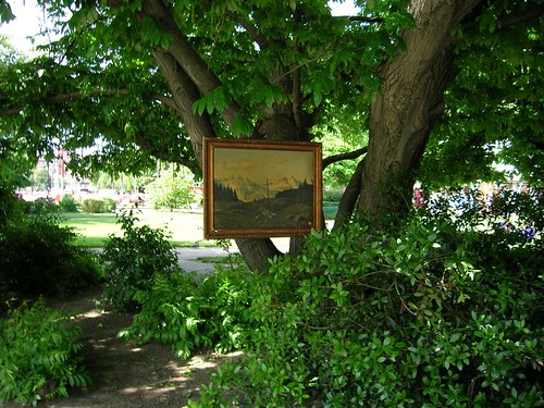
Dscn0066

Picture taken by myself in 2005 in Geneva, some folks here hang up paintings in the city.

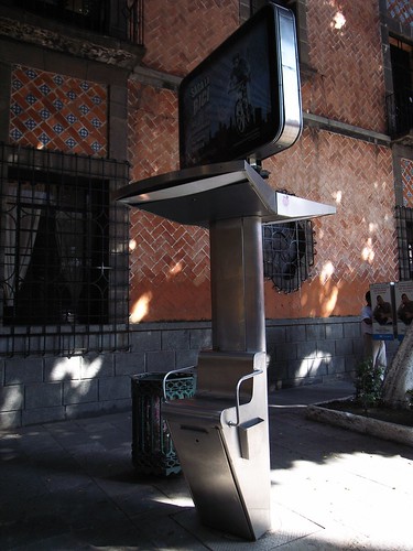
Outdoor ad and shoe polish device

This device is an elevated seat employed by shoe polisher in Puebla, Mexico (Seen last month there). What is strikingly intriguing on this picture is that it has been used as an outdoor advertisement space. Outdoor advertising surface to its best

Why do I blog this? this draws some good reflection about spatial features in cities and cultural differences (nothing like this can be seen down there in Switzerland ;). To what extent an urban artifact begins to have secondary affordances like this? Would it be interesting to use it as a receptacle for other types of information?

Sidewalk edges/curb

The difference of size between sidewalk curbs, first example in Geneva, Switzerland, second in Torino, Italy: Thin sidewalk edge

R0013363

There would be a lot to say about the different sort of curbs (insurmountable, rolled, or rounded, surmountable or traversable and barrier) but here I'm only stuck by the difference of size between these two examples.

IEEE Pervasive Computing about Urban Computing

The last issue of IEEE Pervasive Computing is devoted to urban computing (edited by Tim Kindberg, Matthew Chalmers and Eric Paulos), a topic defined as "the integration of computing, sensing, and actuation technologies into everyday urban settings and lifestyles". What is interesting is that it gives a sort of overview of the current subtopics and main issues of the field:

"rban settings are challenging places for experimentation and deployment, and they remain lit- tle explored as pervasive environments for largely practical reasons. For one thing, they’re complex in terms of ownership. For example, placing sensors in a city will typically require permission from many stakeholders. Urban settings also tend to be far more dynamic and dense in terms of what and who would participate in an application or system. People constantly enter and leave urban spaces, occupying them with highly variable densities and even changing their usage patterns between day and night. (...) The articles we selected confirm that urban computing is a practical reality but that research is still at an early stage, with much of the subject still to be mapped out systematically. "

Why do I blog this? lots of content to read but this is definitely worthwile to see the cutting edge projects and the current trends. Besides, Fabien, Josep and I wrote a short bit (in the work in progress paper section) about the use of Flickr picture to analyze the behavior of people in cities.

Lewis Caroll, blank maps and geoware

"He had brought a large map representing the sea,Without the least vestige of land: And the crew were much pleased when they found it to be A map they could all understand. "What’s the good of Mercator’s North Poles and Equators, Tropics, Zones, and Meridian Lines?" So the Bellman would cry: and the crew would reply "They are merely conventional signs! Other maps are such shapes, with their islands and capes! But we’ve got our brave Captain to thank" (So the crew would protest) "that he’s bought us the best— A perfect and absolute blank!"

Lewis Carroll, The Bellman’s Map (from The Hunting of the Snark, 1876).

The map is an ocean chart that allows the characters of the book to cross the ocean, hunting for "the Snark". The fact is that is only shows the ocean without any further details.

Why do I blog this? Stories about maps are always intriguing, this blank sheet of paper with navigational cues (N,S,E...) is very mysterious and may represent humans clueless about where they were located. But at the same time, a map that we can all understand.

More seriously, this is also about granularity, in the middle of an ocean this map is quite exact and accurate if there is nothing in the portion considered. Blank maps can be very often found when changing the granularity of online map applications, leading to this nonsensical situation.

The materiality of networked cities

Stephen Graham, in his essay entitled "Strategies for Networked Cities" has some very convincing arguments against supporters of "ICT-based end of city visions" who ignore the very material realities that make the supposedly “virtual” realms of “cyberspace” possible:

"in their obsession with the ethereal worlds of cyberspace – with the blizzards of electrons, photons, and bits and bytes on screens – end of city commentators have consistently ignored the fact that it is real wires, real fibers, real ducts, real leeways, real satellite stations, real mobile towers, real web servers, and – not to be ignored – real electricity systems that make all of this possible. All these are physically embedded and located in real places. They are expensive. They are profoundly material. (...) Because the material bases for cyberspace are usually invisible they tend only to be noticed when they collapse or fail through wars, terrorist attack, natural disasters, or technical failure."

Why do I blog this? some good points there to keep in mind when designing ubiquitous computing applications (which need electricity, access to a network, etc.), material to be quoted in presentations to come.

Some perspectives on urban computing

Dourish, P., Anderson, K., & Nafus, D. (2007) Cultural Mobilities: Diversity and Agency in Urban Computing, Proc. IFIP Conf. Human-Computer Interaction INTERACT 2007 (Rio De Janiero, Brazil). This article is a comprehensive critique of mobile computing in the city that has been construed quite narrowly. the authors criticized urban computing applications, and the underlying vision of urban and mobility they convey. Some excerpts:

"The narrowness of both the site and “the users,” we will argue, has meant that mobile and urban computing have been driven by two primary considerations. The first is how to “mobilize” static applications (...) The second is how to provide people with access to resources in unfamiliar spaces, the “where am I?” approach, as manifested in context-aware applications (...) While these applications clearly meet needs, they fail to take the urban environment on its own terms; they are based on the idea that urban life is inherently problematic, something to be overcome, in comparison to the conventional desktop computing scenario."

The view on mobility they propose is oriented by 3 principles that can help opening up the design space for urban computing: (1) Mobility takes many forms (different type of journey, different means of transport) (2) Movement in space is more than going from A to B (3) People move individually but collectively produce flows of people/goods, etc. that serve to structure and organize space

As described in the conclusion:

"To that end, our criticisms of much (certainly not all) of conventional urban applications of ubiquitous computing are that, first, they construe the city as a site for consumption, organizing it in terms of available resources; second, that they reflect only very narrowly the breadth of urban experience, focusing on particular social groups (generally young and affluent); third, that they focus on individual experience and interaction, rather than helping people connect and respond to the larger cultural patterns and urban flows within which they are enmeshed. "

They also present 4 areas of research into mobile computing: mobility as a disconnection (i.e. how to get a mobile access to information), the problem of dislocation (i.e. wayfinding and resource location), disruption (i.e. how context-sensitivity might provide contextualized service/filter) and locative media. While the first three categories focus on "mobility as a problem", locative media is more appealing to them because it takes "mobility as an opportunity".

Why do I blog this? This is the sort of remarks/principles that I like being expressed because it resonates a lot with my own thoughts about urban/mobile computing, and the underlying issues propelled by designers of these applications.