SpacePlace

Space, cognition, interaction 4: the importance of territories

This is the fourth blogpost of a serie that concerns my thoughts about the topic “Space, cognition, interaction” that I address in my dissertation . Step 4 is about the importance of territoriality (see step 1, step 2, and step 3). When dealing with people and location, the fundamental use of space concerns human territoriality. It reflects the personalization of an area to communicate ownership. Territories as specific context support social roles among a community (Prohansky et al., 1970). Therefore, the meaning of a particular place is endowed through its exclusive use. Each place thus corresponds to a set of allowed behaviors. There is a strong inter-relation between group identity (feeling that we belong to a larger human group) and spatial identity (based on our habits, experience and knowledge about the environment). Jeffrey and Mark (1998) found that territoriality was an important feature in the context of virtual worlds. For example, building one’s house in Active World is a way “to provide a territorial marker and provide a feeling of ownership for the owner” (Jeffrey and Mark, 1998, p. 30). Furthermore, it seems that people build their house in existing neighborhoods rather than in uninhabited places. Additionally, territoriality could be defined as a way to achieve and exert control over a segment of space (Prohansky et al., 1970) and then to maintain and achieve a desired level of privacy. According to Minami and Tanaka (1995, p45), "group space is a collectively inhabited and socioculturally controlled physical setting". The activity then becomes a group activity in terms of interactions with and within space as well as a control to the degree of space maintaining.

Another concern linked to the topic of human territoriality deals with the visibility and the permeability of its boundaries. There are not only fixed and impermeable community perimeters (closed by walls for instance), but also invisible temporary group territories. Small conversing groups in public places are an interesting example: fixed barriers are replaced by what Lyman and Scott (1967) call “social membranes”. Knowles (1973) studied which factors affect the permeability of those invisible boundaries. Using spatial invasions, he showed that people tend not to invade other group territories even if they are in a public space or path (Knowles, 1973). Furthermore, Cheyne and Efran (1972) found that group spaces feel invaded if the boundaries become fuzzy or if the distance among group members becomes large. If this distance is above four feet, the boundary becomes ineffective and passers by begin to walk through the group. Space thus models group interaction. Agreements on spatial territory (Lyman and Scott, 1967) or the closeness of members (Cheyne and Efran, 1972) are examples of rules that govern group interaction.

References:

Cheyne, J. A., & Efran, M.G. (1972): The effect of spatial and interpersonal variables on the invasion of group controlled territories. Sociometry, 35, 477-487.

Jeffrey, P., & Mark, G. (1998). Constructing Social Spaces in Virtual Environments: A Study of Navigation and Interaction. In K. Höök, A. Munro, D. Benyon, (Eds.) Personalized and Social Navigation in Information Space, March 16-17, 1998, Stockholm (SICS Technical Report T98:02) 1998) , Stockholm: Swedish Institute of Computer Science (SICS), pp. 24-38.

Knowles, E. S. (1973). Boundaries around group interaction: The effect of group size and member status on boundary permeability. Journal of Personality and Social Psychology, 26, 327-331.

Lyman, S. & Scott, M.B. (1967): Territoriality. A Neglected Sociological Dimension. Social problems, 15, pp. 236-249.

Prohansky, H.M., Ittelson, W.H. & Rivlin, L.G. (1970). Freedom of choice in a physical setting. In H.M. Prohansky, W.H. Ittelson, & L.G. Rivlin, (Eds.) Environmental psychology: People and their physical settings (pp.177-181). New York: Holt, Rinehart & Winston.

Minami, H., & Tanaka. K. (1995). Social and Environmental Psychology: Transaction Between Physical Space and Group-Dynamic Processes. Environment and Behavior, 27(1), 43-55.
Tags all over the place

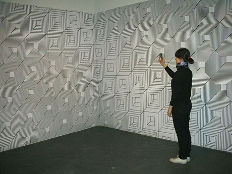
Look at this project by Variable Environment:

As described by Patrick Keller:

" The overall set of pictures will describe a sort of (little bit visually) annoying space, made of artifacts that look traditional on first sight (wallpapers, mirrors, table, etc.) but that have a discrete second or third function. A marker based room which functions can potentially evolve over time, be (inter-)/re/active and/or endlessly customizable, evolve from a private atmosphere to a more public one. A space where also most of its content remains invisible to the human eye but can be seen through (cellphone, handheld, fixed) camera. It could be a "one room somewhere -including a film set-- where somebody live and work"."

Archizoom's "No stop city"

The "No stop city" by archizoom associati (italian radical architecture group) is one of the visionary architecture project that Kazys Varnelis desribes as having a role in terms of " bing useful when they don't rely on a proximate future but rather suspend the question of their nearness, thereby being both already present and objects of contemplation". Kazys defines this project as follows.

"Archizoom elaborated on this in their 1969 No-Stop-City, an extrapolation of the postmetropolitan urban condition – that was simultaneously utopian and dystopian. (...) Modeled on the supermarket, the factory, and the horizontal plans of Büro Landschaft, No-Stop-City was envisioned as a "well-equipped residential parking lot" composed of "large floors, micro-climatized and artificially lighted interiors." Without an exterior, these "potentially limitless urban structures" would be "made uniform through climate control and made optimal by information links." Rather than serving to identify a place, No-Stop-City would be a neutral field in which the creation of identity through consumption could be unfettered."

Why do I blog this? I find intriguing this vision of the city, reminds me of what we discussed during the LIFT07 workshop about it. This potential future sees the city as a terminus due to the economic changes and its networked organizations (made possible by technologies such as phones/internets...). As Kazys puts it after Banzi: "No longer viable as a place, the city would become a condition, existing not as a physical entity but as programming". Of course, this is a vision that makes us ask some important "why" questions about the future.

Understanding the cultural dimensions of cities (for urban computing)

Williams, A. and Dourish, P. (2006). Reimagining the City: The Cultural Dimensions of Urban Computing. IEEE Computer, 39(9), 38-43. The paper aims at changing the view of cities as they can be perceived in "urban computing": it's essentially an overview of how cities should not be seen as a generic concept that is made of infrastructures and people living in them. Much rather, the authors advocates for viewing them as a product of history and culture. In a sense they described to what extent how infrastructures, city-dwellers and their practices are entwined to answer the question "What cultural dimensions frame research in technologies for city life?". Doing so, they bring forward three "urban themes":

"Friends and strangers: (...) Others see them as embodiments of communitas, social togetherness, belonging, and mutual support. [Lovegetty, Dodgeball.com] (...) pervasive computing technologies are commonly depicted as being capable of transforming strangers into friends who are available for social (frequently heteronormative) interaction. (...) Paulos and Goodman’s device, Jabberwocky, detects the people its user encounters in travels throughout the city, lighting up when it detects someone the user has encountered before. While not designed as a friend finder, it nonetheless renders spaces intelligible in terms of occupancy and patterns of hidden and potential familiarity. (...) Mobility: (...) we share urban spaces with people who, due to disability, economic status, immigration status, employment, race, caste, and other reasons, find themselves unable to move about easily or, conversely, have mobility forced upon them. (...) Legibility: (...) cities as informative environments that inhabitants can understand and interpret."

So, once integrated, what does that bring to the table? Williams and Dourish interestingly gives 3 directions:

"see spatial distance, regional familiarity, and personal contact not simply as instrumental aspects of cityscapes to be “overcome” by new technologies, but also as contexts within which new technologies must operate.

Second, we should adopt a broader view of the city’s occupants, their activities, and the conditions in which they conduct those activities (...) While urban computing has focused primarily on the city’s image as a setting and container of action, we argue instead for viewing the city that we experience every day as a product of historically and culturally situated practices and flows."

Why do I blog this? The paper definitely echoes with my interest in space as a way to affords social and cognitive interactions. By highlighting the importance of cultural dimensions, the paper is IMHO a pertinent read about how to better think the city as a complex system in which the context matters. Hence the problem of thinking about urban computing as an easily generic design problem for which outcomes can be transferrable or sold everywhere. This definitely helps criticizing normative design such as the so-called intelligent house or smart information systems about public transport that companies want to throw on the markets.

Space, cognition, interaction 2: Person to person relationship in space

This is the second blogpost of a serie that concerns my thoughts about the topic “Space, cognition, interaction” that I address in my dissertation . Step 2 is about the person to person relationship in space (see step 1). A large amount of research about how spatiality shapes one’s behavior focused on co-present settings since it is the most recurrent situation of our lives. The best-known example of how space structures social interaction is proxemics: the distance between people is indeed a marker that expresses the kind of interaction that occurs, and reveals the social relationships between the interactants (Hall, 1966). Depending on the distance, Hall proposed four kinds of spheres (intimate, personal, social and public) that each affords different types of interactions. His point was also to show how theses interactions are culturally dependent and how distance constrains the types of interactions that are likely to occur. The perception of the “others” in space thus communicates to participants as well as to observers, the nature of the relationships between the interactants and their activity. Studies of 3D worlds show that proxemics are maintained in virtual environments (Jeffrey and Mark, 1998; Krikorian et al. 2000). These authors found that, even in virtual worlds, a certain social distance is kept between participants’ avatars. They noticed how spatial invasions produced anxiety-arousing behavior (like verbal responses, discomfort and overt signs of stress) with attempts to re-establish a preferred physical distance similar to the distance obverted in the physical world.

(picture courtesy of the Library of Congress, Prints and Photograph Division, FSA-OWI Collection taken as an example of how people will maintain differing degrees of distance depending on the social setting and their cultural backgrounds)

Proximity has also proved to improve various processes like conversation initiation. Communication is easier in physical settings than in mediated contexts. The physical environment increases the frequency of meetings, the likelihood of chance encounters and therefore community membership and group awareness thanks to informal conversations triggered by repeated encounters (Kraut et al., 2002). Furthermore, distance between people has an important influence on friendship formation, persuasion and perceived expertise (Latané, 1981). Latane shows that people are more likely to deceive, be less persuaded by and initially cooperate less with someone they believe to be distant.

References:

Hall, E.T. (1966). The Hidden Dimension: Man’s Use of Space in Public and Private. Garden City, N.Y.: Doubleday.

Jeffrey, P., & Mark, G. (1998). Constructing Social Spaces in Virtual Environments: A Study of Navigation and Interaction. In K. Höök, A. Munro, D. Benyon, (Eds.) Personalized and Social Navigation in Information Space, March 16-17, 1998, Stockholm (SICS Technical Report T98:02) 1998) , Stockholm: Swedish Institute of Computer Science (SICS), pp. 24-38.

Krikorian, D.H., Lee, J.S., Makana Chock T., & Harms, C. (2000). Isn't That Spatial?: Distance and Communication in a 2-D Virtual Environment. Journal of Computer Mediated Communication, 5(4).

Kraut, R. E., Fussell, S. R., Brennan, S. E., & Siegel, J. (2002). Understanding effects of proximity on collaboration: Implications for technologies to support remote collaborative work. In P. Hinds & S. Kiesler (Eds.) Distributed Work (pp.137-162), Cambridge: MA: MIT Press.

Latané, B. (1981). The psychology of social impact. American Psychologist, 36(4), 343-356.

Boundary Functions

Boundary Functions is a project by Scott Sona SNIBBE:

"If you participate in this work, you will see a line as a boundary between you and others, which is usually supposed to be invisible, to identify your territory. The boundary changes according to the position of each individual on the floor, but the rule is that the person at the center must always be the closest to the boundary. This line-producing program relates to the "Voronoi Diagram" and "Dirichlet Boundary Conditions", which are used to analyze natural phenomena with mathematical rules: patterns of ethnic settlement, animal dominance, or plant competition in anthropology or geography, the arrangement of atoms in a crystal structure in chemistry, the influence of gravity on stars or star clusters in astronomy, and so on. The boundary that surrounds participants does not exist on their own but changes in a subtle way like conflicts between the individual and society."

Why do I blog this? I thought it's a nice project that exemplify the spatial aspects of interactive technology.

Space, cognition, interaction 1: space/place

This is the first blogpost of a serie that concerns my thoughts about the topic "Space, cognition, interaction" that I address in my dissertation. This issue has been tackled by various disciplines ranging from environmental psychology to sociology, architecture and human-computer interaction when technology is involved. This blogpost serie summarizes some important notions and results arising from these fields. In each of the post I try to describe how this is important to the the object of my research: the location awareness of others. Step 1 is about the differentiation between "space" and "place". A recurrent discussion concerning spatiality targets the differences between the concepts of “space” and “place”. Harrison and Dourish (1996) indeed advocated for talking about place rather than space. They claim that even though we are located in space, people act in places. This difference opposes space defined as a range of x and y coordinates or latitude/longitude to the naming of places such as “home” or “café”. By building up a history of experiences, space becomes a “place” with a significance and utility; a place affords a certain type of activity because it provides the cues that frame participants’ behavior. For instance, a virtual room labeled as “bar” or “office” will trigger different interactions. In a sense, it is the group’s understanding of how the space should be used that transform it into a place. Space is turned into place by including the social meanings of action, the cultural norms as well as the group’s cultural understanding of the objects and the participants located in a given space. However, as Dourish recently claimed, this distinction is currently of particular interest since technologies pervade the spatial environment (Dourish, 2006). This inevitably leads to the intersection of multiple spatialities or the overlay of different “virtual places” in one space. Thus, location-awareness of others also relates to how people make sense of a specific location: depending on the way the location of others is described, it could lead to different inferences. For example, knowing that a friend is at the “library” (place) frames the possible inferences about what the friend might be doing there.

Additionally, partitioning activities is another social function supported by spatiality (Harrison and Dourish, 1996). For example, in a hospital, corridors are meant to be walked in to go to waiting rooms where people wait before meeting doctors who operatein operating rooms. Research concerning virtual places also claims that a virtual room can define a particular domain of interaction (Benford et al. 1993). Chat rooms, for example, are used to support different tasks in collaborative learning: a room for teleconferences and a room for class meetings (Haynes, 1998). Different tasks correspond to virtual locations: a room for meetings related to a project, office rooms related to brainstorm, public spaces related to shopping and so on. Fitzpatrick et al. (1996) found that structuring the workspace into different areas enables to switch between tasks, augments group awareness and provides a sense of place to the users as in the physical world. Since work partitioning can be supported by space, knowing others’ whereabouts is an efficient way to make inferences about the division of labor in a group. Once we know that a person is in a particular place, we can infer that he or she is doing something (as we saw in the distinction space/place) and how this may contribute to the joint activity.

References: Benford, S.D., Bullock, A.N., Cook, N.L., Harvey, P., Ingram, R.J., & Lee, O. (1993). From Rooms to Cyberspace: Models of Interaction in Large Virtual Computer Spaces. Interacting With Computers, 5(2), 217-237.

Dourish, P. (2006). Re-Space-ing Place: Place and Space Ten Years On. In Proceedings of CSCW’2006: ACM Conference on Computer-Supported Cooperative Work (pp.299-308), Banff, Alberta.

Fitzpatrick, G., Kaplan, S. M. Mansfield, T. (1996). Physical spaces, virtual places and social worlds: A study of work in the virtual.. In Q. Jones, and C. Halverson, (Eds.) Proceedings of CSCW'96: ACM Conference on Computer Supported Cooperative Work (pp.334-343), Boston, MA.

Harrison, S., & Dourish, P. (1996). Re-Place-ing Space: The Roles of Place and Space in Collaborative Systems. In Q. Jones, and C. Halverson, (Eds) Proceedings of CSCW'96: ACM Conference on Computer Supported Cooperative Work (pp.67-76), Cambridge MA, ACM Press.

Haynes, C. (1998). Help ! There’s a MOO in This Class. In C. Haynes, and J.R. Holmevik, (Ed.s) High Wired: On the Design, Use, and Theory of Educational Moos (pp.161-176). Ann Arbor: The University of Michigan Press.

Podotactility: feeling texture with your feet

Podotactility This is what the french calls a "podotactile", namely a textured strip which runs along the edge of the metro/tram station platform or even sidewalk, which one can feel with the feet. It's meant to warn people (blind or not) that there is limit/boundary between a space one is free to walk in and another area that can be dangerous. So the texture affords the limit (Bruno Latour would say that this "non-human" artifact is a way to delegate a function to an object).

This leads to another kind of "touch" feeling: in a sense "podotactility" is about feeling with the feet.

So why this is interesting? I quite like this example because it shows how textures are important and can have affordances (especially in physical space). Would it be possible to use podotactility in innovative way, beyond signaling people that there are dangers? Yes, of course, but what will happen if it has several affordances? A possible solution would be to use different granularities. Will then people learn these new codes (lot of space between dots = low danger, close dots = big danger)? Certainly food for thoughts for near-field interactions.

And of course, in terms of digital equivalent, there are some projects that propose some rugosity in mouse interactions/force feedback that can be perceived by similar (felt by the hand though).

Code and architecture

"When code matters" by Ingeborg M Rocker is an article in Architectural Design that deals with the role of computation in the discourse and praxis of architecture. It gives a well summarized overview of historical computational models and concepts and then interestingly discuss their role in architecture.

While previously architects were obsessed with the reduction of complexity through algorithms, today they are invested in exploring complexities based on the generative power of algorithms and computation.(...) Most architects now use computers and interactive software programs as exploratory tools. All their work is informed by, and thus dependent on the software they are using, which inscribes its logic, perhaps even unnoticed, onto their everyday routines (...) The computer is no longer used as a tool for representation, but as a medium to conduct computations. Architecture emerges as a trace of algorithmic operations. Surprisingly enough, algorithms – deterministic in their form and abstract in their operations – challenge both design conventions and, perhaps even more surprisingly, some of our basic intuitions.

Why do I blog this? curiosity towards architectural practices, and - of course - how technology reshape how people do what they do.

Spatiality and sensor technologies

The Spatial Character of Sensor Technology is an academic paper by Stuart Reeves, Steve Benford, Andy Crabtree, Jonathan Green, Claire O’Malley and Tony Pridmore that interestingly propose a framework for analysing the intricate relationships between sensors and spatiality. As the authors point out, it discusses an important fact: the way seams between sensor-based devices such as Wifi or GPS create this spatial character and hence users' reactions.

Some excerpts I found pertinent concerned the examples given by the authors (these are raw excerpts, not very well understandable if you don't know the systems)

Example 1: the spatial character of the network as experienced by players was exploited and repurposed as part of the game. (...) The spatial character of this game arena was thus experienced as very much part of the game’s dynamic as players ‘discovered’ network coverage. (...) Example 2: Can You See Me Now: runners sometimes relied on ‘hiding’ in the GPS ‘shadows’ created by buildings obscuring satellites in order to obfuscate their position from online players until the last moment, when runners would then spring out from the shadows and ambush unsuspecting players. In this example, again, spaces in which interaction is impossible (i.e., GPS shadows) became an exciting and special dynamic within the game, deepening the playing experience rather than being a source of breakdown for runners and players to constantly repair. Here the spatial character was created by the contingencies of GPS coverage; this was experienced for runners as a developing “body of knowledge,” informing them of, for example, ‘good’ times of day for being in particular locations and appropriate places to ‘hide.’ (...) Example 3: Savannah: the invisibility of region boundaries (and occasionally the uncertainties of GPS) caused discrepancies between participants’ views of the action, and thus their ability to coordinate attacks successfully. (...) Example 4: MIT Media Lab’s Kidsroom: The spatial character of the room created by the sensor technology was thus not revealed to participants but was rather worked into the narrative in an endogenous fashion so that the children could be guided into the correct places.

The authors then describe a "spectrum of spatial character" based on those examples:

At one extreme end interaction and interference spaces are revealed to users who are expected to fully manage breakdown as part of their interaction, whereas at the opposing end, such interaction and interference spaces are hidden from the users, and they are guided through the spatial arrangement by the system in some way. Towards the centre are systems in which spatial aspects of interaction and interference are partially revealed, however users are provided with some system support to resolve breakdown. (...) It is thus possible that different design strategies could be appropriate for different demographics of users; for children, a designer may wish to intentionally hide seams for pedagogical reasons, or perhaps in order to create certain forms of experience, such as a “magical” system where the effects produced by the interface are exposed, but the underlying structure is hidden from the user.

Why do I blog this? because this is connected to my PhD research that deals with the link between spatiality and user experience of pervasive computing. The issues described here are very interesting in terms of what should be revealed to the users, surely an important paper for Fabien.

Playground for elderly persons

Via delicious, I ran across this short news in Times about playgrounds for elderly persons:

The idea was hatched in Finland, where researchers have experimented with what they call “three-generational play”.

The University of Lapland found that a combination of climbing frames, swings and seesaws had significantly helped old people to regain confidence in their bodies. Forty test patients aged between 65 and 81 showed improvements in balance, co-ordination and speed after using a playground for three months.

Why do I blog this? that's relevant, when thinking about social cohesion and urban planning, why not devoting places for people that would enjoy such activities. Much of the energy is focused on kids playground, why not thinking about other users. This does not mean that it should be a parkour for elders but there is surely a design issue here.

Elephant paths

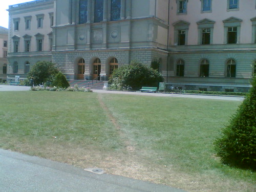
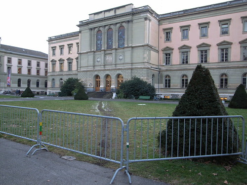
Sometimes "elephant paths" do not please people. As I explained here, this terms refers to paths that is formed in space by people making their own paths and shortcuts. Look at what happened in the "Parc des bastions" in Geneva: Elephant path in Geneva Please no

Why do I blog this? from the user point of view, an elephant is interesting because it shows some explicit traces of people's intentions in space. Therefore, when you see these fences that tries to prevent people from having a shortcut, this makes me wondering whether what will happen. And since fences are only put on one side of the elephant path, there will be some interesting traces because people from the other side will still keep using it and change their trajectory only at the end of the path.

Now, if we think about virtual worlds, there are of course research works about walkthrough and shortcuts in video games (see Axel Stockburger's paper about discursive walkthrough which is somewhat related to that). But is there any instance of counter-elephant paths measures in MMORPG?

Lazarus/Zombie devices

On waiting and killing time: doing hanging around is a paper by Mark Perry that would surely be of interest for Karen Martin, Arianna Bassoli and Johanna Brewer who organized a workshop on this topic ("Waiting: a workshop on place/time and future technologies"). In this short paper, the author explores what he calls "the reality of waiting" and inevitably, this lead to the concept of "dead time" that lots of tech designers try to fill in with crazy technologies; based on the assumption that dead moment needed to be filled:

Information technology use plays an important role in contemporary waiting, especially through the mobile telephone, which allows us to act somewhere other than where we are waiting. We have called these technologies (see Perry and Brodie, 2005) Lazarus devices (reviving dead time), although more realistically they should be seen as Zombie devices (only partial reanimation). (...) Industry rhetoric would like us to think about technology as a post-modern agent in ‘the death of time’, but our data does not suggest this; rather it can offer a resource to making more effective use of our time, or to perform our activities in a different way or temporal sequence. But this is hardly radical. People make use of this technology (in the same way that they used paper previously) precisely because they are waiting, and not because the concept of waiting has been weakened or vanquished. (...) technology developments can do more than simply allow us to fill this time with things that we could only otherwise do elsewhere (...) we could improve the quality of the waiting rather than trying to diminish its resource constraining effects on our plans.

I really liked this excerpt too because I find quite revealing:

This perspective on the wait differs from those expressed earlier, in the notion of work-as-waiting. Certainly, the time is being filled, but worthlessly, and is consequently experienced as a drag. A similar view can be seen in the groups of teenagers hanging around fast food restaurants, perpetually waiting for some (often never actuating) event to happen (often termed ‘loitering’, not just the neutral form of waiting)

Why do I blog this working on consulting projects regarding mobile/casual gaming, I have always been amazed by this tendency to fill dead moments. But the situation is really more complicated (not to mention the benefits of "down moments") The arguments described in this paper interestingly address those issues. Besides, there will be a lot to discuss on the "aggregated waiting experience" topic but I leave that for another time.

Geo-games: M3 glider

Geogames is a dutch company that proposes services regarding geo-simulated environments such as M3D Glider.

M3Glider delivers add-on for Google Earth allows you to interactively explore the world in all informative detail - on demand. Smoothly glide from the global to local level while M3D Glider instantly presents you with high quality images, photography and location-based information streamed from anywhere on the internet. Unlike other simulation systems M3D Glider offers a truly light-weight plug-in in an open, Ajax and web 2.0 oriented solution.

This technology offer tools to simulate 3D environments on Google Earth. As stated by one of their employee:

Our idea at GeoGames is that avatars should be seen as a transparent, fluid entity - not an end in itself. They become usefull when they function as tools for the personal data mining and search activities that geo-simulated environments will offer soon.

Why do I blog this? looking at all those tools that focus on how to improve Google Earth's interactivity as a virtual world platform is very intriguing; might this platform be used as a social space at some point?

Lessons learned from connected classrooms

This morning, Jeffrey Huang gave a very interesting talk at the classroom of the future workshop. It was about lessons and challenges regarding new types of environments that would benefit from technologies to connect people from different places. My raw notes are below: lessons learned from connected classrooms 2 examples - swisshouse project (2000-2010): to address brain drain, a network of 20 buildings in strategic lcoations, to transfer knowledge back in switzerland - digial agora: 4 buildings (washington, naplio, alexandria, callisto: a boat): a structure to facilitate seminars of the harvard center for hellenic studies

in both projects, architecture is an interface using walls, ceilings... to connect this idea is not new, already in the 17th century: athanasius kirchner (1650): walls and ceilings as "interfaces", you can stand next to a statue and eavesdrop conversation or spread secret by whispering secrets to the wall another example: 1964 Eames' IBM pavilion (to show the progress of IBM at the time, the building was a communication vector)

today: it's much easier to do it, these interfaces have become smaller and more powerful how to embed this tech in architecture

design principles used to create those spaces - hardware component: modular system with basic shells to accomodate different configurations + plug and play module. In the swisshouse, the floor is the infrastructure in which they plug walls - software: building OS (operates the i/o devices: light, audiovisual...) and application layers (ambient, artifact, people). Ambient layer = what is part of the wall, there are lots of dispays. Artifact layer = where you display artifact, flat for example on tables. People layer = the way to bring remote people into the space, LCD screens on rollers.

4 key challenges:

  1. Different ways of knowledge transfer: how to go beyond the traditional lectures and passive behavior: this is achieved through a different spaces: knowledge cafés, digital wall (for more traditional lectures and peesentations), arenas (step down spaces for intimate debate) + curtains to reduce noise.
  2. Different levels of presence: problem that you have when people are remote... schedule remote presentations... lack of copresence sense, translucent presence... awareness of others, design a presence that is more gradual. Always-on video that connect spaces (and not people).... virtual cocktail after the lecture in both Boston and Zurich. RFID reader to register physical visitor in order to know who is where (Swatch watch with rfid tag). Viz of who is where
  3. Adaptive usage and future: trading flexibility and coherence... accomodate different knowledge transfer scenarios, can evolve over time versus obsolescence, adapat architecture in real time through software driven cutomization. For example: the glasswall has not technology in it, you can replace it. Part of the design of the 2 projects are 50% about software: different interactive wallpapers. Microphones in certain locaiton that capture conversations and represent them on walls ("sediments of thoughts"), chat on a wall, tangible and playful wall.
  4. Beyond the desktop: choreographing connectivity: coordination of multiple displays and multiple inputs, pervasiveness of mapping (superimpose versus invent new elements), layered approach: context defines content (ambient, artifact, people layers), "tangible" interfaces. Pinwheels that generate wind depending where people are present (if people are in asia...).

no scientific studies of the results yet lessons learned form first nodes so far: (+) community creation capacity - events, rituals informality, spontaneous interactions adaptivity of walls (-) acoustic transparency versus visual transparency (in the end people just want visual transp and not acoustic transp.) connectivity (most of the actions are only local but this is due that are just 1 node with a digital agora... it's like if only one person had a fax machine)

Q&A: Stefano Baraldi: how people learn to use that space? Jef: there is a tech person that set and maintain this stuff so visitors do not have to learn, people intuitively interact there. Because things should work similarly.

Why do I blog this? I liked the approach and the discussion about key challenges to have augmented environments. Besides, the infrastructure is a very well thought with less technology in the environment (it's easy to remove elements such as walls) and rather use software components.

More about this: Huang, J. and Waldvogel, M. (2004). The swisshouse: an inhabitable interface for connecting nations, Symposium on Designing Interactive Systems archive Proceedings of the 2004 conference on Designing interactive systems: processes, practices, methods, and techniques, pp. 195 - 204.

Level design patterns

Persons interested in video game design, space and place issues and design patterms, you should have a look at what Simon Larsen wrote about level design patterns. The author aims at providing a "unified theory" about formal design tools for creating levels for multiplayer first-person shooters (FPS). To do so he relied on the now very classical work of Christopher Alexander et al. in the field of architecture in the book "A Pattern Language: Towns, Buildings, Construction (Center for Environmental Structure Series)". This approach has already been addressed by others (see for instance "Design Patterns: Elements of Reusable Object-Oriented Software (Addison-Wesley Professional Computing Series)" (Erich Gamma, Richard Helm, Ralph Johnson, John Vlissides) or"Patterns in Game Design (Game Development Series) (Game Development Series)" (Staffan Bjork, Jussi Holopainen)). However, Larsen's contribution is to go beyond what had been done and propose ideas for level design in FPS. The icons below exemplify the following design patterns (same order):

  1. Multiple paths: Each path must be supplemented by one or more paths in order to overcome bottlenecks.
  2. Local fights: Break up the level in smaller areas that are more or less closed of the rest of the level.
  3. Collision points: The paths of opposing players must cross at some point to create tension in the level.
  4. Reference points: Always provide reference points in your level to help navigation.
  5. Defense areas: Aide the players or team defending objects by making the architectural layout of the level work to their advantage.
  6. Risk Incentive: Access to wanted objects in a level must be connected with some element of risk

Why do I blog this? Because I am interested in space/place issues related to games (computer games and pervasive gaming). Although I am absolutely not a level designer, I found interesting to see how this set of guidelines could trigger some thoughts about players' behavior in the spatial environment. I rather see them as probes or open questions to create challenges in FPS. Besides, it's full of good examples nicely described. Besides, it's not that commesensical as one could though, many games have problems dues to bad level design. Moreover, his next work will address more complex patterns. However, I may have a different point of view concerning this assertion: he wants to ensure designers "that the players can seamlessly navigate through your game world". As a matter of fact , game design is sometimes a matter of creating problems/seams/obstacles in the level design to create challenges. Don Norman has a point about this issue in "The Design of Everyday Things"

Finally, would this hold in urban gaming? Would this hold in environments that could not be re-designed (urban gaming)? And of course this leads to the question addressed by Simon Schleicher (I'll post more about his work soon) who tries to investigate whether architecture be created by a game and its rules.

Street life in Lausanne

Spotted in Lausanne, in front of the railway station, there is an interesting stairway (next to the MacDonald) where teens usually hang out: Street Floppy disk Street annotations

The first picture shows a tagged floppy disk stuck on a concrete wall. The second one is an interesting set of street annotations: "Jesus comes back" on a tiny paper clip, url tagged on the walls, remnants of posters, a badly-drawn penis... Why do I blog this? I was just taking some pictures for a potential project about urban gaming and traces left in space.

Network Architecture Lab

The Network Architecture Lab (Columbia University Graduate School of Architecture, Planning, and Preservation) directed by Kazys Varnelis:

Specifically, the Network Architecture Lab investigates the impact of computation and communications on architecture and urbanism. What opportunities do programming, telematics, and new media offer architecture? How does the network city affect the building? Who is the subject and what is the object in a world of networked things and spaces? How do transformations in communications reflect and affect the broader socioeconomic milieu? The NetLab seeks to both document this emergent condition and to produce new sites of practice and innovative working methods for architecture in the twenty-first century. Using new media technologies, the lab aims to develop new interfaces to both physical and virtual space.

More on this on BLDGBLOG. Why do I blog this? it's been a while that I spotted Kazys' new lab and I am curious to see how this works collide and to read more about their work.

Mobile phones and locality

Sorting out some old quotes for my dissertation, I found that one by Andrew Curry (The Henley Centre) in my notes:

« Design predictions were that 80 per cent of information would be pan European, 20 per cent local, but it is actually the other way around. Phones are about mobility, but they are also about localness and specific regionality. They are about a configuration of place that is a quite local sense of place. Phones are about remapping the locality. »

Why do I blog this? this nicely expresses how mobile communications have the potential to reinvent our ideas about the local.