Studies of the impact of the media on people have not produced stable results

Great read tonight: Studying the New Media by Howard Becker (Qualitative Sociology, Vol. 25, No. 3, 2002). The author focuses here on the studies about the "impact of the media on people", the sort of stuff you see popping up in the press on a regular basis (be it about tv, video-games, comic-books or the interwebs). Becker shows that these studies have not produced stable results, because they operate with an unrealistic view of people. He describes how inaccurate the "impact" paradigm is and the fact it never produced any solid findings about the good or bad effects of XXX (where XXX stands for arts experience/TV/video-games, etc.):

"The idea that you could isolate a unique influence of such a thing as TV or movies or video games is absurd on the face of it. Social scientists, operating under the best conditions, have enough trou- ble demonstrating causal relations between any two variables—to tell the truth, I don’t think they ever do, just maybe hint at it. Studying the effect of a commu- nication medium which operates in the middle of ordinary social life, with all its complications, is not working under the best conditions, and the demonstration of cause and effect is, practically speaking, impossible. (...) The “impact” approach improperly treats the public as an inert mass which doesn’t do anything on its own, but rather just reacts to what is presented to it by powerful (usually commercial) organizations and the representatives of dominant social strata."

He exemplifies how "the image of an inert, passive mass audience is a gross empirical error" with various cases where other researchers had shown that "ordinary people" aren't passive: TV-viewing (where "users" explored imaginatively the possibilities of adult relationships), the creation of internet website, or the writing of homosexual pastiches of the Star Trek stories or pornography:

"One of the first uses of any new communication technology has always been to make pornography. Photography was no sooner invented in the mid-nineteenth century than people were using it to make and distribute dirty pictures. (...) I’m talking about the “amateurs” in this field, of whom there have always been a lot. (...) In other words, pornography is a major area of use of digital technology by ordinary folks."

Why do I blog this? reflecting on past paradigms and approaches I used to be taught.

About the "long nose of innovation"

Reading the PDFs that accumulate on my computer desktop (see picture above), I ran across two columns by Bill Buxton. Both addresses a constant pattern: the very slow diffusion of technical innovation over time.

The first one, from January 2008 is about what he calls the "long nose of innovation", a sort of mirror-image of the long tail that is "equally important to those wanting to understand the process of innovation". Like its tail counterpart, the "long nose" is an interesting metaphor to describe the diffusion of a certain technology. It complement the list I've already made here by taking a different viewpoint.

To Buxton, the long nose states that:

"the bulk of innovation behind the latest "wow" moment (multi-touch on the iPhone, for example) is also low-amplitude and takes place over a long period—but well before the "new" idea has become generally known, much less reached the tipping point."

In his column, Buxton grounds this notion in research conducted by Butler Lampson which traced the history of a number of key technologies driving the telecommunications and information technology sectors. They found that "any technology that is going to have significant impact over the next 10 years is already at least 10 years old.". Research about technical objects diffusion often refers to this kind of delay (some says 10, other 20 but one should also remember than some technologies never make it) and Laurent gave another example this morning.

The conclusion the author make is the following:

"Innovation is not about alchemy. In fact, innovation is not about invention. An idea may well start with an invention, but the bulk of the work and creativity is in that idea's augmentation and refinement. The newer the idea, the coarser the granularity of most analysis, and the more likely people are to say, "oh, that's just like X" or "that's been done before," without any appreciation for how much work and innovation is involved in taking an idea from concept to wide practice. (...) The heart of the innovation process has to do with prospecting, mining, refining, and goldsmithing. Knowing how and where to look and recognizing gold when you find it is just the start. (...) those who can shorten the nose by 10% to 20% make at least as great a contribution as those who had the initial idea."

In a second column, Buxton applies this to the frenziness towards "touch technology" that appeared after the iPhone. He describes how "touch and multitouch are decidedly not new". It was first discovered by researchers in the very early 1980s and staid below the radar before some peeps "recognize the latent value of touch".

But there's another good lesson from this article. He starts by mocking executives and marketers who rush on saying "It has to have touch" (I guess you could replace "Touch" by 3D back in 1998, or Second Life back in 2005 or Augmented Reality in 2009). He then recommends that "true innovators needs to know as much about when, why, and how not to use an otherwise trendy technology, as they do about when to use it." What this means is simple: one should not dismiss the technical innovation, but simply have a more specific/detailed approach. As shown by his example of touch interfaces on watches, saying that "something should have a touch interface" is pointless because "The granularity of the description is just too coarse. Everything—including touch—is best for something and worst for something else". Therefore, his lesson is that:

"Rather than marveling at what someone else is delivering today, and then trying to copy it, the true innovators are the ones who understand the long nose, and who know how to prospect below the surface for the insights and understanding that will enable them to leap ahead of the competition, rather than follow them. God is in the details, and the details are sitting there, waiting to be picked up by anyone who has the wit to look for them."

Why do I blog this? Good material for my course about innovation and foresight, as well as insights for an upcoming book project about failures.

Unusual topics for Dec 26

Two unusual topic that attracted my attention on this Dec 26th day:

1. Football/soccer evolution as an interesting model of futures thinking as described by this quite curious article in The Guardian that Scott Smith dispatched on Twitter. Some elements to draw here in terms of culture, foresight and the diffusion of innovation: "maybe North Korea, which is about as close as football gets to the Maliau Basin, will take advantage of its isolation to generate something new (...) Isolation in itself, though, is not necessarily a good thing, because it often leaves the isolated vulnerable to predators to which the rest of the world has built up immunity ", "Evolution, though, is not linear. It hops about, goes forward and back, and isn't necessarily for the better", "Lurking behind progress, though, are old ideas waiting to be reapplied". All these quotes actually exemplify existing theories in futures research/innovation.

Car culture

2. Car body lines and creases which remains constant over time in automobile design (as shown above). The crease is a "pressed or folded line created by the meeting of two different planes or surfaces" (as explained here). I don't really have any interests in cars but I tend to have a glance at car culture as an interesting locus for design issues (as addressed here for example).

Why do I blog this? material to keep up my sleeve for discussion about the importance of observing the mundane in design/futures research. Perhaps also some examples to use in class with students.

Interpreting automatic door movements

Automatic door Approachability: How People Interpret Automatic Door Movement as Gesture by Ju, Wendy, and Takayama Leila (International Journal of Design, Volume 3, Issue 2, 2009) was a curious read. The authors describes this issue as interesting to exemplify the challenges of designing emotionally welcoming interactive systems:

"While people understand the basic interaction with automatic doors, any sustained observation of a building employing automatic doors will reveal numerous breakdowns: people have difficulty distinguishing automatic doors from non-automatic doors; people inadvertently trigger the doors without meaning to; people walk toward the door too quickly, or not quickly enough; people frustrated in their attempts to trigger the door before or after regular hours. Automatic doors show that extended use and familiarity alone are not sufficient to attain the critical sense of approachability; people are familiar enough with doors that they illustrate what can and cannot be accomplished through conventions of design alone."

The paper reports the result of a study about how how people respond to a variety of “door gestures” designed to offer different levels of approachability. They expected that the door gestures would be interpreted in a similar fashion by a range of study participants (even when the door gestures themselves are non-conventional). Results are the following:

"These two experiments indicate that door trajectory is a key variable in the doors expression of welcome, with door speed and the interactive context in which the door is opening acting as amplifying factors influencing how the door's gestures are interpreted emotionally. The wide range of expression available with only one physical degree of freedom suggests that designers can trigger emotional appraisal with very simple actuation; unlike previous systems, which employed anthropomorphic visual or linguistic features, our interactive doors were able to elicit social response by using only interactive motion to cause attributed cognition and intent. If designers can convey different “messages” in such a highly constrained design space, it seems reasonable to extrapolate that more information could be conveyed with more complex ubiquitous computing and robotic systems."

Why do I blog this? This is a topic that I have always been interested in (the doors EPFL sparked some good discussions about this) from a user experience point of view. The notion of "implicit interaction" described in the paper is interesting and the results are curious. Besides, I very much like the idea of going beyond anthropomorphic cueing.

Platform studies: Atari 2600

As part of our project about gamepad design evolution, we collect plenty of material concerning game interfaces (mostly joypad but still) and historical pointers about these devices. Which is why we've paid close attention to the recent "Platform Studies collection at MIT press, which "investigates the relationships between the hardware and software design of computing systems and the creative works produced on those systems".

Although it does not deal with gamepad per se, the first book in this series is highly relevant to us. Called "Racing the Beam: The Atari Video Computer System", it's written by Nick Montfort & Ian Bogost. The point of this book is to show that the physical hardware design of the Atari VCS influenced the design of some games, and that those design decisions themselves gave birth to conventions still apparent in modern video game design. In terms of methodology, Montfort and Bogost details that their approach is "mainly informed by the history of material texts, programming, and computing systems".

The whole book was a great read (both from a personal and project-oriented perspective). The introductory chapter set the issues at stake and gave a good perspective on the decisions that lead to the Atari 2600. Each of the other chapter presents different cartridge-based games as case studies to highlight design issues (such as space scrolling for example). The descriptions are quite detailed, which makes the book a good reference. Some excerpts that I found important to my work:

About the importance of "platform studies", p.3

"Studies in computer science and engineering have addressed the question of how platforms are best developed and what is best encapsulated in the platform. Studies in digital media have addressed the cultural relevance of particular software that runs on platforms. But little work has been done on how the hardware and software of platforms influences, facilitates, or constrains particular forms of computational expression. (...) work that is built for a platform is supported and constrained by what the chosen platform can do. Sometimes the influence is obvious: a mono- chrome platform can’t display color, for instance, and a videogame console without a keyboard can’t accept typed input. But there are more subtle ways that platforms influence creative production, due to the idioms of programming that a language supports or due to transistor-level deci- sions made in video and audio hardware. (...) platforms also function in more subtle ways to encourage and discourage different sorts of computer expression."

This is important for our project because we want to observe a different sort of platform: the gamepad, how it has been created (based on earlier lineage such as joysticks), how it evolved and what is the relationship between the joypad hardware and game control schemes.

The Atari Video Computer System

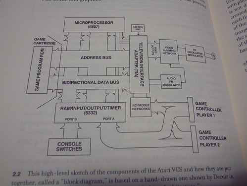
The design of the Atari VCS itself is based on a different set of decisions that are grounded in earlier platforms, as shown on p.11 and 12:

"The tremendous success of Pong and the home Pong units suggested that Atari should produce a machine capable of playing many games that were similar to Pong. The additional success of Tank by Kee Games suggested another similar game (...) along with projectiles that bounced off walls. The computational model and basic game form were almost identical to those of Pong, and became the essence of Combat, the title that was included with the original VCS package. The simple elements present in these early games would be the basis for the console’s capabilities from that point on. (...) The engineers developing the Atari VCS needed to account for two goals— the ability to imitate existing successful games and some amount of versatility —as they designed the circuitry for a special-purpose microcomputer for video games (...) Material factors certainly influenced the design. (...) The Atari VCS would need to navigate between the Scylla of powerful but expensive processors and the Charybdis of a cut-rate but inflexible set of hardwired games."

The Atari Video Computer System

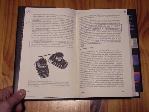
The part about controllers is of course relevant for our project, p.22-23:

"although joysticks were already in use in arcades by 1977, the introduction of the VCS joystick into the context of the home undoubtedly did much popularize the controller (...) the game joysticks are connected by cords to the console, where they are plugged in. This means that they can be unplugged and different controllers can be swapped in for different games: it also means that players can sit back away from the video-game unit as they play" (...) "there arose the issue in the difference between the controller scheme of the inspirational arcade game and the available VCS controllers. The VCS controllers were simpler than those in many contemporary arcade games. Although it was possible to develop new controller, the cost and difficulty of doing so precluded it in almost every case. It also wasn't tenable to produce arcade-style controls of greater durability, higher quality, and higher cost for the home market."

About the "lineage" and path-dependence between the VCS games and recent games, p.5:

"Gradually, conventions of different sorts began to emerge and various genres became evident. Some of the development of today’s videogame genres arose thanks to computer games and arcade games, but games for the Atari VCS made important contributions as well. (...) In studying the Atari VCS from the perspective of the platform, several things stand out about the system and its influence on the future of video games.

  1. The strong relationship between the console and the television. (...) The focus on the production of images for display on the TV helps explain why games running on circuits and later computers became known as “video games,
  2. Its controllers and peripherals were fashioned for use on the floor or the couch. The games made for the platform are likewise oriented toward home use—either for enjoying the arcade experience at home or for playing in different ways with friends and family.
  3. The powerful influence of earlier games.
  4. The tremendous representational flexibility of the machine and the less-than-obvious reason for this flexibility. (...) The breadth of the system’s software library becomes even more striking when one considers that two simple arcade games were the major inspirations for its hardware design—and that no one fathomed how successful and long-lived the console would be."

Why do I blog this? The "platform studies" rationale seems to be an interesting approach for our gamepad project. We'll try to ground our discussion in such type of work, although we do not know yet whether ours should be as academic as this piece.

Naming conventions and usage

Naming digital devices such as music players or car-navigation system is always intriguing and it's often curious to see which terms are employed by people. In a world where artifacts do not necessarily rely on existing technical lineages, companies need to create new terms. Eventually, theses names are not the one that make it to the surface. Two examples that I like:

John, saved by THE GPS

The story of a kid who has been "saved by The GPS" (or in French "Le GPS"). GPS which refers to car-navigation assistants that generally use this positioning technology to locate the vehicle. In this case, the name of device emerged from the enabling technique itself.

Another great examples that is commonly used in the swiss press is "Le MP3", i.e. the music player that allows to play audio files. In this case, the name of the device emerged from the file format itself... even if the artifact play different file format (such as .AAA).

Why do I blog this? Just though about this while reading one of my student's dissertation draft. Naming conventions are always interesting and it's curious to follow what terms are picked up by people. This echoes with other trends from the past for which we had obvious examples such as "Frigidaire" (a brand name used as a generic term).

The "0" of Peugeot cars

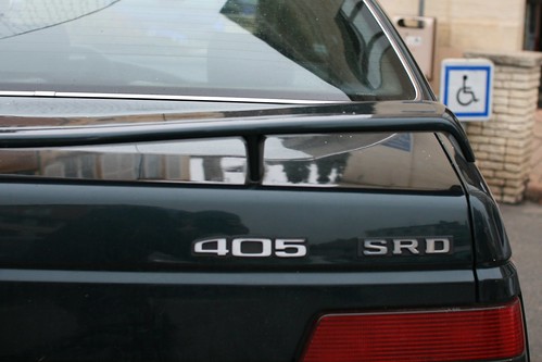
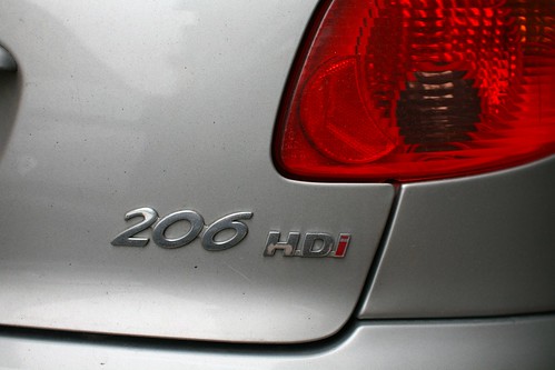
205 Mundane things always hide elements that are not obvious when you see them for the first time. Peugeot cars names have always been curious to me with their "x0x" nomenclatural label. A sunday in a small village in France enabled me to document this more thoroughly and wonder about it. There is a indeed a curious reason for this convention with a mid "O": at the time when Peugeot brothers invented their car models, starting the engine was done by turning a handle/crank. Drivers needed to turn a crank that they had to put in a hole in the front of the car. The "O" of the Peugeot car name is thus a remnant from this time.

305

405

206

Why do I blog this? Nothing really digital here, curious observation though. It's yet another interesting example of a process that I am trying to follow and document: the circulation of cultural elements as theorized by Basile in this paper. Hope that can be useful for him.

Transportation system information

Transport information A quick visit to EPFL last week in Lausanne gave me the opportunity to observe and test the new QR-code system that enable to get some information about the tram schedule.

The service works pretty well but it's rather the little poster showed on the picture above that raised my attention. What is strikingly curious is that the size of this sheet of paper (that explain how to use this weird B&W square) is the same as the tram schedule (on the bottom left-hand corner). For most of the cell-phone users, this kind of system is fairly new and the transportation company (+ the IT company which provided them with this "solution") felt the need to give some sort of step-by-step description.

Why do I blog this? Observing the environment and trying to surface some remarks about the implications. The poster describes what the user needs (obviously, a phone and a service that allows to scan QR code), the different steps to make it work (I like the "Confirm the Internet connection" phase) and a warning that you should check with your mobile phone carrier what would be the price of such transaction. As usual with technological innovations, the stake-holders try to help potential users and give a large amount of details that make the poster as long as the schedule poster. Of course there are two supposed expectations from this long description: (1) Teaching people how to use a technical objects (the QR code scanning process that can help to get real-time information), (2) Once the lesson learned it will be OK to remove this description and only keep the two QR codes.

On the UX side, I am also a bit concerned by the legibility of the two QR codes that refers to both directions of the tram. My guess is that some sort of graphic design trick could help here, either below the code (with a bigger font) or on the code itself using a different sort of visual marker. A D-touch marker with some easy-to-read "Flon" and "Renens" (the name of the two directions) tags would be helpful. Although they look curious-and-cool, I've always thought that a solution which can be "both machine-readable and visually communicative to humans" would be better. Especially in an urban context.

Lift lab research agency

It seems that these times are quite active with different announcements. As usual, some projects stay below the radar for a while and pop up here and there. Of course, some are bigger than others. Aside from the Lift conference, Laurent Haug, Fabien Girardin and myself created Lift lab, an independent research agency that helps companies and institutions understand, foresee and prepare for changes triggered by technological and social evolutions. We now have what people use to call a "home page". The services we propose range from exploratory field studies to foresight research, applications prototyping and event-building. We are active in domains such as Web/internet services, video games, mobile and location-based services, urban informatics and robotics/networked objects.

For the record, our logo is made by our friend from our friends from Bread and Butter (with the great Akkurat typeface) and the web design by Maja Denzer.

About Don Norman's take on "design research"

Reading Technology First, Needs Last by Don Norman the other day echoed a lot with recent discussions I had with clients, recent panel invitations, discussions with Julian and meetings last week with people such as Rémy. To put it shortly, Norman claims that design research (i.e., to him, it refers to ethnography-like observational studies) is good for improving but less at something he refers to as "innovation":

"design research is great when it comes to improving existing product categories but essentially useless when it comes to new, innovative breakthroughs. I reached this conclusion through examination of a range of product innovations, most especially looking at those major conceptual breakthroughs that have had huge impact upon society as well as the more common, mundane small, continual improvements. "

What I find curious in the article is that this view seems to reflect a narrow understanding of what field research about people can convey (not to mention the limited vision of what is *design research*, but that's another big debate). The way Norman characterizes this notion of research-before-design is caricatural as shown by this straight-forward motto he employs: "Discover hidden, unmet needs" or "aim at one thing: to determine those hidden, unspoken needs that will lead to a novel innovation and then to great success in the marketplace". I thought we were a bit beyond this and it definitely reminded me some discussions I had with clients and some engineers who crave for finding a new "need" their technology can fulfill. This is IMHO a limited perception of what studying people can bring to the table in terms of "innovation".

Observing people and their practices is not just about finding needs and problems waiting to be solved (nor it was about asking people what they need, but that's another story). There are other possibilities, other insights that can be extracted, other opportunities that can be uncovered. A good example of which is described in "Transfer Scenarios: Grounding Innovation with Marginal Practices" by Ljungblad and Holmquist. In their paper, they described how they studied “marginal practice” (in their examples having unusual pets, such as snakes and spiders) not to regard the persons involved as "end users" but instead as a way to understand underlying human interests and qualities of interaction, relevant for the design outcome. The whole point in this case is to observe people to draw some elements about their motivations or interests and explain how this can be "transferred" as a material for design purposes. Beyond this example, observations are also about surfacing ideas, drivers, constraints and opportunities which can be turned into pertinent materializations.

Furthermore, applying observatory methods is not just meant to fuel engineers and designers as a preliminary step before design. This distinction between "Technology first, invention second, needs last" is awkward as the boundaries between all of these elements are not so firm. Observations can also be done during the design process with iterations, product prototypes (WoZ or something more complete. Given that nobody never knows how a technical object will evolve (and Norman agrees with that in his paper: "New products arose through the tinkering and experimenting of inventors. Most fail."), it can be relevant to observe the appropriation and the way it is repurposed by users... and feed this back into a new iteration. It's also about studying failures and understanding the slow adoption Norman is talking about. Understanding what the hurdles and pain points are, etc. to refine the proposition.

But then it leads to the second problem that bugged me in the article: the distinction between improvement and breakthrough (or what he calls "revolutionary innovation"). the idea of revolutions and the rhetoric of innovative breakthroughs is surprising to me. Especially when discussed by someone such as Norman. It's weird to bring David Nye (the introductory quote) into this given that a great deal of researchers in history of sciences and technologies have published a lot about how technical objects such as the dish-washer or the phone never came out from the blue. The situation is much more organic, lots of people are working on similar topics, some products are released and fail, are reinterpreted, etc.... and it becomes hard to date what is the first "phone" (as a commercial success). Perhaps it's a framing issue but the notion of a "breakthrough" seems a bit weird when one think about the whole history of technologies. This terms seems more appealing to the marketing/business people than observer of how objects evolved over time.

One of my favorite book about this issue about the history of the dish-washer (sorry for the obscure french reference) shows how this device has evolved over time from both technical possibilities AND the work done by inventors to understand what is the practices of cleaning, what is important to potential users, etc. ... to a point where some of the first patents for dish-washers has been set by inventors and their wives (the users of the device at the time, sadly enough). Of course, it's hard to say that "design research" had an impact on the invention of the airplane or the phone at a time where this term wasn't used. However, the activities undertaken by "inventors" at the time covered many things: tinkering technical material, finding business models, etc. and surely observing people. What I mean here is that the skills great inventors (such as Edison) had certainly shared some common patterns with what good ethnographers can bring to design. Should it be called ethnography? design research? maybe, maybe not indeed.

That said, it's however fair to question the extent to which insights coming from field research help and nurture design. It's indeed hard to evaluate the influence of such approach. As Jan Chipchase described here:

"For all the current buzz currently surrounding ethnographic / anthropological research - this isn't the only way to feel out what or how to design (in the broadest sense of the word), doesn't always provide value, and absolutely shouldn't be part of every design process - anyone who thinks otherwise isn't asking enough questions about what their client needs and hasn't factored in the skills of the team at hand. At it's worst ethnographic research is an expensive, time-consuming distraction that can take the design team (and the client they represent) in the wrong direction."

Why do I blog this? this debate is highly interesting and the lines above are just my two cents on this. Lots of the issues raised by this article are very important lately and it's surely something I'll try to discuss with students in my course about field research for design. The problem is see in all the fuss about field research to nurture design is rather about how to translate observations and implications into materializations, that's quite an issue.

See also Steve Portigal's feedback on the same article.

Lift 2010 in Geneva

We've just launched the new website of the upcoming Lift 2010 edition in Geneva. The event will revisit the myths about connected people:

"Lift10 will explore the most overlooked aspect of innovation: people. Known in the techno-parlance as users, consumers, clients, participants, prosumers, citizens or activists, people ultimately define the success of all technological and entrepreneurial projects. They adopt or refute, promote or demote; embrace, reject, or re-purpose. Their approaches are unique, influenced by cultural and generational diversity. A decade after the rebirth of user-centered design and innovation, it's time to explore the myths and uncover the reality behind the "connected people"."

Also check the current speakers roster and the program format/sessions:

"Generations and technologies How to go beyond the usual clichés on generations, with Seniors unable to benefit from technology and Millenials ruining their future careers on social networks?

The redefinition of Privacy What is privacy in the 21st Century? Is personal security threatened by the massive collection of personal data?

Communities Since 2006 Web 2.0 has celebrated the so-called "amateur revolution". What did we learn in the past 5 years? Are we reaching the limits of Web 2.0?

Politics Beyond the much talked-about political campaigns on Facebook, how to turn users into engaged citizens in public action?

The old new media Newspapers are struggling, TV is not sure of what the future holds. What is at stake nowadays when informing, reaching and involving people?"

For this edition, our friends from Bread and Butter did a great job to instantiate our theme in a proper and original graphic identity. As they explained on their weblog:

"We tried to find a new way to represent the fragile balance between connected groups of people. We are all sometimes influencers, sometimes pirates and sometimes just an audience. Therefore the concept of a "mobile" seemed just the right transcription. Without saying that it also fits the Conference's spirit and is easy to apply on all applications from website to stickers and from Marseille themes to korean's alphabet."

Let's observe the different steps from their generative metaphor:

Phone-clock mix

Modulo-phone My interest in old phones as well as interface that tells you time has been attracted to this utterly weird telephone found at a flea market in Paris. What's curious here is that the device itself is a mix of a phone and a clock but, as we can see, it doesn't go fairly well:

  • The numbers are set in a way that do not correspond to neither the clock arrangement nor a standard phone keypad.
  • To some extent, there is a mismatch between the mapping of the phone numbers (from 0 to 9 with a Bis and I do not know what P stands for) and clock numbers (from 1 to 12).

Down the road, this interface is not very meaningful to the user. The design decision to use the clock analogy as a phone keypad (arranging the number all around the circle) is simply wrong. Even tough it looks curious, you should definitely not look at the numbers if you want to read time.

Why do I blog this? rationalizing the discussion I had with Julian while visiting the flea market. A great place to collect insights about design decisions.

Moreover, this is an interesting example for Basile's research about cultural elements circulation that you can find in the following poster and a forthcoming article entitled "Redesigning Culture: Chinese Characters in Alphabet-Encoded Networks" at Design and Culture from Berg Publishers.

Co-presence in the 21st century

Co-presence Two persons in the same place, as represented on the Foursquare interface. A depiction of co-presence mediated by technology.

Co-presence, as described by Zhao can refer to the sense of being together with other people in a remote or a shared virtual environment. To refer back to Goffman, it's a form of human co-location in which individuals become "accessible, available, and subject to one another".

The advent of location-based services lead to a new class of situation where people can b both physically copresent (what Zhao calls "Corporeal Copresence") and located in electronic proximity (what Zhao calls "Corporeal Telecopresence"). Which is what happens with the Foursquare interface. The categories are then not mutually exclusive.

Why do I blog this? curiosity about what this kind of constraints can lead to, in terms of location-based services in a physically co-present context.

Autopsies: The Afterlife of Dead Objects

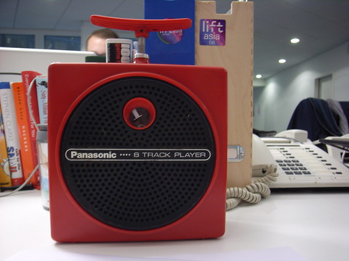
Panasonic 8 track player (A Panasonic 8-tracks music player found last week at trashed next to the flea market in Geneva)

Morning read on "Material World" (found via):

"Autopsies: The Afterlife of Dead Objects

This project explores how objects die. Just as the twentieth century was transformed by the advent of new forms of media--the typewriter, gramophone, and film, for example--the arrival of the twenty-first century has brought the phasing out of many public and private objects that only recently seemed essential to "modern life." What is the modern, then, without film projectors, typewriters, and turntables? How has the modern changed as trolley cars disappeared and hot air balloons were converted into high-risk sport rather than the demonstration of national pride in science and a crucial tactical mechanism of wartime? But what will our twenty-first century entail without mixmasters, VCRs, or petrol-driven automobiles? Does the "modern" in fact program the death of objects? What is the significance of death for things that live only through such a paradoxical program of planned obsolescence? How can cultural historians and theorists participate in the reflection on the ends of objects, from their physical finitude to the very projects for their disposal, the latter increasingly of concern with the multiplication of things that do not gently decompose into their own night."

Why do I blog this? Great questions asked in the project, lots to digest from the website and the weblog

Besides, this excerpt reminded of a discussion with Basile about his gf's interest in how objects die/vanish. The first picture above depicts this topic at the general level (a now defunct technical-object lineage) but the place I found it (next to a trash) exemplifies the death of a particular object (that I actually saved). There are ten two levels for objects death: as the "lineage" level and the instantiation level.

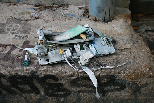
The picture below shows the traces of a dying object (and not necessarily the whole lineage though) in Montreal:

Trashed

"The tube map as a graphical user interface to the city"

Read in "Mind the Gap: The London Underground Map and Users’ Representations of Urban Space" by Janet Vertesi (Social Studies of Science 38, 2008). Hacker Mullins Prize, American Sociological Association: Science, Knowledge and Technology Section, 2006.):

"A stable, iconic representation such as the Tube Map may convey a general sense of structure, establish points of interaction, and enable further representations and narratives about the object. It can act as a reference point for practices of navigation and wayfinding, affording judgments of normalcy and degrees of expertise or resistance. It may also, through its mapping of topological connections, be read not only as a subway map but as a useful way of representing the city in general: an object it does not pretend to represent. The Tube Map thus becomes something of a graphical user interface to the city, presenting and concealing opportunities for engagement, and making sense of the city to its users. (...) we are challenged to examine the representation as distinct from a discussion of ontology, topology, utility, or mimetic fidelity – against which the Tube Map would surely fail as an ‘accurate’ representation of London above-ground – to analyze the concrete ways in which representational organization enables narratives of movement and manipulation and, most important, to locate the boundaries and points of interaction for particular communities of users."

Why do I blog this? I simply loved this excerpt when reading the paper, wondering about its implications in map design. Regardless of the media employed (physical versus digital), there are some important decisions to be taken when designing such maps and the paper pinpoints relevant issues regarding this topic.

Besides, the quote "The tube map as a graphical user interface to the city" could also be interesting for class discussion about technical objects acting as metaphors.

Lamp evolution

Evolution of the electronic tube from 1924 to 1952 quoted by Gilbert Simondon’s Genetic “Mecanology” and the understanding of laws of technical evolution by Vincent Bontems and found in "On the Mode of Existence of Technical Objects" by Gilbert Simondon. As the author mentions:

"The ebonite base became smaller and smaller until it eventually vanished; the functional parts grew larger and larger and, at the end, fill the total volume of the glass light bulb. Functional convergences also imply the differentiation of functions. Specialization is accomplished synergy by synergy."

Why do I blog this? interesting example that I keep up my sleeve about an interesting claim of Simondon: the immanent order of concretization (i.e. the complex processes through which technology as sets of relations form and are vitalized) is the same as that of the historically observed order.