User Experience

Pneumatic mail and flows of information made explicit

Main system My hotel last week in San Francisco had this fascinating mail transit system that allowed people to drop letters in this pneumatic-like system parallel to the elevators. You can leave your letter at the floor you're located (picture above) and it drops down the collecting box downstairs.

Mail system

Why do I blog this? fascination towards this sort of communication system (as a first step in the sending of snail mail) that embeds an intriguing physical component. However, I haven't seen any mail/postcard going through it apart from the one I sent the day after I discovered such a device.

What I find interesting here, although it's rarely employed today, is the possibility to visualize the information flow. To some extent, it makes explicit an rather invisible phenomenon (communication). A sort of similar (and more quiet) version of Palantir (the vizualization of facebook data on the globe):

"Paper direct"

Press in the 21st century Encountered last week-end in Venice, Los Angeles. Still about press, I am fascinated by foreign press available as these A3 sheets of papers sold straight from the printer. Far from the complex e-paper technology, these very low-cost one-sided magazines show an interesting trend about the importance of physical artifacts. Besides, the name of this service ("paper direct") is conspicuously relevant in these times of frenetic digitalization. Given that it's printed locally, it's an up-to-date instantiation (that prevent you from waiting two or three days to have the same newspaper coming from the guts of an Airbus/Boeing Cargo flight).

Why do I blog this? observing original practices related to media consumption enabled by various technologies. I see this "paper direct" as an interesting signal that seem more usable than they bloody e-book reader that I rarely use.

Browsing time

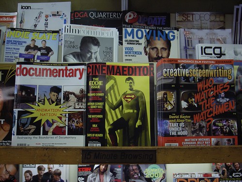
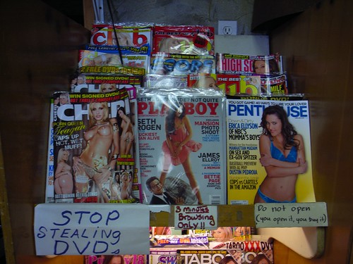
15 minutes browsing Highly intriguing notice in this newsstands visited in Venice Beach yesterday afternoon: the indication of the time customers are allowed to flip through the magazines. Temporary consumption of products indicated in the place where you can access them (see of course "The Age of Access" by Jeremy Rifkin). As a customer, you then know the rules you're subjected to and act accordingly.

Interestingly, the duration is conditioned by the type of content one might want to access as attested by these two other signs:

5 minute browsing

3 minutes browsing only!

Why do I blog this nothing particular in mind... this is fun at first glance but there are some interesting lessons to draw here about media consumption (signage to prevent certain behavior), the importance of certain types of content (and the inherent need to refrain people from spending too much time on it), design choices (3-5-15? I wonder how the owner made it up!, besides 15 seems quite a long time). The different shapes/typefont of the 3 signs is also curious: as if the norm was this "15 minute browsing" classic sign from back in the day (back in the days before people were soooo much into this "access" meme), followed sometime after by a more temporary "5 minutes ONLY" printed in black-and-white, and eventually by this quick-and-dirty "3-minutes only" sign (as if it reached a climax).

Dead end on the interwebs

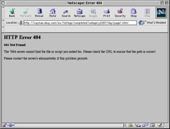
404 on Netscape Navigator There was a time when this sort of message was more common. For the record, an error 404 (or Not Found error message) refers to:

"a HTTP standard response code indicating that the client was able to communicate with the server but either the server could not find what was requested, or it was configured not to fulfill the request and did not reveal the reason why. 404 errors should not be confused with "server not found" or similar errors, in which a connection to the destination server could not be made at all."

A time when information superhighways were full of dead-ends and wrong-ways... People were given means to circulate (through URLs addresses, Web directories and then search engines) but these tools could also be misleading... and lead to Error 404. It's less usual now, and web folks have learn to create user-friendly 404-pages.

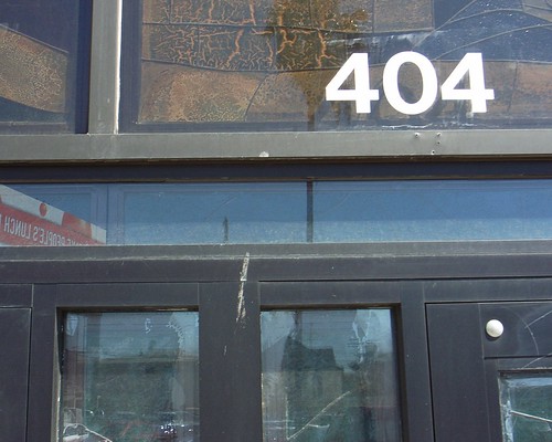
404

Is there a physical equivalent to 404? What would be a "404 error" when wandering on the streets (or in the countryside)? A mistake where "you don't find what you looked for/requested".

Why do I blog this? thinking about translations of practices and rituals from the digital to the physical.

Technology breakdown and people's reactions

Tossed cell-phone The picture above taken in Marseilles (France) few months ago depicts a human practice that fascinates me: the deliberate destruction of artifacts. There are different reasons for that, ranging from anger towards someone (and throwing the object at hand) to being upset by a certain piece of technology. Observing this practice is quite difficult as it's both uncommon and quick... you generally access to traces of this behavior. The phone above is an example of such traces. Among all the reasons to destroy things, it's perhaps the frustration the user feels when the object doesn't work as he/she intended. In this situation, of course, people are not always so violent but it can happen. This is perhaps why I am also intrigued by breakdown, failures and people's reactions (or perception).

Nailing down some references about failures and adoption issues of technology, I enjoyed reading this report from the Pew Internet & American Life Project insightfully called "When technology fails". The reports presents some statistics about people's usage (or non-usage) of various technologies in the US. Some examples of problems I found interesting:

"nearly half (48%) of adults who use the internet or have a cell phone say they usually need someone else to set up a new device up for them or show them how to use it. (...) 44% of those with home internet access say their connection failed to work properly for them at some time in the previous 12 months. (...) 39% of those with desktop or laptop computers have had their machines not work properly at some time in the previous 12 months. (...) 29% of cell phone users say their device failed to work properly at some time in the previous year."

And it's also important to look at how people deal with breakdowns:

"Some 15% of those experiencing problems (...) said they were unable to fix the problem. However, the majority of users found solutions in a variety of ways: 38% of users with failed technology contacted user support for help. 28% of technology users fixed the problem themselves. 15% fixed the problem with help from friends or family. 2% found help online."

People's perception is of course very emotional as the PEW research showed:

"Users whose technology had failed also reported a mix of emotions during the course of trying to solve the problem:

  • 72% felt confident that they were on the right track to solving the problem.
  • 59% felt impatient to solve the problem because they had important uses for the broken technology.
  • 48% felt discouraged with the amount of effort needed to fix the problem.
  • 40% felt confused by the information that they were getting."

I guess they did not find anyone in their sample revealing that sometimes they just trash/punch/kick the object that users can't use because it's a not-so-common behavior. Perhaps it can be a subset of "impatience"... given that this study as based on a survey it may be a side-effect of the methodology. I would find intriguing to show picture of tossed/destroyed artifacts as a probe to discuss with participants.

Why do I blog this? gathering material about this topic that fascinates me for quite a while. Documenting the experience of breakdowns is insightful for design, as a locus of people's creativity in finding solutions (bricolage, social navigation, asking questions to others, destroying the system and trying to repair it after a while, etc.).

These issues are also related to another favorite topic of mine: how people build a representation of their computers/cell phones/nintendo Wii/etc. and how they use this knowledge to explain the artifacts' behavior (and breakdowns).

Public notepad

Appointments This hanging pen/notepad assemblage can be found at a beauty salon in my neighborhood. Interestingly, the notepad is meant to be used by customers to note their contact information so that the owner (when busy) can phone them back. What is important here is that:

  1. This notepad features contact information in some sort of transitional artifact: people write down their particulars, the owner tear up the sheets of paper and phone people back. It's only a temporary inscription.
  2. For some time, contact information (and sometimes customers' requests) are in a semi-public display (that curious person can observe when passing by). The private/public boundaries are somewhat blurred.
  3. This shop has a phone number BUT it seems important for the owner to provide its customers with a specific interface when people are passing by. In this case, the notepad acts as just-in-time just-in-place interface.
  4. The fact that people can write with a pen (a costly mean of communication in these days of 140-characters messages) and that someone may peruse the requests and contact people back has an important value: a direct and specific relationship between customers and the shop owner.

Why do I blog this? observing rituals in my neighborhood when heading to the local baker to refill my stack of croissant this morning.

Social practices around mobile gaming

Japanese kids playing gameboy This picture of kids I encountered in Japan in 2004 playing with a game-boy exemplify one of the most intriguing feature I observe in gaming: a situation where only one person has a game device and the others are participating without it, in their own way. This is a common situation in gaming, one can also observe it on game consoles (where one person plays with the pad and the other helps in a less formal way).

In their paper presented at CHI 2008 "Renegade Gaming: Practices Surrounding Social Use of the Nintendo DS Handheld Gaming System", Christine Szentgyorgyi, Michael Terry & Edward Lank describes an interesting exploration of the social practices related with a mobile game platform. Unlike my picture above, they investigated players who had their own mobile consoles. Based on a qualitative study, the authors studied how players engage in multiplayer games via ad-hoc, wireless networking and how it affects the social gaming practices.

In their results, they identify three themes related to the multiplayer gaming practices of the Nintendo DS:

" renegade gaming, or the notion that users reappropriate contexts traditionally hostile to game play; pragmatic and social barriers to the formation of ad-hoc pick-up games, despite a clear desire for multiplayer, collocated gaming; and private gaming spheres, or the observation that the handheld device’s form factor creates individual, privatized gaming contexts within larger social contexts."

The paper provides informative elements about these themes and also tackles their design implications:

"we focus on two particularly salient design implications suggested by the data, namely better support for ad-hoc, pick-up gaming, and mechanisms to expand the social gaming experience (...) Mechanisms that allow one to more easily locate other local DS gamers, invite a player to a multiplayer game via the DS itself, join preexisting games, and gracefully exit games would all help address the desire for pick-up games. The implementation of these suggestions is certainly technically feasible for a system such as the DS (...) To help create a broader social context, the system could provide provisions to externally display game state on a shared display so non-players could observe game action. "

Why do I blog this? gathering material for a potential project about social gaming practices for a client. This is quite an exciting topic and I am try to collect some material about it in the context of mobile games. I am quite sure that lessons can be learned from the Nintendo DS and that it would be possible to transfer them into a cell-phone context.

Clive Grinyer on customer experience design

In this insightful blogpost Clive Grinyer, formerly designer a Orange, now at CISCO, reflects on his experience of customer experience design in the mobile industry. Some excerpts I enjoyed:

"In the conventional industrial product development process at that time, my design specification was handed to a mechanical engineer, with specialisms in a greater level of detail of material and process. It was a shock to then realise that the design was treated as merely a guide, where the engineer would take hold of the reigns and steer the object in whatever route made the production easier and more robust. (...) It is only in exceptional circumstances, such as at Apple, where their leadership, investment and strategy embraces those values, that you see the full impact. (...) In the mobile world I saw this repeated through a culture dominated by technology and decisions and assumptions made at every level that impacted badly on the end experience of the user. The situation was worse, in that I was not in the right order of process and "design" had already happened by the time I or my team had anything to do with it. This leads to technology developed without any thought of how it would be used, or 3rd party application providers incapable of customising or improving usability. (...) For the last months I have also struggled to understand what to say about the mobile. It seems so exciting that millions of people can be walking round with so much technology in their pocket but find so little use for it apart from speaking and texting. Open platforms, the promise of Android, ever more capable devices failed to unlock my cynicism in the ability of the mobile to deliver useful applications to normal people. And then the iPhone 3G did it."

His conclusion about "what to do" is basic: Talk about people (look at what people do), Discover the customer journey, Tell stories of how it could be, which are relevant aims in technological companies, and as he points out generally a surprise ("Hardly rocket science but revealing to most people still").

mobile device

Why do I blog this?some good hints here to be re-used in my user experience course. The "talk about people" is a familiar trope to me. I often face the same situation, delivering a speech to technology people in a certain company (e.g. video-game industry, mobile software organization, design students) and I see the fascination towards the material I show them. Most of the time, documenting people's life is of great value to them as they smile and see how things work (or don't work) in a concrete way. However, it's then important to show them how this is valuable for the time being, for what they're achieving. Which is why what Grinyer describes about telling "stories of how it could be" is important. Perhaps I would add as a preliminary step "showing problem, issues, pain points and dreams", as a sort of material to inspire design.

Vending machine interface design

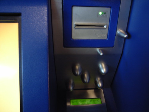
Prevention against stickers? The evolution of vending machine interfaces is highly curious. Seen in Amsterdam yesterday, at the train station in Schiphol. This train ticket machine sports weird spikes. What do they mean? What are they intended to do? preventing people to put stickers? Or it can be a way to prevent credit card skimming (the practice of retrieving and using the information that is encoded on the magnetic strip of a legitimate credit card).

Prevention against stickers?

The way they are place on the interface is very odd. Any clue?

Augmented meeting point

Augmented meeting point An interesting cluster of services at Schiphol airport near Amsterdam. This meeting point is enriched with:

  • A physical whiteboard so that people can leave messages, notes and writes stuff.
  • A dual screen that: (a) explains how to send SMS messages, (b) list the different messages that people sent with their mobile phone. You can send messages to greet people and tell them you're arriving (or simply to take a certain transport mean).

Why do I blog this? It's interesting that both media (physical and electronical whiteboard) are present. Each of them have their own values (the physical one is available in case of power failure or if the tv screen is our of order) and allows a sort of presence mediated by different characteristics of the artifacts employed.

I also find relevant to observe how cluster of services are deployed in physical space, see also here.

Repurposed object

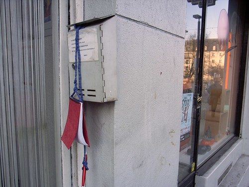
Door handle as letter-box When the mailbox is too small, the door handle can serve a relevant alternative. These package (4-5 newspapers) is indeed to thick to be posted in the mailbox.

An intriguing example of a repurposed object, mundane creativity on the street.

Touch / don't touch

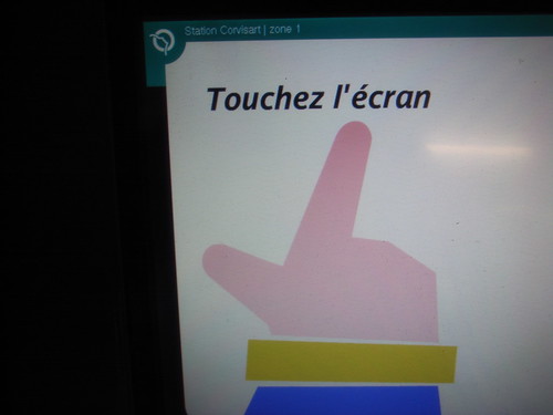
Touch the screen Above in Paris, below in lyon. Duality of signs to encourage or prevent people with certain norms (use of the red color...)

Don't use

How can I not be intrigued by this odd sign that prevent people from using a specific device (a container of salt to be put on sidewalks)? This gentle "touch" hand with a crossbar to indicate the restriction.

About automated journeys

Automatic door A good list of papers from the Automated Journeys workshop (at Ubicomp 2008) has been put on-line recently. This event was about examining how automation reconfigure people's interactions with cities and speculate on what innovations might be to come. I unfortunately missed it, although this is a favorite topic of mine.

I haven't checked all the papers but I was intrigued by the one called Automation as a Very Familiar Place written by Mads Ingstrup. Some excerpts that I enjoyed:

"The constraints set by the infrastructures supporting our journey through spaces we create are a strong determinant of how we experience those spaces and their places. We argue that rigidity of infrastructural constraints causes familiarity, and that familiarity breeds the automatic experience. (...) They are familiar because they are stable across a variety of contexts—a journey by train in Scandinavia now compared with one in Japan some hundred years ago, while not exactly the same, has some stable and defining features: the passive traveler situated in the train car, observing the landscape passing by the window. (...) What happens to our experience of journeys such as train travel if it is infested/blessed with the wave of technologies ubicomp represents—enabling people to increasingly personalize their surroundings? (...) Digital technologies that increase the opportunity for personalization may change the ways in which infrastructure influence our experiences. In particular, we raised the question of whether it makes the meaning of our experiences more personal and therefore less shared. Further we suggested that the notion of automation can usefully be analyzed in terms of where control is situated and in terms of the rigidity of its implementation."

Then "Connectability in Automated Journeys" by Shin'ichi Konomi & Kaoru Sezaki is also interesting as it uncovers a specific dimension of automated journey: connectabiliy:

"Ubicomp technologies can enable new forms of connectability in a city, and technologies for supporting connectability need to be integrated into subtle human processes. We then introduced the 6 dimensions that could be used to explore the design space for supporting connectability:

  • People - things - spaces Connections can be made within and across the following categories: people, things and spaces.
  • Digital - physical Connectability can be represented by using digital, physical, as well as ‘hybrid’ media.
  • Explicit - implicit Connectability can suggest connections explicitly or implicitly. Connectability can be ambiguous.
  • Real time - batch Connectability can be identified in real time (e.g., Lovegety) or through batch processing (e.g., post hoc analysis of GPS traces)
  • ^

  • One Time - repeated Some opportunities to connect arise only once. Others arise multiple times and even repeatedly. This dimension is also relevant to serendipity.
  • Ignorability Connectability can/cannot be ignored without causing negative effects (cf. “plausible ignorability”)"

Why do I blog this? Automation is one of the dimension of technology that I find the most interesting since it's an obvious locus of research. It directly embeds the topic of human relationship to technologies given that automation is often a goal for system designers (as a substitute for human activities) and if often leads to failures and troubles.

Internet icons and idioms

@ Some interesting internet icons and idioms ("hot hot spot") from Guadeloupe, France. The first one above has been taken on Marie-Galante, a small island south of Guadeloupe. The internet café seems rather old and abandoned.

The "@" is highly common if you already followed past episodes. The "W.W.W." is here followed by dots and doesn't seem to refer to any specific url: it's rather employed as a brand. The fact that the "@" is really bigger may indicate that this sign is a more important metaphor of the information super-highways. And why using both the "@" and "www"? Does that mean that @ is something different, perhaps referring to email? @

The "hot hot spot" below is highly intriguing, perhaps referring to the fact that locals have "le sang chaud" (literally "hot blood"), meaning that they can get emotional easily. Maybe it shows how emotions/sens of relationships can be conveyed through the wires. Or how email/web communication could serve "hot" purposes. @

Fax seems to be still important as attested by the big signage one can see on picture 2 and 3. Sending faxs is as important as dealing with "Photo" and perhaps a bit less than the Web (if I follow the hierarchy of picture 2). On picture 3, you can as well note the arrows on the fax tag which indicates how the device can send and receive information: this part is tremendously interesting since it shows the underlying features of this tool.

Also, the "Gwadaweb" subtitle under the "cyber-espace" ("cyberspace") logo is interesting too. "Gwada" is short for "guadeloupe" in creole, meaning that there seems to be some part of the cyberspace that are explicity from this culture: Gwadaweb

Why do I blog this? fascination towards the representation of "the digital" (i.e. access to the internet, virtual worlds, etc.) and how they are made manifest in the physical environment. Cultures which favor paintings on shops always have curious ways to depict this matter and I try to document it when travelling. There is a lot to draw from this, especially in terms of people's representation of telecommunication devices.

Protected device

Protection Interestingly, this radio has been protected by a ziploc because of its context of use (the bathroom). Sometimes, the context dictates a necessary protection to the owner... who reported me how she ingeniuously had to use it as the room can be highly humid.

From our desktop to our mobiles

James A. Landay and Todd R. Kaufmann in 1993 ("User Interface Issues in Mobile Computing"):

"A theme common to much of the past work on mobile computing devices is the desire to run similar computing environments on the mobile machines and on the user’s office workstation. Although running many of the same applications may be useful and desirable, running the same environment may be both undesirable and, for many mobile devices, impossible."

Why do I blog this? surely this quote is deja vu here for people who reads this blog, but I wanted to have a reference about this important topic.

lottery game interface

Lottery interface For lots of people, this is a very common game interface. The picture shows a device usually employed in France to verify whether your lottery ticket is a winning one. You have to swipe the ticket below this light and the results are then displayed on a tiny screen above. Minimal game interface!