SpacePlace

Map on street plate

Wandering around in the street of Paris last thursday, I ran across this terrific street plate:Map on street plate

Why do I blog this? I found interesting the usage of the street plate as a way to create new affordances such as a direction map. Judging from the picture, there is already a street plate in the background but that one is more relevant. Of course this is the 1st arrondissement of the french capital, hence you won't find this in every parts of the town...

Urban juice: traveling system

It's kind of weird but after blogging about the "urban radar" I now ran across this Urban Juice project by Mine Danisman Tasar done at the Umea Institute of design (and Philips), which expands the notion of travelogue:

Prior to a trip, the modern nomad can not afford time to get acquainted with a new location. Besides that, it is challenging to be fully prepared for a new place. Urban Juice turns your travel experience into a fun activity by letting you get on-the-spot information and keep a log of your trip. By incorporating a social network of travelers, it provides you with the accumulated information.

There is a lot more to draw from the project report (beware! 23Mb pdf!). It explains the 3 modes of the projects: map (get location information, tag places, document your trip...), menu (travel planning), camera/augmented reality (take picture and document your trip in the camera mode OR get on-the-spot information in the augmented reality mode).

Why do I blog this? it's yet another system that aim at gathering traces of people's activity (like location tagging) to share them and create a filtering system about cities and travels.

Gilles Paté and defensive space

Gilles Paté's "Le repos du fakir" ("Fakir's rest") is finally available in the DVD format. It's actually a short movie that describe the concept of "defensive space": all the transformation in space that aim at preventing people to have a specific behavior... such as sleeping on a bench, doing skateboard, sitting next to a window... In this short movie, the author try to sleep at diverse places in paris, having to stretch his own body to find a proper position...

Why do I blog this? as an observer of city phenomenons (as well as for potential urban computing research projects), I am always impressed by the devices people design to reshape behaviors. This ons is frightening:

Narrative represented as paths

A representation from "The Life and Opinions of Tristram Shandy, Gentleman (Oxford World's Classics)" by Laurence Sterne illustrating the Linear Progression of the Narrative:

Why do I blog this? I found interesting how a story could be turned into an illustration. Still trapped in timeline visualizations for my phd research, I was looking for curious examples of how to represent events that occur over time. In this case, what is relevant is the way the illustration depicts a non-linera path with deviations and circles.

Berlin: Temporal Topographies

Berlin: Temporal Topographies is a project by the Stanford Humanities Lab that investigates the historical and cultural layers of a city space.

The project takes Berlin-arguably one of the most rich, contradictory, and multi-layered cities in the world-as its point of departure and seeks to develop a research platform and pedagogical methodology for studying the history of the city space. The key objectives of the project are: 1. To develop a web-based research framework for the representation of the topographical and historical layers of Berlin by creating virtual reality maps of the synchronic and diachronic transformations of the city 2. To develop a pedagogical methodology informed by new media studies for teaching about Berlin, including the creation of curricular material for use in hybrid classrooms.

Why do I blog this? since I am interested in blogjects and history of objects, this project is curious regarding the investigation of different spatial and cultural layers.

Faces on street tech, Jesus on objects and some related thoughts

A trend I have spotted in street art is the addition of elements on technologies so that it looks more human. Based on the perceived anthropomorphy of certain technological features one can find on a street (tubes, street lights, power adapters...), it's curious to see how adding few signs may try to humanize them. Two examples, one in Madrid (left) and another in Paris (right):Face on Technology (2) Face on technology

Why do I blog this? that's a noticeable and curious trend one can see. I also blogged about a similar phenomenon: pareidolia "a psychological phenomenon involving a vague and random stimulus (usually an image) being mistakenly perceived as recognizable”. The most known example is how people tend to see Jesus' face on any object. In the case of pareidolia, it's the interpretation of people that is at stake. In the case of the above street art, the perceived pattern is augmented by drawings or duct tape.

In the case of this drawn faces on street objects, what is at stake? I'd be interested by people's reaction? is these eyes make people less confortable than the real big-brotherish eyes of street camera/CCTV? are they perceived as augmentation by street-artists? Would the design of street object include this sort of metaphor?

Imagine if all the technology you can find down the street would have eyes pointing at you.

GeoIQ: Heat map visualization platform

Fortiusone just releases the GeoIQ platform:

GeoIQ is an open platform for building intuitive geographic analysis and visualization tools into web-based mapping applications. It gives people a simple and compelling way to filter, analyze and get value from geographic data without ever leaving their web browser.

GeoIQ is a dynamic geospatial analysis and heat mapping technology that delivers high resolution raster analysis through a web browser.

Developers can use GeoIQ to add geographic data visualization and analysis tools to their web mapping applications. So instead of just seeing search results as sets of points or colored polygons, users can ask the map questions like:

"How does location A compare to location B, in terms of the parameters I have chosen?" "Which places have the most or least of the things I'm interested in?" "Where can I find the greatest overlap between all of the things I'm looking for?"

Why do I blog this? this is a pertinent way of visualizing geospatial traces, with different information flows depicted on a map metaphor. Might be relevant for future projects.

CHI 2007 workshop about "Imaging the City"

Imaging the City: Exploring the Practices & Technologies of Representing the Urban Environment in Human-Computer Interaction is a CHI 2007 workshop that quite fits with my research interests.

The aim of the workshop is compelling:

This one-day workshop will explore the practices and technologies of imaging the urban environment, bringing together an interdisciplinary array of designers, HCI experts, urban planners and technologists to investigate such issues as: How do we represent the city in HCI, and how do these representations inform HCI research and practice? What kinds of technological devices, services, and platforms support imaging the city now and might be created in the near future? How are and might these new representations of the city and urban imaging technologies be used for social and political ends? What new methods are required for developing technologies that image the city in new ways? What can we learn from the urban experience to design stronger representations and interfaces within HCI research and practice?

It's targetted to HCI practitioners, architects, visualization specialists, urban planners, futurists and artists. Why do I blog this? I am interested in this topic, with regards to the aggregation/visualization of traces in space, as well as the representation of information flows... maybe as a way to show the intersection between 1st life (the physical world) and 2nd life (a virtual world).

Would-be skyscraper structure

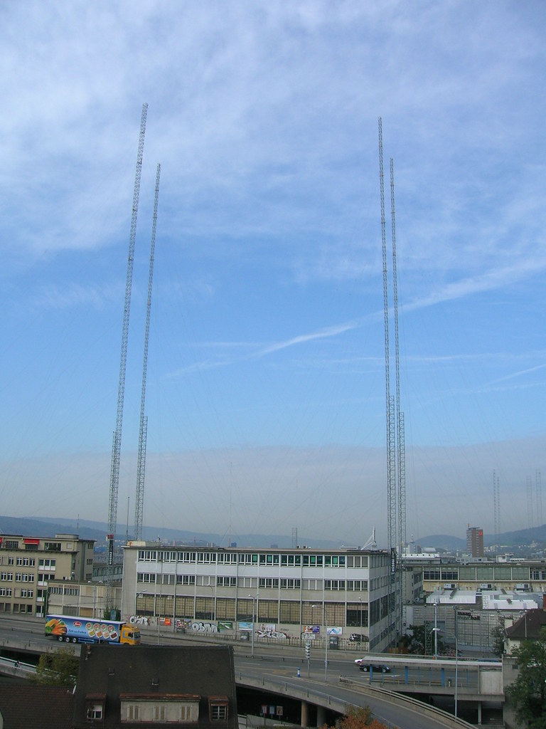
I was in Zürich last week and I ran across this interesting structure: Skyscraper to be expected

It seems that when a skyscraper is built in Switzerland, the population should first be aware of the expected heights. What is interesting is how they create this impression using this metal structure: a sort-of building gauge.

Why do I blog this? because I found curious to have this sort of "simulated space".

Space and Place 10 years after

Dourish, P. 2006. Re-Space-ing Place: Place and Space Ten Years On. Proc. ACM Conf. Computer-Supported Cooperative Work CSCW 2006 (Banff, Alberta). This paper is a follow-up of the "Re-Place-ing Space: The Roles of Place and Space in Collaborative Systems" by Steve Harrison and Paul Dourish that has been published 10 years ago. The first paper advocated for a distinction between “place” and “space” that might serve as a basis for the understanding settings of collaborative work:

One common reading of the relationship between space and place as articulated by Harrison and Dourish has been to see space as a natural fact – a collection of properties that define the essential reality of settings of action – and place as a social product, a set of understanding that come about only after spaces have been encountered by individuals and groups.

What is interesting is that Dourish re-visits this previous paper with a different light: the increasing importance of mobile and ubiquitous technologies reshuffles the questions related to space and place in a considerable way (much more than with previous virtual space). At the same time, virtual environment are still around (think of MMORPG). The paper is very dense and full of important insights, I grasped here only few items related to my research:

While the 1996 paper pointed to the importance of understanding place socially, similar arguments can be applied to space. Indeed, where the conventional reading of place and space in CSCW has suggested that “place” arises only out of (and therefore both consequently and subsequently to “space”), I would suggest instead that place comes first. Our experience of the world is not an experience of mathematically derived uniformity and connectedness; what we experience are places, heterogeneous locales with local meaning, different extents, and individual properties. Space is something we can encounter only afterwards (...) What this suggests, then, is that we need to understand, first, something of the relationship between spatiality and practice, and, second, how multiple spatialities might intersect. This is particularly the case when we think not about “virtual” settings but rather about the ways in which wireless and other technologies might cause people to re-encounter everyday space. Introducing technology into these settings does not simply create new opportunities for sociality (the creation of places); rather, it transforms the opportunities for understanding the structure of those settings (developing spatialities)

Why do I blog this? in this paper, Dourish puts more emphasis on "space" rather than "place" (what he actually did in the 1996 paper). What I find interesting here is the way he is arguing against simplistic interpretations that has been done on the first paper. The idea of multiple spatialities is also very important to me given the kind of intersections we're more and more experiencing. And I am wondering about developing spatialities that would emerge first from new technologies (like adding a wifi layer at cityscale, no mentions to seams and flaws) and second by the intersection of those layers (gsm, wifi, past traces of earlier tech...).

Anti-skateboard devices on the Embarcadero

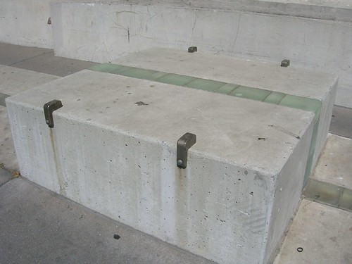
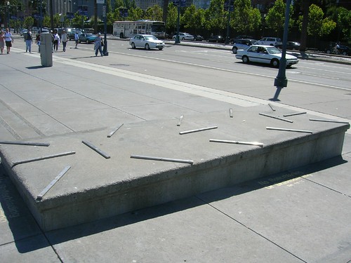
Anti-skateboard devices are now very common features of urban space. Following the "Defensible Space" concept (the idea that crime and delinquency can be controlled and mitigated through environmental design), some physical elements popped up and reshaped skateboarding practices. What is interesting is that to follow it evolves over time. The Embarcadero, in SF, is interesting for that matter. Relying from my experience of skateboarding and observation of space here are some quick thoughts: First, skateboarders do jump (ollie, but let's stay simple) on sidewalks, banks or benches and handrails; a specific trick done after jumping is to "grind": i.e. to slide on the hangers of the skateboard trucks on any urban element that may fit between the space between the wheels where the truck meets. Proponent of 'defensible space' started by adding metal plates on benches or concrete elements:

defensible space (1)

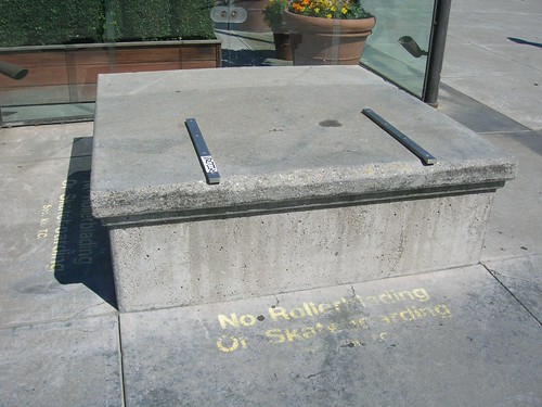
But the problem is that it did not prevent skateboarders to do "wheelie" (which is called "wheeling" in french): jumping (Ollie) onto an obstacle and rolling all the way with the back or nose wheels (nose = front). So a new kind of elements popped up (I've never seem them apart from today in SF, never saw that in SoCal or European cities): bigger metal plates covering the whole obstacle:

defensible space (3) defensible space (4)

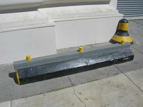
(of course some folks removed these plates), so skateboarders were left with lower urban elements (not benches) like delimitations of space (for buses or bicycle tracks); then the marvelous urban planners heightened them with weird plates and cylindric stuff:

defensible space (2)

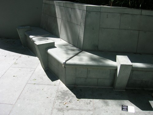
Why do I blog this? user/activity-centered design of skateboarding practices may have been conducted to come up with these solutions. Of course, this raises the creativity of skateboarder who will use them to create new skateboarding tricks, but that's another story. In the end, the average pedestrian might be intrigued or pissed by all those elements that prevent him/her just to sit properly:

defensible space (5)

On a different note, I blog about that because this is important today. There are two forces at stake: one that drives urban space into this crappy defensible direction and another that tries to create more playful environments.

Back on track

Just came back from a part of France located in the Indian Ocean. It was basically for a trek but I could not help visiting superb mom and pop's shop like the following one who can fix EVERYTHING ranging from Nintendo portable console to old school cell phones: Electrorama

I walk. Principally I walk

A nice quote for a rainy saturday I which got back to some situationist writings:

—What do you do anyways? I don’t really know . —Reification, Gilles replied. —It’s serious work, I added. —Yes, he said. —I see, Carole said with admiration. It’s very serious work with thick books and a lot of papers on a big table. —No, Gilles said. I walk. Principally I walk.

This is from Michele Bernstein's Tous les chevaux du roi (quote translation from french to english taken here).

Why do I blog this? I like the punchline "Non, je me promène. Principalement je me promène" (i.e. "I walk. Principally I walk"). This is by no means related to my Human Computer Interaction research but I appreciated the quote from an aesthetical point of view (any maybe because I gather lots of ideas by walking too).

Andrew Hudson-Smith on city visualizations

In Londonist, there is an insightful interview of Andrew Hudson-Smith (UCL, Department of Advanced Spatial Analysis) about new ways of visualizing the city in three dimensions. The picture below shows an air pollution map.

So, tell us a bit about your background, and how you came to be playing god with the London skyline.

The story dates back to a phone call from Professor Mike Batty (CBE) asking me to do a PhD after seeing an early webpage on communicating architecture to the public. I always said that I wouldn’t do a PhD unless I could change how things are planned and how the public are informed about planning and architecture in general. You only need to look around London to see some of the mistakes of the past and if we can use the latest technology to inform the public so they can have a free and open say then maybe things will be better planned in the future. It may sound dull (and maybe that’s why I don’t get asked to many parties!) but it makes me wake up each day and think woohoo work, honestly it’s a fun job.

His perspective about the future of such technologies is also intriguing:

How do you see virtual environments in general, and Google Earth in particular, developing over the next few years?

If you look at chat systems using avatars such as Second Life and then merge it with Google Earth I think that’s the one to watch. To fly into the cities of the world and have people walking around them as avatars would suddenly make an inhabited virtual earth. I can see this happening in the next few years.

SAFEGE: old-school suspended monorail

Here is a superb webpage that shows some picture of the SAFEGE. According to the Wikipedia:

SAFEGE is an acronymn for the French consortium Société Anonyme Française d' Etude de Gestion et d' Entreprises (en: French Limited Company for the Study of Management and Business). The consortium, consisting of 25 companies, including the tire-maker Michelin and the Renault automotive company, produced an arial railway technology. The design team was headed by Lucien Chadenson.

Nowadays, the SAFEGE is in a more 80s-metro-style:

Why do I blog this? summer cool websurf during a break writing a chapter of the PhD dissertation...

Elephant path in Geneva

I am always amazed by elephant paths ("a name for a path that is formed in space by people making their own paths and shortcuts; it is an unofficial route"): Elephant path in Geneva

Why do I blog this? this nicely depicts "social navigation" or how the activity of others could be a trigger to your own activity (like footprints in the snow). A previous post about that here.

Learning Trails

Kevin Walker is using a very interesting concept, which he calls "learning trails":

This research explores the hypothesis that having a trail of where you have been - or creating a trail for someone else - helps you to learn.

Your web browser keeps a history of the pages you visit. What if you had a record of the artifacts you saw on a museum visit? Or sites in a foreign city? It is hypothesized that in any unstructured or semi-structured knowledge base, trails help to filter and connect individual 'learning objects' by providing a linear, narrative structure. I test this in the real world, with technology for automatic capturing of trail data, and by enabling people to easily create learning trails for other people. (...) The value of an automatically generated trail is in the way it is represented after it is created - when it can be revisited, edited, and shared - thus I call it a 'reflective trail.' If, however, you consciously create a trail for someone else, its value to the other person is in its use by them. But there is an added value to you, the creator, because consciously creating a trail requires planning and thought about what story the trail will tell, and how each stop will contribute.

Why do I blog this? I like this idea of using trails to afford specific behavior (this can be articulated to the "social navigation" concept), which eventually would be interesting for various purposes (learning activities, signalization in public transports...)

"The Networked City", a presentation by Manuel Castells

Some notes from "The Networked City: Information and communication technologies, spatial structure, and urban dynamics", a presentation by Manuel Castells at EPFL today. He addressed the transformation of urban/spatial forms due to IT and transportations systems. The presentations was in french, I took notes in english but it might be a bit rough. manuel castells presentation

Networks are a fundamental transformation in the last 20 years, not due to technology, but intrinsically connected to it. If we say "network", we think globalization and no boundaries because they are organized around exchange that goes beyond institutions. These network have a specific dynamic: inclusion/exclusion.

Predictions done by "futurists" has proven to be wrong: the end of the city (due to IT transformations). We are seeing the most important urbanization phenomenon we have ever seen (50% of the earth population lives in cities today, 75% in 2050; Earth is not overpopulated, it's true for Belgium but not for Russia or Africa, 90% of california has village with less then 1000 inhabitants).

Analyzing the socio-spatial transformations due to IT, studies at his lab in UC Berkeley showed that there is no concentration and no decentralization: but there are both at the same time. This is a fundamental characteristics of networks: concentration and deconcentration. The point is to know what is concentrated and what is not (+ which sort of spatial constructions). They found a huge processus of concentration in metropolitan regions (more than areas), and inside there is a big decentralization of fonctions with polycentric structures. See "The polycentric metropolis": constitution of macro-regions in europe (Tokyo-Nagoya, Paris-Lilles-Bruxelles, Ruhr, North of Italy, Lyon-Grenoble-Torino, Greater Shangai, San Paolo, Buenos Aires, LA).

Articulation/Interconnections of those regions thanks to transport and communication technologies. Those mega-metropolis are articulated in world networks: the Global City (Saskia Sassen). BUT this does not mean that part of the region is global: some parts of NYC are absolutely local and not connected. It's rather that every city interconnected with other is a Global City. The different proportion of global/local in every city showed the level of dominance. There are different specificies of the network: finance (London, NYC), technology (Silicon Valley), criminal economy (5% of world GDP), Visitors' city: the city for tourists, which is not the real city (ramblas in Barcelona, old city centers in europe...) with different NODES in every city.

This is important for public policies: the point is to be involved in wealth creation networks and then local redistribution (but how? where?). This creates tensions, that urbanists and architects have to deal with. Wireless and mobile communication accentuates this phenomenon of concentration/deconcentration because it's not well distributed (even though 2Mb of mobile phones). Some strategies like people with bikes that can recharge their mobile phones in Africa. + Example of Bill Mitchell's new work (who created a new lab at MIT: MIT Design Lab): interconnections between built space and communication space.

People don't live in the space that we in europe call "los angeles" but they refer either to the part of the city leave in or a bigger dimension. So naming the metropolitan regions is very difficult: here we are Lausanne and not Geneva but for the rest of the world it's the french part of Switzerland. Normally, it's the means of communication that often gives the name to refer: in LA, it's the Southland (Santa Barbara to Tijuana), decentralization of economic structures, industries, social segregation (rich people who build their own ghetto). There are also different models related to the density: very dense areas allow to have more service and more opportunity for people to meet.

Castells underlined the 3 most important problems of those regions: - how to establish a multimodal communication system (it's not anymore public transport versus cars but cars, pedestrians, bikes, buses, electrical cars...); and it's not only transport but communication: how cell phones/smart information systems allows to organize these transports - how to preserve public space in which social life could be articulated: a need to prevent public space to be privatized (big shopping malls in the periphery of cities). - what about the institutional coordination at the metropolitan regions level: it does not exist and the solutions that exists so far did not work

Then he presented 3 different interventions/design solutions: - more planning of mobility and connectivity: usage of "ground" and multimodality must be better planned in order to less concentrate flow. - paying attention to environmental issues: some regions are close to ecological disasters (water, diseases, air quality...), not only in the Third World but also in LA - one of the most important problem is how to diffuse in the city the cultural sense of cities: there are more and more "villes sans histoires" (cities without history): less and less physical/cultural marks for inhabitants, less intermediary forms between their home and the world. An idea was to built monuments ("architecture de signature") a la Ghery, but it's still problematic and concentrated in specific places: it does not solve the loss of sense for daily life of inhabitants. Barcelona managed to have an innovative solution: opening public space with urban architecture (sculpture, small monuments...), people don't always like them but at least they make senses, as landmarks for navigation for instance.

He concluded that every attempt to articulate citizens needs in these metropolitan regions should start with the political will; and it does not exist: so it's rather a problem of reconstructing or tightening between professional of space (urban planners, architects...) and populations.

To read: "Mobile communication in Society", by Manuel Castells (MIT Press), November 2006

Information Vizualisation of 3D virtual worlds

Just read that paper (Via Infosthetic): Katy Börner, Shashikant Penumarthy: Social diffusion patterns in three-dimensional virtual worlds , Information Visualization 2(3): 182-198 (2003).

The paper is about a visualization tool set that can be used to visualize the evolution of three-dimensional (3D) virtual environments, the distribution of their virtual inhabitants over time and space, the formation and diffusion of groups, the influence of group leaders, and the environmental and social influences on chat and diffusion patterns for small (1 – 100 participants) but also rather large user groups (more than 100 participants).

Resulting visualizations can and have been used to ease social navigation in 3D virtual worlds, help evaluate and optimize the design of virtual worlds, and provide a means to study the communities evolving in virtual worlds. The visualizations are particularly valuable for analyzing events that are spread out in time and/or space or events that involve a very large number of participants.

This sort of work is very important for studying users/players' behavior virtual space:

extending the work on the spatial-temporal diffusion of groups presented in the section on spatio-temporal diffusion of social groups, user studies will be conducted to examine the influence of spatial, semantic, and social factors on dynamic group behavior. While spatial maps can be used to depict the influence of a world layout and positions of other users on the diffusion of users, they may also help to visualize the influence of spatially referenced semantic information, information access points, on the pathways users take.

The visualizations presented in the paper have three main user groups: Users in need of social navigation support, designers concerned with evaluating and optimizing their worlds and researchers. Even though this is more related to space/time visualization, It reminds me the work of Nicolas Ducheneaut I've seen when I visited him; in the sense that he and his colleagues are interested in "social dashboards" (information visualization tools for community managers of MMORPG). They're more concerned about social aspects (for people who are interested in what they do, the patent is not publicly disclosed yet).

Why do I blog this? clearly this is connected to my research about studying people behavior (communicate, move, act together) in certain technological scenes (virtual worlds but also pervasive computing). For that matter, and like in my masters and PhD project, the use of such visualization (and replay features) is interesting. I also use this sort of visualization (mostly to help me analyzing how people behave in space), for instance in CatchBob:

In addition, since I work with game designers, trying to show them new tools and ideas to improve their work, this sort of research is important so that level modeling and gameplay could be modified.

In addition, I am intrigued by this idea of feeding back the user with visualization (in this paper, it's about social visualization): how can players could benefits from them? would it be valuable to give them a social mirror of their activities (individual or group one)? That's also something I discussed with Nicolas at PARC when I saw his visualization of WoW: how information about a guild (like the evolution of the guild participation or the size of the network over time) could be fed back to the users? would it be valuable for them? how would that change the socio-cognitive processes accordingly?

Mmh a good research topic to investigate for my post-phd life.