SpacePlace

A library of audio walks

[ljudstråk] seems to be a nice urban-related project (carried out by studio 12-21):

[ljudstråk] is a library of audio walks, available to the public. These audio walks consist of young people's dull, mysterious, exciting and horrifying stories in the public space. They can be borrowed and bought as cd:s and downloaded from the internet so that the user can go out in the town and follow in the steps of these young people's stories.

HR Giger urban stuff in Switzerland

Today I was in gruyère, a not-so remote part of Switzerland but definitely not a city nor an international capital, and I stumbled across very interesting pieces of urban furnitures, obviously designed by HR Giger (the creator of 'Alien', who happens to be Swiss). It's actually the entrance of the HR Giger Museum :) There is first this nice bench:

Then, this intriguing handrail:

And of course an alien on the wall:

Intelligibility/Legibility of large-scale virtual environement?

MMORPG players with an architectural spin may wonder about the intelligibility of (large-scale) virtual worlds. This topic has been addresses by Ruth C. Dalton in an article entitled Is Spatial Intelligibility Critical to the Design of Large-scale Virtual Environments? (International Journal of Design Compiuting, Vol4. 2002).

Abstract: This paper discusses the concept of 'intelligibility', a concept usually attributed to the design of real-world environments and suggests how it might be applied to the construction of virtual environments. In order to illustrate this concept, a 3d, online, collaborative environment, AlphaWorld, is analyzed in a manner analogous to spatial analysis techniques applied to cities in the real world. The outcome of this form of spatial analysis is that AlphaWorld appears to be highly 'intelligible' at the small-scale, 'local neighborhood' level, and yet is completely 'unintelligible' at a global level. This paper concludes with a discussion of the relevance of this finding to virtual environment design plus future research applications.

Conclusion: This paper has discussed attempts to understand how we find our way through virtual environments and what factors may contribute to the design of environments that are easily navigable. It continues by discussing a number of applications of ideas from Lynch about how to create virtual environments that have a high degree of 'legibility' It goes on to argue that 'legibility' is not as important as the concept of 'intelligibility' defined by the author as the need for a spatial structure which is easily retrievable/communicable and defined more specifically by Hillier as the relationship between local visual cues and global spatial structures. A 3D, collaborative, online virtual environment was subsequently analyzed in a manner consistent with analyses of the spatial structures of real cities, in order to determine how intelligible its structure. Although at the level of the local neighborhood, this environment appeared to be highly intelligible, overall (and hence by Hillier's definition) it must be considered to be extremely unintelligible; this environment being one which contains no unifying superstructure.

Why do I blog this? I think that this topic seems very intriguing both for level designers and architects

Between the virtual and the physical

The International Journal of Design Computing has a special Issue on the Space Between the Physical and the Virtual.

This special issue contains research which navigates the territory between the real and virtual world through metaphor, cognitive model, data stream and a designer's synergy. (...) In this volume of IJDC we attempted to solicit and select papers that explore that overlapping boundary between the physical and the virtual. In particular, we looked for research that contemplated the role of the subject user versus the machine automaton. The first paper from Maher, Gero, Smith, and Gu's utilizes agents that sense their environment and react accordingly. What is of particular interest is in how those artificial agents responded to users who inhabit their world. The Heylighen and Segers' DYNAMO article considers the synergy a designer develops between many forms of media and data, analog and digital. The system again works in partnership with the user predicting their design goals and suggesting appropriate case studies. In the Bermudez cyberPRINT, a dancer interacts with the virtual manifestation of his physiological data. The performance aims to closely couple the human physical condition and the virtual condition such that, eventually, the boundaries between them are blurred. The article from Fischer and Fischer appropriates a morphogenetic biologic model to digital form finding. The human, in this case acts as a director shaping and nudging largely independent virtual actors. It is in the lack of complete control that we find such systems intriguing. Their apparent independence gives the illusion of (or perhaps some may say illustrates) intelligence and purpose.

The Memory Wall

(via and regine), The memory wall a project developed by Jason Bruges

Working in collaboration with architect, Kathryn Findlay, the interactive installations are the only integrated artworks created for the hotel [Puerta America Hotel] and will be a permanent part of the 8th floor lobby and corridors. Memory Wall shown here is integrated into the lobby space and interacts with individuals passing by.

The Guardian has a good piece about it:

At the Hotel Puerta América, a cast of starry international designers - half of them British or British-based - has been commissioned by the Spanish hotel group, Hoteles Silken, to design an entire floor each (28 rooms, two suites, plus corridor and landing).

Jason Bruges's amusing Memory Wall picks up the colours of your clothes - in the rooms, there's more good clean white fun. The architect hopes the cantilevered beds and feature baths will tempt guests to be a bit raunchy. Carry on up the design hotel? Blushing, I move on.

The article explains what happened on the other floor, it's amazingly rich!

Map morphing project

Map Morphing seems to be a relevant project carried out at the EDGE Lab (Dalhousie) by D. Reilly and K.M. Inkpen :

Map Morphing is an interactive morph between two maps covering approximately the same region. Using both blending and distortion, the maps appear to merge into one another. This allows the user to directly visualize how the two maps diverge from one another in their presentation. This is particularly useful when one or both maps provide views that aren't spatially accurate (such as the typical "schematic" subway map).

We currently generate short movie sequences (between 10-20 frames), which the user controls with a slider (blending and distortion are not independently controlled). In this way they can interactively build an understanding of how the two maps are related. The movie sequences are created using the free MorphX software.

Some demos are available on the website.

Skatestoppers

(via), an impressive list of skatestoppers. This is related to the concept of 'defensible space': "the term used to describe an area that has been made a "Zone of Defence" by the design characteristics that create it" (according to neighbourhoodwatch). Creating a defensible space allow urban designers to get rid of skateboarders... Here is one I spotted in San Diego:san diego antiskatedevice But some of the skatestoppers made by this company are impressively ugly: >Why do I blog this? as a skater (in my spare time or to go quickly from one place to another on the campus), I hate this kind of stuff. I started a group about it on Flickr, it's called antiskatedevice. Connected Pasta I already mentioned this here.

Technorati Tags:

Cannes Reloaded

Cannes Reloaded is a workshop project carried out by WJ Mitchell's students at MIT in 2003.

CANNES today functions mostly as a tourist, festival, and retirement destination. But it has the potential to play a new, far more dynamic role. Its climate and lifestyle attractions, its connections to the film and media world, and its proximity to the Sophia Antipolis technopole, position it to become a leading center of the creative industries. The focus of this workshop is on innovative development, urban design, and technological infrastructure strategies to achieve that goal. The recent Nation Academies report "Beyond Productivity" will provide a starting point. Cannes has partnered with MIT to develop an approach for a new high-technology neighborhood on one of the last available waterfront sites (more than 30 ha) near the downtown. The workshop will challenge students to develop specific architectural, urban, and technological interventions that will initiate beneficial urban change.

There are some spare document about it on the web like this analysis, some pictures, the user profiles and so on. The participants came up with various ideas like (great development/concept designs about it here:

  • Monitors in public places
  • Media juke-box
  • Moving images, moving projections, moving audience
  • Hot spots, hot things (Plugged-in zone)
  • Site-specific light installations

Why do I blog this? this ideas of an über-technopole in Cannes really reminds me the Super-Cannes book by JG Ballad. It's interesting to see how this partnership occurs and what it aims at. It's a pity the documents about their "study on inluence of wi-fi to the built environment and work-life scenarios" is not more developed because it's definitely a topic I am looking forward to know more (Mitchell deals with it in his book but not that much). Any good reference about how wifi/cell phones/locative tech reshape urban planning/urban practices? Apart from Do Android Crows Fly Over the Skies of an Electronic Tokyo?: The Interactive Urban Landscape of Japan by Akira Suzuki, I don't have so much things. I am looking for stories like in the XIXth century rich people lived on the second or third floor (and poor people on the last floor). After the introduction of lifts, rich people ended up living on the last floor whereas poor people lived "closer to the sidewalk" on the first floor...

BBC on Proboscis

(via the urban tapestries weblog) There is an interesting article on the BBC website by Bill Thompson about the failure of technology/application to establish a 'wired world'. The author exemplify the approaches he estimates relevant (which I fully concur with) with the work done by Proboscis and their Urban Tapestries project.I have to admit that one of my favorite part of the article is the one that describes Proboscis:

It was run by Proboscis, one of those groups of intimidatingly clever people who occupy nondescript offices around London and do work which nibbles away at the edges of our current models of the world until the whole edifice comes crashing down.

Why do I blog this? What I find interesting in this description is the balance between the fact that the future is invented their and how the buidling may look like. It seems to be slightly different from the garage metaphor to describe entrepreneurial succes stories. Perhaps that's the point, such a place is the equivalent for R&D structure of the garage thing for start-ups!

Micro-compact home

(via), the micro-compact home is a concept I find quite nice:

The micro compact home [m-ch] is a lightweight, modular and mobile minimal dwelling for one or two people. Its compact dimensions of 2.6m cube adapt it to a variety of sites and circumstances, and its functioning spaces of sleeping, working - dining, cooking, and hygiene make it suitable for everyday use. Informed by aviation and automotive design and manufactured at the micro compact home production centre in Austria, the m-ch can be delivered throughout Europe with project individual graphics and interior finishes.

The design of the micro compact home has been informed by the classic scale and order of a Japanese tea house, combined with advanced concepts and technologies in Europe. The tiny cube provides a double bed on an upper level and working table and dining space for four or five people on a lower level. The kitchen bar is accordingly arranged to serve these two levels. The entrance lobby has triple use and functions as a bathroom and drying space for clothing. Storage is provided off each of these four functioning spaces.

Technorati Tags: ,

Free spirit spheres (hung in trees)

I really like this Free Spirit Sphere architecture by Tom Chudleigh

Free Spirit Spheres can be hung from the trees as shown, making a tree house. They can also be hung from any other solid objects or placed in cradles on the ground. There are four attachment points on the top of each sphere and another four anchor points on the bottom. Each of the attachment points is strong enough to carry the weight of the entire sphere and contents.

The spheres are made of two laminations of wood strips over laminated wood frames. The outside surface is then finished and covered with a clear fibreglass. The result is a beautiful and very tough skin. The skin is waterproof and strong enough to take the impacts that come with life in a dynamic environment such as the forest.

Equally durable reproductions of these wooden Spheres are now available in fibreglass, reducing the cost of a completed Sphere significantly.

Empty Paris Pictures

Stunning project by Nicolas Moulins: Vider Paris (Empty Paris):

"I worked on Vider Paris in a very rational way, as if I was part of a public engineering firm. I removed all traces of life, I dismantled the urban furniture and kept the architecture. It is a fiction without narration. I do not tell a story, I just present the facts. These images allow an open fiction, creating a powerful projection".
Nicolas Moulin

Why do I blog this? I find this pictures impressive, it reflects a very strange atmosphere.

Technorati Tags: ,

Groundscrapers and Subscrapers

Just came across those 2 concepts: Groundscrapers and Subscrapers. It actually the title of a book: "Groundscrapers + Subscrapers of Hamzah & Yeang " (Ivor Richards)

Ken Yeang has made his reputation building the bio-climatically considered skyscraper; more recently he has been discovering the advantages for building horizontally. As the world wakes up to this latest ecological progression Yeang is leading the way. In contrast to the discussions and publications elsewhere on the high-rise work of Ken Yeang, Groundscrapers examines his low-rise, medium-rise and master-planning work, and sets these in context of the work that is being created in the rest of the world. Illustrated thoughout in colour and black and white, it includes many schemes that demonstrate this way of building, as well as a subterranean project - an underground 'skyscraper'.

Groundscrapers and Subscrapers are the antithesis of the environmentally-responsive Skyscrapers that are designed by Ken Yeang. These are eco-medium-rise buidlings, the roof-vegetated underground buildings and the landscape-driven materplans produced by his firms Hamzah & Yeang.

Why do I blog this? I really like these eco-friendly buildings. Connected pasta: I already put stuff about vertical farming here and here (pif farm in a skyscraper)

Technorati Tags: , , , , ,

Employees closer to the products their companies make

Metropolis has a good column by Susan S. Szenasy about a new trend today: the new workplace brings employees closer to the products their companies make.

At first glance the corporate cultures, as well as the products, of Boeing and BMW seem worlds apart both geographically and philosophically. But the airplane colossus of Renton, Washington, and the car giant of Munich, Germany, are defining the new paradigm of work and working together. Their designers have given physical form to the mixed-use workplace where manufacturing types rub shoulders with managers, engineers, and clients.

Connecting the people who engineer planes and those who make them seems like a no-brainer now that Boeing has found a way with the aid of their architects (...) This connectivity is also present on a somewhat smaller scale at BMW's new plant in Leipzig by superstar architect Zaha Hadid.

Why do i blog this? I like this idea of mixing diverse activities in the same building. It reminds Laboratory's Life (Latour and Woolger) where they explain how researchers' workplace offer this kind of mixity between places for experiments and places to writes papers + give talk and lectures.

Technorati Tags: ,

MIX-m: mixed space architecture project in Geneva

Christophe from fabric | ch-- sent me this link about their new exhibit: MIX-m.org

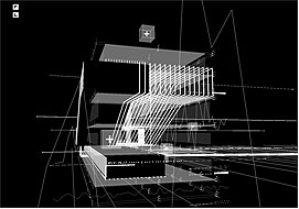
MIX-m is a mixed space architecture that exists at the same time in variable and complementary spaces: physical space (Contemporary Art Centre Geneva), digital space (a multi-users and game like environment), networked spaces (distributed over the internet). MIX-m.org exists at different scales. (...) Oscillating and hesitating between black and white, between 2d and 3d, MIX-m.org museum echoes to some historical archetypes: the "white cube" of modern museum as well as the "black box" of video-art installations. It also echoes to some historical "special effects" environments (Tron, before post-processing). Translated into "screen based" or "beamer based" architecture, this white to black condition becomes an over- to under- enlightened situation. Far from a functional intention, it proposes an evolving illumination system connected to the global activity of MIX-m.org server (rate of information). This system exists both in physical (neon light) and digital spaces (virtual light beam). MIX-m.org as mixed museum becomes therefore a variation between architectural types and references, playing with the user's eye and cultural habits.

The exhibit occurs at MAMCO in Geneva.

From New York to Coruscant

Last week-end, I read this book:


"" (Alain Musset) (!!! book in french !!!)

The authors' point is that science fiction novels, as Dickens or Zola's books reflects how society behave at a specific moment in time. He thinks that studying how sci-fi envisions problems related to social/political/organisational/environmental issues are very rich; it can be useful to get some feedback about our society which is the basis of the one described in the novels. He then assumes that sci-fi pushes our society is today to its limits. Coruscant (Star Wars' Republic and Empire central city-planet) is an extension of North-American cities from the east coast (based on the skyscraper paradigm) as well as being based on the socio-spatial divisions that we can find in todays metropoles worldwide.

In this book, the authors analyses Star Wars cities under the lenses of social sciences to study todays societies AND he tries to understand how todays' cities are perceived, using the image and the discourse of sci-fi.

It's very insightful, there are lot of interesting parallels drawn here. For instance, some are really easy to find like the Senate which is a good metaphor of today's United Nations or connection between Coruscant, Saskia Sassen global city and Isaac Asimov' Trentor planet (in Foundation). The part about socio-spatial division is very interesting and the ghettos formed by various zones inhabited by different aliens clearly close to 20th century's worse moments.

Why do I blog this? I really appreciate the authors' claim: the way he uses science fiction as a way to explore the present (assuming that writers base their fiction as an extension of today). This approach is very uncommon for french academics and I am glad to see that some now move forward and do not consider sci-fi as just a genre.

Makrolab Autonomous Lab

This Makrolab seems interesting:

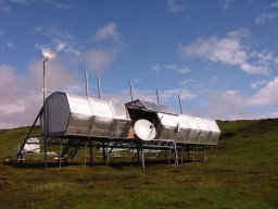
Makrolab is an autonomous communications, research and living unit and space, capable of sustaining concentrated work of 4 people in isolation/insulation conditions for up to 120 days. The project started in 1994 and was first realised during an art exhbition, documenta X in Kassel in 1997.

The project was started by Marko Peljhan, but has evolved and includes work of many people from many different disciplines. The current setup of the project, the mark II, was designed by the architects Matevz Francic and Aljaz Lavric, the metal work is the work of Joze Miklic. The construction itself was designed already in 1997 and you can find more information on it on the 1997 website.

And what I like here is what they do inside:

Makrolab is equipped to accommodate artists, scientists, tactical media workers and creators and provides them with tools and means for their joint independent progressive work. People in the Makrolab do research primarily in the fields of telecommunicatons, weather systems and migrations on a very wide basis. (...) Science is the field of human activity, where concentrated cognition, coupled with the dialectic of the clear goal and target and the exploration into the unknown is most present. If the methods and systems of art give us freedom, methods and systems of science give us the ability for progression and reflection. 


Why di I blog this? I really like this idea of lab accomodation, in terms of both architectural and lateral/parallel organization. Even though it's supported by national governments, international organisations, private companies and private individuals, it appears really compelling.