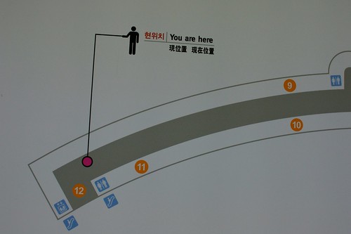
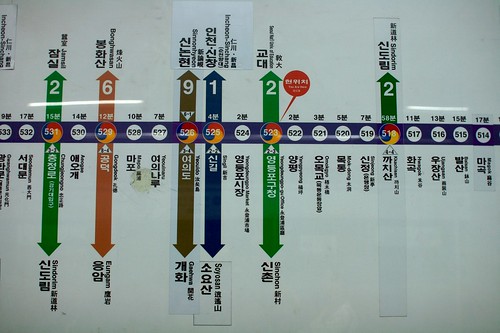
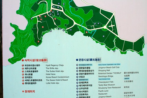
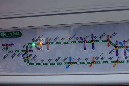
Why do I blog this? the "you are here" sign is a common wayfinding element that is always interesting to observe. Stating where people are can take many forms ranging from ubiquitous red dots (w/o captions) to interactive LED and the context can also influence the signage.
Cognitive sciences deal with this issue and state different criteria to evaluate what they call "YAH" (you are here maps). See for instance You-Are-Here Maps in Emergencies – The Danger of Getting Lost by Klippel, Freksa and Winter which summarize the literature about this:
- "Local placement: One important aspect of the local placement of YAH maps is the use of asymmetries to facilitate locating the map within the environment. An asymmetrical part of an environment is easily identified on the map as its layout combined with the YAH symbol (see below) shown on the map provides many cues for its location. Therefore, the location of the map in the environment becomes non-ambiguous.
- Correspondence: YAH maps should allow for easily establishing a correspondence between the represented information and the information that is immediately erceptible. While locating oneself should be guided by a YAH symbol (see below), several aspects contribute to whether or not the orientation within an environment can be accomplished easily:
- Alignment: The YAH map and the environment should be aligned.
- Architectural cues: YAH maps should be designed such that architectural cues and natural landmarks are included and that the shape of the route drawn in the YAH map relates to the actual shape of the route the user has to take in the environment, i.e. the behavioural pattern depicted corresponds to the behavioural pattern to be carried out
- YAH symbol: The YAH symbol fulfils two tasks: First, it locates the user within an environment; second, it should indicate the user's orientation with respect to her immediate surroundings (...) The double function can be achieved by combining a dot with an arrow or by a triangular shaped symbol designs.
- Alignment of text in the map: The text in a map should be generally readable without requiring to turn one's head.
- Repetition: Combining the principles mentioned above may allow for easier self-localization, orientation and determination of the route to the destination."
The principles can be employed as a mean to evalate YAH maps as well as a way to design and place then in the environment. As a matter of fact, they can also be interesting if you want to automate a "you are here" system through LBS. The level of mobility (or immobility) would then be an additional factor (in-car GPS versus pedestrian versus bike). There is a whole world to explore here in terms of user/field studies.


