 Mapping is a favorite topic of mine, not only because I worked on locative media, but also because I find they are fascinating objects. Maps are really interesting these days as they exemplify one of the design trend I spotted recently: the transformation of non-digital objects by design techniques coming from the digital world. To some extent, lots of artifacts from the material world can be re-designed by applying insights learned when creating weird interfaces and new sorts of interactions.
This is what happens currently with paper-maps which design is reshuffled by people who grew up with video-games and on-line mapping tools, or by designers who consciously want to apply techniques coming from the digital. What is highly captivating in this context is that it also reshapes the user experience of the object at hands. Maps are a good example of such phenomena.
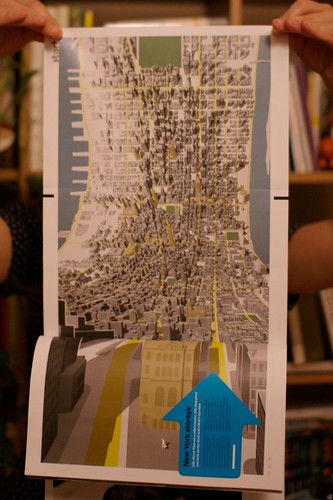
One of the most advanced project along these lines is certainly Jack Shulze's Here and There. Although I don't have the poster version, the Wired UK version will do to exemplify what it is:
Here is the idea:
"Imagine a person standing at a street corner. The projection begins with a three-dimensional representation of the immediate environment. Close buildings are represented normally, and the viewer himself is shown in the third person, exactly where she stands. As the model bends from sideways to top-down in a smooth join, more distant parts of the city are revealed in plan view. The projection connects the viewer's local environment to remote destinations normally out of sight."
There is more on S&W's on-line web log where Schulze describes how he wanted to "exploits and expands upon the higher levels of visual literacy born of television, games, comics and print". More specifically, he wanted to tap into the satellite representation as a symbol of omniscience and the reason why a platform such as Google Earth is so compelling. The point was to have "a speculative projections of dense cities (...) intended to be seen at those same places, putting the viewer simultaneously above the city and in it where she stands, both looking down and looking forward".
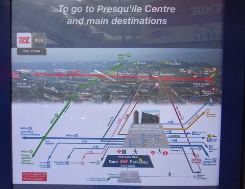
Reading this in the train yesterday made sense when few minutes after, arrived at my final destination in the city of Lyon (France), I encountered this curious map:
The map depicts the city of Lyon from the train station at the bottom (in this white area) and the city itself in the upper part of the picture. There is a lot to discuss here and I won't comment about what is not represented (can the white part be absent because it may have been perceived as not interesting for tourists?). What I find relevant there is:
- The sort of bird eye's view, as if we were in a video game, where the landscape is represented in plan over distance
- The color overlay that shows the subway, tram and bus lines is also curious. It basically maps the public transport infrastructure on the perspective
- The map is fixed and located in the train station, it's only drawn for this specific viewpoint (the station) and definitely match the context of use.
Why do I blog this? trying to make some connection between online musing and urban scouting... and the map topic is highly intriguing for that matter. I am convinced there is a lot to work on to modify non-digital objects with this sort of design techniques.

