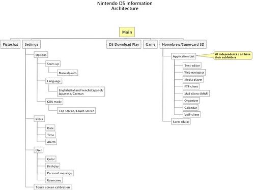
Last year, during a project with Nokia and the EPFL Media and Design Lab, we "mapped" the structures of the "digital world" as represented in mobile devices (cell phones, iphones, ipods, portable consoles). The point was to graphically represent the information architecture so that we could understand how it evolves over time in different devices. Francesco Cara, design strategist at Nokia is talking about it in his LIFT08 presentation.
Anyhow, I was in charge of looking at mobile entertainment devices (such as the Nintendo DS and the Sony PSP, among others) because one my research them is about the exploration of portable technologies to understand the implications in terms of mobility and new interactions. The underlying idea, consists in analysing the usage of the technologies to determine opportunities and constraints for design.
This type of quick graph is interesting at it represent different information architecture strategies (menus globally speaking) and to so in a quick glance how Nintendo simplifies interfaces with a limited depth unlike the PSP. This graph was a first step before other more evolved representations mostly focused on cell phones that I can't show here (non disclosable yet).

