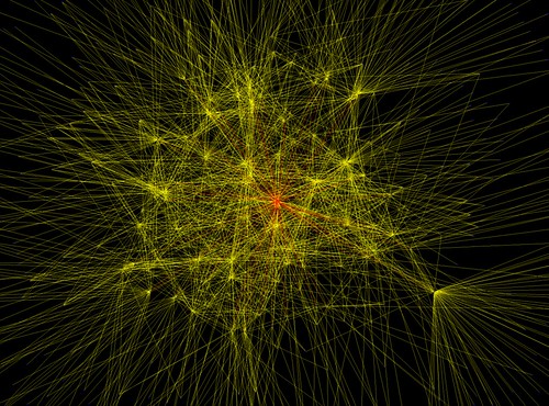
Just ran across these interesting diagrams of O'Reilly Connection Network using FOAF and Graphviz here. For instance: It depicts:
2nd degree of O'Reilly Connection contacts. This is a close up of the populated section of this graph. This graph was created by crawling the FOAF documents from my [the author Timothy M. O'Brien] O'Reilly Connection profile and then obtaining the FOAF documents of people associated with me. The results were then stored in a neato format and visualized using graphviz neato.
The guy's complaining about the fact that he lacks computational power to visualize six degrees, what a pity that would be great; however, judging from the previous graph it might be quite messy!
Why do I blog this? I still find FOAF relevant and I have always wondered about can we use this sort of network data in a useful, efficient and reasonable way. Apart from viewing the network, how this could be of interest in a peculiar kind of application? There are already good examples like what people do at the Sociable Media Group (MIT) but apart from that?