architecture

Atom style - Atoomstijl

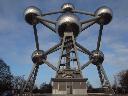
Perhaps one of the most important building I wanted to see in Brussels this week was the Atomium. Built for the Expo'58 (1958 Brussels World's Fair) and designed by André Waterkeyn, this building is a 103-mettre connection of 9 steel sphere so that the whole forms the shape of a unit cell of an iron crystal magnified 165 billion times: Atomium

According to the wikipedia entry, one of the original ideas for Expo '58 was to build an upside-down (and 6 months lasting) version of the Eiffel tower but the architect felt that an atomic structure would be more symbolic of the era.

Atomium

Why do I blog this? I find this building intriguing as its whole architecture exemplifies progress. The representation of where the future would lay (the atom) is embedded in this architecture. This whole style called "Atoomstijl/style atome" has also inspired other people such Yves Challand who drew comics in this retro movement.

The use of wax

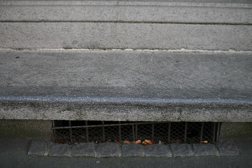
Waxed area for sk8 A bench in Zürich, conspicuously rubbed with wax by skateboarders... reduced friction, makes is easier to grind the bench.

Why do I blog this? The tweaking of urban elements in an interesting practice to observe. What does that say about urban computing? possibly that a certain audience can modify the infrastructure they need to operate with regards to their needs. At the social level, the presence of wax on curbs/bench is also a trace of people activity, a social navigation indicator that skateboard hang out there. I recently wrote a short article about that topic for a trend book for JCDecaux (the street billboard/furniture/toilet/biking company) on cities, mobility and new media.

Adam Greenfield at PicNic 2007

Adam Greenfield's talk at Pic Nic was entitled "The City is Here for You to Use: Urban Form and Experience in the Age of Ambient Informatics. His presentation is basically about the implications of ubiquitous computing on the form and experience of the city. After "Everyware: The Dawning Age of Ubiquitous Computing" Adam is now zooming on a more specific aspect of ubicomp: its influence on the urban environment. Inspired by Jane Jacobs, Christopher Alexander or Bernard Rurdofsky, he drawn our attention to their "generosity" about the life on the street and the recent changes exemplified by this quote from Alexander: "For centuries, the street provided city dwellers with usable public space right outside their houses. Now, in a number of subtle ways, the modern city has made streets which are for "going through," not for "staying in.". Through various examples, Adam showed how "we killed the street" due to cars, traffic, overplanning, the "repeating module of doom" (succession of franchises) leading to what Augé calls "non-places" and Rem Koolhas refers to as "junkspace". The city then becomes "stealthy, slippery, crusty, prickly and jittery" through defensible space elements such as the following one I spotted in Amsterdam last week:
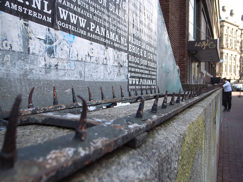
Defensive space

This situation leads to various forms of "withdrawal syndromes": ipod usage, mobile phone/blackberry digging... and the city is less "a negotiation machine between humans". In sum, "we lost something" and instead of lamenting ("nostalgia is for suckers"), Adam highlights the challenge: to rediscover the city of Jacobs, Rudofsky and Alexander in a way that is organic to our own age. This means that ubiquitous computing can be a candidate for that matter.

He then presented how ubiquitous computing (everyware) is already affecting cities. Information processing, sensors start showing up in new places at different scale. At the body level, he cited the Nike+ipod example, at the urban level, some dynamic signs allow people to be aware of bus schedule or use contact-cards, leading to more agency in infrastructures. This enable new model of interaction and "information processing dissolving in behavior". The upside of this might be that people can get information about cities and their pattern of use, visualized in new ways (Stamen Design's cabspotting, crime and real estate mapping, map of cities with WiFi hotspot)... and that information can be made available locally on demand in a way that people can act upon. Would ubicomp turn cities in more efficient and sustainable places? Possibly this is meant to allow better choices and entirely new behavior might emerge, will we get a participatory urbanism? a "genuine read/write urbanism" as he mentioned?

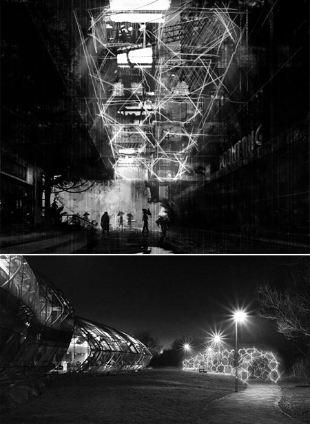
How will it affect urban forms? Adam showed some instances of how information as output at the building envelope: living glass modified by CO2 or the Blur Building by Diller-Scofidio (from swiss expo02). Ambient information becomes addressable, scriptable and/or query-able objects such as in the Chaos Computer Club Blinkenlights project.

(Picture courtesy of Diller-Scofidio)

One of the downside he presented concerned how this can lead to new inscriptions of class. He showed a DVD rental booth in NYC that allows cash to rent DVD but needs a credit card to access it. Another problem concerns the over-legibility of things: when there is too much explicitness and not enough ambiguity on plausible deniability, when everything is made public, what happens? maybe we do not want all our friends to know where we are, of course there are special case but not all the time.

The embodiment of space

"We cannot express its relation to ourselves in any other way than by imagining that we are in motion, measuring the length, width and depth, or by attributing to the static lines, surfaces, and volumes the movement that our eyes and our kinesthetic sensations suggest to us, even though we survey the dimensions while standing still. The spatial construct is a human creation and cannot confront the creative or appreciative subject as if it were a cold, crystallized form."

- Schmarsow, August (1994)

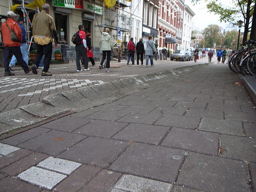
Why do I blog this? I quite like how that quote reflects the importance of the body in space: it's because we are embodied that we can create a spatial construct which corresponds to our reading of the spatial environment. An example? See this street spotted in Amsterdam below, if you're a skateboarder, this quote will make sense: you felt the curved sidewalk only by seeing it, feeling how this would be experienced afterwards with your board. And indeed, the affordance is to make an ollie and use it to jump.

Curved sidewalk

Now, what does that mean for the design of ubiquitous computing systems? I don't have a unique answer but it certainly gives some inspiration about how to create affordances that can be bodily experienced through shapes, forms or representations.

Alien architecture (pre-20th Century)

Alien Architecture: The Building/s of Extra-terrestrial Species - Pre-twentieth Century is a Georgia Leigh McGregor's Honours Thesis from UTS. It deals with what kind of architecture is portrayed by pre-20th century "extra-terrestrial literature". It's basically a study of architectural imagination based on textual research (". It includes both fiction and non-fiction and draws on a range of narrative and scientific works, including utopian, satirical, comedic, philosophical and adventure texts.") that takes architecture as a "tool for understanding" the relationship between ourselves and an alien species, "proposing that architecture is one of the means by which the character of an alien species is read." Few curious insights from the conclusion:

"Consistently the architecture of alien beings has been the architecture of humanity with the wholesale transfer of architectural assumptions. The application of anthropometrics to alien forms, assuming a relationship between dimensions of an extra-terrestrial and their buildings, was made evident (...) In one way the architecture of extra-terrestrial civilisation has remained the same but different, to refer to Ben Jonson’s concept. The conventions of earthly architecture are repeated in space though changing and transforming over time. The twentieth century would see an explosion in the quantity of other worldly literature and new media, with the advent of film and television, through which extra-terrestrial cultures would be portrayed. In the process many of these conventions would be reused and reinvented. Yet some of the most significant conventions arose prior to the twentieth century. (...) Extra-terrestrial architecture moved from representation at an individual level to a portrayal of society, as a whole, integrated with its urban fabric in this period. Architecture was used to create difference and to link to the familiar. Architecture and technology were confirmed as definitive evidence of an intelligent civilisation"

("A View of the Inhabitants of the Moon" - Illustration from an 1836 English pamphlet, publisher unknown - "Note the biped beavers on the right") Why do I blog this? my interest about space, technological implications in space and sci-fi led me to this paper. Lots of interesting stuff here (although it's more food for thoughts than material for my research). I quite like the analysis of the implications as well as the description of the connections between the pieces of text and their context of production (in terms of scientific discovery, etc).

Architectural analysis of WoW and BFME II

McGregor, G.L. (2006). Architecture, Space and Gameplay in World of Warcraft and Battle for Middle Earth 2 , Proceedings of the 2006 international conference on Game research and development, pp.69-76. This paper, which is very relevant to my work at the lab, is an architectural analysis of the spatial qualities of two video games: World of Warcraft and Battle for Middle Earth 2. The author starts by pointing out how game architecture is different from architecture in reality because the underlying rationale has a different purpose. In games, the architecture is created to produce challenges and gameplay.

The whole paper offers an analysis of two video games, let's jump to the conclusion to see the main issues of interest to me, i.e. the meaning of space:

"Both games build on established fantasy traditions, using architectural and ecological diversity to differentiate races and spaces. Both games use architecture to clarify and simplify gameplay in two very different ways. World of Warcraft uses architecture and landscape as an organisational system that contains activity and builds on usage patterns from real life. In contrast BFME II creates architecture as a symbolic object that stands for complex systems within a flattened and simplified contested spacemap. (...) The dichotomy between architecture in videogames as a spatial entity or as an object suggests a primary division of games into those that are concerned with movement through space as a visceral experience and those that are not. (...) they operate with significantly different approaches to spatiality. On one hand we have a game that represents architecture and landscape as accessible and spatial, that is characterised by an embodiment in and a personal view of space, that focuses on an individual’s movement through that space and that simulates a physical (though primarily visual) experience of space. On the other we have a game that produces architecture as an object and the landscape as a map, that uses architecture to represent intangible concepts, that simplifies the landscape and favours an external viewpoint, a game that simulates a conceptual view of space in which codified relationships are more important than physical characteristics, favouring metaphor over corporeal experience. "

(Pictures taken from the paper: WoW and BFME II)
I was also interested in the part about affordances:

"It is interesting to briefly consider the architecture of both games in relation to notions of affordance, taking William Gaver’s separation of affordances and perceptual information. The architecture of BFME II exhibits a false affordance of conventional architectural/spatial use in the way it mimics the visual properties of real buildings. Other uses of architecture in gameplay, for example creating soldiers, exist as hidden affordances. BFME II relies on the gameplay manual and knowledge of established traditions in real-time strategy games to indicate to the player the buildings utility. Conversely World of Warcraft primarily exhibits perceptible affordances of customary architectural and spatial use to its architecture, creating a congruity between what between what the player perceives they can do and the activities they can perform. "

Why do I blog this? it's been a long time that I am interested in finding this sort of paper, that would use architectural analysis of video game. This type of work is both interested for architecture (new objects to analyze, new behavior to observe, etc.) and for game design as it allows to understand more level design and how space could be articulated with game mechanics.

I am also wondering about how to go further, how to enrich game/level design through that sort of research analysis. Currently, I am gathering material like this paper and hopefully try to integrate this more deeply, maybe I'll try to write a paper about architecture and gaming to formalize more the interconnections.

Research studio (in architecture)

In a very insightful blogpost entitled "Is there research in the studio?", Kazy Varnelis wonders about "research studios" in architecture. The main issue here is that"such studios invoke analysis rather than design as their method and aim for publication or exhibition as end products". Quoting Turpin Bannister’s “The Research Heritage of the Architectural Profession,”, Varnelis shows how this is not a recent trend, but rather that the architect practice changed and less dealt with that.

"Over the last decade, “research studios” have become common in schools of architecture. Investigating clothing, logistics networks, favelas, malls, airports and cities worldwide, such studios invoke analysis rather than design as their method and aim for publication or exhibition as end products. But as is often the case in architectural education, this pedagogical model has thus far has been little theorized. (...) Research in these kind of studios is architectural in so far as it draws on the processes of information gathering, analysis, and synthesis that an architect undertakes in the early phases of design, utilizing the architect’s skills in structuring visual and verbal communication into a coherent whole."

It's also very interesting to see what sorts of agenda Kazy delineates:

"This, then, is the question that research studios need to address, indeed it is a broader litmus test for architecture|be it post-critical, critical, or otherwise|how does it help us to re-envision the world anew? By this I do not just mean add to the existing condition, either through replication of data, through nonlinear geometries, or exotic materials and structures, but rather through a contribution to knowledge. By its nature, this suggests that we should not go with the flow but rather redirect it utterly, remaking the terrain through which flows travel."

Why do I blog this? Coming from the research side, working in an architecture lab, I am of course very into "systematic process of investigation into the city" but I am wondering as well about how to contribute to architecture. What I found very interesting is the idea of a "research studio", which (at least from the research POV) is a boundary object (between research and architecture). And I definitely find this pertinent, also in terms of methods, goals and explorations.

Preparing for Dean - dismounting the infrastructures

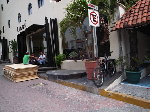
Preparing for Dean Picture taken on sunday afternoon in Playa del Carmen, before the arrival of the hurricane Dean.

Why do I blog this? What was fascinating there is too see how people efficiently know how to dismount the infrastructure (putting down streetlights, panels) and add new layers on top of existing structures to protect them (in this case wood to protect glass/windows).

I found intriguing the idea of temporarily dismounting the infrastructure. What does that mean for design? What can be done beyond easing the dismounting process? These are definitely questions to be expected if we have more and more stormy hurricanes.

Variable_environment booklet

The report of the "Variable_environment" project, a joint project between EPFL and ECALhas just been released. Although it's in french, this 19 Mb. document is full of great content, material and insights (some parts are in english).

With principal textual contributions by Patrick Keller, Philippe Rahm, Ben Hooker, Rachel Wingfield, Christophe Guignard, Christian Babski, etc., it addresses the notion of the "variable environment/" or the "mobility" problematic:

"From industry, planes, cars and motorways to services, mobile media, mobile (micro)-spaces, interactions, jet-lag, ...From Architecture's "high-tech" & mobility utopias to a "mish-mash" (hybridization) of (technological) objects, micro-architectures, situations, networks and interfaces. Those two comparative images (yesterday/today, see below) serve us since the start of the project as a kind of general background for our transversal ra&d project (transversalities between architecture, design, sciences). They resume some of our main concerns:

They both speak about "mobility". Two kind of "mobilities": 1__ mobile environment in term of distance. It moves and its context of use is changing (img 1: a walking city & a "mobile personal environment") or 2__ mobile environment in term of time. Its configuration, shape or function varies along time, but its location is fixed (img 2: an instant city and a flock of blimps). We can therefore speak about "Variable environments" in these two cases (variable in distance/context and/or in configuration/size over time)."

Why do I blog this? great material to be read, 2 possible of reading the document: (1) simply focusing on the content, (2) observing the underlying signs of collaboration between different actors (engineers, researchers, designers) and trying to understand the ideas at stake, what happens when art/design and research work together. Surely a relevant achievement for that matter.

interactive cities

Anomos and Hyx recently edited an interesting book called "interactive cities" about the ways in which the digital domain impacts the contemporary cities.

"In the field of urban planning, there has been much debate about the information and intelligence society and its flourishing potential. Discussion is gradually veering away from the idea of modeling all the components involved in a given project, as a means of managing the complexity of sustainable development. Instead, current initiatives call on continuous, distributed and dynamic methods to ensure consistency among the environmental, economic and social dimensions.

Interactive Cities contributes to this debate with over a dozen articles by various recognized authors. Researchers, urban planners and historians present their approaches to understanding interactive cities, endowed with invisible digital infrastructures and thriving at accelerated metabolic rates. Dominique Rouillard, Denise Pumain, Laurent Perrin, Carlo Ratti and Daniel Berry, David Gerber, Gerhard Schmitt, Jeffrey Huang and Muriel Waldvogel, Ted Ngai and Philippe Morel"

Why do I blog this? curiosity towards a book I've to find.

Googie architecture

Googie architecture, according to the Wikipedia:

"Googie, also known as populuxe or doo-wop, is a subdivision of expressionist, or futurist architecture influenced by car culture and the Space Age and Atomic Age, originating from southern California in the late 1940s and continuing approximately into the mid-1960s. With upswept roofs and, often, curvaceous, geometric shapes, and bold use of glass, steel and neon, it decorated many a motel, coffee house and bowling alley in the 1950s and 1960s. It epitomizes the spirit a generation demanded, looking excitedly towards a bright, technological and futuristic age. (...) Cantilevered structures, acute angles, illuminated plastic panelling, freeform boomerang and artist's palette shapes and cutouts, and tailfins on buildings marked Googie architecture (...) Roofs sloping at an upward angle - This is the one particular element in which architects were really showing off, and also creating a unique structure. Starbursts - Starbursts are an ornament that goes hand in hand with the Googie style, showing its Space Age and whimsical influences "

(Images taken from spaceage city) Why do I blog this? curiosity

Archizoom's "No stop city"

The "No stop city" by archizoom associati (italian radical architecture group) is one of the visionary architecture project that Kazys Varnelis desribes as having a role in terms of " bing useful when they don't rely on a proximate future but rather suspend the question of their nearness, thereby being both already present and objects of contemplation". Kazys defines this project as follows.

"Archizoom elaborated on this in their 1969 No-Stop-City, an extrapolation of the postmetropolitan urban condition – that was simultaneously utopian and dystopian. (...) Modeled on the supermarket, the factory, and the horizontal plans of Büro Landschaft, No-Stop-City was envisioned as a "well-equipped residential parking lot" composed of "large floors, micro-climatized and artificially lighted interiors." Without an exterior, these "potentially limitless urban structures" would be "made uniform through climate control and made optimal by information links." Rather than serving to identify a place, No-Stop-City would be a neutral field in which the creation of identity through consumption could be unfettered."

Why do I blog this? I find intriguing this vision of the city, reminds me of what we discussed during the LIFT07 workshop about it. This potential future sees the city as a terminus due to the economic changes and its networked organizations (made possible by technologies such as phones/internets...). As Kazys puts it after Banzi: "No longer viable as a place, the city would become a condition, existing not as a physical entity but as programming". Of course, this is a vision that makes us ask some important "why" questions about the future.

The architecture of research facilities

The last issue of Metropolis features different articles about the "The Architecture of Research" that addresses the extent to which architecture can inspire science practice. There is a lot to draw there but have a look at the one called "The DNA of Science Labs". It postulates that scientific research labs now receive more and more attention form architects

Both Rubin and McGhee, who has spent the last 20 years studying lab design and refining his theory of space planning, constantly refer to the most successful research centers from the past century (...) tracing relationships between the physical structures and their enormous scientific and technological achievements (...) connectedness emerged as one of the project’s overriding themes (...) “The best thing you can do is to a have single corridor, because that’s the one place where you always run into people.” (...) Another major theme for Janelia Farm’s space planning was flexibility, which emerged partly as a negative observation about the flaws of existing research facilities. The rapidly changing nature of scientific equipment and the need to adapt quickly to different research projects, as well as to adjust to individual preferences, meant that the labs should be capable of being transformed without the wasted time and expense of a total retrofit.

The article about labs in skyscrapers is a good read too.

Glass-walled labs provide a visual connection between the benches and offices, as well as between colleagues as they pass through the long wavy corridor. They also let in natural light and views of the world outside. Picture by Jeff Goldberg/Esto

Why do I blog this? this connects my interest in how the spatial environment shape social/cognitive processes, and conversely how can it be possible to design environments to improve collaborative behavior.

Level design patterns

Persons interested in video game design, space and place issues and design patterms, you should have a look at what Simon Larsen wrote about level design patterns. The author aims at providing a "unified theory" about formal design tools for creating levels for multiplayer first-person shooters (FPS). To do so he relied on the now very classical work of Christopher Alexander et al. in the field of architecture in the book "A Pattern Language: Towns, Buildings, Construction (Center for Environmental Structure Series)". This approach has already been addressed by others (see for instance "Design Patterns: Elements of Reusable Object-Oriented Software (Addison-Wesley Professional Computing Series)" (Erich Gamma, Richard Helm, Ralph Johnson, John Vlissides) or"Patterns in Game Design (Game Development Series) (Game Development Series)" (Staffan Bjork, Jussi Holopainen)). However, Larsen's contribution is to go beyond what had been done and propose ideas for level design in FPS. The icons below exemplify the following design patterns (same order):

  1. Multiple paths: Each path must be supplemented by one or more paths in order to overcome bottlenecks.
  2. Local fights: Break up the level in smaller areas that are more or less closed of the rest of the level.
  3. Collision points: The paths of opposing players must cross at some point to create tension in the level.
  4. Reference points: Always provide reference points in your level to help navigation.
  5. Defense areas: Aide the players or team defending objects by making the architectural layout of the level work to their advantage.
  6. Risk Incentive: Access to wanted objects in a level must be connected with some element of risk

Why do I blog this? Because I am interested in space/place issues related to games (computer games and pervasive gaming). Although I am absolutely not a level designer, I found interesting to see how this set of guidelines could trigger some thoughts about players' behavior in the spatial environment. I rather see them as probes or open questions to create challenges in FPS. Besides, it's full of good examples nicely described. Besides, it's not that commesensical as one could though, many games have problems dues to bad level design. Moreover, his next work will address more complex patterns. However, I may have a different point of view concerning this assertion: he wants to ensure designers "that the players can seamlessly navigate through your game world". As a matter of fact , game design is sometimes a matter of creating problems/seams/obstacles in the level design to create challenges. Don Norman has a point about this issue in "The Design of Everyday Things"

Finally, would this hold in urban gaming? Would this hold in environments that could not be re-designed (urban gaming)? And of course this leads to the question addressed by Simon Schleicher (I'll post more about his work soon) who tries to investigate whether architecture be created by a game and its rules.

Chance meetings at the RAND

(Via Dr.Fish) Archrecord has an interesting article about the design of RAND Corporation Headquarters (the nonprofit policy research institution in Santa Monica, California). It describes these curious figure-8-shaped headquarters:

DMJM Design took a page from RAND’s own playbook. It organized the building within a figure-8-shaped floor plan: the figure 8, according to RAND’s mathematicians, increases the probability that researchers from different departments will have chance encounters with each other in the hallway. This shape, moreover, corresponds to RAND’s nonhierarchical, egalitarian organization—and, to boot, its internal circulation pattern lacks dead ends.

RAND's website also describes more thoroughly these issues:

While the headquarters is modern in design, its central design theme is based on ideas first expressed in 1950 by a RAND mathematician, John Williams. He proposed a design that would facilitate more interaction between staff by increasing the odds of "chance meetings." Today, that theme is carried through with elements such as a system of interconnected bridges and stairwells that are unusually wide to encourage impromptu discussions among employees.

Why do I blog this? this is an interesting (and classic) example of how architecture can structure certain behavior.

A living structure

The blog of the EPFL/ECAL joint project nicely summarizes the results of a workshop they recently set. A project developed in this context is about "How nature can be resumed to a simple mathematical formula" by Florian Pittet & Margaux Renaudin:The idea is to create a whole living structure: Using light as a protector and as a living manifestation, the structure interact with the walker that pases threw her by sensors, and glows all around him. (...) Light will play an essential role by creating a cocoon that follows the human, by a gradual glowing light cycles, using a new kind of neon tubes that can fade out and have a more organical kind of light. Structures can be supported by a kind of skin that can tense the volume or follows the movement of the structure.

Their description is quite interesting (as a work in progress) and there are plenty of pictures and videos to precise their thoughts. More here.

Why do I blog this? this is IMHO an interesting example of "landscape as interface" through glowing lights based on passers-by movements. Kind of an instantiation of a ubiquitous computing environment... Besides the blog is great to keep track of those guys from lausanne are up to).

"We experience spaces not only by seeing but also by listening"

Barry Blesser recently sent me sample chapters of his book called "Spaces Speak, Are You Listening?" (written with Linda-Ruth Salter, at MIT Press). The main thesis propelled by this book is that social relationships are strongly influenced by the way that space changes sound ("aural architecture"), an issue I can fully agree with given my background in cognitive psychology and ergonomics. Some excerpts:

The composite of numerous surfaces, objects, and geometries in a complicated environment creates an aural architecture. (...) consider displacing familiar sounds to unfamiliar environments. Transported to an open desert, urban traffic would not have the aural personality of a dense city environment. (...) In addition to providing acoustic cues that can be interpreted as objects and surfaces, aural architecture can also influence our moods and associations (...) Aural architecture can also have a social meaning. For example, the bare marble floors and walls of an office lobby loudly announce the arrival of visitors by the re-sounding echoes of their footsteps.

Why do I blog this? I am interested in how the environment structures social and cognitive interactions, therefore this book seem to deal with that issue from the auditory perspective. It reminds me of a study I did five years ago about which sort of awareness cues FPS players (Quake II...) deployed while competing; in the interview, lots of players told me that they were listening to footsteps noises as an indicator of which weapons the opponents were carrying.

Living buildings

In The Economist this week, there is an article about “Responsive” buildings" capable of changing shape andresponding to their users' needs, namely how architecture can be thought as "living systems rather than static buildings". Some excerpts I found interesting: What woudl that look like?

Houses, for example, might shrink in the winter to reduce surface area and volume, thus cutting heating costs. They could cover themselves to escape the heat of the summer sun or shake snow off the roof in winter. Skyscrapers could alter their aerodynamic profiles, swaying slightly to distribute increased loads during hurricanes. Office buildings could reconfigure themselves to improve ventilation.

And to do so, what is needed?

Such “responsive architecture” would depend on two sorts of technology: control systems capable of deciding what to do, and structural components able to change the building's shape as required. (...) One approach being pursued by researchers is to imitate nature. Many natural constructions, including spiders' webs and cell membranes, are “tensegrity systems”—robust structures made up of many interconnected elements which can be manipulated to change shape without losing their structural integrity.

Why do I blog this? one of the most striking features of such description is that the "dynamic" paradigm" (that I would define as linked to the responsiveness of an artifact to the environmental conditions) now pervades static objects, long life to biology-based inspiration!