Urban
Micro-mobility devices to handle "micro-distance"
When it comes to mobility, people are in general mesmerized by Velib or Zipcar lately but there are there sorts of devices that I find very intriguing: aluminium scooters or K-2 Kickboard Scooter. Some people would argue that this for start-up pricks (because real value is in pure P&P skateboarding gear) or that it is childish and useless but I don't think so. I don't have any scooters but what I find interesting here is the notion of "micro-mobility" and the balance of cost: the cost to use the device is low (lower than unfolding the A-bike Adam gave me for instance). And it's way cheaper than a Sidekick. Another characteristic is that it can be used indoor/outdoor.

Invented around 2000 by dutch/swiss banker Wim Outboter, these scooters are still very popular. His point at that time was to solve this concrete problem:
"When Wim was 30 years old and living in Zurich, he came across a problem. His favourite sausage shop was too far away to walk, yet not far away enough to take the car out of the garage. 'I called it a microdistance,' he says. 'I made a primitive scooter using the wheels of some inline skates and it worked. The only problem was that when I went down town on it, people laughed at me.' With his characteristic mixture of a kid's desire to be cool and a grown-up's application of technology, Wim worked at the scooter until it was small enough to hide in his backpack. It still took another 10 years (and the constant encouragement of his wife) to get the invention on the road."
Why do I blog this? interest in less common means of transport and their implications in terms of design (of the device itself as well as the infrastructure to support it). Micro-mobility devices also seems to be a bit dismissed in the discourse about the future of mobility in urban environment, although scooters, lifts, elevators, electric sidewalks, etc are prominent in our everyday life. And high-rise architects surely have to deal with that.
About pneumatic network
Pneumatic tubes and networks (as the one described in Boris Vian's novels) have always fascinated me. The name itself is gorgeous and it really looks like a strange vehicle. Although there are sometimes still use to transport cash and documents (transparent supermarkets pneumatics are intriguing), their usage has often stop or led to new possibilities: using tubes to put optic fibers to serve as internet infrastructure OR use both technology and pneumatic to vehicle paper documents which still matters in the 21st century.
Also of interest is the mapping of pneumatic networks, see for instance the Paris network as shown in this article:

Why do I blog this? What is interesting here is not that you can get web-based remote control of an electro-pneumatic (nor the impact on net neutrality) but rather the existence and sometimes the resilience of this communication network. An old version of the "city of flow" sort-of.
Skateboarding readings of space
The other day I mentioned this short article I wrote in JCDecaux trend report. It was about how skateboarders "read" space, make decision about where they do skateboard or to hang out with peers. In a sense, it's about "social navigation" and what sort of "footprints in the snow" matter for skateboarders. I dug up some examples from my city ventures below. Choosing a skateboard spot according to the physical aspect of the place
For instance, in Niteroi (Brasil), that curved sidewalk is definitely an invitation to skate it:

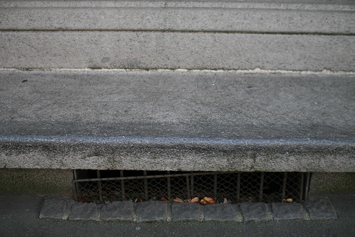
This bench in Zürich (Switzerland) is also an obvious point of interest (from the physical point of view) but the presence of wax also attests that OTHERS are using it as a spot. The place can also be more than a physical spot as the presence of wax indicates it marking by a community. It reveals the appropriation by a click of skateboarders (and the likelihood to find them here on saturday afternoon)
Skatespot approval or how places are validated for certain activities
This "thumb-up" stickers found in front the of the University of Geneva indicates the approval of the spot by a community of skater (in that case a local shop/community):
Skateboard map
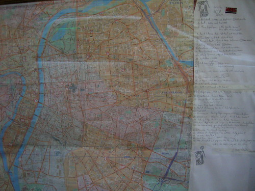
The usual paper map, for example in Lyon (France) found in a shop called Wallstreet, that depicts interesting spots to do skateboarding:
And of course, there is an on-line/participatory version, named freeyourspot, see the example of London (which not really reveal about skateboarding potential there):

Why do I blog this? of course one could use lots of other examples but I find skateboarders a very interesting target group to study spatial behavior, and how they use various techniques (from wax to participatory websites or cell phones). In this post, I tried to update some examples of how skateboarders read/navigate in space.
I find them really interesting examples IMHO of what some would refer to as "situated technologies".
Today's urban computing versus "I just want to catch a bus"
Some tough but relevant issues presented in Backbone about how technology help solve the problems of city dwellers ("Or even just tell them when a bus is coming?). An excerpt that is particularly strong (about a Microsoft urban computing project)
" So what impact does this sort of thing really have on a city? Not much, according to Austin Williams, technical editor of the Architects’ Journal and director of Future Cities, a forum that critically explores city issues. Williams, who calls such technology-driven projects indulgent, points to more urgent urban problems awaiting solutions, such as the loss of social connections between city dwellers. “The people who are inventing these technologies are creations of this fragmented society. They don’t want to have a hard argument. You need a proper political analysis,” he said. “A lot of these things are public art projects. It relates to people on an individual emotional level rather than on a group political level.” (...) What irks Williams could be the sense of playfulness in many of these urban computing projects, which is at odds with the hardheaded policy building that is the mainstay of think tanks like Future Cities. But playfulness lies at the centre of Eric Paulos’ work. (...) A trash can that regurgitates its own garbage. Cute, but how useful is it? “You can look at some of the things you do as being efficient and productive and getting things done, while some things are about wondering and reflecting and daydreaming,” Paulos said. “I am fearful that ‘city’ plus ‘technology’ equates to Wi-Fi cafés. [It should be] more about letting us radically rethink what’s possible.” "
Why do I blog this? a very interesting and critical discussion of urban computing form different angles. Especially about the techno-driven argument. That said, I am not sure it's efficient to oppose two tracks (politics/instrumentality versus art/emotional/playful) in such a caricatural way. There are big problems but instrumentality is always relevant, and some urban computing projects tackle them as well.
Also there is this interesting issue in the conclusion:
" Pollution sensors bluejacked the Bluetooth radio interfaces of nearby cell-phones with unsolicited information and Web links on pollution levels in the surrounding area. (...) because people walk quickly through city streets, by the time the device set up a connection with a nearby phone, most people had already walked out of range, eager to reach their destination. And that is a reminder for urban technologists: the biggest challenge of all is to keep pace with a fast-moving and multitasking population."
Contribution for urban trend-report
Recently wrote a short article for a trend report of urban company JCDecaux. The whole book is called Les Audiences dans la Ville (The Audiences of the City) and addresses the new practices of people in contemporary cities. Other writers include: Fabien, Adam Greenfield, Frederic Kaplan, Daniel Kaplan, Bruno Marzloff and lots of others interesting people from the media/design/urbanism community. It's in french though.
My contribution called "social navigation in urban space" starts by describing skateboarder as an interesting metaphor for making spatial decision in the city (i.e. choosing where to go, which area to visit and "do something there"). Skateboarder indeed rely on: looking for physical spots (implicit traces like grinded or waxed sidewalks/benches), active tagging (stickers which are explicit traces), social knowledge of spots or often maps found in magazines or on the Web (community traces). Looking for a spot is, in essence, looking at the physical environment, relying on one's community or finding resources. I then describe how technological devices (gps, cell phones, digital cameras...) allow the same functions as they produce electronic traces that we can read/analyse to make spatial decisions (through social navigation). We can use the same typology:
- the implicit traces: the one that appeared because of people's activity (doing skateboard results in grinded benches, using your cell phone allow to provide digital traces to some companies).
- the explicit traces: active tagging of the environment in its ecology (graffiti, yell arrow).
- community traces: active tagging or reference to the environment on an external resource (web).
The article goes on by discussing what does that mean to have traces and what sort of urban services we can think about that can take advantage of them.
Different layers of information
 Seen in Verona, Italy last week-end. Different layers of information, some official (regular signage), some more informal (badly written with Tipp-Ex, to state that drugs can be find on the right).
Another way to communicate that information is to use shoes hung onto a telephone wire as seen on the picture taken in San Francisco few years ago (but this is not more a sort of urban legend):
Anyway, this is part of an ecosystem of signs in contemporary cities that are more less perceived or understood by city-dwellers.
Ordered versus less ordered modern cities
 (clean San Diego, a vision form the future)
As stated by Mike Crang:
""as robins (1999) has pointed out, too often futuristic accounts of the electronic city are driven by a resurrected modernism that, like the Saint Simonian's of the 19th century, looks to offer transparency, efficiency, and thus social harmony. Indeed visions of the city in accelerated time-space very often assume the desirability of instantaneity and speed, in the 'real-time city'. Robins (1997) has called for a revaluation of Byzantine complexity, and social complexity rather than transparency in thinking through the city - rather than the often unthinking celebration of ordered, purified digital space that is somehow friction-free and the assumption that the absence of dirt and disorder is a good thing."
(In Crang, M. Urban Morphology and the Shaping of the Transmissible City. In: Graham, S. The Cybercities Reader. London: Routledge; 2004:129-132.)
Why do I blog this? the contradiction between the clean and almost aseptic vision of modern city (or what modern cities should be) is well described in this quote from Mike Crang. Especially when it comes to digital/physical interlinkages. Too often, it's represented as on the first picture and not as on the second one.
Feel the city differently
The "lagoon emergency button"
The "lagoon emergency button" is surely one the most interesting interface I've seen recently. I've stumbled across it few days ago, close to LucasArts offices in San Francisco.
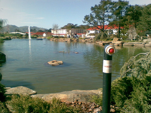
The red button basically controls the (nice and fake) waterfall that operates on the left of the picture. What I find impressively curious (and odd I would say) is the notion that the whole semi-natural feature represented here can be "turned off" by pressing a button. Interesting enough is the gap between that small red thing and the big environmental surrounding. Can this be a "responsive environment" where the interaction is basic but still possible.
Furthermore, the name of the button itself is fantastic ("lagoon emergency button") and I don't know if there are other combinations of the word "lagoon" and "button" in the same phrase (well...) but that sounds almost paradoxical.
That being said, the "blue lagoon button" sort of belongs to the technologies and infrastructures described in the "street as a platform", in a sort of weird way. And it's definitely related to the automatic component of the city mentioned the other day about Rotterdam.
Framing the inter-relationships between ICTs and urban environments
One of the best book I've read recently is certainly "The Cybercities Reader (Routledge Urban Reader Series)", a collection of articles selected and commented by Stephen Graham. The whole thing is about the ICT's influence on forms, processes, experiences and ideas of urban life. To some extent, it's one of the most important resource to frame "urban computing". The introductory chapter (and the introduction to Section 2 ) is of great relevance to describe the debate about the relationships between ICTs and urban realities. Graham presents the 3 dominating types of conceptual and theoretical discourse that analyses the inter-relationships between cities and ICTs: - substitution and transcendence: human territoriality and space/place-based dynamics can and will be replaced by using new ICT technologies. Authors in that vein: thinkers like Toffler, Virilio and technologists like Negroponte, Kelly. - co-evolution: both digital spaces and territorial spaces must be produced together as part an on-going process (which is capitalism). Authors in that vein: Castells. - recombination: there is a fully relational view of the links between technology, time, space and social life. Authors in that vein: inspired by Latour and Haraway, Thrift, Bingham, Graham, etc.
The "substitution" model is the one that received the most attention, implying that space will disappear, distance will disappear, cities will vanish and that cyberspace would replace it. And also it was the model that seems to be recurring over the years (was what happened last year about Second Life). Graham describes the 4 characteristics of this discourse: - he speaks of a "Post-Urban fantasy", Bolter and Grusin use the term "Theology of Cyberspace" for the "stream of excited, romantic and often utopian accounts of the ICT-based demise of cities". - it's generally about having a "friction-free" capitalism, with "perfect transactional fluency". - ICTs are expected to meld communities and mediate democratic processes. - a strong libertarian component.
What is implied by this substitution model is the technological determinism assumption, an "hyperbole of unlimited power" of ICTs and cyberspace. The most striking example here is the use of the "impact" metaphor: something (internet/mobile phone) that comes out from the blue, like an asteroid would arrive "out there" and influence everything in a very straight-forward or linear cause-and-effect chain. This view is wrong and it's funnily not the first time that I hear a critique of the word "impact" (the other person who mentioned it to me was the anthropologist Daniela Cerqui). What is important here is to keep in mind that innovation do not comes from disembodied asteroids and that it's definitely part of a socio-political process. Of course, it's not the first time in history that substitution model are called upon, TV, magazines, radio, telephones, publishing, photography, etc were also mistaken.
This is why Graham, after Bolter and Grusin, prefer to talk about "remediation":
"not as a revolution but as a complex amalgam of new technologies and media fused on to and 'remediating' old ones. (...) we are experiencing a complex and infinitely diverse rang of transformations where new and old practices and media technologies become mutually linked and fused in an ongoing blizzard of change."
Graham identifies 6 majors flaws in the "substitution" discourse that predict the end of the city/distance/space: - being wrong empirically: data shows that urbanisation and ICTs goes hand in hand: mobility is not reduced. - ignorance of the material realities that make the cyberspace supposedly "virtual" possible: infrastructures are needed and often noticed when broken. - over-generalization and not locally-described: the vision imply that all experiences are the same anywhere and that ICTs relate to all cities in the same way. - tendency to overestimate the capabilities of ICTs to mediate human relationships and underestimate the richness and power of co-presence of human bodies. - promotion of simplistic, biased and glossy ideology of the "information age" (as a camouflage for neo-liberalism) - show depoliticised depictions of cities being "impacted" by waves of "autonomous" technologies arriving out from the blue as if there were not place for policy innovation in cities or higher-level institutions (regions, states, supranational).
That said, the book itself does not dismiss current transformations but rather describe the complexity of the inter-relationships between ICTs and urban environments.
Why do I blog this? that sort of discussion is an important framing for current research about urban computing, also at a high-level, it's an interesting overview of the different models promoted about how technologies and human activities are inter-related in a more nuanced way than what we read here and there. Will probably re-use this material in course and talks.
Traces of contact in a contactless interaction
 Seen in San Diego this week. A near-field interaction device, aimed at being contactless... but the patina clearly indicates some contact traces. This pictures shows the paradox between the sort of interaction we are expected to have in the city of the near future (contactless?) and past practices (contact). Moreover, the patina also reveals the messiness of technologies and the inevitable presence of dirt at some point. Digital is physical to some extent.
Locate outdoor power outlets
Plugfinder is a website that helps people find electricity outlets in the city, and encourages them to do some activities using them ("Charge your cell phone, cook food on a hotplate, project slides onto a building, or maybe install an inflatable sculpture"). As the FAQ says:
"Why map out electricity outlets?A: Lots of reasons:
1. Gives people an excuse to walk outside AND visit parts of the city they have never gone to before. We just covered essential public health and economic initiatives in one swoop. Bam! 2. InfoNomads always need a quick burst of electricity to charge up there gear. Your city WANTS to attract the creative class, right? If your city is smart, you'll get corporations to freely give out electricity on the street as part of Payment in Lieu Taxes (PILOT) plans. 3. Making electricity outlets public has all kinds of positive unintended consequences: think about the reduced property damage when kids can project their graffiti rather than put it on the wall with all those awful chemicals. 4. It'll make your city more interactive. Thats cool right? Like Archigram envisioned, but more diffuse and street level. 5. Democracy requires communication. Communication increasingly happens with ICT. ICT requires electricity. Democracy requires electricity? 6. Don't take my word for it. You'll probably only listen when the venture capital starts to roll in, anyways. This is America after all."
 (Picture taken last week in Burbank, California, an outdoor power outlet located on a train platform).
Why do I blog this? Electricity is more and more an important resource when you're outdoor, especially when traveling. Although certain commodities like water (toilets, and sometimes WiFi) are made free on the street, electricity is scarcely made available (even in public places such as airport, train station). Moreover, I like the contrast of having external/outdoor power plugs and the possibility of rain.
Therefore, I find Plugfinder more interesting because of what it reveals (the need to get access to electricity, and the assumptions made by the designer for how it can be useful) than the real service it provides so far.
San Diego: scifi city
Wandering around San Diego for ETech 2008 makes me realize how this city displays a peculiar sense of science fiction. It's not the first time that I visit that place but it's perhaps the conjunction of that tech conference and the watching of Battlestar Galactica that made me me thinking about this. Downtown SF definitely looks as if colonial spaceships-shaped building had to suffer for a temporarily grounding and were ready to take off or spacefold to another dimension:
That impression also materializes at the ground level with all those city infrastructures that are generally hidden/covered but not here:
Unlike Rotterdam that I described last week as the automatic/mechanic/electronic city to shows how the town is a "process", San Diego looks rather more about "shapes". Processes are present of course but they are more hidden, often more about access to buildings (through contactless cards) or the presence of the wifi clouds.
Why do I blog this? this is not very rocket-science thoughts, just psychogeographic feelings on a sunday morning.
Notes from the Mobile City conference
Some notes of things that I found relevant to me at the Mobile City conference. Malcolm McCullough Malcom gave an insightful talk about the history of "urban inscriptions" and how the City has been the place of "marking" for a long time. First, "the city itself is an inscription" and there lots of instances of inscriptions from graffiti to state proclamations to the contentions of branding, and from petroglyphs to banners to lit facades, the architecture of the city has been layered with lasting messages. To him, there's an tension between "locative media/emergent culture of street level participatory urban computing" AND the "built environment as a new media", sort of "tagging versus LED display". In one case, it's about the fashion of blinking "push media" (displays), in the other, it's a rather "pull" mode. As he claimed "locative media is different from watching a war from your bed alone, it's like dog marking fire hydrant". And it asks the question "must media means remoteness?".
Moreover, the layering of cities have some analogies with past histories of electricity and print, that - in their times - also covered cities. Text was pretty scarce at first, but then handbills and gazettes started to spread and there was text everywhere. Electrification also gave rise to industrial design and situated technologies: lights, streets lamps. The tech then became ambient: air conditioning, radio advertising (through outdoor speakers)... he showed a very peculiar example of "rock speakers":

There is thus a "toxic data smog" along with "a competition for eyeballs on buildings". This pollution should be "managed" and although the answer in Sao Paulo (removal of urban ads.) is a bit extreme, it certainly acknowledges the presence of a problem.
Christian Nold Nold 's presentation was entitled "The Locative Media Autopsy" as he criticized the notion of "locative media": what does it refer to? the community who created that term or the weird gadgets we are talking about? He thinks that these applications are not representing the right representations of cities. To him, the work of Blast Theory or GPS drawings are nice but are only a limited account of cities and wondered about the presence of people and social relationships in there (or the lack of). He then criticized projects such as Real Time Rome stating that they are interesting but are a techno-fetishistic way to represent Rome: where is the history of Rome? What kind of social relationships are represented behind these atomic explosions?
Locative Media, for Nold, is about verbs such as "gather/share/play/visualize/imagine" currently. And he thinks the field should rather focus on "collaborate (people, institutions), archive, educate, challenge (politics), change behavior (although it may sound instrumental) and organise". That's why he think Oakland crimespotting (Stamen Design) interesting because they re-interprete publicly available data and make then legible for people. He also showed very basic examples of "register your fruit tree": maps where people indicate where passers-by can collect fruits on certain trees.
He concluded saying that locative media can be a way to engage people in a long-term relationship with their environment and their issues of concern. To do so, locative media should take an extra step to really make it work.
Jeroen van Shaik This one was not a keynote presentation but one of the project description. Van Shaik described "Urbanism on Track", an urban planning project that explores the possibilities of the application of knowledge from research on activity patterns using new tracking technologies. His research question is "is it possible for urban planners to adopt these tracking technologies as a tool? is there a future for urban planning with these technologies?" and discussed why they can be relevant for urban designers/planners.
Using examples drawn from Spatial Metro, he showed how activity patterns can represent urban attraction, invisible borders, the structure of the city, the relation between movement and people's purposes or the relation between time spent in certain places and patterns of movements.
To him, tracking have challenges: - re-conceptualizes City-ICT relationships - tracking tech are space/time adjusting (see Jannelle and Gillespie, 2004: Space–time constructs for linking information and communication technologies with issues in sustainable transportation): there is a difference between cities (which are about building streets, material stuff), which tracking technologies is not. - re-ceonptualizes the role of urban research, urban design/planning OR merely a new research instrument? As Jeroen said, "perhaps tracking tech are nothing more than a tool but at least we have batter pictures". And they need to be combined with other design tools.
The problem of tracking tech is that it measures the past state of affair whereas design is about the future. And we can never track the future patterns.
Stephen Graham This talk was a presentation of Graham and Crang's paper entitled "Sentient cities ambient intelligence and the politics of urban space" published in Information, Communication & Society, a reflection on politics, locative media and ubiquitous computing and how we are moving towards "a society of enacted environments". With Ubiquitous computing, architecture and urban spaces are continually animated, brought into being and continually performed. This leads to a "calculative background", a "technological unconscious" that brings both opportunities and political questions. What was great in his talk was all this precise (and almost poetic) vocabulary social scientists/geographers have about the politics of urban computing, very much in the same vein of Rob Kitchin or Martin Dodge.
Graham proposed 3 starting points: 1) To abandon the notion of a "real" and a "virtual" world. The situation is best understood not as real/virtual binary but rather simply the latest process in a long history of remediation that refashions and extends earlier media (as proposed by Bolter and Grusin in 1999). It's indeed a "new layering" and holographics or cyberspace are wrong vision: we're not abandoning physical mobiltiy. 2) Cities can be seen to emerge as fluid machines, places which combine "distant proximity" and "proximate distance". It's more accurate to follow Deleuze and Guattari when they take the city as a process and not as a shape: with flows of energy, people goods, services, etc. Therefore it's interesting to see how locative media fit into cities as a process. 3) Like all new technologies, ubicomp and locative media tend to becomes hidden and disappear at precisely the moment they become most important. As Mark Weiser stated, "the most profound technologies are those who disappear" but we're not yet at that stage. But the SATNAV/GPS navigator tends now to disappear (to re-appear when they fail). Technologies becomes adopted and becomes a part of our infrastructure, creating a "sociological black-box", "th engineers' stuff".
For Graham, several trajectories of ubicomp are emerging, each struggling to becomes fixed, normalized and standardized: consumerisation, militarization/ securitisation and finally urban activism/democratization.
Consumerization is about creating the long-dream of "friction-free capitalism" and enhance the control of consumption, this sort of long-standing trope of perfect flow, complete efficiency, seamless interconnection and annihilation of space through time. What falls into this category: RFID for "smooth flows" and "just-in-time management", Microsoft Aura, software-sorting techniques that recommodify public infrastructure into neoliberal mobility marketplace (faster lane on the highway if you pay), prioritized internet traffic depending on services used, call-centres or on-line GIS that enable to get different services depending the neighborhood (software-sorted cities).
Militarization/ securitisation towards "passage-point urbanism" or "the clutter of concealment" or as a way to "differentiate the good and the bas people". The anonymity of the city is seen as a problem requiring profiling, data-mining, anticipation and tracking to identify targets. Hence the development of biometrics, detection of walking styles, etc. because "everyone is a potential war target" and identifying bad people is difficult because "leaders look like everyone else". A good example is also "privium" at Schiphol airport, which leads to "software-sorted mobility" or a selectivity of street usage through facial recognition. As he said, "we should all grow beards women included". Most of the time, technology is put in place for other reasons (for instance the congestion charge in London was meant to limit traffic) but then, once the system is in place, it can be used for other purposes than intended. So the question is how can you build regulation robust enough to prevent misuse? Graham recommends the work of Jordan Crandall about this.
Urban activism and democratization: this is where might the re-enchantment can come from, to re-politicize the city: to reclaim the potential of augmented space, re-appropriate technologies (calls for new forms of public action) and new social performances. What is interesting is that technologies often start military, then are commercially exploited or tweaked by artists.
He concluded saying that multiple visions of "sentient urbanism" are struggling with these new technologies of locative media to become fixed into infrastructure, striving to remediate urban life in various ways. He argued that relations between these multiple visions are poorly understood. Also, temporality is important because it's about inferring the future and delegating agency to invisible and sentient systems.
The mechanical and electronic processes of Rotterdam
Having spend few days in Rotterdam makes me realize how this European city was a very interesting example of how the spatial environment can show heavily-visible signs of mechanical and electronic processes. And this, with different levels of interaction with regards to whom (or what) can influence this process. Let's pick up son pictures from my urban safari to illustrate this.
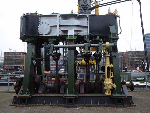
Given its geographical location, Rotterdam has a big port. Therefore, you have plenty of devices that are related to how a port process material. Cranes for example are omnipresent but other devices are just remnants of past activities (and machinery to activate them)
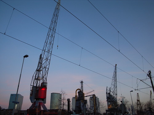
Still in terms of mechanics, bridges can be moved above canals (as in other cities in the Netherlands) and automation seems to be pervasive as indicated by those signs:
But the environment can also be responsive, as attested by these red crane-like objects on Schouwburgplein square. Designed by West8, theses hydraulic cranes can be controlled by a panel situated on the square so that anyone can set the position of the light.
Of course, this is also reflected in the architecture through very classical ambient displays such as the cladding of Renzo Piano's building for KPN Telecom. It acts as a giant billboard that displays patterns that change throughout the day.
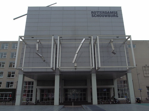
Back on Schouwburgplein square, very curious clock-like shapes are adopting dancing patterns in a somewhat ambient display-like ballet:
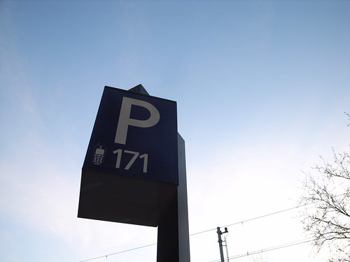
At the individual level, there are also lots of examples of spaces from everyday life that becomes reliant on software (sort of what Kitchin and Dodge refer to as "code/space"). See for instance, the use of chipkaart (metro pass), the omnipresence of chipknip or how the inhabitants can use their cell-phone to deal with parking lots:
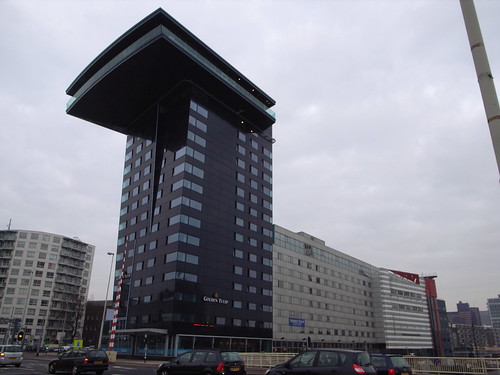
That is even more intriguing when you encounters buildings whose shape adopt the form of machinery:
Why do I blog this? To some extent, I've been amazed by how wandering around in the city gave a feeling of "urban computing" at the lower level sense. As if there was some background sense of systems operating implicitly, quietly in a sort of ballet of movements and displays more or less controlled by the inhabitants. IMHO, it definitely exemplify the city as a dynamic process with changing shapes. My examples are of course not exhaustive, and some of them can also be found elsewhere but the combinations there seemed to be utterly explicit.
In addition, beyond "urban computing" notion such as location-based services or touch-interactions, it's rather when I encounter street signage about "automation" that I feel the digital city.
Metro pass surfaces
(Seen in Paris last week)
Why do I blog this? I just wanted to point the size and color of the contact area (coherence and homogeneity). This big violet circle is intriguing and as you can see on the second picture there is a sort of "tail" maybe to facilitate the passing of the card/pass when moving. The tail allow the user not to stop to validate his/her card.
Notes from Paris digital city conference
Some notes from the urban computing symposium I attended in Paris last week. The whole thing was about what the organizers call "Villes 2.0" (i.e. City 2.0) based on the assumption that the transformation the Web have seen (from its first use to a second generation much more participative) is an interesting model to observe what is happening nowadays in urban environment. They have a whole research transfer/workshop program about this topic and this event was focused on "new urban perspectives". Isabelle Mari (JCDecaux) and Bruno Marzloff (Groupe Chronos) The discussion was about the bike renting system put in place by JCDecaux (see the one in Paris) for example. To them, the biggest surprises were:
- The service was a success unlike what the marketing studies they've done before had revealed. People seemed to be not interested before the introduction of the service but their offer revealed a latent demand from city dwellers
- The service was a success very quickly and with an incredible richness of appropriation, as attested by pictures on Flickr, lots of curious practices and tools created by people (mash-ups).
- They expected people to get bike pass (because it's more convenient) but people acted as "reccuring occasional users" by paying only when they needed a bike. As if people wanted to minimize the constraints and employ the service to optimize their liberty of use.
They then presented the reasons why an outdoor advertising company such as JCDecaux becomes a "mobility company". One of the reason is that people are used to a fluidity of services and information; they than have similar expectations for urban services. The problem is that city councils or other public bodies don't have resources/time/expertise to do that. Therefore some public/private hybridization with new actors are appearing. The problem is then to have a continuity of services between all these actors. The advantage of a company such as JCDecaux is that they're already working with networks (of physical objects, i.e. billboards, people, subcontractors, etc.). The network organization is a fundamental aspect of mobility.
The last thing they discuss was the similarity between the web and the city (in this web2.0/city analogy): people on the web buy "display", a need to have an embodiment and it's the same in the city. She also made an analogy with digital music which is now a commodity and it augmented the value of concerts. In the city, there will be new commoditized services that will augmented the value of city activities.
Jean-Louis Fréchin Jean-Louis talked right after me, in the session about the invisibility of the digital city. More specifically, his presentation was about urban signs and identity (see his slides in french here).
The identity of a city is built through: monuments and symbols (Eiffel Tower), history (traces of the past), signs that are sometimes discreet (manhole covers), signs (street plates), road signs, infrastructures (like Guimard's entrance in Paris subway), companies signs. This often lead to a "ville-spectacle" (spectacle-city). On the other hand, the signs and the identity of a city are participative. graffitis, space invaders, political announces.
Through various examples, he then detailed the issues at stake concerning signs for digital services: should we create new signs? new objects? old objects (can we reinvent the orientation table?)? or should we combine signs to other infrastructures? What should be the level of precision? Do we need the information to be legible? What about the regulation? who will control these signs? Can it be participative?
Yo Kaminagai (RATP) Yo is a design director at the Paris transport utility company RATP. Personally, I always enjoy his talks as they're a mix of down-to-earth and design description. The sort of thing I get from his talks are elements such as "we need 20 square meters per metro station to put infrastructures for GSM covering of the whole subway system and we never have enough room in corridors built in 1910. So there is less room for people, less for billboards and our revenues drop". As a matter of fact, he started by discussing how the immaterial, what some call "the virtual" is material and that people, users, are impacted by that. Thus, space is not an adjustment variable but a parameter.
A big part of his talk was about the design guidelines they set to create metro stations (easy to use, reliable, enriching, regulating, safe) and the importance to link (or not to link) the underground city and the city above. And he highlighted how the disorder of spatial environment often reflect the communication problems between people who are taking care of it.
Part of their problem is also that they need to think at different scales. For instance, they will soon renew their metro trains. What happens is that they buy something that will last 60 years (and will only be renovated once). So planning is VERY important: taking new needs into account, flexibility (how to design billboard 30 years before), how to combine safety, comfort and huge numbers of users (3 lines on 14 are overcrowded today, in 10 years, it will be 10 on 14!).
In that context, they consider building new (digital) services (for orientation, supporting conversations or meetings...) but given that the subway is already crowded it can be perceived as an aggression (too much information!) by users. This is why they think about "doubling" the physical environment with digital representations (hence their interest in platform such as Second Life).
Maps as abstraction
Current discussions lately have led me to have a glance at the "critical cartography" field. Reading An Introduction to Critical Cartography by Jeremy W. Crampton and John Krygier was a good introduction to that. The part that interested me most was the one about the critiques of maps, as shown by this quote by Yves Lacoste: "The map, perhaps the central referent of geography, is, and has been, fundamentally an instrument of power. A map is an abstraction from concrete reality which was designed and motivated by practical (political and military) concerns; it is a way of representing space which facilitates its domination and control. To map…serves the practical interests of the State machine (Lacoste 1973: 1). "
Back to Crampton and Krygier:
"We define critical cartography as a one-two punch of new mapping practices and theoretical critique. Critical cartography challenges academic cartography by linking geographic knowledge with power, and thus is political. (...) The explicit critique of cartography and GIS that arose in the late 1980s should therefore be understood in this much longer tradition. While the former is better known, to overlook the latter is merely to “accept what cartographers tell us maps are supposed to be” (Harley 1989: 1). In fact, cartography as a way of knowing the world has constantly struggled with the status of its knowledge in a manner similar to that of the geographical discipline (Livingstone 1992). "
Why do I blog this? having worked on the user experience of location-based services, it's important to keep in mind how maps are not absolute representation of the reality but are definitely influenced by other factors (such a political or economical factors).
What appearance means...
as shown by satellite antennas
In Swiss Mountains, they can be decorated as typical housing add-ons. In the example below, the owners have put a sort-of typical paintings (with cow going up the mountains, a sort-of "poya"):

At Reuters Headquarters in Geneva, the situation is different and antennas are huge and protected by barriers:

Both are integrated differently in the landscape, but both are upload/download devices.


